
The igDatePicker control is jQuery-based widget that extends the igDateEditor control and it exposes a number of options for styling. To customize style of the numeric editor you must use theme option to apply custom CSS rules to the control.
Note: The
igDatePickercontrol reuses the drop-down calendar fromjQuery.datepickerand you should use style options available forjQuery.datepicker.
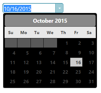
As the igDatePicker control uses the jQuery UI CSS framework it can also be fully styled using the jQuery UI ThemeRoller where you can customize your own theme or choose from a gallery of available ones. These themes replace the ones that come by default with Ignite UI for jQuery.
Date picker using the UI Darkness theme:
Your CSS may include style overrides for many more elements of the date picker. For a full list of available classes see the API Reference Theming classes. Styles can be applied both by overriding the global classes applied to all editors or by targeting specific elements by ID or other specific trait to allow for more per-control customization.
.ui-igedit-input{
    color: #00aeef;
}

View on GitHub