
The igNumericEditor control is jQuery-based with a number of options for styling. To customize style of the numeric editor you can use different themes or apply custom CSS rules to the control.
The Ignite UI for jQuery package comes with a number of jQuery UI and Bootstrap themes. Bootstrap support also includes generating and customizing your own bootstrap themes - see Styling and Theming for details. All of the themes will style all controls including the editors on the page.
As the igNumericEditor control uses the jQuery UI CSS framework it can also be fully styled using the jQuery UI ThemeRoller where you can customize your own theme or choose from a gallery of available ones. These themes replace the ones that come by default with Ignite UI for jQuery.
Numeric editor with drop list using the UI Darkness theme:
Your CSS may include style overrides for many more elements of the numeric editor. For a full list of available classes see the API Reference Theming classes. Styles can be applied both by overriding the global classes applied to all editors or by targeting specific elements by ID or other specific trait to allow for more per-control customization.
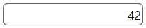
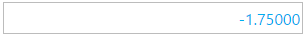
The default color for a negative value in the igNumericEditor is red. Here is an example how to change this color:
<style>
.ui-igedit-negative
{
    color: #00aeef;
}
</style>
View on GitHub