
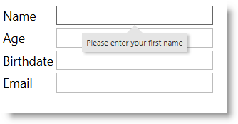
The igPopover™ control is a pop-up window functioning as a browser tooltip: it dispays over a DOM element that provides context information about it.
The igPopover control is designed to be used as an enhanced replacement of browser tooltips and cannot work as a standalone window. Its content and display are dependent on the target element on which it is initialized.
igPopover Overview: This topic provides an overview of the igPopover control and its main features and functionality.
Adding igPopover: This topic explains, with code examples, how to add the igPopover control to an HTML page in either JavaScript or ASP.NET MVC.
Configuring igPopover: This topic explains how to configure the content, activation, and positioning of the igPopover control.
Handling events(igPopover):This topic explains the events of the igPopover control and provides code examples of attaching event handlers.
Styling igPopover: This topic explains, with code examples, how to configure the look-and-feel of the igPopover control using CSS. This includes setting the background color of the content, the visibility and color of the pointer, the color of the header, and the appearance of the Close button.
Accessibility Compliance: This topic explains the accessibility features of the igPopover control and provides information on how to achieve accessibility compliance for pages containing this control.
Known Issues and Limitations (igPopover): This topic summarizes the known issues and limitations of the igPopover control
jQuery and MVC API Links (igPopover): This topic provides links to the API reference documentation for the jQuery and its ASP.NET MVC helper class for the igPopover control.
Property Reference (igPopover): This topic explains the properties of the igPopover control and lists their default values.
View on GitHub