
The following table lists the concepts, topics, and articles required as a prerequisite to understanding this topic.
igGrid control and the functionalities this feature provides.igGrid control.This topic contains the following sections:
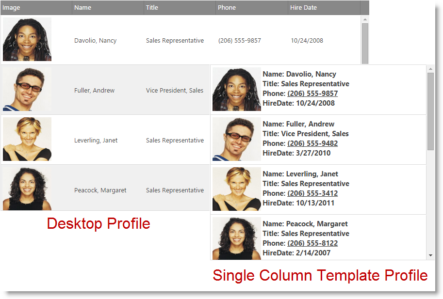
The responsive Single Column Template allows you to define a custom template that renders the data from a row into a single column based on the current layout mode (tablet or phone).
This allows you to create a specialized look for the data in the grid when it's rendered on small devices.
Note The RWD Single Column Template feature is supported only with the Paging grid feature. All other grid features are currently not supported with this mode.
The templates per specific profile are specified via the singleColumnTemplate option of the Responsive Web Design Mode feature.
Different templates can be specified based on the current layout mode (tablet or phone) in order to further customize the way the data is presented.
The below sample shows how this configuration affects the rendering of the data depending on the device size. In order to see the different modes take effect please open this sample on a mobile device or resize the browser's window.
The following topics provide additional information related to this topic.
igGrid control and the functionalities this feature provides.View on GitHub