
Demonstrates using styles and applying themes with igPieChart™.
Concepts
Topics
External Resources
jQuery UI: jQuery UI library home page
Theming jQuery UI: Detailed explanation of the approach taken and inner workings of themes with the jQuery UI.
jQuery UI CSS Framework: Explains in detail the jQuery UI CSS framework.
This topic contains the following sections:
The igPieChart uses the jQuery UI CSS Framework for the purpose of applying styles and themes. By default, the igPieChart uses the IG Theme, part of the jQuery UI theme, provided by Infragistics for use in your application along with some additional chart specific styles. This means that a general jQuery UI theme is insufficient to customize the looks of charts. You will need to provide additional style classes that alter chart specific elements like data series and axes.
You can use ThemeRoller to customize a theme. ThemeRoller is a tool provided by jQuery UI which facilitates the creation of custom themes that are compatible with jQuery UI widgets. Many pre-built themes are available for download and use in your website. The igPieChart control supports the use of ThemeRoller themes.
Detailed information for using themes with Ignite UI for jQuery library is available in the Styling and Theming topic.
Note: The base theme of Ignite UI for jQuery is unnecessary for charts and may be omitted on pages that contain only charts.
The following table summarizes the themes available with the igPieChart.
| Theme | Description | ||||||||||
|---|---|---|---|---|---|---|---|---|---|---|---|
| IG Theme | Path: {IG CSS root}/themes/Infragistics/ File: infragistics.theme.css | This theme defines general visual features for all Ignite UI for jQuery controls. Detailed information for using the IG theme is available in the Styling and Theming in Ignite UI for jQuery topic. | |||||||||
| Chart Structure |
{IG CSS root}/structure/modules/
File: infragistics.ui.chart.css
|
This theme defines charts specific visual elements. | |||||||||
The following CSS resources are necessary for the correct rendering of charts:
infragistics.theme.css – Contains the IG Themeinfragistics.ui.chart.css – Contains the Chart Structure classesIn the code snippets that follow, it is assumed that the CSS resources are located into Content/ig folder below the web site/application root.
Note: The following blocks provide information on manually including required CSS files; however, we recommended using the Infragistics Loader control to load these files into your page.
In HTML:
<link href="Content/ig/themes/Infragistics/infragistics.theme.css" rel="Stylesheet" />
<link href="Content/ig/structure/modules/infragistics.ui.chart.css" rel="Stylesheet" />
In ASPX:
<link href='<%= Url.Content("~/Content/ig/themes/Infragistics/infragistics.theme.css")%>'      rel="stylesheet" type="text/css" />
<link href='<%= Url.Content("~/Content/ig/structure/modules/infragistics.ui.chart.css")%>'      rel="stylesheet" type="text/css" />
A summary of the igDataChart control’s styles and functions.
| Property | Description |
|---|---|
| .ui-chart-palette-1 to .ui-chart-palette-N | Sets border and background color for data series 1 to data series N. You can have as many ui-chart-palette classes as needed by your application. |
| .ui-chart-axis | Sets border and background color for chart axes. |
| .ui-chart-legend-items-list | Sets all styling options for chart legends. |
| .ui-chart-legend-item-text | Sets all styling options for legend item text. |
| .ui-chart-legend-item-badge | Sets all styling options for legend item icon. |
| .ui-chart-tooltip | Sets all styling options for chart tooltips. |
Note: In all style classes the border-color setting determines the outline of the corresponding element and the background-color setting determines the background or fill color of the element.
The igPieChart control is all about visual content and has a lot of properties and styling options for changing a charts layout and colors. Use CSS to define:
With individual pie chart control options you can define:
The following reference table catalogs all options for changing chart element colors and their purpose. When set, pie chart options have precedence over style classes defined in CSS files. These options provide programmatic runtime changes to the rendering of charts.
A summary of the igPieChart styles’ purpose and function.
| Property | Description |
|---|---|
| brushes | Defines the palette for selecting automatically assigned slice colors. |
| textStyle | Overrides the label rendering style. |
| outlines | Defines the palette for automatically assigned slice outline colors. |
This procedure explains how to alter the default settings for various visual elements of the igPieChart control by changing the styles in the chart specific infragistics.ui.chart.css file.
Use an existing page with a pie chart, as this example does not provide the procedure for creating a pie chart. In this example, we modify the chart styles by changing the colors of the pie slices.
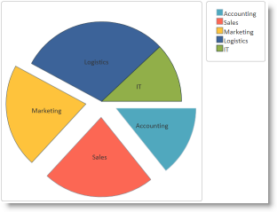
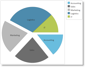
The following screenshot shows the default view of a sample chart with the default styles along with an example of updated slice colors.
| Default slice colors | Updated slice colors |
|---|---|
 |
 |
igPieChart control.Step-by-step instructions for creating a custom chart theme. The following is a conceptual overview of the process:
Demonstrate how to modify the default IG Chart styles with your preferred settings.
Copy the default chart CSS file
Copy the CSS file with the default chart styles ( infragistics.ui.chart.css ) from the Ignite UI for jQuery installation to the themes folder of your web site or application.
For instance, if you have a folder Content/themes in your web site or application where you keep the CSS files used by the application, make a copy of the default chart CSS file mentioned above paste it here, Content/themes/MyChartTheme/ig.ui.chart.custom.css.
Modify styles for chart visual elements
Open the copy of the CSS file and make the desired style changes. (Refer to the Chart Styles Reference section for details about the individual igPieChart styles.)
In CSS:
 .ui-chart-palette-1
 {
     border-color: rgb(35, 128, 168);
     border-color: rgba(35, 128, 168, .8);
     background-color: rgb(68, 172, 214);
     background-color: rgba(68, 172, 214, .8);
 }
 .ui-chart-palette-2
 {
     border-color: rgb(51, 51, 51);
     border-color: rgba(51, 51, 51, .8);
     background-color: rgb(73, 73, 73);
     background-color: rgba(73, 73, 73, .8);
 }
 .ui-chart-palette-3
 {
     border-color: rgb(128, 128, 128);
     border-color: rgba(128, 128, 128, .8);
     background-color: rgb(168, 168, 168);
     background-color: rgba(168, 168, 168, .8);
 }
 .ui-chart-palette-4
 {
     border-color: rgb(24, 81, 112);
     border-color: rgba(24, 81, 112, .8);
     background-color: rgb(33, 110, 153);
     background-color: rgba(33, 110, 153, .8);
 }
 .ui-chart-palette-5
 {
     border-color: rgb(135, 153, 34);
     border-color: rgba(135, 153, 34, .8);
     background-color: rgb(164, 186, 41);
     background-color: rgba(164, 186, 41, .8);
 }
 .ui-chart-axis
 {
     border-color: #989EA3;
     background-color: #989EA3;
 }
 .ui-chart-legend-items-list
 {
     padding: 10;
     margin: 5px;
 }
 .ui-chart-legend-item-text
 {
     vertical-align: text-bottom;
 }
 .ui-chart-legend-item-badge
 {
     vertical-align: baseline;
 }
 .ui-chart-tooltip
 {
     -moz-box-shadow: 5px 5px rgba(0,0,0,0.5);
     -webkit-box-shadow: 5px 5px rgba(0,0,0,0.5);
     box-shadow: 5px 5px rgba(0,0,0,0.5);
 }
Change the link from the default chart CSS file to the modified file
Update the link to the default chart CSS file to point to the CSS file modified in the previous step.
In HTML:
<link href="/Content/themes/MyChartTheme/ig.ui.chart.custom.css" rel="Stylesheet" type="text/css" />
In ASPX:
<link href='<%= Url.Content("~/Content/themes/MyChartTheme/ig.ui.chart.custom.css")%>' rel="stylesheet" type="text/css" />
To verify that the chart colors and styles have changed, save the web page and open it in your browser.
The following topics provide additional information related to this topic.
igPieChart Overview: Provides conceptual information about the igPieChart control including its main features, minimum requirements for using charts and user functionality.
Adding an igPieChart: Demonstrates how to create add the igPieChart control and bind it to data.
The following third party material provides additional information related to this topic.
View on GitHub