
This topic provides an overview and image explaining the visual elements of the igSparkline™.
The following topic is a prerequisite to understanding this topic:
igSparkline control, its benefits, and the supported chart types.The igSparkline control has several visual elements and corresponding features through which these elements can be configured and customized. The primary benefit of Sparkline compared to other charting controls is that it can render in a limited space such as a grid cell with all its visual elements shown. With that in mind, the Sparkline cannot display every label of the data points. It only allows showing high and low values on the Y-axis, and first and last values on the X-axis.
The Sparkline has the ability to mark the data points with elliptical icons to indicate the highest, lowest, first, last and negative values. Customize the markers with the desired shape, color or images, etc. Additionally, the Sparkline decreases the size of the chart in order to accommodate the space required for rendering the X and Y axis along with their associated labels.
The following screenshot depicts the visual elements of the igSparkline control. Listed below are the elements that are configurable through properties. None of these visual elements display by default.
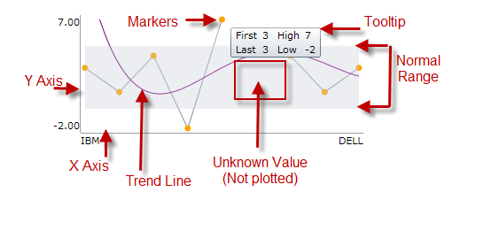
Configurable Visual Elements:
Markers
Trend Line
Normal Range
Unknown Values
Axis
Tooltip
The following table maps the visual elements of the igSparkline control and the options that configure them.
| Visual Element | Option |
|---|---|
| Markers | markerVisibility |
| Trend Line | trendLineType |
| Normal Range | normalRangeVisibility |
| Plotted or Unplotted Unknown Value | unknownValuePlotting |
| Axis | horizontalAxisVisibilityverticalAxisVisibility |
| Tooltip | tooltipTemplate |
The following topic provides additional information related to this topic.
igSparkline is built as a jQuery UI widget with an accompanying ASP.NET MVC Helper. For more information about each API, follow the links given below to the API documentation.The following samples provide additional information related to this topic.
Normal Range and Trend Lines: This sample shows the normal range and trend line functionality. To set a normal range, provide a normalRangeMinimum and normalRangeMaximum values and set the normalRangeVisibility. For trend lines, there are many styles to choose from. To enable the trend line, choose the trend line type that is best for your application and set the trendLineType option.
Tooltips and Markers: To enable tooltips and markers, set the tooltipTemplate and markerVisibility option to 'visible’.
View on GitHub