
This topic demonstrates how to customize the igUpload control to achieve a custom look and feel. You’ll also learn about the required scripts and styles needed to style the control.
The Ignite UI for jQuery™ igUpload, like other jQuery widgets, utilizes the jQuery UI CSS Framework for styling. Included in Ignite UI for jQuery are custom jQuery UI themes called Infragistics and Metro. These themes provide a professional and attractive design to all Infragistics and standard jQuery UI widgets.
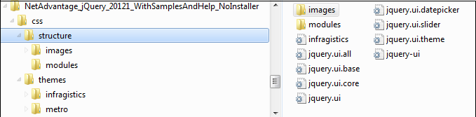
In addition to the Infragistics and Metro themes, there is a structure directory, which is required for the basic CSS layout of the Infragistics widgets.
The Infragistics and Metro themes are located in the installed directory within the css folder. To add the themes to your application, copy the whole css folder (including structure and themes directories) into your site’s location.
Note: When using Infragistics Loader, the folder structure must be preserved. Thus the loader will work as expected. If some of the themes are not used they can be deleted, but the structure should remain the same.
Figure 1: Included theme folders upon product install
The Infragistics Theme is a custom theme which includes all of the styles typically found in a jQuery UI theme. This theme may be replaced by a different theme but for the jQuery widgets to display correctly a reference to file {IG Resources root}/css/structure/infragistics.css is required..
Metro theme is implementation of the clean, modern and fast Metro design language. It has the same requirements for {IG Resources root}/css/structure/infragistics.css like Infragistics theme.
When using a theme other than the Infragistics (or Metro) theme, the igUpload has some additional styling points that may need customization to achieve a complete design (depending on the upload's enabled features and theme).
The igUpload control requires having a link to the stylesheet of a standard jQuery UI theme. For the IG Theme, you must include reference to the theme’s stylesheet in the page:
In HTML:
<link href="css/themes/infragistics/infragistics.theme.css" rel="stylesheet" type="text/css" />
<link href="css/structure/modules/infragistics.ui.upload.css" rel="stylesheet" type="text/css" />
In HTML:
<%@ Import Namespace="Infragistics.Web.Mvc" %>
<!DOCTYPE html>
<html>
<head runat="server">
<link href="<%= Url.Content("~/css/themes/infragistics/infragistics.theme.css") %>” rel="stylesheet"                                                                       type="text/css" />
<link href="<%= Url.Content("~/css/structure/modules/infragistics.ui.upload.css") %>” rel="stylesheet"                                                                       type="text/css" />
Metro Theme
The Metro Theme is referenced after the jQuery Theme. The following stylesheets are required when using the igUpload control:
In HTML:
<link href="css/themes/metro/infragistics.theme.css " rel="stylesheet" type="text/css" />
<link href="css/structure/modules/infragistics.ui.upload.css" rel="stylesheet" type="text/css" />
In HTML:
<%@ Import Namespace="Infragistics.Web.Mvc" %>
<!DOCTYPE html>
<html>
<head runat="server">
<link href="<%= Url.Content("~/css/themes/metro/infragistics.theme.css ") %>” rel="stylesheet"                                                                       type="text/css" />
<link href="<%= Url.Content("~/css/structure/modules/infragistics.ui.upload.css") %>” rel="stylesheet"                                                                       type="text/css" />
The upload CSS property is the member where all the styles for the control are applied. Table 1 shows all the properties of the CSS object property and all the rules applied to them. This gives you the freedom to create your own theme by overwriting specific classes.
Note: The Theme Roller theming the control by simply overwriting the listed classes presented in the table. For more information you can see the running sample with Theme Roller [link to sample].
| CSS object properties | List of CSS classes applied to the property | Area where CSS classes are applied |
|---|---|---|
| clearClass | ui-helper-clearfix | Applies float wrapping properties to parent elements |
| hiddenClass | ui-helper-hidden | Hide element |
| baseClassIE6 | ui-ie6 | Class for IE6 |
| baseClassIE7 | ui-ie7 | Class for IE7 |
| baseClassMoz | ui-moz | Class for FF |
| baseClassOpera | ui-opera | Class for Opera |
| startupBrowseButtonClasses | ui-igstartupbrowsebutton | Class for startup browse button |
| baseClass | ui-widget ui-widget-content ui-corner-all ui-igupload | Class for the container |
| baseMainContainerClass | ui-igupload-basemaincontainer | Classes applied to main container in single/multiple mode |
| multipleDialogClasses | ui-iguploadmultiple | Classes applied to main container when multiple file upload mode is selected |
| singleDialogClass | ui-iguploadsingle | Classes applied to main container when multiple file upload mode is selected |
| browseButtonClass | ui-igupload-browsebutton | Classes applied on browse button - button in main container |
| containerClass | ui-igupload-container ui-widget-content | Classes applied to DOM element containing all file upload progress bars |
| uploadProgressClass | ui-igupload-uploadprogress | div containing separate individual file upload |
| fileInfoMainContainer | ui-igupload-fimaincontainer | Class applied on div which contains add button, clear button and progress details of the files |
| progressContainer | ui-helper-clearfix | Class container for each file |
| progressBarUploadClass | ui-igupload-progressbar-upload ui-helper-clearfix | Class applied on single progressbar |
| progressBarFileNameClass | ui-igupload-progressbar-filename | Classes applied to file name DOM element in the summary progress bar |
| progressBarFileSizeClass | ui-igupload-progressbar-filesize | Classes applied to file size DOM element in the summary progress bar |
| progressBarInnerHTMLContainerClass | ui-igupload-progressbar-container ui-helper-clearfix | Classes of the container of the filename DOM element and file size DOM element inside each of the progressbar |
| containerButtonCancelClass | ui-container-button-cancel-class ui-helper-clearfix | Classes for container of the cancel/done button near the progress bar |
| summaryProgressBarClass | ui-igupload-summaryprogressbar | Classes applied to summary progressbar |
| summaryProgressContainerClass | ui-igupload-summaryprogresscontainer | Classes applied to container of summary progress bar |
| summaryProgressbarLabelClass | ui-igupload-summaryprogress-label | Classes of label of the summary progress bar |
| summaryInformationContainerClass | ui-igupload-summaryinformation-container ui-helper-clearfix | Classes of container in summary progress area - contains label for summary progress and show/hide details button |
| summaryUploadedFilesLabelClass | ui-igupload-summaryuploadedfiles-label | Classes applied to DOM element showing status of summary progress |
| summaryShowHideDetailsButtonClass | ui-igupload-showhidedetails-button | Classes of show/hide details button in summary progress area |
| summaryButtonClass | ui-igupload-summary-button | Classes which are set to the cancel button |
| summaryProgressBarInnerProgress | ui-igupload-summaryprogres_summpbar_progress | Classes set inside progress DIV |
| summaryProgressBarSecondaryLabel | ui-igupload-summaryprogress-label ui-igupload-summaryprogress-secondary-label | Class for the second label in summary progress bar |
| containerFUS | ui-widget-content ui-igupload-progress-container ui-corner-all ui-helper-clearfix | Class for container of each individual file - including progress bar, file info, cancel button, etc. |
Note: Not all of the classes are custom for the upload control. Some of them are reused from the jQuery UI CSS Framework.
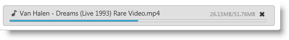
When the Upload property showFileExtensionIcon is set to true, the control displays an icon to the left of the file name indicating the type of the file being uploaded.
Figure 3: File Extension icon during an upload
By default most of the popular extensions has built-in icons. The types that are supported with icons are from the current categories:
| File Type | File Extension |
|---|---|
| Application | exe, app |
| Images | gif, jpg, jpeg, png, bmp, uyv, tif, thm, psd |
| Music | mp3, wav, mp4, aac, mid, wma, ra, iff, aif, m3u, mpa |
| Documents | doc, docx, xls, xlsx, txt, ppt, pptx, pdf |
| Video | 3pg, asf, asx, avi, flv, mov, mp4, mpg, rm, swf, vob, wmv |
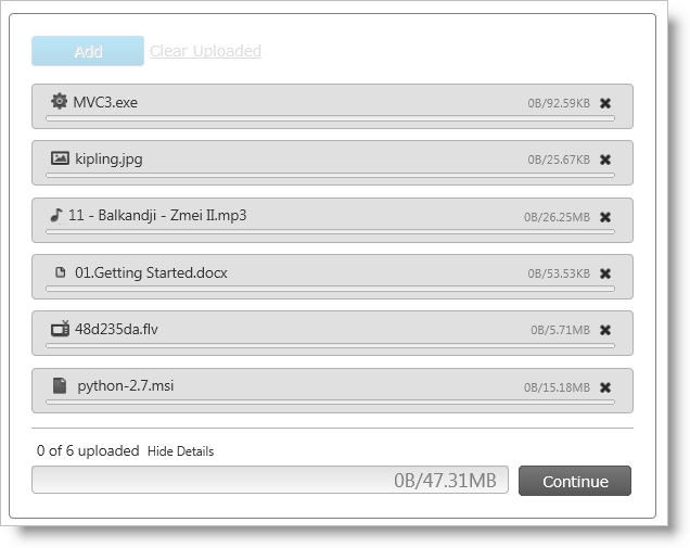
Figure 4 depicts how the default values of the icons look during a multiple file upload operation.
Figure 4: The upload control during a multiple file upload process
Note: If the file type is outside the built-in ones, a default icon is applied.
If you want to customize the file extension icons, you can override the default values by providing new icons to the fileExtensionIcons property.
The fileExtensionIcons property accepts an an array of objects that maps to each file type. Listing 1 demonstrates how to associate existing extension styles to a new CSS class.
Listing 1: Overriding default file extension icons
In JavaScript:
fileExtensionIcons: [
    {
        ext: ['gif', 'jpg', 'jpeg', 'png', 'bmp', 'yuv', 'tif', 'thm', 'psd'],
        css: 'image-class',
        def: true
    },
    {
        ext: ['mp3', 'wav', 'mp4', 'aac', 'mid', 'wma', 'ra', 'iff', 'aif', 'm3u', 'mpa'],
        css: 'audio-class',
        def: false
    }
]
Each mapping must account for the following three values:
ext: Array of the file extensions to share an iconcss: CSS class that is applied to each file that has the extension as defined in the ext propertydef: Designates if this is the default rule that is going to be applied to the types that have not been defined in any ext array.If there are file extension icons with more than one set default property then the last definition takes precedence.
View on GitHub