
This topic provides information on configuring axis gap and axis overlap in the igCategoryChart™ control.
The following topic is a prerequisite to understanding this topic:
This topic demonstrates how to add the igCategoryChart™ control to the page and bind it to data.
The Axis Gap feature of the igCategoryChart™ control allows setting the gap between series of the chart.
Property name: xAxisGap.
Can be set either during the widget initialization, or as an option after the widget was initialized:
$("#chart").igCategoryChart("option", "xAxisGap", 0.5);
The property accepts a numeric float value between 0 and 1. The value represents a relative width of the gap out of the available number of pixels between series. 0 - no gap is rendered between series; 1 - maximum available gap is rendered between series.
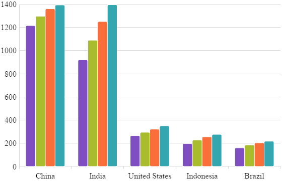
For the example, xAxisGap of 0.5 is a half of the available space is used to draw the gap:
To initialize igCategoryChart with xAxisGap of 0.5 the following code can be used:
$("#chart").igCategoryChart({
    title: "Countries population",
    xAxisTitle: "Countries",
    yAxisTitle: "Millions of people",
    dataSource: data,
    chartType: "column",
    xAxisGap: 0.5
});
The Axis Overlap feature of the igCategoryChart™ control allows setting overlap of rendered categories.
Property name: xAxisOverlap.
Can be set either during the widget initialization, or as an option after the widget was initialized:
$("#chart").igCategoryChart("option", "xAxisOverlap", 0.5);
The property accepts a numeric float value between -1 and 1. The value represents a relative overlap out of the available number of pixels dedicated to each series.
Negative value (up to -1): the categories are pushed away from each other producing a gap between themselves.
Positive value (up to 1): the categories are overlapping each other. Value of 1 directs the chart to render categories on top of each other.
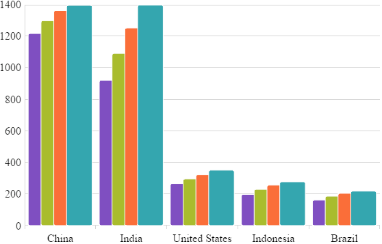
For the example, xAxisOverlap of 0.5 is a half of the available space is used to draw categories overlapping each other:
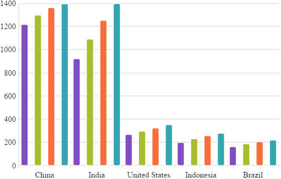
xAxisOverlap of -1 pushes categories from each other as far as possible:
To initialize igCategoryChart with xAxisOverlap of 0.5 the following code can be used:
$("#chart").igCategoryChart({
    title: "Countries population",
    xAxisTitle: "Countries",
    yAxisTitle: "Millions of people",
    dataSource: data,
    chartType: "column",
    xAxisOverlap: 0.5
});
View on GitHub