
This topic provides information about the category highlight layer which is used for hover interactions. It describes the properties of the category highlight layer and provides an example of its implementation.
The following topics are prerequisites to understanding this topic:
Adding igDataChart: This topic demonstrates how to add the igDataChart™ control to a page and bind it to data.
Binding igDataChart to Data: This topic explains how to bind the igDataChart™ control to various data sources (JavaScript array, IQueryable<T>, web service).
This topic contains the following sections:
The categoryHighlightLayer targets a category axis, or all category axes in the igDataChart control. If the axis contains any series that are aligned between major gridlines of the axis, for example, columnSeries series, this will render a shape that fills the current category.
For other series, such as lineSeries series, it will render a band with an adjustable thickness at the closest gridline to the mouse position. In this situation if the useInterpolation property is enabled this will cause the x position to become affixed to the x position of the cursor.
You can change the color of the highlighting area by setting the brush property. For more information on this property see the Hover Interactions Property Reference (igDataChart) topic.
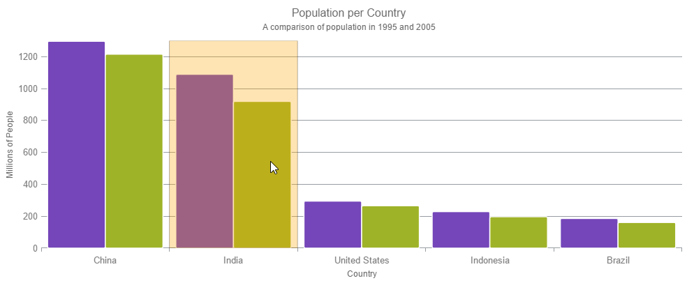
The following image is a preview of the igDataChart control rendered with the categoryHighlightLayer added.
The following table summarizes the properties of the categoryHighlightLayer layer.
| Property Name | Property Type | Description |
|---|---|---|
| bandHighlightWidth | double | This property specifies the width of the highlight area for series that are aligned on gridlines. For example, lineSeries, areaSeries and splineSeries. This property has no effect if there are series present aligned between gridlines. For example columnSeries and waterfallSeries. When this property is set, it highlights a banded shape of the specified size around the gridline. |
| targetAxis | categoryAxisBase | This property specifies which axis should have the enabled category highlight layer. |
| useInterpolation | bool | This property specifies if the highlight band should snap-to-cursor, instead of snap-to-gridlines. This property has no effect if there are series present aligned between gridlines. For example, columnSeries and waterfallSeries. |
This sample demonstrates the Category Highlight Layer that targets a category axis, or all category axes in the igChart control. The sample options pane allows you to edit the properties of the Category Highlight Layer, such as changing the color of the highlight, outline, thickness and more.
Hover Interactions Overview (igDataChart): This topic provides conceptual information about the hover interactions available on the igDataChart control including the different types of hover interaction layers available.
Hover Interactions Property Reference (igDataChart): This topic provides information about the properties and methods that the hover interaction feature uses for highlighting, hovering and interacting with the tooltip interactions inherited from the series class.
Configuring the Category Highlight Layer (igDataChart): This topic provides information about the category highlight layer which is used for hover interactions. It describes the properties of the category highlight layer and provides an example of its implementation.
Configuring the Category Tooltip Layer (igDataChart): This topic provides information about the category tooltip layer used for hover interactions. It describes the properties of the category tooltip layer and provides an example of its implementation.
Configuring the Item Tooltip Layer (igDataChart): This topic provides information about the item tooltip layer which is used for hover interactions. It describes the properties of the item tooltip layer and also provides an example of its implementation.
Configuring the Crosshair Layer (igDataChart): This topic provides information about the crosshair layer used for hover interactions. It describes the properties of the crosshair layer and provides an implementation example.
The following samples provide additional information related to this topic.
Hover Interactions – Category Item Highlight Layer: This sample demonstrates the Category Item Highlight Layer that highlights items in a series that use a category axis either by drawing a banded shape at their position or by rendering a marker at their position.The sample options pane allows you to edit the properties of the Category Item Highlight Layer, such as changing the color of the highlight, outline, thickness and more.
Hover Interactions – Category Tooltip Layer: This sample demonstrates the Category Tooltip Layer that displays grouped tooltips for series that use a category axis. The sample options pane allows you to edit the properties of the layer, such as changing the position of the tooltip.
Hover Interactions – Item Tooltip Layer: This sample demonstrates the Item Tooltip Layer that displays tooltips for all target series individually. The sample options pane allows you to edit the properties of the layer, such as changing the transition duration.
Hover Interactions – Crosshair Layer: This sample demonstrates the Crosshair Layer that provides crossing lines that meet at the actual value of every series that they are targeting. The sample options pane allows you to edit the properties of the layer, such as changing the thickness of the crosshair.
Hover Interactions – Multiple Layers: This sample demonstrates how multiple layers interact within the igDataChart control. This sample displays the Item Tooltip Layer, the Crosshair layer and the Category Highlight Layer.
View on GitHub