
This topic lists all configurable visual elements of the igDataChart™ control and the properties that manage them.
The following topics are prerequisite to understanding this topic:
This topic provides conceptual information about the igDataChart control including its main features, minimum requirements for using charts and user functionality.
Configurable Visual Elements of the igDataChart Control and Related Properties
The following picture demonstrates the configurable visual elements of the igDataChart control. A listing of the properties that manage them is available in the Configurable visual elements and related properties block below.
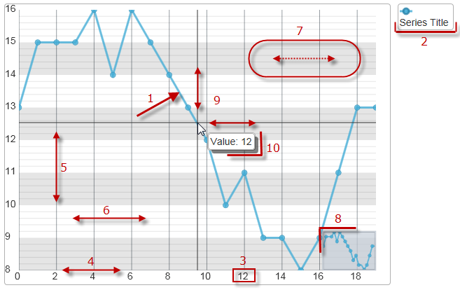
Configurable Visual Elements:
1) Data series
2) Legend
3) Axis label
4) Axis line
5) Axis major line
6) Axis minor line
7) Axis strip
8) Overview plus detail panel
9) Cross-hairs and cross-hair point
10) Tooltip
The following table maps the visual elements of the igDataChart control and the properties that configure them.
| Visual Element | Property |
|---|---|
| Data Series | series[] |
| Legend | series["key"].legend |
| Axis Labels |
axes["key"].labelVisibility
axes["key"].labelLocation axes["key"].labelExtent axes["key"].labelHorizontalAlignment axes["key"].labelVerticalAlignment axes["key"].labelTopMargin axes["key"].labelRightMargin axes["key"].labelBottomMargin axes["key"].labelLeftMargin |
| Axis Lines | axes["key"].stroke |
| Axis Major Lines | axes["key"].majorStroke |
| Axis Minor Lines | axes["key"].minorStroke |
| Axis Stripes | axes["key"].strip |
| Axis Ticks |
axes["key"].tickLength
axes["key"].tickStroke axes["key"].tickStrokeThickness axes["key"].tickStrokeDashArray |
| Overview Plus Detail window | overviewPlusDetailPaneVisibility |
| Cross-hairs |
crosshairVisibility
crosshairPoint |
| Tooltip |
series["key"].showTooltip
series["key"].tooltipTemplate |
This sample configures several of the elements, available in the igDataChart control.
Chart elements such as axis, labels, grid lines, grid stripes, zoom bars, series, trend lines, indicators and crosshairs are all available to enhance the control's presentation.
In addition to the settings above, the sample below demonstrates both enabling the default tooltip for the Chart’s series and configuring a custom tooltip template for the "United States" series.
The following topics provide additional information related to this topic.
Adding igDataChart: This topic demonstrates how to create add the igDataChart™ control and bind it to data.
jQuery and MVC API Reference Links (igDataChart): This topic provides links to the API documentation for jQuery and Ignite UI for MVC class for igDataChart™ control.
View on GitHub