
The topic introduces the user to the igDialog™ control’s main features.
This topic contains the following sections:
In HTML:
<div id="dialog">
    igDialog Content
</div>
The following table summarizes the all possible states of the control. Additional details are available within the related topics:
| State | Description | Related Topic |
|---|---|---|
| Opened | In this state, igDialog is opened. This is the default state of the control. | Show and Hide |
| Closed | In this state igDialog is closed. | Show and Hide |
| Minimized | In this state igDialog is minimized. | Maximize and Minimize Window |
| Maximized | In this state igDialog is maximized. | Maximize and Minimize Window |
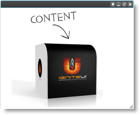
The following image shows the igDialog, which has an image as content. The control is in an open state.
The following table summarizes the features of the igDialog control. Additional details are available after the summary table:
| Feature | Description |
|---|---|
| Show and Hide | This is the ability to show and hide the dialog window using special buttons and control API. |
| Maximize and Minimize | This is the ability to minimize and maximize the dialog window using special buttons and the control API. |
| Pin | This is the ability to pin the dialog window to the parent container at the top left edge. |
| Position | This is the ability to put the dialog window at any place at the page, independent of his parent’s position. |
| Drag | The ability to move the dialog across the page. |
| Resize | The ability to resize the dialog. |
| Header and Footer | The igDialog control proposes properties for modifying the footer and header as well as for modifying the buttons and their images. |
| Keyboard support | The ability to close the dialog window using Esc key. |
| Modal state | The ability to disable the page behind the modal dialog. |
| Multiple dialogs | The ability to build in igDialogs one inside another. |
| External Page | This is the ability to load an external page as content of the igDialog. |
| Animations | The ability to select, open, and close animations. |
| Focus on child | Sets and retrieves the ability to process focus and blur events of child elements located in dialog, in order to maintain focused state. |
| Persistence | This feature allows saving the state of the igDialog, after a postback to the server is executed. |
The main functionality is that a window has the ability to show and hide itself. For closing the igDialog, you can use its user-interface button, use the “Esc” keyboard button, or use the control API. To open a hidden button again, you can only use the control API. For more information on the usage of the properties and methods for achieving this functionality, you can check the topic and sample links below.
Related Topics:
Related Samples:
You can maximize and minimize the igDialog by using the appropriate buttons. The control API proposes properties and methods to modify this behavior. You can also double click in the header to achieve behavior similar to the Windows OS window. For more information on the usage of the properties and methods for achieving this functionality, you can check the topic and sample links below.
Related Topics:
Related Samples:
The igDialog can be pinned the to the parent container at its top left edge. This will make the window unmovable, but it will be possible to resize it. For more information on how to configure this feature you can review the topic and sample below.
Related Topics:
Related Samples:
You can drag and drop the igDialog. The only property that needs to be modified to support this behavior is draggable, which is set to true as its default.
Related Samples:
You can drag and drop the igDialog. The only property that needs to be modified to support this behavior is resizable, which is set to true as its default.
Related Samples:
You can set the position of the igDialog using coordinates and also using the jQuery position method. For more information on how to configure this feature you can review the next topic and sample.
Related Topics:
Related Samples:
The igDialog control proposes properties for modifying the footer and header as well as modifying the buttons and their images. For more information on how to configure this feature you can review the next topic and sample.
Related Topics:
Related Samples:
You can close the igDialog using the “ESC” key. The only property that needs to be modified to support this behavior is closeOnEscape, which is set to true by default.
Related Topics:
Related Samples:
When igDialog is in modal state, the page in the background is hidden and disabled. You can only interact with the igDialog control. For more information on how to configure this feature you can review the next topic and sample.
Related Topics:
Related Samples:
You can show multiple igDialog widgets on a page and they will appear properly, without being required to define any relationship between them. You can use a combination of normal igDialog and modal dialogs. You can find more information about this in the following sample and topic.
Related Topics:
The igDialog can have an entire page as content. For more information on how to configure this feature you can review the next topic and sample.
Related Topics:
Related Samples:
The igDialog lets you choose opening and closing animations. For more information of how to configure this feature you can review the next topic and sample.
Related Topics:
Sets and retrieves the ability to process focus and blur events of the control itself, as well as its child elements located in the dialog. The only property that needs to be modified to support this behavior is trackFocus, which is set to true by default.
The feature allows saving the state of the igDialog, after a postback to the server is executed. If Persistence is enabled, you will have the ability to save the igDialog width, height, position, zIndex, pinned position and state. This feature is enabled when one of the overload Dialog() constructors is used. In this constructor, you need to pass, as a second parameter, a string name which will be the name of the hidden input that will hold the setting of the igDialog. The control will use this hidden field to persist the igDialog state during the calls to the server. For more information about Dialog() overloads, check the API documentation for the Dialog.
To enable igDialog persistence please use the following code:
In C#:
@Html.Infragistics()
    .Dialog("igDialog1", "hdnPersistnceInput")
    .Render()
The following topics provide additional information related to this topic:
Adding igDialog: This topic demonstrates how to add the igDialog control to a web page.
Configuring igDialog: This topic references all of the main igDialog features, their configuration, and usage.
igDialog API Reference: This topic introduces igDialog API categories. You can find all of the references to the control properties, methods, events and CSS classes, as well as some specific cases when the API is used.
igDialog Known Issues and Limitations: This topic demonstrates the known issues for the igDialog control.
The following samples provide additional information related to this topic:
igDialog height, width and state.View on GitHub