This topic provides an overall look at the igDoughnutChart™ control.
This topic contains the following sections:
The igDoughnutChart control allows for proportionally illustrating the occurrences of a variable. The inner radius of the control is configurable, and the Doughnut Chart’s series provides a built-in support for selecting and exploding its slices.
Visualizing the occurrence of multiple variables (adding multiple series) is possible, using concentric rings. The chart can be styled by configuring its properties or applying themes.
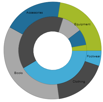
The following screenshot illustrates an igDoughnutChart with two series.

The following table summarizes the main features of the igDoughnutChart control.
| Feature | Description |
|---|---|
| Configurable rings | Each series of the igDoughnutChart control can be configured in a variety of aspects such as: slices color, labels, tooltips, start angle for slices rendering etc.
|
| Multiple rings support | The igDoughnutChart can display multiple rings at the same time with each of the rings capable of being bound to a different collection, or they can share a common data source.
|
| Slice selection | The igDoughnutChart exposes the API for setting the state of one or more slices to selected. Optionally, you may apply a single custom visual style to the selected slices.
|
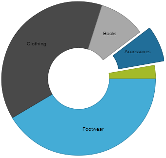
| Slice explosion | The igDoughnutChart slices explode either programmatically or by user interaction.
|
The following table summarizes the user interaction capabilities of the igDoughnutChart control.
| The user can… | Using… | Details | Configurable? |
|---|---|---|---|
| Click slices | Mouse-clicks | The igDoughnutChart exposes a sliceClick event, raised when the user clicks on a slice. Enabling slice selection or slice explosion allows you to modify the slice’s selection and explosion state upon click. |
 Configuring Selection and Explosion (igDoughnutChart) Configuring Selection and Explosion (igDoughnutChart) |
The following topics provide additional information related to this topic.
Adding igDoughnutChart: This topic explains how to add the igDoughnutChart to an HTML page.
Configuring Selection and Explosion (igDoughnutChart): This topic explains how to configure the slice selection and explosion on igDoughnutChart.
jQuery and MVC API Links (igDoughnutChart): This topic provides links to the API documentation about the igDoughnutChart control and the Ignite UI for MVC for it.
The following samples provide additional information related to this topic.
Bind to Collection: This sample demonstrates how to render igDoughnutChart using the Ignite UI for MVC and bind it to a collection of objects on the server.
Bind to JSON: This sample demonstrates how to bind doughnut chart to JSON data.
Labels and Tooltips: This sample demonstrates how to configure labels, tooltips and other options on igDoughnutChart.
Configure Legend: This sample demonstrates how to configure igDoughnutChart's legend.
View on GitHub