
This topic demonstrates how to configure the Tooltips Popover style.
The following table lists the topics required as a prerequisite to understanding this topic.
Touch Support for Ignite UI for jQuery Controls: This topic introduces to user to the new updates that jQuery controls has to support touch interactions.
igGrid™ Tooltips Overview: This topic shows how to enable and use igGrid tooltips.
This topic contains the following sections:
The following table lists the configurable aspects of the igGrid Tooltips Style property. Additional details are available after the summary table.
| Configurable aspects | Details | Properties |
|---|---|---|
| Configure tooltip style for touch devices | The igGrid Tooltip is configured to show as popover and to be compatible for touch devices |
style |
The normal tooltip appears when a cell is hovered and it appears at the bottom right corner of the cursor. But under touch platforms there is no hover state. Further, tooltips appear partially hidden by a user’s finger and there is no way to hide the tooltip unless another tooltips is shown. Therefore in touch environments, a more natural tooltip state is added called “popover”. If the popover style is activated it shows on a click or tap and the popover displays on the top of the cell and has touch optimized layout. If there is not enough space at the top, then the popover appears in another position (by priority: bottom, left, right). If there is no space around the touched cell, the popover exceeds the screen dimensions. The popover itself has a Close button that allows the user to hide the popover. Another difference compared to the "toolip" style (which content is rendered as plain text) is that the popover content is rendered as HTML. Finally, by tapping and holding users can select the text inside the popover.
The following table shows which property you need to set so that have the popover enabled
| In order to: | Use this property: | And set it to: |
|---|---|---|
| Show popover tooltip on click/tap | style | popover |
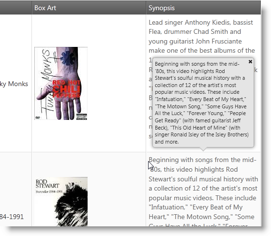
The screenshot below demonstrates how the igGrid Tooltips looks as a result of the following settings:
| Property | Value |
|---|---|
| name | Tooltips |
| style | popover |
| visibility | always |
Note: The table below lists the tooltip properties, which are ignored when the style is set to popover. This is because they are Desktop specific and don’t work in touch browsers.
| Property | State when popover style is enabled |
|---|---|
| hideDelay | ignored |
| showDelay | ignored |
| cursorLeftOffset | ignored |
| cursorTopOffset | ignored |
The following table explains the style property of the Tooltip feature and lists the default and recommended values.
| Property | Type | Description | Default Value |
|---|---|---|---|
| style | string |
This property allows you to change the look and behavior of the igGrid tooltip feature. Recommended Value: popover
|
tooltip |
The following topics provide additional information related to this topic.
igGrid Tooltips Overview: Topic describing the properties and behavior of the igGrid Tooltips.
Touch Support for Ignite UI for jQuery Controls: This topic introduces to user to the new updates that jQuery controls has to support touch interactions.
View on GitHub