
This topic provides an overview of the vertical column rendering in igGrid™; explaining its configuration and listing its limitations integrating with the other features.
The following table lists the concepts, topics, and articles required as a prerequisite to understanding this topic.
igGrid control and the functionalities this feature provides.igGrid control.This topic contains the following sections:
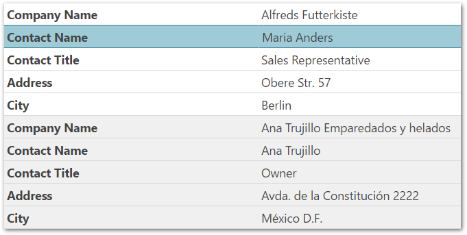
By default, enabling the Responsive feature renders the igGrid using vertical columns. This means that when the width of the browser is less than the width of the grid it renders the grid as a key/value pair list, similar to the screenshot below.
The windowWidthToRenderVertically option controls this behavior. The default value for the option is determined at runtime, calculating the grid’s width needed to accommodate columns of a certain size. By default, the width calculations occur in real-time.
Use the allowedColumnWidthPerType property members to configure column widths. For string columns the minimum setting size is 120 pixels, for number columns the minimal width is 50 pixels before forcing the vertical rendering. If the window is shrunk to a size less than the minimum column width, then the grid renders vertically. The user may configure these setting to a width that better suited to the user’s needs.
Set the enableVerticalRendering option to false in order to disable the vertical column rendering.
When rendering the grid vertically, the ui-iggrid-responsive-vertical class is added to the grid’s container. This allows you to determine the grid’s orientation, vertical or horizontal, simply by checking for the existence of this class.
There are no new events or parameters added to existing events for this feature.
The rows render as key/value pair lists, have the alternating row/record styles applied, if and only if, the alternateRowStyles option is set to true.
You can control the width of the headers and values columns with the propertiesColumnWidth and valuesColumnWidth properties.
The sample below demonstrates the igGrid’s Responsive Web Design feature in vertical mode. Responsive vertical rendering mode renders the grid data in two columns. The left column holds the columns captions and the right column holds the data.
Enabling the Responsive feature causes, by default the igGrid™ control to use the vertical rendering mode if this setting is not wanted; explicitly configure the windowWidthToRenderVertically to prevent this behavior.
This is done differently in JavaScript and ASP.NET MVC.
The following table briefly explains how to configure the igGrid control’s vertical rendering mode. For details, refer to the code examples following the table.
| To configure the vertical rendering mode in… | Do this… |
|---|---|
| JavaScript | Configure the RWD mode (the feature name is Responsive) in the igGrid’s features array. Set the windowWidthToRenderVertically option value in pixels. |
| ASP.NET MVC | Instantiate the Responsive feature in the delegate passed to the Features method of the grid. Set the WindowWidthToRenderVertically method’s parameter value in pixels. |
The following lists the code examples included in this topic.
Disabling vertical column rendering in JavaScript: Demonstrates disabling igGrid’s responsive vertical column rendering in JavaScript.
Disabling vertical column rendering in ASP.NET MVC: Demonstrates disabling igGrid’s responsive vertical column rendering in ASP.NET MVC.
This example creates an igGrid instance bound to the Products table data from the AdventureWorks sample database.
igGrid’s features arrayenableVerticalRendering option to falseFollowing is the code that implements this example.
In JavaScript:
$("#grid1").igGrid({
    height: "100%",
    width: "100%",
    columns: [
        { headerText: "Product ID", key: "ProductID", dataType: "number"},
        { headerText: "Product Name", key: "Name", dataType: "string" },
        { headerText: "Product Number", key: "ProductNumber", dataType: "string" }
    ],
    autoGenerateColumns: false,
    dataSource: adventureWorks,
    responseDataKey: "Records",
    features: [
        {
            name: "Responsive",
            enableVerticalRendering: false
        }
    ]
});
This example creates an igGrid instance bound to a custom Product object collection defined as a View model.
Responsive feature in the delegate passed to the grid’s Features methodEnableVerticalRendering methodFollowing is the code that implements this example.
In C#:
@using Infragistics.Web.Mvc
@model IQueryable<GridDataBinding.Models.Product>
@(Html.Infragistics()
    .Grid(Model)
    .ID("grid1")
    .AutoGenerateColumns(false)
    .Columns(col =>
    {
        col.For(c => c.ProductID).HeaderText("Product ID");
        col.For(c => c.Name).HeaderText("Product Name");
        col.For(c => c.ProductNumber).HeaderText("Product Number");
    })
    .Features(feature =>
    {
        features.Responsive().EnableVerticalRendering(false);
    })
    .DataBind().Render())
Although, no feature integration was planned for this mode: some features are supported.
Note: It is not advisable to combine column hiding and vertical rendering because they achieve the same goal in different ways.
When the vertical column rendering mode is turned on, the responsive grid supports the following API features (, but no UI is currently implemented to support them)
Selection feature works through the UI but only if Selection uses indexes for row identifiers. For best results no primaryKey should be specified and selection persistence should be disabled. Event arguments, selectedCells / selectedRows properties and API will return erroneous result regardless.
This section describes the various properties related to the Vertical Rendering when using the Responsive feature in the igGrid control.
The following table summarizes the purpose and functionality of the unbound columns’ properties.
| Property | Type | Description | Default Value |
|---|---|---|---|
| enableVerticalRendering | bool | Toggles responsive vertical rendering for the grid on or off. | true |
| windowWidthToRenderVertically | "string|number|null" |
The width of the window within which the grid renders its content vertically. The default value is null leaving the grid to automatically determine when to render this mode based on the allowedColumnWidthPerType settings.
|
null |
| propertiesColumnWidth | "string | number" | The width of the left properties column with vertical rendering enabled. | “50%” |
| valuesColumnWidth | "string | number" | The width of the right values column with vertical rendering enabled. | “50%” |
| allowedColumnWidthPerType | "object" |
The members of the property determine the minimal widths the columns can take, when windowWidthToRenderVertically is null, before forcing the grid to render vertically. For example, the minimal width in pixels that the bool columns can take, before forcing vertical rendering, is 50.
|
string: 120, number: 50, bool: 50, date: 80, object: 150 |
This section describes the various CSS classes related to the Vertical Rendering when using the Responsive feature in the igGrid control.
The following explains the CSS class applied when Vertical Rendering is enabled.
Enabling vertical rendering applies classes to the grid table. When this class is added to the grid’s container then the grid renders vertically.
Checking for the existence of the class allows you to determine if the grid renders vertically or horizontally.
The following topics provide additional information related to this topic.
Configuring Column Hiding (igGrid, RWD Mode): This topic explains, with code examples, how to configure column hiding for the igGrid control in Responsive Web Design (RWD) mode.
Configuring Column Templates (igGrid, RWD Mode): This topic explains, with code examples, how to define row and column templates for the individual Responsive Web Design (RWD) mode profiles of the igGrid control and how to configure automatic change of template when switching the active RWD mode profile.
Creating Custom Responsive Web Design (RWD) Profiles (igGrid): This topic explains, with code examples, how to create custom Responsive Web Design (RWD) mode profiles for the igGrid control.
Configuring Bootstrap Support (igGrid, RWD Mode): This topic explains how to configure Responsive Web Design (RWD) mode for the igGrid control using Twitter Bootstrap’s RWD classes.
View on GitHub