
This topic explains, with code examples, how to style the igScroll scrollbars to deliver different end-user experiences.
This topic contains the following sections:
The Ignite UI for jQuery™ Scroll (or igScroll), like other jQuery widgets, provides a number of CSS classes that apply to
specific UI elements. Each CSS class defines the look and feel of a DOM element that the igScroll renders.
The list of CSS classes that apply to the vertical custom scrollbar are:
igscroll-vcontainerigscroll-vtrackigscroll-varrowigscroll-uparrowigscroll-uparrow-activeigscroll-downarrowigscroll-downarrow-activeigscroll-vdragigscroll-vdrag-thinigscroll-vdrag-bigTo visualize which CSS class for which element is being used refer to the following picture. It displays four different scenarios that the default custom scrollbar has and shows each class applied:
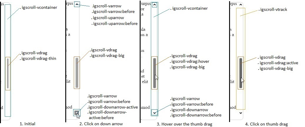
In order to style the container, position it differently and etc. only the igscroll-vcontainer class
needs to be changed. On the image above can be seen that the container wraps all elements composing the vertical custom scrollbar.
Setting the background color of that element for example will mean that all elements will have the new background
and will be positioned on top of it.
To style the track area only the igscroll-vtrack class needs to be modified. The track area is container of the scroll thumb
and that is the area where the scroll thumb is moving along. This area can also be seen in the screenshots above. It is positioned between the Up and Down arrows.
Initial state
The screenshot displays that initially by default only the scroll thumb is shown and it is visible in its thin state.
The classes applied are igscroll-vdrag and igscroll-vdrag-thin.
The first class is responsible for the overall look of the scroll thumb like background color, border styles and etc. The second class is responsible for how it will look when the scroll thumb is in its thin state. In general this class is used to set the width and the left offset of the thumb relative to the parent element.
Hovering over the scrollbar area
In the second scenario, because the scrollbar area is hovered, the scroll thumb is in its big state. This is reflected in the classes that are being applied on it as well.
The first class igscroll-vdrag is the same as in the previous state. The igscroll-vdrag-thin is now removed and
igscroll-vdrag-big is applied. The difference in this case is that now the width is bigger and the left offset is
smaller in order to compensate for the difference in the size.
Hovering over the scroll thumb
When hovering the scroll thumb the :hover pseudo-selector is used on top of the igscroll-vdrag to change the color of the scrollbar.
That way it indicates that the scroll thumb is being hovered. Everything else stays the same as without the :hover state.
This can be seen in the third scenario.
Clicking on the scroll thumb
Clicking on the scroll thumb will apply the :active pseudo-selector to it. Every other class still stays the same
as when the scroll thumb is show and it is not being hovered. The active selector for the igscroll-vdrag is
responsible for changing the look of the thumb when it is being clicked. Every other class still stays
the same as when the big thumb is shown and it is not being hovered.
Initial state
The first example displays that the thin scroll thumb is shown and the arrows are not visible.
If you want to set the arrows to be always visible, you simply need to change igscroll-varrow and set the opacity to 1.
Hovering over the scrollbar area
When you are not interacting with an arrow, but the area of the scrollbar is being hovered with the mouse
the igscroll-varrow, igscroll-varrow:before, igscroll-downarrow and igscroll-downarrow:before classes are used.
The igscroll-varrow defines the background color, while the second class defines the background image that will be on top
of the background color. In this case the background color is not set and it is transparent and only the image
is visible. The :before pseudo-selector is responsible only for the rotation of the background image and other transformations
regarding the background image.
Hovering over an arrow
When hovering over an arrow all classes stay unchanged. Only the :hover pseudo-selector is being applied on top of the igscroll-varrow class.
This way the arrow can be styled additionally. For example if the background color needs to be
different when hovering, the :hover pseudo-selector needs to have the new background color that will be used.
Clicking on an arrow
When clicking the down arrow, the classes applied to that elements are igscroll-varrow,
igscroll-varrow:active, igscroll-varrow:before, igscroll-downarrow-active and igscroll-downarrow-active:before.
This scenario can be seen as the second one on the screenshot above.
The first class is used to define overall default properties applied to both Up and Down arrows.
The :active pseudo-selector is used to define the background color that an arrow would have when it is being clicked on.
The :before pseudo-selector is used to specify the background image and set its properties. The background image will be
places on top of the background color. The before selector is used to properly position the background image,
set its size, position and etc.
The classes igscroll-downarrow-active and its :before pseudo-selector are used to specify exactly how
the down arrows should be styled which being active. The class is used for general properties regarding the down arrow.
The :before pseudo-selector is used like the igscroll-varrow:before and
in it the background image is changed. In the default custom scrollbars it is used as well to rotate
the background image so the arrow points down.
Note: Similar classes are used for the horizontal scrollbar. Their naming can be seen in the igScroll API.
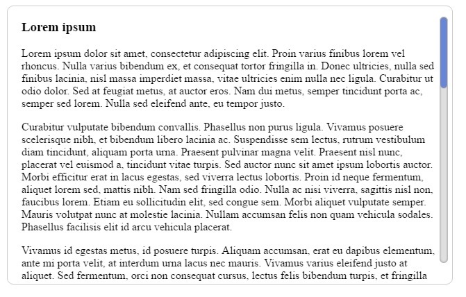
In this example we will describe how to style the vertical scrollbar so it will look like on the image bellow. It will not hide when we do not hover the content area and it will not change its size. It will also have the arrows hidden to provide more minimalistic look:
Initializing the igScroll
The igScroll is initialized on a div element that has a couple of paragraphs. We have styled that div to
have a border that is displayed above. The scrollbar that we are gonna style will be always visible, that's why
the alwaysVisible option of the igScroll should be set to true. The whole initialization would look like:
 $("#loremText").igScroll({
     alwaysVisible: true,
     scrollbarType: "custom"
 });
The actual body of that html sample looks like:
 <div id="loremText" tabindex="1">
     <h3> Lorem ipsum </h3>
     <p>..</p>
     ...
     <p>..</p>
 </div>
The div element has the following style applied to it:
 #loremText {
     height:400px;
     width: 600px;
     overflow: hidden;
     border: 1px solid #ccc;
     border-radius: 9px;
     padding-right: 20px;
     padding-left: 20px;
 }
We have added some padding as well to make sure that the scrollbars do not cover the text area on the right side. The width and the height of it specifies the general visible area for the text that will be displayed.
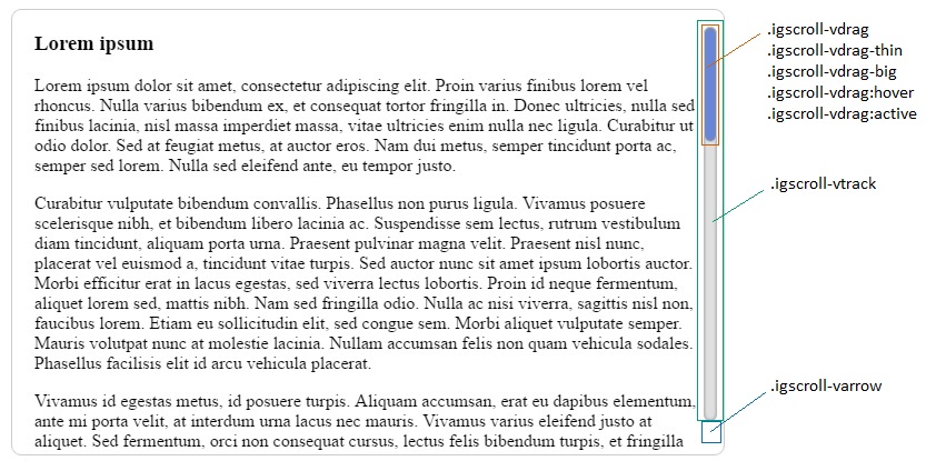
Now that we have initialized the igScroll we can proceed with the styling of the actual scrollbars. The classes that we will be using and where are they applied is displayed in the next screenshot:
Styling the arrows for the vertical scrollbar
In order to always hide the Up and Down arrow the igscroll-varrow class is used, which is set
to "visibility: hidden". This way both arrows will not be visible.
Styling the track area
To style the track area only the igscroll-vtrack class is used. The CSS for it is:
 .igscroll-vtrack {
     background-color: #dfdfdf;
     border-radius: 30px;
     width: 12px;
     box-shadow: inset 0px 0px 5px #888888;
 }
In that class we set the background color to be grey, round the edges using border-radius and add a box shadow.
The width is set to 12px in order to be the same size as the scroll thumb.
Styling the scroll thumb
Styling the vertical scroll thumb requires editing a few of the classes that are applied to it. The first class
that we will look into is the main class igscroll-vdrag. It is mainly used to style the scrollbar. In that class
we specify the initial background color, set border-radius so that it matches the track area,
add box-shadow and border to make it more distinguished.
The CSS for that class would look like:
 .igscroll-vdrag {
     border-radius: 6px;
     border: 1px solid #ccc;
     box-shadow: inset 0px 0px 5px #888888;
     background-color: #587adb;
 }
Now that we have set the basic style we will need to specify the width so it matches the track area. We will
need to set the left offset as well, so that the scrollbar is positioned properly. To do that we will need
to set both igscroll-vdrag-thin and igscroll-vdrag-big. This way we make sure the scrollbar will
stay the same size and will not change its width when we are no longer hovering the scrollbar area.
 .igscroll-vdrag-thin {
     width: 10px;
     left: 0px;
 }

 .igscroll-vdrag-big {
     width: 10px;
     left: 0px;
 }
To add a final touch to our scrollbar and make it so that the scroll thumb changes its color when we
hover or when we click on it we will change the hover and active selectors for the main class
igscroll-vdrag. Example for achieving that is by changing the background color to darker tones of
the same color:
 .igscroll-vdrag:hover {
     background-color: #4c69ba;
 }

 .igscroll-vdrag:active {
     background-color: #3f58a0;
 }
View on GitHub