
The Ignite UI for jQuery™ igTimePicker allows you to have an editor with time-only input and a drop-down with listed hours:minutes values. By default, the listed time values are with 30 minutes delta.
The igTimePicker input and display format are configurable. By default, the control uses a 12-hour format.
Depending on the specified time format (12-hour or 24-hour format), the drop-down list begins with 12:00 AM or 00:00 AM and ends with 11:30 PM or 23:30 PM.
The control supports localization by recognizing different regional options provided by the browser.
The igTimePicker control exposes a rich client-side API, which may be configured to work with any server technology. While the Ignite UI for jQuery™ controls are server-agnostic, the picker control is featured in Ignite UI for MVC that is specific for the Microsoft® ASP.NET MVC Framework and can be configured the with the .NET™ language of your choice.
The igTimePicker control may be extensively styled giving you an opportunity to provide a completely different look and feel for the control as opposed to the default style. Styling options include using your own styles as well as styles from jQuery UI's ThemeRoller.
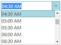
Figure 1: The igTimePicker control during time selection
The igTimePicker includes the following characteristics:
On your HTML page or ASP.NET MVC View, reference the required JavaScript files, CSS files, and ASP.NET MVC assemblies.
In HTML:
<link type="text/css" href="/css/themes/infragistics/infragistics.theme.css" rel="stylesheet" />
<link type="text/css" href="/css/structure/infragistics.css" rel="stylesheet" />
<script type="text/javascript" src="/Scripts/jquery.min.js"></script>
<script type="text/javascript" src="/Scripts/jquery-ui.min.js"></script>
In Razor:
@using Infragistics.Web.Mvc;

<link type="text/css" href="@Url.Content("~/css/themes/infragistics/infragistics.theme.css")" rel="stylesheet" />
<link type="text/css" href="@Url.Content("~/css/structure/infragistics.css")" rel="stylesheet" />

<script type="text/javascript" src="@Url.Content("~/Scripts/jquery-1.9.1.min.js")"></script>
<script type="text/javascript" src="@Url.Content("~/Scripts/jquery-ui.min.js")"></script>
For jQuery implementations, create an INPUT, DIV or SPAN as a target element in HTML. This step is optional for ASP.NET MVC implementations as the Ignite UI for MVC creates the containing element for you.
In HTML:
<input id="timePicker"/>
Once the above setup is complete, initialize the time picker.
Note: For the ASP.NET MVC Views, the
Rendermethod must be called after all other options are set.
In Javascript:
 <script type="text/javascript">
       $('#timePicker').igTimePicker();
 </script>
In Razor:
 @(Html.Infragistics().TimePicker()
              .ID("timePicker")
              .Render())
Run the web page to view the basic setup of the igTimePicker control.
The timeInputFormat and timeDisplayFormat options specify how time is formatted when the control is being edited or is simply displaying a value.
If specific format is not set, the timeInputFormat is used with its default value - "time". Presets like "time" map to the patterns defined by the regional options.
Supported formats follow the general patterns for Formatting Dates and Time. The time format can also be defined using a common set of time specifiers - for example, a format of "HH:mm" would display time similar to "16:35" where "HH" displays the hour number in 24-hour format and "mm" - the minute numbers, excluding the AM/PM part.
The buttonType option defines the type of buttons applied to the time picker control. This option defines as well provided interactions. Available button types are:
spin - spin buttons are added to enable incrementing/decrementing of time parts
Note: This option can not be set run-time and a combination like "dropdown, spin" is not allowed.
The itemsDelta option specifies the delta between the displayed consecutive time items. By default, the items delta is 30 minutes. This option defines also the step for increment/decrement when using the Up Arrow and DOWN Arrow. Use this option when you have buttonType set to "dropdown".
The spinDelta option specifies the increment/decrement step applied when the spin buttons are used in the time picker control. This option defines also the step for increment/decrement when using the Up Arrow and DOWN Arrow. Use this option when you have buttonType set to "spin". Note that when the input is not focused, clicking the spin buttons changes the minute part.
If you use the limitSpinToCurrentField option and set it to true, you can limit the spinning in only one time field without affecting the other parts.
The minValue and maxValue options specify the minimum\maximum value, which can be displayed/entered in the time picker by the end user. These two options also define the range of items in the control dropdown list.
In order to support ISO formatted dates, the time picker's value should be set to a date rather than to a string.
$("#timePicker").igTimePicker("option","value", new Date("2019-02-21T00:00:00.000Z"));
View on GitHub