
The igValidator control provides new look and feel compared to the previous one. It is designed to be easy to use with any form element and our existing components such as editors, combo box and other components for collecting user input. This control takes advantage to the notification widget design and use its visualizations to display the necessary success and error messages.
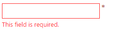
The main purpose of the igValidator control is to inform the end user for the passed and failed validation immediately by default. This means that when a user blur the editor's input a feedback message is immediately displayed giving useful information about the state in which the editor is in. For example it can display messages that indicate whether the current field is required or not and whether the user filled the input with the expected type of data.
The igValidator supports different configurations and multiple validation rules with messages for both success and error. The messages can be either placed in a predefined messageTarget or handed off to the igNotifier widget. In the latter case if the user data fails a validation rule the specific input is colored in red to indicate that something went wrong with the current interaction along with showing a notification.
Optionally you can use the requiredIndication property to hint in advance which form elements are required. There is also an optionalIndication property that indicates a particular field is optional.
The whole list of the igValidator options can be found in the igValidator API
The validator control can be configured independently on one or multiple targets (fields) or as an integrated part of the supported Ignite UI for jQuery controls - Editors, Combo and Rating. It possesses plenty of options which allows you to customize and configure this control corresponding to your needs.
<div id="textEditor"></div>
$('#textEditor').igTextEditor({
  inputName: "pass",
  textMode: "password",
  validatorOptions: {
    required: true,
    onblur: true,
    lengthRange: [6, 20],
    requiredIndication: true
  }
});
Note: When configured from an Editor control the validator does not support an additional
fieldscollection.
The following example demonstrates a basic usage with a single target filed. Targets can be any HTML form element as well as our specific editor controls and the combo.
<div id="validator"></div>
$('#validator').igTextEditor();

$('#validator').igValidator({
  required: true,
  onblur: true,
  requiredIndication: true
});
The control supports a fields collection describing each field with validation options and a selector. Fields must provide a valid jQuery selector and can contain any of the validation rules and triggers, but not other fields or event handlers. Rules from the main options level will also be inherited by fields if no such option is provided.
<form id="validationForm">
    <fieldset>
        <h4> Feedback form</h4>
        <p> Enter your name: (Validation onsubmit, required)</p>
        <input type="text" id="grpEdit1"></input>
        <p> Enter date: (Validation onblur, not required on submit)</p>
        <input type="text" id="grpEdit2"></input>
        <p> Give us rating: ( Validation onsubmit, minimum value = 1.5) </p>
        <div id="rating"></div>
        <p> Subscribe for free samples : (Validation onsubmit,required)</p>
        <div id="igCheckboxEditor"></div>
        <br>
        <input type="submit" value="Submit"></input>
    </fieldset>
</form>
$("#rating").igRating({
        precision : "half",
        valueAsPercent : false
    });
    $("#igCheckboxEditor").igCheckboxEditor();

    $('#validationForm').igValidator({
        required : true, //inherited
        fields : [{
                selector : "#grpEdit1",
                onblur : false // override default
            }, {
                selector : "#grpEdit2",
                date : true,
                required : false, // override
                onchange : true
            }, {
                selector : "#rating",
                successMessage : "Thanks!",
                onchange : true,
                valueRange : {
                    min : 1.5,
                    errorMessage : "At least 1.5 stars required (custom message)"
                },
                notificationOptions : {
                    mode : "popover"
                }
            }, {
                selector : "#igCheckboxEditor",
                onchange : true
            }
        ]
    });
Note: Both standalone configurations support fields enhanced with Ignite UI for jQuery Editor controls, however they must be initialized in advance for the validator to discover and handle them correctly. In case the timing cannot be controlled and the validator is initialized before other control(s) the
updateFieldmethod can be used to update that field in the validator.
Triggers allow specifying when validation should be performed and include three settings - onchange, onblur and onsubmit. These options resemble the native DOM events that they relay to and allow to control how often should the value be checked based on standard user interactions. By default only onchange is disabled to accommodate most common scenarios. Note that the onsubmit trigger will have no effect unless there's a parent form for the target input or the validator is initialized on the form itself.
While the threshold option is not technically a validation trigger, it is still an integral part of the validation cycle. When set, if the length of the value is less than the threshold then none of the validation rules will be run. This is most useful in scenarios where there's no value in showing an error message too early (for example when onchange is enabled) as the value cannot realistically fulfil the requirements under a certain length.
Note: Using the
isValidandvalidatemethods or validation on submit will ignore the threshold option. This allows required fields to properly prevent submitting for example. API methods will also ignore trigger conditions.
The igValidator rules define a number of conditions for a value to be accepted and in some scenarios you might need to use multiple rules on a single input in order to validate upon different criteria. On a single input the rules are executed per validation and in a particular order.
Default validation rules include (by priority):
For detailed information for each rule, refer to the Validation Rules topic.
To setup a validator in ASP.NET MVC using Ignite UI for MVC Helper Validator().html) extension can be used:
In Razor:
    @(Html.Infragistics().Validator()
        .ID("firstName")
        .Required(true)
        .Render())
The helper can also be initialized with an ValidatorModel. Model properties and Ignite UI for MVC methods follow the jQuery API of the control as closely as possible.
Besides configuring the validator through the dedicated helper, when using strongly-typed editors the Model will be automatically inspected for Data Annotations and the appropriate validation rules and their messages will be added to the control configuration. Additionally, the ValidatorOptions() helper method can still be used to add or override rules.
For a step-by-step guide please refer to the Configuring ASP.NET MVC Validation (Editors) topic.
View on GitHub