
This topic provides conceptual information about the igMap™ control including its main features, minimum requirements, and user functionality.
The following table lists the topics, and concepts required as a prerequisite to understanding this topic.
Topics
This topic contains the following sections:
The igMap control is intended to facilitate drawing maps with custom overlays in HTML5 web applications and sites. It uses the Canvas tag in HTML5 to plot the actual maps and visualize data on the maps.
Maps rendered by the igMap control consist of a background content (the actual geographic map) delivered by a map provider (like Bing® Maps or OpenStreetMap maps) and an overlay which represents the actual custom data you wish to visualize for the user. There are several types of overlays you can render on a map called “map series” or “map types” (see Supported Map Types).
A map can have an Overview Plus Detail (OPD) panel which serves the user to navigate and to give understanding about the exact location on the world map. The map supports user interactions like panning and zooming with keyboard, with keyboard and mouse actions, or by touch and drag action on touch-enabled devices. For details, see the Main Features Summary section.
The igMap control allows for a variety of series types to be implemented for different visualization purposes. The series are managed by setting igMap’s series.type property and its respective data binding properties.
See the Supported map types table block for detailed information on supported series types and basic configuration information.
The following table displays the supported map (series) types.
| Series type | Description | Series.type property setting | Data binding properties |
|---|---|---|---|
| Geographic Symbol Series |
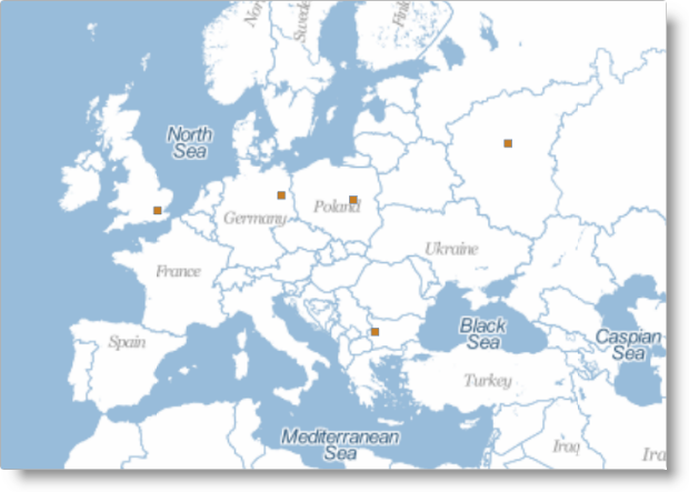
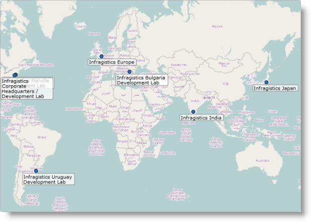
Visualizes markers on the map based on geographic coordinates.
_2.png) Related Topics: |
geographicSymbol | |
| Geographic Shapes Series |
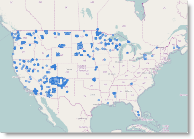
Visualizes enclosed areas on a map like countries or regions based on shape data provided by shape (SHP) files or a custom shape data source.
_3.png) Related Topics: |
geographicShape | |
| Geographic Polyline Series |
Visualizes open paths on a map like roads, rivers or daily supply routes based on shape data provided by shape (SHP )files or a custom shape data source.
_4.png) Related Topics: |
geographicPolyline | |
| Geographic Scatter Area Series |
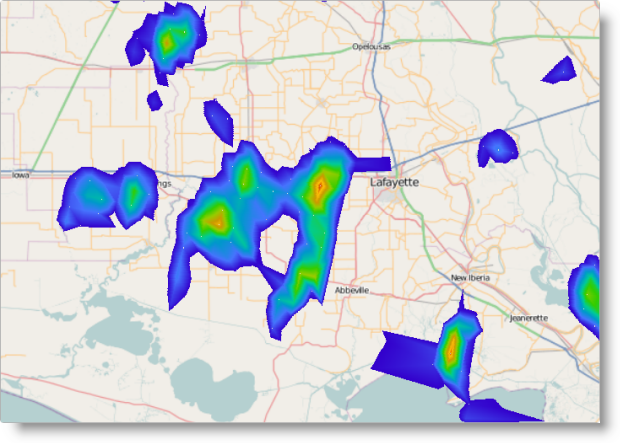
Visualizes colored geographic area based on triangular irregular networks (TINs) defined in a triangulated (ITF) file or other custom triangulation data source. Geographic coordinates and a value member are also needed. This can be used to depict terrain elevation, population density, average/current temperature and others.
_5.png) Related Topics: |
geographicScatterArea | triangulationDataSource Optional: |
| Geographic Contour Line Series |
Visualizes colored closed paths based on triangular irregular networks (TINs) defined in a triangulated (ITF) file or other custom triangulation data source. Geographic coordinates and a value member are also needed. This can be used to depict terrain elevation, population density, average/current temperature or others.
_6.png) Related Topics: |
geographicContourLine | triangulationDataSource Optional: |
The igMap control is a jQuery UI widget and depends on the jQuery and jQuery UI libraries. The Modernzr library is used internally for detecting browser and device capabilities. The control uses shared resources from the Ignite UI for jQuery™ for functionality and data binding. References to these resources are needed nevertheless, in spite of pure jQuery or Ignite UI for MVC being used. The Infragistics.Web.Mvc assembly is required when the control is used in the context of ASP.NET MVC.
The following table summarizes the requirements for igMap control.
| Requirement | Description | ||||||||||||||||||||
|---|---|---|---|---|---|---|---|---|---|---|---|---|---|---|---|---|---|---|---|---|---|
| HTML5 canvas API | The functionality of the igMap control is based on the HTML5 Canvas tag and its related API. Any web browser that supports these will be able to render and display maps generated by the control. No other HTML5 features are required for the operation of the igMap control. The topic Canvas Element: Support from Wikipedia™ details which versions of the most popular desktop and mobile web browsers support the HTML5 Canvas API. | ||||||||||||||||||||
| jQuery and jQuery UI JavaScript resources |
Ignite UI for jQuery is built on top of these frameworks:
|
||||||||||||||||||||
| Modernizr (Optional) |
The Modernizr library is used by the igMap to detect browser and device capabilities. It is not mandatory and if not included the control will behave as if it works in a normal desktop environment with HTML5 compatible browser.
|
||||||||||||||||||||
| JavaScript resources |
The functionality of the igMap control uses some utilities and the data visualization core from the Ignite UI for jQuery library.
|
||||||||||||||||||||
| CSS resources |
The CSS resources consist of the IG theme and the map structure CSS.
The IG theme contains custom visual styles created for the Ignite UI for jQuery library. It is contained in the following file:{IG CSS root}/themes/Infragistics/infragistics.theme.css
The map structure CSS resource is used for rendering different elements of the map control:{IG CSS root}/structure/modules/infragistics.ui.map.css
|
Note:It is recommended to load JavaScript and CSS resources using the
igLoadercontrol. For examples on how to use the theigLoadercontrol withigMap, refer to the Adding an igMap topic and the Geographic Symbol Series sample.
The following table summarizes the main features of the igMap control. Additional details are available after following the summary table.
| Feature | Description |
|---|---|
| Support for different map providers | The map providers deliver the map images and the map series are plotted as overlays over this background content. Any geographic series can be plotted on any background content. |
| Support for different map types (series) | The igMap control can visualize different map series. The series type is determined by the type option of each series object. Depending on the map series type, different kinds of input data must be supplied and correspondingly different data binding options must be set. |
| Zooming | Zooming is part of the user interaction features of the igMap control. It allows details for a specific map area to be revealed or a larger scale view to be displayed. Zooming can also be performed programmatically using the control’s API. |
| Panning | Panning is part of the user interaction features of the igMap control. It allows the currently displayed window from the map to be moved to the North, South, East, or West. Panning can also be performed programmatically using the control’s API. |
| Tooltips | Tooltips can be displayed when hovering over a marker or shape area of the map. Tooltips are based on templates which can render custom HTML markup and display data about a particular area of the map. |
| Customizable markers | Different markers can be used to designate points from the map. There are a plenty of built-in shapes like circle, triangle, diamond or others. Apart from the built-in markers, you have the option to create a custom marker by drawing directly on the canvas element. |
| Customizable look-and-fill of the series | The visual components of the series, like outlines, shapes, and fills, can be configured in terms of line thickness and patterns, color, color gradient, opacity, and so on. The exact customizations that can be applied are specific for each series type. |
| Binding to data attributes | Map series are based on custom data in addition to geographic coordinates and/or triangles. You can access and display custom data attributes (or members of data records) in tooltips or custom markers. |
The actual map background displayed in the igMap control is content retrieved from a map provider. The igMap can use different map providers. The map providers deliver the map images and the map series are plotted as overlays over this background content.
The igMap control supports the following map providers:
Note: Bing Maps require you to provide your custom access key to access their content.
The table below shows the same map area and geographic symbol series with the three available map providers.
| OpenStreetMap | Bing Maps |
|---|---|
 |
 |
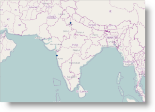
Zooming allows details for a specific map area to be revealed by zooming in or a larger scale view to be displayed by zooming out. Zooming in and out can be performed directly by the user with the keyboard and/or mouse, by touching, holding and dragging on touch devices or with the help of the Overview Plus Detail (OPD) screen. Zooming can also be performed programmatically using the windowRect option of the igMap control.
The following table shows an initial map view and zoomed in view.
| Initial View | Zoomed In View |
|---|---|
 |
 |
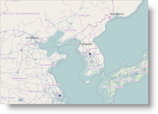
Panning allows the currently displayed window from the map to be moved to the North, South, East or West. Panning can be performed directly by the user with keyboard and/or mouse, by touching, holding and dragging on touch devices or with the help of the Overview Plus Detail (OPD) screen. Zooming can also be performed programmatically using the windowRect option of the igMap control.
The following table shows an initial map view and then the same view slightly panned to the East.
| Initial View | Panned to the East |
|---|---|
 |
 |
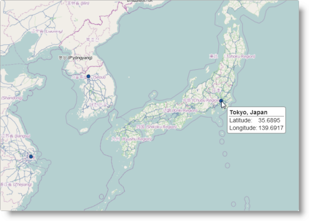
Tooltips allow you to display information about a specific point or region on the map. Tooltips are displayed when the user hovers with the mouse pointer over a marker or shape area on the map or touches and holds on touch enabled devices. Tooltips are based on templates which can render custom HTML markup and access data bound to a particular area of the map. Rendering of the templates is performed by the igTemplating engine. (For details, see igTemplating).
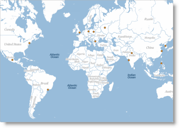
The following picture shows a geographic symbol series map with a tooltip activated on a point of the series.
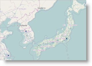
The igMap control uses markers to designate points on the map for the geographic symbol and geographic shapes series. Markers can be of several built-in shapes and their outline color and thickness, and fill color can be controlled by the igMap control’s properties or CSS. You can also disable displaying of markers if that makes sense for your application. The standard markers are circle, triangle, pyramid, square, diamond, pentagon, hexagon, tetragram, pentagram, and hexagram, but you can configure custom markers as well.
The following picture shows a map region with some points denoted by square markers.
If the shapes and behavior of the built-in markers are not sufficient you can configure a custom marker drawing function to be called whenever a marker is to be plotted on the map. Any custom marker function receives an object with the Canvas context object, position and size of the marker area and the data item bound to the marker. Additionally, another function can be provided to calculate and return custom size for the marker. The marker drawing function can use the full HTML5 Canvas API to draw whatever suits the requirements of the client application or web page.
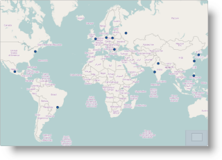
The following picture shows a map with custom markers which display detailed information about data points.
The visual components of the series, like outlines, shapes, and fills, can be configured in terms of line thickness and patterns, color, color gradient, opacity, and so on. The exact customizations that can be applied are specific for each series type.
For the Geographic Symbols, Geographic Shapes, and Geographic Polyline series, the nature of the visualization requires outlines and fills to be drawn. You can specify color, opacity and line thickness for markers and shapes outlines, and for polylines using the standard HTML colors or the rgba syntax. You can specify color and opacity for the fill of markers and shapes. All these aspects are configurable both by options and by CSS.
The following picture shows a geographic shapes series map with some custom colors applied.
The Geographic Scatter Area and Geographic Contour Line series use a palette of colors to be used for the visualization. The actual color for each point is picked from the palette based on a configurable data attribute, and minimum and maximum values. The palette of colors can be configured and may contain an arbitrary number of colors. The first color in the palette is applied to values below the minimum value and the last color is applied to values greater than the maximum value.
The following picture shows a geographic scatter area map with custom palette.
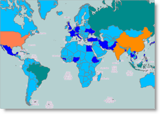
The Geographic Shape Series allows you to set different colors for fill and outline for each shape. This is accomplished by specifying a custom function to be called for each shape being plotted. The function can apply custom logic based on the data bound to the particular shape to select outline and fill color. This is useful for plotting political maps or designating arbitrary geographical regions by color depending on some of their data attributes.
The following figure shows the World map with countries in different colors based on their population.
The following table summarizes the user interaction capabilities of the igMap control.
| The user can… | Using… | Details |
Configurable?
|
|---|---|---|---|
| Zoom |
|
Zooming in allows details about a region to be revealed. Zooming out shows a broader view over an area. |
|
| Pan |
|
Shifts the view horizontally or vertically to display an adjacent area. |
|
| Navigate | The OPD panel | Shows the relative location of the currently displayed part of the map. Contains buttons and a slider for zooming, and allows the currently displayed window to be panned. |
|
| View tooltip |
|
Displays a tooltip to the user. |
|
Map series are based on custom data in addition to geographic coordinates and/or triangles. You can access and display custom data attributes (or members of data records) in tooltips or custom markers.
The essence of the map overlays is that they are based on some data records bound to the specified geographic coordinates. The igMap control needs geographic data in the form of single or connected points, or triangles and can bind arbitrary additional data attributes to each geographic element. The data bound to each are accessible in tooltip templates or in different callback methods which the control may invoke to customize the look and feel of the visualization. The control recognizes and works with simple points specified in geographical latitude and longitude, with shape files together with database (DBF) files.
The following topics provide additional information related to this topic.
Adding an igMap:This topic demonstrates how to add a simple map with basic features to a web page.
Data Binding (igMap):This topic explains how to bind the igMap control to different data sources depending on the map series visualized.
Styling Maps (igMap):This topic explains to customize the look-and-feel of the igMap™ control using themes.
Configuring Features (igMap):The topics in this group explain how to configure the various features of the igMap™ control. Features covered include navigation to specific geographic area, enabling/disabling of the Overview Plus Detail panel, getting the currently displayed area on the map, configuring interaction with the user regarding panning and zooming, configuring tooltip templates, and setting a custom marker.
Configuring the Map Series (igMap):The topics in this group explain how to configure all supported map types (map series) by the igMap control and thus produce different kinds of maps.
The following samples provide additional information related to this topic.
igMap control.View on GitHub