
Ignite UI API Reference
ui.igCombo
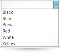
The igCombo control is a jQuery combo box which supports virtualization, auto-complete, auto-suggest, multiple selection, and item templates. With the igCombo control you can create drop downs that accept text entries as well as options selected from the items list. Further information regarding the classes, options, events, methods and themes of this API are available under the associated tabs above.
The following code snippet demonstrates how to initialize the igCombo control.
Click here for more information on how to get started using this API. For details on how to reference the required scripts and themes for the igCombo control read, Using JavaScript Resources in Ignite UI and Styling and Theming Ignite UI.Code Sample
      <!doctype html>
        <html>
        <head>
            <!-- Infragistics Combined CSS -->
            <link href="css/themes/infragistics/infragistics.theme.css" rel="stylesheet" type="text/css" />
            <link href="css/structure/infragistics.css" rel="stylesheet" type="text/css" />
            <!-- jQuery Core -->
            <script src="js/jquery.js" type="text/javascript"></script>
            <!-- jQuery UI -->
            <script src="js/jquery-ui.js" type="text/javascript"></script>
            <!-- Infragistics Combined Scripts -->
            <script src="js/infragistics.core.js" type="text/javascript"></script>
			      <script src="js/infragistics.lob.js" type="text/javascript"></script>
            <script type="text/javascript">
     	            $(function () {
                          var colors = [{
                          "Name": "Black"
                        }, {
                          "Name": "Blue"
                        }, {
                          "Name": "Brown"
                        }, {
                          "Name": "Red"
                        }, {
                          "Name": "White"
                        }, {
                          "Name": "Yellow"
                        }];

                  $("#combo").igCombo({
                          dataSource: colors,
                          textKey: "Name",
                          valueKey: "Name",
                          width: "200px",
                          autoComplete: true
                    });
                });
            </script>

      </head>
      <body>
         <input id="combo" />
      </body>
      </html>
Related Samples
Related Topics
Dependencies
Inherits
-
allowCustomValue
- Type:
- bool
- Default:
- false
Gets sets ability to enter and keep custom value in field.
Notes for enabled:
1. The matching item in list becomes active, but not selected.
2. If load on demand or dataBindOnOpen is enabled, then after the load, the matching item can be selected.
3. If text option was not set, the selectedItems contain only one item and that item was not found in dataSource, then the "value" member of that selected item will be used as the custom text.Code Sample
//Initialize $(".selector").igCombo({ allowCustomValue : true }); //Get var allowCustom = $(".selector").igCombo("option", "allowCustomValue"); //Set $(".selector").igCombo("option", "allowCustomValue", true); -
animationHideDuration
- Type:
- number
- Default:
- 50
Gets sets duration of hide drop-down list animation in milliseconds.
Code Sample
//Initialize $(".selector").igCombo({ animationHideDuration : 25 }); //Get var animationDuration = $(".selector").igCombo("option", "animationHideDuration"); //Set $(".selector").igCombo("option", "animationHideDuration", 25); -
animationShowDuration
- Type:
- number
- Default:
- 100
Gets sets duration of show drop-down list animation in milliseconds.
Code Sample
//Initialize $(".selector").igCombo({ animationShowDuration : 25 }); //Get var animationDuration = $(".selector").igCombo("option", "animationShowDuration"); //Set $(".selector").igCombo("option", "animationShowDuration", 25); -
autoComplete
- Type:
- bool
- Default:
- false
Gets sets ability to autocomplete field from matching item in list.
Note: if "autoComplete" option is enabled, then the "startsWith" is used for "filteringCondition" option.Code Sample
//Initialize $(".selector").igCombo({ autoComplete : true }); //Get var autoComplete = $(".selector").igCombo("option", "autoComplete"); //Set $(".selector").igCombo("option", "autoComplete", true); -
cascadingDataSources
- Type:
- object
- Default:
- null
Gets sets collection (array or dictonary) of javascript objects which allows to configure dataSource and other properties of this igCombo.
The key in dictionary should represent selected value in parent igCombo. If value in parent igCombo is integer, then array can be used instead of dictionary.
Each item in collection may contain dataSource, or an object, which should have following members.
dataSource: reference to dataSource,
valueKey: optional override for valueKey of this igCombo,
textKey: optional override for textKey of this igCombo,
dataSourceUrl: optional dataSourceUrl when dataSource is not set.
Note: that option has effect only when "parentCombo" option is set and it has priority over "parentComboKey".Code Sample
dsCountryCascading = [ { txtCountry: "United States", valCountry: "US" }, { txtCountry: "Bulgaria", valCountry: "BG" }, ]; dsStatesUS = [ { state: "New Jersey"}, { state: "California"}, { state: "Ilionois"}, { state: "New York"}, { state: "Florida"} ]; dsDistrictBG = [ { district: "Sofia"}, { district: "Plovdiv"}, { district: "Varna"}, { district: "Yambol"} ]; // Cascading Data Source as dictionary dsCascStatesDistricts = { "US": { dataSource: dsStatesUS, textKey: "state" }, "BG": { dataSource: dsDistrictBG, textKey: "district" } }; dsParent = [ { textKey: "Local", valKey: 0 }, { textKey: "Remote", valKey: 1} ] // Cascading Data Source as an array. Note that this is only possible if parent value key is integer. dsCascRemoteLocal = [ { dataSource: localDS, valueKey: “Identificator” } { dataSourceUrl: http://odata.netflix.com/Catalog/Titles?$filter=Name%20eq%20%27The%20Name%20of%20The%20Rose%27&$format=json, valueKey: “Id”} ] //Initialize $(".selector").igCombo({ cascadingDataSources : dsCascStatesDistricts }); //Get var ds = $(".selector").igCombo("option", "cascadingDataSources"); //Set $(".selector").igCombo("option", "cascadingDataSources", dsCascRemoteLocal); -
caseSensitive
- Type:
- bool
- Default:
- false
Gets sets ability to use case sensitive or ignore case searching for matches defined by "renderMatchItems" and "filteringCondition" options.
Code Sample
//Initialize $(".selector").igCombo({ caseSensitive : true }); //Get var caseSensitive = $(".selector").igCombo("option", "caseSensitive"); //Set $(".selector").igCombo("option", "caseSensitive", true); -
clearButtonTitle
- Type:
- string
- Default:
- null
Gets sets title for html element which represend clear button. That is an override for the $.ig.Combo.locale.clearButtonTitle.
Code Sample
//Initialize $(".selector").igCombo({ clearButtonTitle : "Clear value" }); //Get var title = $(".selector").igCombo("option", "clearButtonTitle"); //Set $(".selector").igCombo("option", "clearButtonTitle", "Clear value"); -
clearSelectionOnBlur
- Type:
- bool
- Default:
- false
Preserves the selected items, even the text in the input is not available in the drop down items.
This options is useful, when we have the 'allowCustomValue' option enabled. Then we can have a text in the input that is not related to the selected item or items.
E.g. We select 2 drop down items, then we put custom text in the input "2 items selected", replacing existing text - both values separated with comma.
If you don't want to loose the selected items on blur, 'clearSelectionOnBlur' should be set to false.
If you want to clear the selected items when none of them is matching the text in the input, then set 'clearSelectionOnBlur' to true.Code Sample
//Initialize $(".selector").igCombo({ clearSelectionOnBlur : true }); //Get var clearSelection = $(".selector").igCombo("option", "clearSelectionOnBlur"); //Set $(".selector").igCombo("option", "clearSelectionOnBlur", true); -
closeDropDownOnBlur
- Type:
- bool
- Default:
- true
Sets gets ability to close drop-down list when control loses focus. Note: if application disables that option, then it is responsible for closing drop-down list.
Code Sample
//Initialize $(".selector").igCombo({ closeDropDownOnBlur: false }); //Get var closeDropDownOnBlur = $(".selector").igCombo("option", "closeDropDownOnBlur"); //Set $(".selector").igCombo("option", "closeDropDownOnBlur", false); -
closeDropDownOnSelect
- Type:
- bool
- Default:
- true
Sets gets ability to close drop-down list when item is the list is selected.
Code Sample
//Initialize $(".selector").igCombo({ closeDropDownOnSelect: false }); //Get var closeDropDownOnSelect = $(".selector").igCombo("option", "closeDropDownOnSelect"); //Set $(".selector").igCombo("option", "closeDropDownOnSelect", false); -
dataBindOnOpen
- Type:
- bool
- Default:
- false
Gets sets ability to load data (bind dataSource) at the time when drop-down list is opened.
Notes:
1. Before data is loaded the selectedItems, value, text and other options/methods will fail.
2. Initial selection, text and value will have no effect.
3. If on first drop-down the dataSource does not contain selectedItems (for example, enabled load on demand), then selection will be destroyed.
4. To get around with values, an application may enable "allowCustomValue" option and use the "text" option instead of "selectedItems".Code Sample
//Initialize $(".selector").igCombo({ dataBindOnOpen: true }); //Get var closeDropDownOnSelect = $(".selector").igCombo("option", "dataBindOnOpen"); //Set $(".selector").igCombo("option", "dataBindOnOpen", true); -
dataSource
- Type:
- object
- Default:
- null
Gets sets a valid data source accepted by $.ig.DataSource, or an instance of an $.ig.DataSource itself.
Note: if it is set to string and "dataSourceType" option is not set, then $.ig.JSONPDataSource is used.Code Sample
//Initialize $(".selector").igCombo({ dataSource : data }); //Get var data = $(".selector").igCombo("option", "dataSource"); -
dataSourceType
- Type:
- string
- Default:
- null
Gets sets data source type (such as "json", "xml", etc). Please refer to the documentation of $.ig.DataSource and its type property.
Code Sample
//Initialize $(".selector").igCombo({ dataSourceType : "xml" }); //Get var dataType = $(".selector").igCombo("option", "dataSourceType"); -
dataSourceUrl
- Type:
- string
- Default:
- null
Gets sets url which is used for sending JSON on request for remote filtering (MVC for example). That option is required when load on demand is enabled and its type is remote.
Code Sample
//Initialize $(".selector").igCombo({ dataSourceUrl : "data.svc" }); //Get var dataUrl = $(".selector").igCombo("option", "dataSourceUrl"); -
dropDownAsChild
- Type:
- bool
- Default:
- false
Gets sets ability to append container of drop-down list to the body or to the parent of combo.
Code Sample
//Initialize $(".selector").igCombo({ dropDownAsChild : true }); //Get var isChild = $(".selector").igCombo("option", "dropDownAsChild"); //Set $(".selector").igCombo("option", "dropDownAsChild", true); -
dropDownButtonTitle
- Type:
- string
- Default:
- null
Gets sets title for html element which represend drop-down button. That is an override for the $.ig.Combo.locale.dropDownButtonTitle.
Code Sample
//Initialize $(".selector").igCombo({ dropDownButtonTitle : "Open Dropdown" }); //Get var title = $(".selector").igCombo("option", "dropDownButtonTitle"); //Set $(".selector").igCombo("option", "dropDownButtonTitle", "Open Dropdown"); -
dropDownMaxHeight
- Type:
- number
- Default:
- 300
Gets sets maximum height of drop-down list in pixels.
Code Sample
//Initialize $(".selector").igCombo({ dropDownMaxHeight : 25 }); //Get var height = $(".selector").igCombo("option", "dropDownMaxHeight"); //Set $(".selector").igCombo("option", "dropDownMaxHeight", 25); -
dropDownMinHeight
- Type:
- number
- Default:
- 0
Gets sets minimum height of drop-down list in pixels.
Code Sample
//Initialize $(".selector").igCombo({ dropDownMinHeight : 25 }); //Get var height = $(".selector").igCombo("option", "dropDownMinHeight"); //Set $(".selector").igCombo("option", "dropDownMinHeight", 25); -
dropDownOnFocus
- Type:
- bool
- Default:
- false
Sets gets ability to show drop-down list when combo gets focus.
Code Sample
//Initialize $(".selector").igCombo({ dropDownOnFocus : true }); //Get var dropOnFocus = $(".selector").igCombo("option", "dropDownOnFocus"); //Set $(".selector").igCombo("option", "dropDownOnFocus", true); -
dropDownWidth
- Type:
- number
- Default:
- 0
Gets sets width of drop-down list in pixels. If it is 0, then width of combo is used.
Code Sample
//Initialize $(".selector").igCombo({ dropDownWidth : 200 }); //Get var width = $(".selector").igCombo("option", "dropDownWidth"); //Set $(".selector").igCombo("option", "dropDownWidth", 200); -
enableActiveItem
- Type:
- bool
- Default:
- true
Gets sets ability to render focus/active item in drop-down list.
Notes: If list had active item and it was closed and opened again, then active item is reset to the first selected item.
It there is no selected items, then active item is not reset.
If that option is disabled, then functionality becomes similar to the SELECT html element.
For example, if list is opened then action keys like up/down arrows/page, home and end will change selected item instead of active item.
If list is closed, then up/down arrow keys will change selected item and update text field for it.
If list is opened, then text-changes in field will select matching item in list instead of activating it.Code Sample
//Initialize $(".selector").igCombo({ enableActiveItem : false }); //Get var enableActiveItem = $(".selector").igCombo("option", "enableActiveItem"); //Set $(".selector").igCombo("option", "enableActiveItem", false); -
enableClearButton
- Type:
- bool
- Default:
- true
Gets sets ability to show a button which allows to clear field.
Button is automatically hidden when field is empty and it automatically appears when field is not empty.Code Sample
//Initialize $(".selector").igCombo({ enableClearButton : false }); //Get var enableClearButton = $(".selector").igCombo("option", "enableClearButton"); //Set $(".selector").igCombo("option", "enableClearButton", false); -
enableDisplayBlock
- Type:
- bool
- Default:
- false
Gets sets style.display "block" or "inline-block" applied to main/outer html element.
Code Sample
//Initialize $(".selector").igCombo({ enableDisplayBlock : true }); //Get var enableDisplayBlock = $(".selector").igCombo("option", "enableDisplayBlock"); //Set $(".selector").igCombo("option", "enableDisplayBlock", true); -
filterExprUrlKey
- Type:
- string
- Default:
- null
Gets sets url key name that specifies how the remote filtering expressions will be encoded for remote requests, e.g. &filter('col') = startsWith. Default is OData.
Code Sample
//Initialize $(".selector").igCombo({ filterExprUrlKey : "filter" }); //Get var filterKey = $(".selector").igCombo("option", "filterExprUrlKey"); //Set $(".selector").igCombo("option", "filterExprUrlKey", "filter"); -
filteringCondition
- Type:
- string
- Default:
- contains
Gets sets condition used for filtering.
Notes:
If the "autoComplete" option is enabled, then the "startsWith" is used regardless of value for this option.
If "parentComboKey" option is set, then data is filtered internally, therefore, filtering while changing text in editor is not available.Code Sample
//Initialize $(".selector").igCombo({ filteringCondition : "startsWith" }); //Get var condition = $(".selector").igCombo("option", "filteringCondition"); //Set $(".selector").igCombo("option", "filteringCondition", "startsWith"); -
filteringType
- Type:
- enumeration
- Default:
- null
Gets sets type of filtering. Notes: If "parentComboKey" option is set, then data is filtered internally, therefore, filtering while changing text in editor is not available; though, that option will still define type of filtering used by cascading functionality. If this option is set to "remote", then the "css.waitFiltering" is applied to combo and its drop-down list.
Members
- remote
- Type:string
- filtering is performed by server.
- local
- Type:string
- filtering is performed by $.ig.DataSource.
- none
- Type:string
- filtering is disabled.
- null
- Type:object
- filtering is disabled.
Code Sample
//Initialize $(".selector").igCombo({ filteringType : "remote" }); //Get var filterType = $(".selector").igCombo("option", "filteringType"); //Set $(".selector").igCombo("option", "filteringType", "remote"); -
footerTemplate
- Type:
- string
- Default:
- null
Gets sets template used to render footer in drop-down list. Note: template is rendered inside of DIV html element.
Code Sample
//Initialize $(".selector").igCombo({ footerTemplate : "<h4>Footer</h4>" }); //Get var template = $(".selector").igCombo("option", "footerTemplate"); //Set $(".selector").igCombo("option", "footerTemplate", "<h4>Footer</h4>"); -
format
- Type:
- string
- Default:
- true
Gets sets format which is applied to items in list. Values null or false will disable format.
Value "auto" or true will use automatic format for Date and number objects.
Value null or false will disable automatic format.
Custom values can be something like "currency", "percent", "dateLong", "time", "MMM-dd-yyyy H:mm tt", etc.
However, custom format should be valid for a specific data type in "textKey" column.Code Sample
//Initialize $(".selector").igCombo({ format : "auto" }); //Get var template = $(".selector").igCombo("option", "format"); //Set $(".selector").igCombo("option", "format", "auto"); -
headerTemplate
- Type:
- string
- Default:
- null
Gets sets template used to render header in drop-down list. Template is rendered inside of DIV html element.
Code Sample
//Initialize $(".selector").igCombo({ headerTemplate : "<h4>Header</h4>" }); //Get var template = $(".selector").igCombo("option", "headerTemplate"); //Set $(".selector").igCombo("option", "headerTemplate", "<h4>Header</h4>"); -
height
- Type:
- string
- Default:
- null
Gets sets height of combo. The numeric and string values (valid html units for size) are supported. It includes %, px, em and other units.
Code Sample
//Initialize $(".selector").igCombo({ height : "25px" }); //Get var height = $(".selector").igCombo("option", "height"); //Set $(".selector").igCombo("option", "height", "25px"); -
inputName
- Type:
- string
- Default:
- null
Gets sets name of (hidden) INPUT element, which value will be set to values of selected items separated by "," character on any change in igCombo.
Code Sample
//Initialize $(".selector").igCombo({ inputName : "textField" }); //Get var inputName = $(".selector").igCombo("option", "inputName"); //Set $(".selector").igCombo("option", "inputName", "textField"); -
itemSeparator
- Type:
- string
- Default:
- ,
Gets sets separator between items in field. Note: that option has effect only when "multiSelection" option is enabled.
Code Sample
//Initialize $(".selector").igCombo({ itemSeparator : ";" }); //Get var itemSeparator = $(".selector").igCombo("option", "itemSeparator"); //Set $(".selector").igCombo("option", "itemSeparator", ";"); -
itemTemplate
- Type:
- string
- Default:
- null
Gets sets template used to render an item in list. Notes:
1. The jquery.tmpl.js of Microsoft is used and application should provide supported syntax for content.
2. Template is rendered inside of LI html element.
So, application should consider restriction for layout: do not use "block" html elements and in case of absolutely positioned elements,
they should not overlap with checkbox icons.Code Sample
//Initialize $(".selector").igCombo({ itemTemplate: "<span class="movieTitle">${Name}</span><img src="${Url}" />" }); //Get var template = $(".selector").igCombo("option", "itemTemplate"); -
loadOnDemandSettings
- Type:
- object
- Default:
- {}
Gets sets container of variables which define load on demand functionality.
Notes:
That option has effect only when data is loaded remotely using dataSourceUrl.
If the parentComboKey is set, then that option is not supported.
Selection is supported only for already loaded items.Code Sample
//Initialize $(".selector").igCombo({ loadOnDemandSettings: { enabled: true, pageSize: 55 } }); //Get var loadOnDemandSettings = $(".selector").igCombo("option", "loadOnDemandSettings"); // Get the enabled state loadOnDemandSettings.enabled; // Get the drop down list page size loadOnDemandSettings.pageSize; //Set $(".selector").igCombo("option", "loadOnDemandSettings", { enabled: true, pageSize: 55 });-
enabled
- Type:
- bool
- Default:
- false
Gets sets option to enable load on demand.
Code Sample
//Initialize $(".selector").igCombo({ loadOnDemandSettings: { enabled: true } }); //Get var loadOnDemandSettings = $(".selector").igCombo("option", "loadOnDemandSettings"); // Get the enabled state loadOnDemandSettings.enabled; //Set $(".selector").igCombo("option", "loadOnDemandSettings", { enabled: true }); -
pageSize
- Type:
- number
- Default:
- null
Gets sets number of records loaded on each request.
Code Sample
//Initialize
$(".selector").igCombo({
    loadOnDemandSettings: {
                    enabled: true,
                    pageSize: 55
                }
});

//Get
var loadOnDemandSettings = $(".selector").igCombo("option", "loadOnDemandSettings");
//  Get the drop down list page size
loadOnDemandSettings.pageSize;

//Set
$(".selector").igCombo("option", "loadOnDemandSettings", { enabled: true, pageSize: 55 });
-
mode
- Type:
- enumeration
- Default:
- editable
Sets gets functionality mode.
Members
- editable
- Type:string
- Allows to modify value by edit field and drop-down list.
- dropdown
- Type:string
- Allows to modify value by drop-down list only.
- readonlylist
- Type:string
- Allows to open list, but does not allow any changes in field or selection in drop-down list. If selection is not set, then first item in dataSource is automatically selected.
- readonly
- Type:string
- Does not allow to open list or change value in field. If selection is not set, then first item in dataSource is automatically selected.
- 0
- Type:number
- Same as editable.
- 1
- Type:number
- Same as dropdown.
- 2
- Type:number
- Same as readonlylist.
- 3
- Type:number
- Same as readonly.
Code Sample
//Initialize $(".selector").igCombo({ mode : "readonlylist" }); //Get var mode = $(".selector").igCombo("option", "mode"); //Set $(".selector").igCombo("option", "mode", "readonlylist"); -
multiSelection
- Type:
- enumeration
- Default:
- null
Gets sets ability to select multiple items in list and enter multiple items in field which are separated by the 'itemSeparator'.
Members
- null
- Type:object
- multiselection is disabled.
- false
- Type:bool
- multiselection is disabled.
- 0
- Type:number
- multiselection is disabled.
- off
- Type:string
- multiselection is disabled.
- true
- Type:bool
- multiselection is enabled.
- 1
- Type:number
- multiselection is enabled.
- on
- Type:string
- multiselection is enabled.
- 2
- Type:number
- multiselection is enabled and checkboxes are used for list items. Those checkboxes allow to add/remove selection without pressing Ctrl key on mouse click.
- onWithCheckboxes
- Type:string
- multiselection is enabled and checkboxes are used for list items. Those checkboxes allow to add/remove selection without pressing Ctrl key on mouse click.
Code Sample
//Initialize $(".selector").igCombo({ multiSelection : "onWithCheckboxes" }); //Get var multiSelection = $(".selector").igCombo("option", "multiSelection"); //Set $(".selector").igCombo("option", "multiSelection", "onWithCheckboxes"); -
noMatchFoundText
- Type:
- string
- Default:
- null
Gets sets text of list item for condition when "filteringType" option is enabled and no match was found. That is an override for the $.ig.Combo.locale.noMatchFoundText.
Code Sample
//Initialize $(".selector").igCombo({ noMatchFoundText : "Please try again" }); //Get var text = $(".selector").igCombo("option", "noMatchFoundText"); //Set $(".selector").igCombo("option", "noMatchFoundText", "Please try again"); -
nullText
- Type:
- string
- Default:
- null
Sets gets text which appears in field in no-focus state and there is no value.
Code Sample
//Initialize $(".selector").igCombo({ nullText : "Please enter text" }); //Get var text = $(".selector").igCombo("option", "nullText"); //Set $(".selector").igCombo("option", "nullText", "Please enter text"); -
parentCombo
- Type:
- enumeration
- Default:
- null
Gets sets selector/id of parent igCombo or reference to parent igCombo object, which is used for cascading functionality. Notes: The selected value in parent igCombo will be used as key to adjust dataSource in this igCombo. Multiselection in parentCombo has no effect on items in child combo: only first selected item of parentCombo is used.
Code Sample
//Initialize $(".selector").igCombo({ parentCombo: "#idComboParent" }); //Get var oParent = $(".selector").igCombo("option", "parentCombo"); //Set $(".selector").igCombo("option", "parentCombo", "#idComboParent"); -
parentComboKey
- Type:
- string
- Default:
- null
Gets sets column key in dataSource, which will be used by cascading functionality in order to get records matching with selected value in parent igCombo.
Notes:
That option has effect only when "parentCombo" option is set and it has no effect if "cascadingDataSources" is set.
If that option is set, then data is filtered internally, therefore, filtering while changing text in editor is not available.
If that option is set, then loadOnDemand is not supported.Code Sample
//Initialize $(".selector").igCombo({ parentComboKey: "keyParent" }); //Get var key = $(".selector").igCombo("option", "parentComboKey"); //Set $(".selector").igCombo("option", "parentComboKey", "keyParent"); -
renderMatchItems
- Type:
- enumeration
- Default:
- multi
Gets sets condition used for rendering of matching parts in items of drop-down list. Note: that option is not related to "filteringType" and "filteringCondition" options.
Members
- multi
- Type:string
- multiple matches in a single item are rendered.
- contains
- Type:string
- match at any position in item is rendered.
- startsWith
- Type:string
- only match which starts from the beginning of text is rendered.
- full
- Type:string
- only fully matched items are rendered.
- null
- Type:object
- matches are not rendered.
Code Sample
//Initialize $(".selector").igCombo({ renderMatchItems : "contains" }); //Get var match = $(".selector").igCombo("option", "renderMatchItems"); //Set $(".selector").igCombo("option", "renderMatchItems", "contains"); -
requestType
- Type:
- string
- Default:
- get
Specifies the HTTP verb to be used to issue the request.
-
responseContentType
- Type:
- string
- Default:
- null
Content type of the response. See http://api.jquery.com/jQuery.ajax/ => contentType.
-
responseDataKey
- Type:
- string
- Default:
- null
See $.ig.DataSource. This is basically the property in the responses where data records are held, if the response is wrapped.
Code Sample
//Initialize $(".selector").igCombo({ responseDataKey : "d.results" }); //Get var dataKey = $(".selector").igCombo("option", "responseDataKey"); -
responseTotalRecCountKey
- Type:
- string
- Default:
- null
See $.ig.DataSource. property in the response specifying the total number of records on the server.
Code Sample
//Initialize $(".selector").igCombo({ responseTotalRecCountKey : "count" }); //Get var countKey = $(".selector").igCombo("option", "responseTotalRecCountKey"); -
selectedItems
- Type:
- array
- Default:
- []
- Elements Type:
- object
Gets sets list of selected items. It should contain array of objects.
Each object should contain the member "index" equals to the index of selected item or the member "value" equals to value of item in dataSource in "valueKey" column.
The member "text" contains value of item in "textKey" column.
Missing values are filled automatically while rendering list items and on other actions. If application set more than one member, then it is responsible for match.
Note: that option is supported only for currently available list of items. When load-on-demand or filtering is enabled, then attempt to select not loaded item will fail.Code Sample
//Initialize $(".selector").igCombo({ selectedItems : [ { index: 3 } ] }); //Get var selectedItems = $(".selector").igCombo("option", "selectedItems"); //Set $(".selector").igCombo("option", "selectedItems", [ { index: 3 }]);-
index
- Type:
- number
- Default:
- -1
Optional="true" Index of item in list. Value should be larger than -1 and less than number of items in list (rows in dataSource).
Code Sample
//Initialize $(".selector").igCombo({ selectedItems : [{ index: 3 }] }); //Get var index = $(".selector").igCombo("option", "selectedItems")[0].index; //Set $(".selector").igCombo("option", "selectedItems", [{ index: 3 }]); -
text
- Type:
- string
- Default:
- null
Optional="true" Value of cell in textKey column for index.
Code Sample
//Get var text = $(".selector").igCombo("option", "selectedItems")[0].text; -
value
- Type:
- object
- Default:
- null
Optional="true" Value of cell in valueKey column for index.
Code Sample
          //Get
          var value = $(".selector").igCombo("option", "selectedItems")[0].value;
-
selectItemBySpaceKey
- Type:
- bool
- Default:
- false
Gets sets ability to select active item in list by Space key.
Note: if that options is enabled, then it will be not possible to type-in the Space character when list is opened.Code Sample
//Initialize $(".selector").igCombo({ selectItemBySpaceKey : true }); //Get var selectSpace = $(".selector").igCombo("option", "selectItemBySpaceKey"); //Set $(".selector").igCombo("option", "selectItemBySpaceKey", true); -
showDropDownButton
- Type:
- bool
- Default:
- true
Gets sets visibility of drop-down button.
Code Sample
//Initialize $(".selector").igCombo({ showDropDownButton : false }); //Get var showButton = $(".selector").igCombo("option", "showDropDownButton"); //Set $(".selector").igCombo("option", "showDropDownButton", false); -
tabIndex
- Type:
- number
- Default:
- null
Gets sets tabIndex for field of combo.
Code Sample
//Initialize $(".selector").igCombo({ tabIndex : 3 }); //Get var tabIndex = $(".selector").igCombo("option", "tabIndex"); //Set $(".selector").igCombo("option", "tabIndex", 3); -
text
- Type:
- string
- Default:
- null
Gets sets text which appears in combo on initialization. If it is not set, then the value from target html element is used automatically.
If selectedItems option is not set and allowCustomValue option is enabled, then first matching item in list will be selected.
Notes: After initialization that option is reset to null. To get text in field, the text() method can be used.Code Sample
//Initialize $(".selector").igCombo({ text : "green" }); //Get var text = $(".selector").igCombo("option", "text"); //Set $(".selector").igCombo("option", "text", "green"); -
textKey
- Type:
- string
- Default:
- null
Gets sets name of column which contains the displayed text. If it is missing, then "valueKey" option will be used.
Code Sample
//Initialize $(".selector").igCombo({ textKey : "ProductName" }); //Get var key = $(".selector").igCombo("option", "textKey"); -
textKeyType
- Type:
- enumeration
- Default:
- null
Gets sets type of values used for data cells/items with textKey. That value is assign to schema of $.ig.DataSource.
Members
- string
- Type:string
- data source uses strings objects.
- number
- Type:string
- data source uses numbers objects.
- bool
- Type:string
- data source uses booleans objects.
- date
- Type:string
- data source uses Date objects.
- auto
- Type:string
- data source uses type defined by cell/items located in first row.
- null
- Type:object
- data source uses type defined by cell/items located in first row.
Code Sample
//Initialize $(".selector").igCombo({ textKeyType : "string" }); //Get var type = $(".selector").igCombo("option", "textKeyType"); -
validatorOptions
- Type:
- object
- Default:
- null
Gets or sets object which contains options supported by igValidator.
Notes: in order for validator to work, application should ensure that igValidator is loaded (ig.ui.validator.js/css files).
Example:
$('#combo1').igCombo({ validatorOptions: { required: true } });.Code Sample
//Initialize $(".selector").igCombo({ validatorOptions: { required: true } }); //Get var text = $(".selector").igCombo("option", "validatorOptions"); //Set $(".selector").igCombo("option", "validatorOptions", { required: true }); -
valueKey
- Type:
- string
- Default:
- null
Gets sets name of column which contains the "value". If it is missing, then name of first column will be used.
Code Sample
//Initialize $(".selector").igCombo({ valueKey : "ProductID" }); //Get var key = $(".selector").igCombo("option", "valueKey"); -
valueKeyType
- Type:
- enumeration
- Default:
- null
Gets sets type of values used for data cell/items with valueKey. That value is assign to schema of $.ig.DataSource.
Members
- string
- Type:string
- data source uses strings objects.
- number
- Type:string
- data source uses numbers objects.
- bool
- Type:string
- data source uses booleans objects.
- date
- Type:string
- data source uses Date objects.
- auto
- Type:string
- data source uses type defined by cell/items located in first row.
- null
- Type:object
- data source uses type defined by cell/items located in first row.
Code Sample
//Initialize $(".selector").igCombo({ valueKeyType : "number" }); //Get var type = $(".selector").igCombo("option", "valueKeyType"); -
virtualization
- Type:
- bool
- Default:
- false
Gets sets ability to use virtual rendering for drop-down list.
If that option is enabled, then only visible items are created and top edge of first visible item in list is alligned to the top edge of list.Code Sample
//Initialize $(".selector").igCombo({ virtualization : true }); //Get var isEnabled = $(".selector").igCombo("option", "virtualization"); -
width
- Type:
- string
- Default:
- null
Gets sets width of combo. The numeric and string values (valid html units for size) are supported. It includes %, px, em and other units.
Code Sample
//Initialize
$(".selector").igCombo({
    width : "300px"
});

//Get
var width = $(".selector").igCombo("option", "width");

//Set
$(".selector").igCombo("option", "width", "300px");
For more information on how to interact with the Ignite UI controls' events, refer to
Using Events in Ignite UI.
-
activeItemChanged
- Cancellable:
- false
Event which is raised after change of active item in list.
Function takes arguments evt and ui.
Use evt.originalEvent to obtain reference to event of browser. That can be null.
Use ui.owner to obtain reference to igCombo.
Use ui.index to obtain index of new active item.
Use ui.oldIndex to obtain index of old active item.Code Sample
$(document).delegate(".selector", "igcomboactiveitemchanged", function (evt, ui) { //use to obtain reference to the event browser evt.originalEvent; //use to obtain reference to igCombo ui.owner; //use to obtain index of new active item ui.index; //use to obtain index of old active item ui.oldIndex; }); //Initialize $(".selector").igCombo({ activeItemChanged: function (evt, ui) { ... } }); -
activeItemChanging
- Cancellable:
- true
Event which is raised before change of active item in list.
Return false in order to cancel change.
Function takes arguments evt and ui.
Use evt.originalEvent to obtain reference to event of browser. That can be null.
Use ui.owner to obtain reference to igCombo.
Use ui.index to obtain index of new active item.
Use ui.oldIndex to obtain index of old active item.Code Sample
$(document).delegate(".selector", "igcomboactiveitemchanging", function (evt, ui) { //use to obtain reference to the event browser evt.originalEvent; //use to obtain reference to igCombo ui.owner; //use to obtain index of new active item ui.index; //use to obtain index of old active item ui.oldIndex; }); //Initialize $(".selector").igCombo({ activeItemChanging: function (evt, ui) { ... } }); -
dataBinding
- Cancellable:
- true
Event which is raised before data binding.
Function takes first argument null and second argument ui.
Use ui.owner to obtain reference to igCombo.
Use ui.dataSource to obtain reference to instance of $.ig.DataSource used by combo.Code Sample
$(document).delegate(".selector", "igcombodatabinding", function (null, ui) { //use to obtain reference to igCombo ui.owner; //use to obtain reference to instance of $.ig.DataSource used by combo ui.dataSource; }); //Initialize $(".selector").igCombo({ dataBinding: function (null, ui) { ... } }); -
dataBound
- Cancellable:
- false
Event which is raised after data binding.
Function takes first argument null and second argument ui.
Use ui.owner to obtain reference to igCombo.
Use ui.dataSource to obtain reference to instance of $.ig.DataSource used by combo.Code Sample
$(document).delegate(".selector", "igcombodatabound", function (null, ui) { //use to obtain reference to igCombo ui.owner; //use to obtain reference to instance of $.ig.DataSource used by combo ui.dataSource; }); //Initialize $(".selector").igCombo({ dataBound: function (null, ui) { ... } }); -
dropDownClosed
- Cancellable:
- false
Event which is raised after drop-down list was closed.
Function takes arguments evt and ui.
Use evt.originalEvent to obtain reference to event of browser.
Use ui.owner to obtain reference to igCombo.
Use ui.element to obtain reference to jquery DOM element which represents container of list.Code Sample
$(document).delegate(".selector", "igcombodropdownclosed", function (evt, ui) { //use to obtain reference to the event browser evt.originalEvent; //use to obtain reference to igCombo ui.owner; //use to obtain reference to jQuery DOM element which represents a container of list ui.element; }); //Initialize $(".selector").igCombo({ dropDownClosed: function (evt, ui) { ... } }); -
dropDownClosing
- Cancellable:
- true
Event which is raised before drop-down list is closed.
Return false in order to cancel hide action.
Function takes arguments evt and ui.
Use evt.originalEvent to obtain reference to event of browser.
Use ui.owner to obtain reference to igCombo.
Use ui.element to obtain reference to jquery DOM element which represents container of list.Code Sample
$(document).delegate(".selector", "igcombodropdownclosing", function (evt, ui) { //use to obtain reference to the event browser evt.originalEvent; //use to obtain reference to igCombo ui.owner; //use to obtain reference to jQuery DOM element which represents a container of list ui.element; }); //Initialize $(".selector").igCombo({ dropDownClosing: function (evt, ui) { ... } }); -
dropDownOpened
- Cancellable:
- false
Event which is raised after drop-down list was opened.
Function takes arguments evt and ui.
Use evt.originalEvent to obtain reference to event of browser.
Use ui.owner to obtain reference to igCombo.
Use ui.element to obtain reference to jquery DOM element which represents container of list.Code Sample
$(document).delegate(".selector", "igcombodropdownopened", function (evt, ui) { //use to obtain reference to the event browser evt.originalEvent; //use to obtain reference to igCombo ui.owner; //use to obtain reference to jQuery DOM element which represents a container of list ui.element; }); //Initialize $(".selector").igCombo({ dropDownOpened: function (evt, ui) { ... } }); -
dropDownOpening
- Cancellable:
- true
Event which is raised before drop-down list is opened.
Return false in order to cancel drop-down action.
Function takes arguments evt and ui.
Use evt.originalEvent to obtain reference to event of browser.
Use ui.owner to obtain reference to igCombo.
Use ui.element to obtain reference to jquery DOM element which represents container of list.
Note: on the very first opening or option-change that member is null and application should
check that before using that member.Code Sample
$(document).delegate(".selector", "igcombodropdownopening", function (evt, ui) { //use to obtain reference to the event browser evt.originalEvent; //use to obtain reference to igCombo ui.owner; //use to obtain reference to jQuery DOM element which represents a container of list ui.element; }); //Initialize $(".selector").igCombo({ dropDownOpening: function (evt, ui) { ... } }); -
filtered
- Cancellable:
- false
Event which is raised after filtering.
Function takes arguments evt and ui.
Use evt.originalEvent to obtain reference to event of browser. That can be null.
Use ui.owner to obtain reference to igCombo.
Use ui.expression to obtain reference to array which contains expressions supported by $.ig.DataSource.
Each expression-item contains following members: fieldName (textKey), cond (filteringCondition), expr (value/string to filter).Code Sample
$(document).delegate(".selector", "igcombofiltered", function (evt, ui) { //use to obtain reference to the event browser evt.originalEvent; //use to obtain reference to igCombo ui.owner; //use to obtain reference to array which contains expressions supported by $.ig.DataSource ui.expression; }); //Initialize $(".selector").igCombo({ filtered: function (evt, ui) { ... } }); -
filtering
- Cancellable:
- true
Event which is raised before filtering.
Return false in order to cancel filtering.
Function takes arguments evt and ui.
Use evt.originalEvent to obtain reference to event of browser. That can be null.
Use ui.owner to obtain reference to igCombo.
Use ui.expression to obtain reference to array which contains expressions supported by $.ig.DataSource.
Each expression-item contains following members: fieldName (textKey), cond (filteringCondition), expr (value/string to filter).Code Sample
$(document).delegate(".selector", "igcombofiltering", function (evt, ui) { //use to obtain reference to the event browser evt.originalEvent; //use to obtain reference to igCombo ui.owner; //use to obtain reference to array which contains expressions supported by $.ig.DataSource ui.expression; }); //Initialize $(".selector").igCombo({ filtering: function (evt, ui) { ... } }); -
noMatchFound
- Cancellable:
- false
Event which is raised after field was modified by end user and autoComplete was not able to find matching item in list.
Function takes arguments evt and ui.
Use evt.originalEvent to obtain reference to event of browser. That can be null.
Use ui.owner to obtain reference to igCombo.
Use ui.text to obtain text in field.Code Sample
$(document).delegate(".selector", "igcombonomatchfound", function (evt, ui) { //use to obtain reference to the event browser evt.originalEvent; //use to obtain reference to igCombo ui.owner; //use to obtain text in field ui.text; }); //Initialize $(".selector").igCombo({ noMatchFound: function (evt, ui) { ... } }); -
selectionChanged
- Cancellable:
- false
Event which is raised after selection change.
Function takes arguments evt and ui.
Use evt.originalEvent to obtain reference to event of browser. That can be null.
Use ui.owner to obtain reference to igCombo.
Use ui.items to obtain reference to array of new selected items. That can be null.
Use ui.oldItems to obtain reference to array of old selected items. That can be null.Code Sample
$(document).delegate(".selector", "igcomboselectionchanged", function (evt, ui) { //use to obtain reference to the event browser evt.originalEvent; //use to obtain reference to igCombo ui.owner; //use to obtain reference to array of new selected items. That can be null. ui.items; //use to obtain reference to array of old selected items. That can be null. ui.oldItems; }); //Initialize $(".selector").igCombo({ selectionChanged: function (evt, ui) { ... } }); -
selectionChanging
- Cancellable:
- true
Event which is raised before selection change.
Return false in order to cancel change.
Function takes arguments evt and ui.
Use evt.originalEvent to obtain reference to event of browser. That can be null.
Use ui.owner to obtain reference to igCombo.
Use ui.items to obtain reference to array of new selected items. That can be null.
Use ui.oldItems to obtain reference to array of old selected items. That can be null.Code Sample
$(document).delegate(".selector", "igcomboselectionchanging", function (evt, ui) { //use to obtain reference to the event browser evt.originalEvent; //use to obtain reference to igCombo ui.owner; //use to obtain reference to array of new selected items. That can be null. ui.items; //use to obtain reference to array of old selected items. That can be null. ui.oldItems; }); //Initialize $(".selector").igCombo({ selectionChanging: function (evt, ui) { ... } }); -
textChanged
- Cancellable:
- false
Event which is raised after value in field was modified by user.
It is not raised when value of field was modified internally, for example, after filling-up from matching item while autoComplete.
Function takes arguments evt and ui.
Use evt.originalEvent to obtain reference to event of browser.
Use ui.owner to obtain reference to igCombo.
Use ui.text to obtain new text in field.
Use ui.oldText to obtain old text in field.Code Sample
       $(document).delegate(".selector", "igcombotextchanged", function (evt, ui) {

           //use to obtain reference to the event browser
           evt.originalEvent;
           //use to obtain reference to igCombo
           ui.owner;
           //use to obtain new text in field.
           ui.text;
            //use to obtain old text in field
           ui.oldText;

       });

       //Initialize
       $(".selector").igCombo({
           textChanged: function (evt, ui) {
           ...
           }
       });
-
activeIndex
- .igCombo( "activeIndex", [index:number], [fire:bool] );
Gets sets index of active item in list.
Note: it is supported only for items, which are available on client at the time when method is called. When load-on-demand or filtering is enabled, then attempt to activate not loaded item will fail.
returnType="number|object" Returns index of active item in list or -1, if parameter is undefined. Otherwise, it returns reference to this igCombo.- index
- Type:number
- Optional
- New active index for list. In order to clear active item, use -1.
- fire
- Type:bool
- Optional
- Value of true will trigger possible events (such as activeItemChanging and activeItemChanged).
Code Sample
//Get var index = $(".selector").igCombo("activeIndex"); //Set $(".selector").igCombo("activeIndex", 5); -
dataBind
- .igCombo( "dataBind", callback:object );
Trigger data binding.
- callback
- Type:object
Code Sample
$(".selector").igCombo("dataBind"); -
destroy
- .igCombo( "destroy" );
- Return Type:
- object
- Return Type Description:
- Returns reference to this igCombo.
Destroys widget.
Code Sample
$(".selector").igCombo("destroy"); -
dropDownVisible
- .igCombo( "dropDownVisible", [showHide:bool], [fire:bool] );
Gets sets visibility of drop-down list.
returnType="bool|object" If parameter is defined, then returns reference to this igCombo, otherwise, returns true if drop down is visible and false if drop down is hidden.- showHide
- Type:bool
- Optional
- Value true will show dropdown, false - hide dropdown.
- fire
- Type:bool
- Optional
- Value of true will trigger possible events (such as dropDownOpening, dropDownClosed, etc.).
Code Sample
//Get var visible = $(".selector").igCombo("dropDownVisible"); //Set $(".selector").igCombo("dropDownVisible", false); -
filter
- .igCombo( "filter", [e:object], [txtNew:object], [noFilter:bool] );
Trigger filtering.
- e
- Type:object
- Optional
- Reference to browser event. .
- txtNew
- Type:object
- Optional
- Filter by string, or array of strings. .
- noFilter
- Type:bool
- Optional
- Skip filtering.
Code Sample
$(".selector").igCombo("filter", null, "textToFilter"); -
getData
- .igCombo( "getData" );
- Return Type:
- array
- Return Type Description:
- Returns array of records.
Returns array of current records used by igCombo. If filtering is enabled, then that represents filtered data.
Note: In order to get all records available in DataSource, the igCombo.getDataSource().data() can be used.Code Sample
$(".selector").igCombo("getData"); -
getDataSource
- .igCombo( "getDataSource" );
- Return Type:
- object
- Return Type Description:
- Returns reference to $.ig.DataSource.
Returns current data source used by igCombo.
Code Sample
$(".selector").igCombo("getDataSource"); -
getFooter
- .igCombo( "getFooter" );
- Return Type:
- domelement
- Return Type Description:
- Return null or jquery object which represents footer.
Gets reference to footer.
Code Sample
var footer = $(".selector").igCombo("getFooter"); -
getRecordsCount
- .igCombo( "getRecordsCount", flag:string );
- Return Type:
- number
- Return Type Description:
- Return number of records according to.
Gets number of records in view, dataSource, filtered server data, or total server data.
- flag
- Type:string
- Flag RECORD_xx or a number.
Code Sample
var recordCount = $(".selector").igCombo("getRecordsCount"); -
hasFocus
- .igCombo( "hasFocus" );
- Return Type:
- bool
- Return Type Description:
- Returns true if combo has focus.
Checks if combo has focus.
Code Sample
var focus = $(".selector").igCombo("hasFocus"); -
isSelected
- .igCombo( "isSelected", index:number );
- Return Type:
- bool
- Return Type Description:
- Returns true if item is selected, otherwise, false.
Checks if list item at index is selected.
- index
- Type:number
- Index of item.
Code Sample
var isSelected = $(".selector").igCombo("isSelected", 5); -
itemByIndex
- .igCombo( "itemByIndex", id:number );
- Return Type:
- object
- Return Type Description:
- The null or object, which contains following members: element- the reference to jquery li or null, index- the id, value- the value of item, text- the text of item.
Gets object which contains members relative to list-item.
- id
- Type:number
- Index of item within drop-down list.
Code Sample
var item = $(".selector").igCombo("itemByIndex", 5); -
itemByValue
- .igCombo( "itemByValue", val:object );
- Return Type:
- object
- Return Type Description:
- The null or object, which contains following members: element- the reference to jquery li or null, index- the id, value- the value of item, text- the text of item.
Finds index of item by value and returns this.itemByIndex(indexOfItem).
- val
- Type:object
- Value of item in drop-down list.
Code Sample
var item = $(".selector").igCombo("itemByValue", "NJ"); -
listScrollTop
- .igCombo( "listScrollTop", [val:number] );
Gets sets scrollTop attribute of html element, which scrolls drop-down list of items.
returnType="number|object" If parameter is undefined, then scrollTop is returned. Otherwise, it returns reference to this igCombo.- val
- Type:number
- Optional
- New value for scroll top in list. Note: if list is closed and new value is provided, then dropDownVisible(true) is called automatically.
Code Sample
//Get var scrollTop = $(".selector").igCombo("listScrollTop"); //Set var scrollTop = $(".selector").igCombo("listScrollTop", 100); -
remove
- .igCombo( "remove" );
- Return Type:
- object
- Return Type Description:
- Returns reference to this igCombo.
Removes combo from its parent element, but keeps the rest of functionality.
Code Sample
$(".selector").igCombo("remove"); -
selectedIndex
- .igCombo( "selectedIndex", [index:number], [fire:bool] );
Gets sets index of selected item in list.
Note: it is supported only for items, which are available on client at the time when method is called. When load-on-demand or filtering is enabled, then attempt to select not loaded item will fail.
returnType="number|object" Returns index of first selected item in list or -1, if parameter is undefined. Otherwise, it returns reference to this igCombo.- index
- Type:number
- Optional
- New selected index for combo. In order to clear selection, use -1.
- fire
- Type:bool
- Optional
- Value of true will trigger possible events (such as selectionChanging, selectionChanged, filtering, etc.). When cascading features are enabled, then value of false will suspend firing events.
Code Sample
//Get var index = $(".selector").igCombo("selectedIndex"); //Set $(".selector").igCombo("selectedIndex", -1); -
setFocus
- .igCombo( "setFocus", [delay:number] );
- Return Type:
- object
- Return Type Description:
- Returns reference to this igCombo.
Set focus to combo with possible delay.
- delay
- Type:number
- Optional
- Delay in milliseconds. If parameter is missing, then 0 is used. If parameter is -1, then focus is set without delay.
Code Sample
$(".selector").igCombo("setFocus"); -
text
- .igCombo( "text", [text:string], [fire:bool] );
Gets sets text text in field.
returnType="string|object" If parameter is undefined, then current text in field is returned. Otherwise, it returns reference to this igCombo.- text
- Type:string
- Optional
- New text for combo. In case of enabled multiselection, that parameter may optionally contain multiple items separated by itemSeparator.
- fire
- Type:bool
- Optional
- Value of true will trigger possible events (such as selectionChanging, selectionChanged, filtering, etc.). When cascading features are enabled, then value of false will suspend firing events.
Code Sample
//Get var text = $(".selector").igCombo("text"); //Set $(".selector").igCombo("text", "Orange"); -
validate
- .igCombo( "validate" );
Trigger validation.
returnType="number|object" Possible values:
1 - application canceled error message.
2 - error message is displayed.
Any other value or undefined means that target is valid or validation is not enabled.Code Sample
$(".selector").igCombo("validate"); -
validator
- .igCombo( "validator", [destroy:bool] );
- Return Type:
- object
- Return Type Description:
- Returns reference to igValidator or null.
Gets reference to igValidator used by igCombo.
- destroy
- Type:bool
- Optional
- Request to destroy validator.
Code Sample
var validator = $(".selector").igCombo("validator"); -
value
- .igCombo( "value", [val:object], [fire:bool] );
Gets sets value of first selected item in list (item for valueKey column).
returnType="string|object" Returns value of first selected item in list if parameter is undefined. Otherwise, it returns reference to this igCombo.- val
- Type:object
- Optional
- New selected value. In case of enabled multiselection, that parameter may optionally contain multiple formatted string-items separated by itemSeparator.
- fire
- Type:bool
- Optional
- Value of true will trigger possible events (such as selectionChanging, selectionChanged, filtering, etc.). When cascading features are enabled, then value of false will suspend firing events.
Code Sample
//Get var value = $(".selector").igCombo("value"); //Set $(".selector").igCombo("value", "Orange"); -
values
- .igCombo( "values", [vals:array] );
Gets sets array of selected values in list (items for valueKey column).
returnType="array|object" If parameter is undefined, then array of selected values is returned. Otherwise, it returns reference to this igCombo.- vals
- Type:array
- Optional
- New selected values. Note: change selection events are not raised.
Code Sample
//Get
var values = $(".selector").igCombo("values");

//Set
$(".selector").igCombo("values", valuesArray);
-
ui-igcombo-button ui-state-default
- Class applied to the SPAN element which represents dropdown button. Default value is 'ui-igcombo-button ui-state-default'.
-
ui-igcombo-button-focus
- Classes applied to the SPAN element of dropdown button when editor has focus. Default value is 'ui-igcombo-button-focus'.
-
ui-igcombo-button-hover ui-state-hover
- Classes applied to the SPAN element of dropdown button in mouse-over state. Default value is 'ui-igcombo-button-hover ui-state-hover'.
-
ui-igcombo-buttonicon ui-icon-triangle-1-s ui-icon
- Classes applied to the SPAN element which represents image on dropdown button. Default value is 'ui-igcombo-button-icon ui-icon-triangle-1-s ui-icon'.
-
ui-igcombo-button-ltr ui-corner-right
- Class applied to the SPAN element which represents dropdown button when direction is ltr. Default value is 'ui-igcombo-button-ltr ui-corner-right'.
-
ui-igcombo-button-pressed ui-state-highlight
- Classes applied to the SPAN element of dropdown button in pressed state. Default value is 'ui-igcombo-button-pressed ui-state-highlight'.
-
ui-igcombo-button-rtl ui-corner-left
- Class applied to the SPAN element which represents dropdown button when direction is rtl. Default value is 'ui-igcombo-button-rtl ui-corner-left'.
-
ui-state-default ui-corner-all ui-igcombo-checkbox ui-igcheckbox-small
- Class applied to the SPAN element which represents checkbox in list item. Default value is 'ui-state-default ui-corner-all ui-igcombo-checkbox ui-igcheckbox-small'.
-
ui-state-hover ui-igcombo-checkbox-hover
- Class applied to the SPAN element which represents checkbox in mouser over state. Default value is 'ui-state-hover ui-igcombo-checkbox-hover'.
-
ui-state-hover ui-igcombo-checkboxicon-hover
- Class applied to the SPAN element which represents icon of checkbox in mouser over state. Default value is 'ui-state-hover ui-igcombo-checkboxicon-hover'.
-
ui-icon ui-igcombo-checkbox-off ui-igcheckbox-small-off
- Class applied to the SPAN element which represents icon in unchecked checkbox. Default value is 'ui-icon ui-igcombo-checkbox-off ui-igcheckbox-small-off'.
-
ui-icon ui-icon-check ui-igcombo-checkbox-on ui-igcheckbox-small-on
- Class applied to the SPAN element which represents icon in unchecked checkbox. Default value is 'ui-icon ui-icon-check ui-igcombo-checkbox-on ui-igcheckbox-small-on'.
-
ui-igcombo-clear
- Class applied to the SPAN element which represents clear button. Default value is 'ui-igcombo-clear'.
-
ui-igcombo-clear-focus
- Classes applied to the SPAN element of clear button when editor has focus. Default value is 'ui-igcombo-clear-focus'.
-
ui-igcombo-clear-hover ui-state-hover
- Classes applied to the SPAN element of clear button in mouse-over state. Default value is 'ui-igcombo-clear-hover ui-state-hover'.
-
ui-igcombo-clearicon ui-icon-circle-close ui-icon
- Class applied to the SPAN element which represents image on clear button. Default value is 'ui-igcombo-clearicon ui-icon-circle-close ui-icon'.
-
ui-igcombo-clear-pressed ui-state-highlight
- Classes applied to the SPAN element of clear button in pressed state. Default value is 'ui-igcombo-clear-pressed ui-state-highlight'.
-
ui-igcombo ui-state-default ui-widget ui-corner-all
- Class applied to the main/top element. Default value is 'ui-igcombo ui-state-default ui-widget ui-corner-all'.
-
ui-igcombo-disabled ui-state-disabled
- Classes applied to the main/top element in disabled state. Default value is 'ui-igcombo-disabled ui-state-disabled'.
-
ui-igcombo-field ui-corner-all
- Class applied to the editing element. Default value is 'ui-igcombo-field ui-corner-all'.
-
ui-igcombo-field-focus
- Class applied to the editing element in focus state. Default value is 'ui-igcombo-focus'.
-
ui-igcombo-fieldholder
- Class applied to the holder of editing element. Default value is 'ui-igcombo-fieldholder'.
-
ui-igcombo-fieldholder-ltr ui-corner-left
- Class applied to the holder of editing element when direction is ltr. Default value is 'ui-igcombo-fieldholder-ltr ui-corner-left'.
-
ui-igcombo-fieldholder-rtl ui-corner-right
- Class applied to the holder of editing element when direction is rtl. Default value is 'ui-igcombo-fieldholder-rtl ui-corner-right'.
-
ui-igcombo-field-hover
- Class applied to the editing element in mouse-over state. Default value is 'ui-igcombo-field-hover'.
-
ui-igcombo-focus ui-state-focus
- Class applied to the main/top element in focus state. Default value is 'ui-igcombo-focus ui-state-focus'.
-
ui-igcombo-hover ui-state-hover
- Class applied to the main/top element in mouse-over state. Default value is 'ui-igcombo-hover ui-state-hover'.
-
ui-igcombo-list ui-widget ui-widget-content ui-corner-all
- Class applied to the DIV element which is used as container for dropdown list. Default value is 'ui-igcombo-list ui-widget ui-widget-content ui-corner-all'.
-
ui-igcombo-listitem ui-state-default
- Class applied to the LI element which represents item in dropdown list. Default value is 'ui-igcombo-listitem ui-state-default'.
-
ui-igcombo-listitem-active ui-state-active
- Class applied to the LI element which represents active item in dropdown list. Default value is 'ui-igcombo-listitem-active ui-state-active'.
-
ui-igcombo-listitemholder
- Class applied to the UL element which is used as container for list items. Default value is 'ui-igcombo-listitemholder'.
-
ui-igcombo-listitem-hover ui-state-hover
- Class applied to the LI element which represents item in dropdown list with mouse-over state. Default value is 'ui-igcombo-listitem-hover ui-state-hover'.
-
ui-igcombo-listitem-match
- Class applied to the text in item which matches with current value in field. Default value is 'ui-igcombo-listitem-match'.
-
ui-igcombo-listitem-selected ui-state-highlight
- Class applied to the LI element which represents selected item in dropdown list. Default value is 'ui-igcombo-listitem-selected ui-state-highlight'.
-
ui-igcombo-listitemtextwithcheckbox
- Class applied to the SPAN element which represents text of item in dropdown list when checkboxes are enabled. Default value is 'ui-igcombo-listitemtextwithcheckbox'.
-
ui-igcombo-no-bottom-corners
- Class applied to the main element when list is below editor and to list when list is above editor. Default value is 'ui-igcombo-no-bottom-corners'.
-
ui-igcombo-no-top-corners
- Class applied to the main element when list is above editor and to list when list is below editor. Default value is 'ui-igcombo-no-top-corners'.
-
ui-igcombo-nulltext
- Class applied to the editing element when it has no value. Default value is 'ui-igedit-nullvalue'.
-
ui-igcombo-waitfiltering
- Class applied to the element while editor waits for response from server on request to filter data. That has effect only when option "filteringType" is set to "remote". Default value is 'ui-igcombo-waitfiltering'.