
This topic provides information about the category tooltip layer used for hover interactions. It describes the properties of the category tooltip layer and provides an example of its implementation.
The following topics are prerequisites to understanding this topic:
Adding igDataChart: This topic demonstrates how to add the igDataChart™ control to a page and bind it to data.
Binding igDataChart to Data: This topic explains how to bind the igDataChart™ control to various data sources (JavaScript array, IQueryable<T>, web service).
This topic contains the following sections:
The categoryTooltipLayer displays grouped tooltips for the series on the igDataChart control using a category axis.
You can configure tooltips to target a specific axis. This can be done be setting the targetAxis property. For more information on this property, see the Properties section below.
By default the grouped tooltips appear at the top of the igDataChart control; however this default value can be overridden by setting the toolTipPosition property. For more information on this property, see the categoryTooltipLayer properties section below.
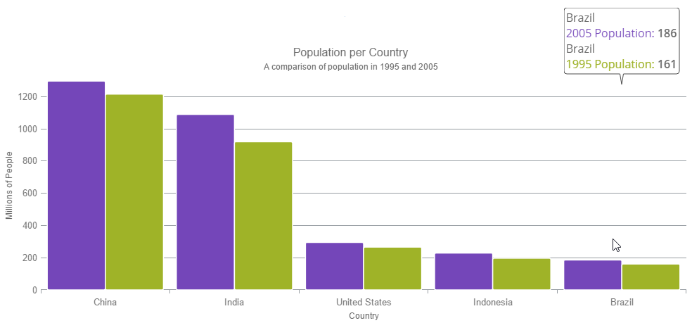
The following image is a preview of the igDataChart control renders with the categoryTooltipLayer added.
The following table summarizes the properties of the categoryTooltipLayer layer.
| Property Name | Property Type | Description |
|---|---|---|
| targetAxis | axis | This property specifies which axis should have an enabled category tooltip layer. |
| useInterpolation | bool | This property specifies if the tooltip’s x position should be interpolated rather than snapping to the gridlines or the center spaces. |
| toolTipPosition | categoryTooltipLayerPosition | This property specifies the location of the tooltip. It can be set to:
|
This sample demonstrates the Category Tooltip Layer that displays grouped tooltips for series that use a category axis. The sample options pane allows you to edit the properties of the layer, such as changing the position of the tooltip.
Hover Interactions Overview (igDataChart): This topic provides conceptual information about the hover interactions available on the igDataChart control including the different types of hover interaction layers available.
Hover Interactions Property Reference (igDataChart): This topic provides information about the properties and methods that the hover interaction feature uses for highlighting, hovering and interacting with the tooltip interactions inherited from the series class.
Configuring the Category Highlight Layer (igDataChart): This topic provides information about the category highlight layer which is used for hover interactions. It describes the properties of the category highlight layer and provides an example of its implementation.
Configuring the Category Item Highlight Layer (igDataChart): This topic provides information about the category item highlight layer used for hover interactions. It describes the properties of the category item highlight layer and provides an example of its implementation.
Configuring the Item Tooltip Layer (igDataChart): This topic provides information about the item tooltip layer which is used for hover interactions. It describes the properties of the item tooltip layer and also provides an example of its implementation.
Configuring the Crosshair Layer (igDataChart): This topic provides information about the crosshair layer used for hover interactions. It describes the properties of the crosshair layer and provides an implementation example.
The following samples provide additional information related to this topic.
Hover Interactions – Category Highlight Layer: This sample demonstrates the Category Highlight Layer that targets a category axis, or all category axes in the igDataChart™ control. The sample options pane allows you to edit the properties of the Category Highlight Layer, such as changing the color of the highlight, outline, thickness and more.
Hover Interactions – Category Item Highlight Layer: This sample demonstrates the Category Item Highlight Layer that highlights items in a series that use a category axis either by drawing a banded shape at their position or by rendering a marker at their position.The sample options pane allows you to edit the properties of the Category Item Highlight Layer, such as changing the color of the highlight, outline, thickness and more.
Hover Interactions – Item Tooltip Layer: This sample demonstrates the Item Tooltip Layer that displays tooltips for all target series individually. The sample options pane allows you to edit the properties of the layer, such as changing the transition duration.
Hover Interactions – Crosshair Layer: This sample demonstrates the Crosshair Layer that provides crossing lines that meet at the actual value of every series that they are targeting. The sample options pane allows you to edit the properties of the layer, such as changing the thickness of the crosshair.
Hover Interactions – Multiple Layers: This sample demonstrates how multiple layers interact within the igDataChart control. This sample displays the Item Tooltip Layer, the Crosshair layer and the Category Highlight Layer.
View on GitHub