
This topic explains, with code examples, how to configure visual features of the igMap™ control like cross hairs, tooltip templates, marker templates, and others.
The following topics are prerequisites to understanding this topic:
igMap Overview:This topic provides conceptual information about the igMap control including its main features, minimum requirements and user interaction capabilities.
Adding an igMap: This topic is a walkthrough for adding a simple igMap control with basic features to a web page.
This topic contains the following sections:
The igMap control provides several visual features that do not depend on and are available for use by different Map series.
The control allows for rendering cross hairs on the screen. The cross hairs are two straight lines crossing at right angle on the location of the mouse pointer. The lines span all the entire height and width of the map so that the user can easily locate the mouse’s insertion carets position. Enable and disable Cross hairs with the help of an option.
Tooltips pop up when the user hovers the mouse pointer over a marker or shape area on the map or touches and holds on touch enabled devices. Tooltips are based on templates that can render custom HTML markup and access data bound to a particular area of the map. The igTemplating engine performs the actual rendering of the templates (for details see the Templating Engine Overview topic). The igMap control gives tooltip templates access to all data bound to a particular point or shape on the map.
The igMap control uses markers to designate points on the map for the geographic symbol and geographic shapes series. Enable and disable markers by setting a series object option. The standard markers are circle, triangle, pyramid, square, diamond, pentagon, hexagon, tetragram, pentagram, and hexagram.
If the shapes and behavior of the built-in markers prove to be insufficient, you can configure a custom marker drawing function. The control calls the marker whenever plotting a marker on a map. Any custom marker function receives an object with the Canvas context object, position and size of the marker area and the data item bound to the marker.
The Marker Collision Avoidance logic determines what the igMap control will draw when two or more markers overlap. Available alternatives for collision avoidance logic are fade; fade and shift; omit; omit and shift; and do nothing (draw all markers).
The following table lists the configurable aspects of the igMap control regarding navigation features.
| Configurable aspect | Details | Properties |
|---|---|---|
| Cross hairs visibility | By default, the control does not render cross hairs. Configuring this setting displays the crosshairs in the control. | In JavaScript:In ASP.NET MVC: |
| Tooltips visibility | By default, the control does not render tooltips. Configuring this setting displays the tooltips. | In JavaScript:In ASP.NET MVC: |
| Tooltip look-and-feel | The look-and-feel of the tooltips is configurable through a template . | In JavaScript:In ASP.NET MVC: |
| Marker type | The type of the marker is configurable. | In JavaScript:In ASP.NET MVC: |
| Custom marker | A custom marker type can be configured through a template. Configure an object with callback functions that render content directly on the canvas element used for the map. | In JavaScript:In ASP.NET MVC: |
| Marker collision avoidance | There is built-in collision avoidance logic for the control’s behavior if two or more markers overlap. By default, overlapping markers are drawn one over the other, but you can configure your own logic. | In JavaScript: In ASP.NET MVC: |
Markers and custom markers area supported by the Geographic Symbol and Shape series. Other Map series do not render markers by their nature and visual presentation characteristics.
The igMap control supports custom markers by invoking callback functions that draw on the HTML5 canvas element created by the map using the canvas API.
Configure callbacks by assigning the functions to the properties of an object assigned to the series object’s markerTemplate option where you want to set the custom markers.The subsections below provide more information about the markerTemplate object and the callback functions to which it points.
The following table describes the required members of an object assigned to the markerTemplate option.
| Property | Description |
|---|---|
| measure | This optional property setting, points to a callback function used to calculate the desired size of the custom marker. |
| render | Points to a callback function using the canvas API to draw custom markers |
The following table describes the input parameter measureInfo passed to the measure callback function. That parameter gives information to the callback about the particular point for which marker must be drawn. The output of the function is the size of the custom marker expected in the width and height properties of the measureInfo parameter. Providing measure callback is optional.
| Property | Description |
|---|---|
| context | CanvasContext2D object. |
| width | If value is present, specifies the available width, the callback may be set to desired width for the content. |
| Height | If value is present, specifies the available height, the callback may be set to desired height for the content. |
| isConstant | Set the callback to true, if you desire the width and height to always be the same for this template. |
| data | If present, represents the contextual data for this template. |
The following table describes the input parameter renderInfo passed to the render callback function. That parameter provides information to the callback about the particular data point for which marker must be drawn. The output of the function is the content plotted on the canvas element.
| Property | Description |
|---|---|
| context | CanvasContext2D object. |
| xPosition | If present, specifies the x-coordinate for rendering the content. |
| yPosition | If present, specifies the y-coordinate for rendering the content. |
| availableWidth | If present, specifies the available width to render the content. |
| availableHeight | If present, specifies the available height to render the content. |
| data | If present, specifies the data bound to the current point or shape. |
| isHitTestRender | If true, indicates that this is a special render pass for hit testing, in which case use the brushes provided by the data |
The following table lists the code examples included in this topic.
| Example | Description |
|---|---|
| Configuring the Tooltip Template | This code example shows how to configure a tooltip template in the context of the Geographical Symbol series. |
| Configuring the Marker Template in JavaScript | This code example shows how to configure a custom marker template in JavaScript. |
| Configuring the Marker Template in ASP.NET MVC | This code example shows how to configure a custom marker template in ASP.NET MVC. |
| Configuring the Marker Template With the SimpleTextMarkerTemplate | This code example shows how to configure a custom marker template using the SimpleTextMarkerTemplate helper class from the Ignite UI for jQuery library. |
| Configuring a Custom Marker Template | This code example shows how to configure a custom marker template in the context of The Geographical Symbol series. |
This code example shows how to configure a tooltip template in the context of the Geographical Symbol series.
The template can be a script HTML element with type=”text/x-jquery-tmpl” or a string passed to the series object’s tooltipTemplate option. The igTemplating engine renders the template and the syntax follows the jQuery templating syntax. For more details please refer to the Templating Engine Overview topic.
In this particular example, see how to pass an array of cities from around the world with their name, country and geographic coordinates. The template displays the name and country of the current city, and its coordinates. The template also contains some elementary styling.
The following code snippet defines the tooltip template along with some elementary styling. The tooltip script block is named cityTemplate that is later used when configuring the igMap control. It assumes that the input data has the following attributes Name, Country, Latitude and Longitude. Assign the tooltipHeading class explicitly to the first row of the tooltip table. Assign the tooltip class to the actual div element created for the tooltip by the control.
In HTML:
<style>
    .tooltip
    {
        border: 1px solid Grey;
        background-color: White;
        opacity: 0.75;
    }
    .tooltipHeading
    {
        font-weight: bold;
        border-bottom: 1px solid grey;
    }
<style>
<script id="cityTemplate" type="text/x-jquery-tmpl">
    <table>
        <tr><td class="tooltipHeading" colspan="2">${item.Name}, ${item.Country}</td></tr>
        <tr>
            <td>Latitude:</td>
            <td>${item.Latitude}</td>
        </tr>
        <tr>
            <td>Longitude:</td>
            <td>${item.Longitude}</td>
        </tr>
    </table>
</script>
The following code snippet defines a geographical symbol series with coordinates contained in the Latitude and Longitude attributes of the data. Assign the name of the script cityTemplate to the Map series object’s tooltipTemplate option.
In JavaScript:
$("#map").igMap({
    ...
    series: [{
            type: "geographicSymbol",
            name: "worldCities",
            latitudeMemberPath: "Latitude",
            longitudeMemberPath: "Longitude",
            markerType: "automatic",
            // Enable tooltips
            showTooltip: true,
            // Configure tooltip template
            tooltipTemplate: "cityTemplate"
        }],
    ...
});
This sample demonstrates how to set map tooltips in the igMap control and bind a view model to the control. The locations of a set of cities around the world are provided by the server in a list of objects which is bound to a geographic symbol series in the map control. The tooltip template that displays city and country name, and geographic coordinates is assigned to the series and displayed when the mouse pointer hovers over the city marker on the map. Zoom in to reveal more detail using both the mouse scroll wheel and, on touch devices, the pinch gesture.
This code example shows how to configure a custom marker template in JavaScript.
In JavaScript:
Code
$("#map").igMap({
    ...
    series: [{
        ...
        markerTemplate: {
            measure: function (measureInfo) {
                // calculate and provide height and width of the custom marker
            },
            render: function (renderInfo) {
                // perform canvas drawing here
            }
        }
        ...
    }]
    ...
});
This code example shows how to configure a custom marker template in ASP.NET MVC.
Pass a string, with contents “customMarker” to the MarkerTemplate() method. This will generate JavaScript code that assigns customMarker to the markerTemplate option. The customMarker variable must be an existing variable in the page with a suitable marker template object assigned to it.
The following code snippet shows how to define a marker template object assigned to a JavaScript variable.
In JavaScript:
var customMarker = {
    measure: function (measureInfo) {
        // calculate and provide height and width of the custom marker
    },
    render: function (renderInfo) {
        // perform canvas drawing here
    }
};
The following code snippet shows how to assign the customMarker variable to the map control in ASP.NET MVC.
In ASPX:
<%= Html.Infragistics().Map(Model)
        .ID("map")
        ...
        .Series(series => {
            series.
                ...
                .MarkerTemplate("customMarker")
                ...
        })
        ...
%>
This code example shows how to configure a custom marker template in the context of geographical symbol series. Configuring custom markers for geographic shape series is identical. Other map series types do not display markers and custom markers are irrelevant.
The example employs a helper widget called SimpleTextMarkerTemplate from the Ignite UI for jQuery created in order to simplify using custom markers. The widget has several options for configuring the tooltip’s appearance.
The following code snippet assigns an instance of the SimpleTextMarkerTemplate object the series object’s markerTemplate option. This example assigns all of the SimpleTextMarkerTemplate object’s options in order to demonstrate their use.
In JavaScript:
$("#map").igMap({
    ...
    series: [{
        ...
        markerTemplate: new $.ig.SimpleTextMarkerTemplate({
                    font: "12pt Arial",
                    textColor: "black",
                    backgroundColor: "rgba(250,250,250,.3)",
                    borderColor: "grey",
                    borderThickness: 3,
                    padding: 10,
                    getText: function (item) {
                        return item.fieldValues.NAME;
                    }
                }),
        ...
    }],
    ...
});
The getText option is assigned an anonymous function that receives the input data for the current point or shape and returns the tooltip’s text for rendering. The function can perform all required processing by the client application using the input data.
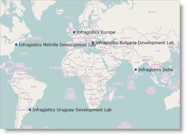
This code example shows how to configure a custom marker template in the context of the Geographical Symbol series. Configuring custom markers for the Geographic Shape series works the same as with Geographical Symbol series. Other map series types do not display markers thus making custom markers irrelevant.
The example code produces a marker consisting of a circle with blue fill on the exact geographical point along with the name of the place next to it as illustrated in the following figure.
The following code snippet shows how to implement measure and render functions using the HTML5 canvas API.
The measure function uses the context object passed and the data item to be rendered to calculate the height and width of the marker and return that data to the control. Height is the actual height of the font already defined in the beginning of the method and width is calculated by using the text metrics returned by the measureText() method from canvas API.
The render function is a bit more complicated. If this is a hit test run, as signified by the renderInfo.isHitTestRender flag, the function simply returns a red rectangle the size of the marker. Otherwise, in case of normal run the function gets the name of the geographical point (var name = data.item()["Name"]) and then draws the name with the fillText() function from canvas API leaving some offset space for a circular marker. Finally, the function plots a black circle with blue fill to complete the custom marker.
In JavaScript:
markerTemplate: {
    measure: function (measureInfo) {
        var context = measureInfo.context;
        context.font = "12pt Verdana";
        context.fillStyle = "rgba(250,250,250,0.3)";
        var data = measureInfo.data;
        var text = data.item()["Name"];
        var height = 12;
        var width = context.measureText(text).width;
        measureInfo.width = width + 5 * 2.0;
        measureInfo.height = height + 5 * 2.0;
    },
    render: function (renderInfo) {
        var context = renderInfo.context;
        var x = renderInfo.xPosition;
        var y = renderInfo.yPosition;
        if (renderInfo.isHitTestRender) {
            //  This is called for tooltip hit test only
            //  Rough marker rectangle size calculation
            context.fillStyle = renderInfo.data.actualItemBrush().fill();
            context.fillRect(x, y, renderInfo.availableWidth, renderInfo.availableHeight);
        } else {
            var data = renderInfo.data;
            var name = data.item()["Name"];
            //  Draw text
            context.textBaseline = "top";
            context.font = '12pt Verdana';
            context.fillStyle = "black";
            context.textBaseline = "middle";
            context.fillText(name, x + 10, y);
            //  Draw marker - black circle with blue fill
            context.beginPath();
            context.arc(x, y, 4, 0, 2 * Math.PI, false);
            context.fillStyle = "#2372D1";
            context.fill();
            context.lineWidth = 1;
            context.strokeStyle = "black";
            context.stroke();
        }
    }
}
The following topics provide additional information related to this topic.
Configuring the Navigation Features (igMap):This topic explains, with code examples, how to configure navigation features of the igMap control and how to use its API to define the position and size of the visible portion of the map.
Configuring the Map Series (igMap):The topics in this group explain how to configure all supported map types (map series) of the igMap™ control in order to produce many different kinds of maps.
The following samples provide additional information related to this topic.
The following material (available outside the Infragistics family of content) provides additional information related to this topic.
HTML5 Canvas Tutorials:This site provides extensive information about the canvas element API.
Canvas element:This is a short description of the HTML5 canvas element from Wikipedia®.
Canvas tutorial:This is a tutorial about the HTML5 canvas element from Mozilla® Developer Network.
HTML5 Canvas Basics: This is a tutorial about the HTML5 canvas element from Dev.Opera.
View on GitHub