
This document will get you acquainted with igGrid Layout and Columns Settings.
This topic contains the following sections:
You can control the way grid layout is handled by defining width and height of the control. The accepted values for width/height are defined as:
Table 1: Width and Height value formats
| Value Format | Accepted Value(s) |
|---|---|
| Strings | Both “500” and “500px” are valid |
| Numbers | 500 (translates to 500px) |
| Percentage Strings | “50%”, “100%”, etc. |
If width and height are defined, the grid is wrapped in a scrolling DIV element. When height is set, and fixedHeaders is set to true (default), the grid headers remain fixed while the user is scrolling.
Note: You can also specify widths for individual columns, which can be seen at the sample.
There are several scenarios that affect the rendering of the grid when widths and height are set.
Table 2: Effects of enabling/disabling fixed headers and scrolling
| Fixed Headers | Scrolling | Details |
|---|---|---|
| No | No | If column widths are defined, the grid stretches according to the widths. If no column widths are defined, the grid stretches according to the data. |
| Yes | Yes | Headers are rendered in a separate table, inside of a DIV (so that if there is width set on the grid and it has horizontal scrollbar, the headers table is in sync with the contents, while scrolling). |
| No | Yes | The header’s element is rendered inside of a single table – where the data is hosted. There is no separate TABLE or DIV. |
The sample below demonstrates how to set up different layout properties of the igGrid. The following properties are exposed:
caption – caption text and/or HTML that will be shown above the grid.fixedHeaders - the column headers can be fixed so they are visible while scrolling.defaultColumnWidth - when columns don’t have width assigned in the columns collection.width (columns) – the width that is applied to the column.width - the width of the grid. If a column’s width exceeds the grid’s width then a horizontal scroll bar appears.Grid columns are defined by adding objects to the columns grid option as shown in Listing 1.
Listing 1: Defining columns as an option to the grid
In Javascript:
$("#grid1").igGrid({
       autoGenerateColumns: false, columns: [
            {
                headerText: "Country Code",
                key: "Code",
                width: "100px",
                dataType: "string",
                formatter: <formatter function>,
                format: ""
            },
            {
                headerText: "Date",
                key: "Date",
                width: "100px",
                dataType: "date",
                format: "dateLong"
            },
            {
                headerText: "Country Name",
                key: "Name",
                width: "80px",
                dataType: "string"
            }
        ],
    responseDataKey: 'records',
    dataSource: remoteService,
    height: '400px'
});
A column definition is a JavaScript object containing at least a key property. It may also contain:
headerText optionwidth option (number or string – px or % or "*")dataType optionDefining column width to "*" will auto-size the column when the grid is initialized. Auto-sizing applies the width of the widest cell content (including header and footer cells) that is currently visible. Auto-sizing doesn't work when virtualization is enabled.
The format and dataType options may be configured a number of different ways.
dataType can be a string, number, date, bool or objectformat column property corresponding to dataType=”date” (Date objects) can be “date”, “dateLong” , “dateLong” , “dateTime” , “timeLong” or explicit pattern like “MM-dd-yyyy h:mm:ss tt”. See Formatting Dates for details on the valid custom date format specifiers.format column property corresponding to dateType=”number” (number objects) or for dataType=”string” can be “number”, “double” , “int” , “currency” , “percent”. See Formatting Numbers for details on the valid custom number format specifiers.format column property corresponding to dateType=”bool” (bool objects) can be “checkbox”.dataType=”number”, then the corresponding format also can be set to something like “0.0###”, “#.##”, “0.000” etc. In this case number of zeros after the decimal point define minimum decimal places and overall number of characters after decimal point defines number of maximum decimal places. See Formatting Numbers for details on the valid custom number format specifiers.dataType is not “date” or “number”, then the corresponding format can contain “{0}” flag. In this case that flag is replaced by the value of cell.For example, if format=”Name: {0}” and value is cell is “Bob”, then cell will be rendered as “Name: Bob” (see Formatting Strings for details).Column formatting defines how column cell values are displayed in the grid. Formatting operates at the grid rendering phase and doesn't affect the data in the underlying data source. This means that features that operate on the data like Sorting, Filtering, Group By will not consider the formatted cell values.
Column formatting (rendering) is affected by several igGrid options. These are column's formatter, format and template. Additionally there's grid's autoFormat option which affects how the regional settings are applied to the grid.
autoFormat - is a string which identifies how the regional settings are applied globally on the grid for "date" and "number" columns. By default only "date" columns are formatted according the regional settings. This option is overridden by format and formatter options if available.
Note: Regional settings can be accessed with the following expression:
$.ig.regional.defaults;
Here is the flow of column rendering when no format decorators are used:
Raw Value -> autoFormat -> (template)* -> Cell Value
* - optional setting
Note: By default when there are no column rendering decorators applied and the Raw Value is null, undefined or empty string ("") a non-breaking space (
) is rendered instead in the cell.
formatter - is a function or a string name of a function bound to the global window object. It gives you full control on rendering the data source value. When defining formatter function it's up to you to control the format and regional representation of the value. There is a utility function $.ig.formatter(rawValue, dataType, formatPattern) which can be used for formatting values either using the regional settings or using custom format pattern.
In Javascript:
var formattedValue = $.ig.formatter(new Date()); //formats the date according to the current regional settings.
var formattedValue = $.ig.formatter(1000000); //formats the number according to the current regional settings.
formatter and format options do not operate at the same time. When defined, formatter function is considered with priority and
format is not used. However value from the formatter function is further decorated with a template.
Here is the flow of column rendering when formatter is used:
Raw Value -> formatter -> (template)* -> Cell Value
* - optional setting
This sample below shows how to format column values before displaying them in the grid. The "Make Flag" boolean column has a formatter function which transforms the true/false values into Yes/No values.
format - is a string identifying a format patterns. Internally format option uses the $.ig.formatter(rawValue, dataType, formatPattern) function. When set, format overrides the setting of the autoFormat option and also the default regional settings.
Here is the flow of column rendering when format is used:
Raw Value -> format -> (template)* -> Cell Value
* - optional setting
The sample below demonstrates the grid column formatting capabilities. The Sell Start Date and Modified Date columns use different date formatting. The List Price number column uses the currency format.
template - is a templated string (templating engine used is defined in the templatingEngine option). See Templating Engine Overview topic for details on template syntax.
Here is the flow of column rendering when template is used:
Raw Value -> (autoFormat|format|formatter)* -> template -> Cell Value
* - optional setting
columnCssClass - is a space-separated list of CSS classes that are applied to the TD element of the cell.
When the template option defines the rendering of the TD element the columnCssClass option is ignored (see the example below).
Here is the flow of column rendering when columnCssClass is used:
Raw Value -> (autoFormat|format|formatter)* -> columnCssClass -> template* -> Cell Value
* - optional setting
Example:
$("#grid1").igGrid({
    autoGenerateColumns: false,
    columns: [ {
            headerText: "Product Number",
            key: "ProductNumber",
            dataType: "number",
            // NOTE: columnCssClass will be applied
            columnCssClass: "align-right",
            template: "<a href='/product/${ProductNumber}'>${ProductNumber}</a>"
        }, {
            headerText: "Modified Date",
            key: "ModifiedDate",
            dataType: "date",
            // NOTE: columnCssClass will NOT be applied
            columnCssClass: "align-center",
            template: "<td style='font-weight: bold'>${ModifiedDate}</td>"
        }
    ]
});
headerCssClass - is a space-separated list of CSS classes that are applied to the TH element of the column header text configured by the headerText option.
Here is the flow of column rendering when headerCssClass is used:
Raw `headerText` Value -> headerCssClass -> Header Text Value
By default the cell text in igGrid is left aligned. To customize the cell text alignment use columnCssClass option. Just create custom CSS classes to align the text to the desired direction and then apply them to the column using the columnCssClass.
The sample below demonstrates how to customize the grid cell text alignment. The grid's "Product ID" and "Reorder Point" numeric columns text is aligned to the right. This is done by applying a custom CSS class to the column cells. The CSS class is configured in the grid column's columnCssClass property.
The mapper function can be used in scenarios where you have a complex data object and you need to extract specific property from it, which will define both the display value and the value used for data operations on that column. For such scenarios the column dataType needs to be specified as "object" and a mapper function can be used to extract the desired data from the record. The mapping is done on a data source level and will allow all data operations to be executed based on the mapped values. For instance if we have a complex object in each record in the data source as in the following example:
var data = [{ "ID": 0, "Name": "Bread", "Description": "Whole grain bread", "Category":  { "ID": 0, "Name": "Food", "Active": true }},
{ "ID": 1, "Name": "Milk", "Description": "Low fat milk",  "Category":   { "ID": 1, "Name": "Beverages", "Active": true } },
 ...
 ];
and would like to display a specific property, or computed value from multiple properties of the 'Category' object( for example we'd like to map the value to contain the ID and Name sub-field values in a single string), we can do so via the mapper function.
Example:
In Javascript:
    mapper: function(record){
    //extracting data from complex object
    return record.Category.ID + " : " + record.Category.Name;
    }
The function is defined via the mapper column option as shown in Listing 2. It allows specifying values per data record to be used for all data operations related to the specific column.
The function accepts a single parameter, which contains the whole data record and should return a single simple value per record.
Note: The function will be invoked each time the grid needs to extract data from the data source for this column. This includes any data rendering or data manupulation operations related to the column. Due to this note that if you have complex data extraction and/or calculation logic there will be a performance impact.
Listing 2: Defining mapper function for a column in igGrid
In Javascript:
  $("#grid").igGrid({
  columns: [
                    { headerText: "", key: "ID", dataType: "number", width: "200px" },
                    { headerText: "Name", key: "Name", dataType: "string", width: "200px" },
                    { headerText: "Description", key: "Description", dataType: "string", width: "200px" },
                    { headerText: "Category", key: "Category", dataType: "object", width: "200px",
                        mapper: function(record){
                                //extracting data from complex object
                                return record.Category.Name;
                            }
                    }
                ],
                autoGenerateColumns: false,
                dataSource: northwindProductsJSON,
               ...
});
The below sample demonstrates how to handle complex data objects via the column's mapper function. In it Sorting and Filtering will be executed based on the values returned by the mapper function and Updating via the combo editor provider will allow updating the whole complex object with the selected combo item's record data.
Whenever autoGenerateColumns is set to false, you are required to manually define columns in the columns array. When autoGenerateColumns is true (default), you are not required to specify columns. In that case the grid will infer columns automatically from the data source (assuming there is at least one row in it) and add them to the columns collection. Header texts are automatically generated as well, and are equivalent to the keys in the data source. Setting column widths for auto-generated columns is done with defaultColumnWidth option, which will apply one and the same column width for all generated columns. When remote data binding is used, header texts are automatically generated only when data is available from the backend on the client. However, in most real-world scenarios it’s best to explicitly define columns.
When autoGenerateColumns is set to true, and you have manually defined columns, there are a few possible scenarios for how the columns render to the user:
Note: Note that whenever
autoGenerateColumnsis true, all columns in the data source are rendered all the time. If you would not like to render specific column, you should setautoGenerateColumnsto false, and then specify your columns in the columns array.
You can also specify widths for every individual column separately. If you have specified column widths, and the grid also has width defined, which happens to be less than the sum of all column widths that you have defined, a horizontal scrollbar is rendered for the grid.
Note: It is not recommended to specify widths for only a few columns, and have a grid width defined at the same time, this results in some columns to appear arbitrary narrow. To help alleviate this problem you can set the
defaultColumnWidthgrid option.Note: Updating feature requires
dataTypeproperty to be set whenautoGenerateColumnsis set to false. That's because Updating feature uses primary key to synchronize records between the grid and the underlying data source and the primary key is compared by value and type.
The sample below shows the auto-generate columns functionality of igGrid. When columns are auto-generated their header captions are taken from the data source field names. The autoGenerateColumns option is used in combination with defaultColumnWidth option.
The jQuery grid is fully jQuery UI Theme Roller compatible. Therefore, you can use the Theme Roller web application to generate a custom theme, or use any of the existing themes, to apply to the grid.
If you would like to use the minified and combined styles, which is preferred, you must include the CSS definitions found in Listing 2.
Listing 2: Required stylesheet definitions
In Javascript:
<link type="text/css" href="infragistics.theme.css" rel="stylesheet" />
<link type="text/css" href="infragistics.css" rel="stylesheet" />
The first CSS, jquery.ui.custom.css represent the actual theme (that is, color-related styling), and you may replace it with any CSS file generated from Theme Roller.
The second CSS is custom to Ignite UI for jQuery and contains layout-related rules that are not available in Theme Roller / jQuery UI. Therefore it is required so the control is ensured to function properly.
If you would like to reference not-combined CSS (used in development scenarios), you can add the references as depicted by Listing 3.
Listing 3: Referencing non-combined or non-minified CSS files
In Javascript:
<link type="text/css" href="css/themes/infragistics/infragistics.theme.css" rel="stylesheet" />
<link type="text/css" href="css/structure/modules/infragistics.ui.grid.css" rel="stylesheet" />
<link type="text/css" href="css/structure/modules/infragistics.ui.shared.css" rel="stylesheet" />
If you would like to change the appearance of any element, you can edit the custom.css file. Another alternative is to define custom CSS rules against the pre-defined class names.
The grid topmost container DIV is prefixed with the class ui-iggrid, so you can use this as a selector to target only the grid. Alternatively, you can use the ID of the grid as a selector if you want your custom CSS to be applied only to a specific grid.
By default for a column which contains Boolean data types, the igGrid shows a string saying true or false. You have, however, the option to make igGrid columns display Boolean data as checked or unchecked checkboxes to indicate, respectively, the true and false states of the data items. You render checkboxes on a column by setting the renderCheckboxes property to true. Rendering checkboxes requires setting the dataType property of the column to bool.
Note that as of 16.1 an improvement in the visual styling of the checkbox is made. It's square box is not going to be rendered when the grid is in display mode. What would be provided is only a plain checkmark. This change is due to refinement of the experience for the end-users, who naturally perceived that this was an interactive element, which they can click to toggle. This is still the case when the igGrid enters in edit mode which means that the previous look and feel of checkboxes is preserved for this mode.
Currently the classes are abstracted into the util property $.ig.checkboxMarkupClasses which is empty by default. Previous layout of the checkbox can be adopted by the usage of the following classes -
$.ig.checkboxMarkupClasses = "ui-state-default ui-corner-all ui-igcheckbox-small";
The property allows custom classes, but any kind of modification should be handled properly so it won't break the layout of the checkbox.
Previous versions of igUpdating had two different behavioral cases for editing checkboxes. First one was when end-user clicks on the checkbox in the cell and the second one was when he clicks outside of the checkbox in the cell. The grid was entering in edit mode in both cases, but in the first one the checkbox value was changed. Currently there are no differences in behavior for editing checkboxes. It is all consistent. The end-user should enter edit mode first and after that is going to able to change the value of the checkbox.
Here's a suggested workaround to achieve the previous behavior:
In Javascript:
$.ig.checkboxMarkupClasses = "ui-state-default ui-corner-all ui-igcheckbox-small";
In Javascript:
features: [
    {
        name: "Updating",
        editMode: "cell",
        editCellStarting: function (evt, ui) {
            if (ui.columnKey === "MakeFlag" && $(evt.originalEvent.target).hasClass("ui-icon-check")) {
                ui.value = !ui.value;
            }
        }
    }
]
The example code that follows renders a checkbox on the Make Flag column as shown in the illustration on the right.
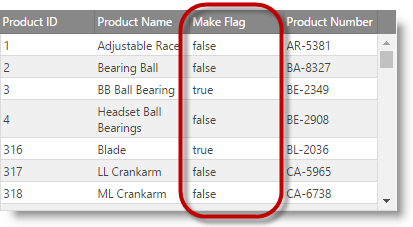
|
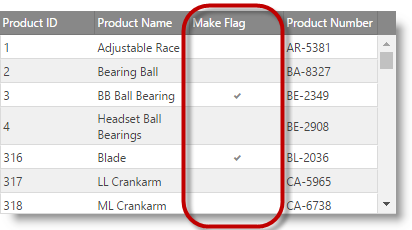
|
Figure 1: A column displaying Boolean values without (left) and with (right) rendered checkboxes
In Javascript:
$("#grid1").igGrid({
    autoGenerateColumns: false,
    primaryKey: "ProductID",
    // enabling render checkboxes on a column
    renderCheckboxes: true,
    columns: [ {
            // note: if primaryKey is set and data in primary column contains numbers,
            // then the dataType: "number" is required, otherwise, dataSource may misbehave
            headerText: "Product Number",
            key: "ProductNumber",
            dataType: "string"
        }, {
            headerText: "Modified Date",
            key: "ModifiedDate",
            dataType: "date"
        }
    ],
    dataSource: gridData,
    height: "300px"
});
The sample below demonstrates how to enable checkboxes in a boolean column instead of the true/false values.
In ASPX:
<%= Html.Infragistics().Grid(Model).ID("grid1").AutoGenerateColumns(false).PrimaryKey("ProductID").RenderCheckboxes(true).Columns(column =>
    {
        column.For(x => x.ProductID).HeaderText("Product ID").DataType("number");
        column.For(x => x.ProductNumber).HeaderText("Product Number").DataType("string");
        column.For(x => x.MakeFlag).HeaderText("Make Flag").DataType("bool");
        column.For(x => x.ModifiedDate).HeaderText("Modified Date").DataType("date");
        })
        .DataBind().Height("300px").Render()
%>
View on GitHub