
The igGrid control sorting feature enables single or multiple column sorting in an ascending or descending order.
This topic contains the following sections:
Persisting Sorting between igGrid re-bindings is made easy in version 14.1 and in fact replaces the previous default behavior.
Note: Sorting persistence is
trueby default. This is a breaking change.
When you enable igGridSorting you are already using it in a persist mode. This means that after explicitly calls of dataBind(), that persistence is applied for UI and data source view (the sorting indicators and the CSS classes are applied, the data source remains sorted)
Sorting persistence is implemented for igHierarchicalGrid too.
The following sample demonstrates the persistance capabilities of the Sorting feature.
If you would like to retain the previous behavior of sorting being cleared after user re-binds the igGrid, you can do this by disabling the feature through the persist option as shown in the code snippet below:
In JavaScript:
features: [
  {
     name: "Sorting",
     persist: false
  }
]
Sorting can be configured to operate either locally or remotely. In the first case, sorting is done entirely on the client, without the need of any server requests. In the case of remote sorting, the grid encodes the necessary URL parameters so the server can retrieve information about which columns must be sorted.
igGrid column you want to unsort.columnSettings object. For example you can disable sorting for a particular column, or specify that you would like it to be sorted in an ascending order by default.caseSensitive option to true. This options works only for local sorting.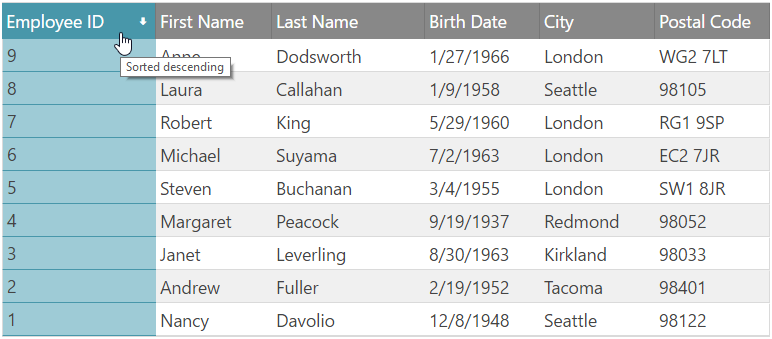
Figure 1: The igGrid control sorting UI
The sample below demonstrates how to enable the Sorting feature:
The following code snippet shows how to enable Sorting in ASPX (MVC)
In ASPX (MVC):
<%= Html.Infragistics().Grid(Model).ID("grid1").Columns(column =>
    {
        column.For(x => x.EmployeeID).HeaderText("Employee ID").Width("15%");
        column.For(x => x.FirstName).HeaderText("First Name").Width("20%");
        column.For(x => x.LastName).HeaderText("Last Name").Width("20%");
        column.For(x => x.BirthDate).HeaderText("Birth Date").Width("15%");
        column.For(x => x.City).HeaderText("City").Width("15%");
        column.For(x => x.PostalCode).HeaderText("Postal Code").Width("15%");
    }).Features(features => {
        features.Sorting().Type(OpType.Local).CaseSensitive(true);
    })
    .Height("500")
    .DataSourceUrl(Url.Action("PagingGetData"))
    .DataBind()
    .Render()%>
If you would like to provide a custom sorting function, please refer to the customSortFunction option.
Each column is configurable with the columnSettings options as listed in Table 1.
Table 1: The columnSettings object
| Property name (default values in parenthesis) | Description |
|---|---|
columnKey( string col name) |
Data key of the column |
allowSorting (true) |
Specifies if this column is allowed to participate in sorting |
firstSortDirection (undefined) |
Sorting direction when the column is first clicked |
currentSortDirection (undefined) |
Initial (default) sorting direction. When invoked at runtime, gives the current direction of sorting for the particular column. |
In JavaScript:
$("#grid1").igGrid({
    columns: [
        { headerText: "Product ID", key: "ProductID", dataType: "number" },
        { headerText: "Product Name", key: "Name", dataType: "string" },
        { headerText: "Product Number", key: "ProductNumber", dataType: "string" },
    ],
    width: '500px',
    dataSource: products,
    features: [
        {
            name: 'Sorting',
            columnSettings: [
                    {columnKey: 'ProductID', allowSorting: false}
               ]
        }
    ]
});
You can control how the URL is encoded when sorting is performed by setting the sortUrlKey option. The sortUrlKey is null by default, therefore the encoding follows oData standards for URI format, as described here:
http://www.odata.org/documentation/odata-version-2-0/uri-conventions/
In order to sort a column programmatically, you can do this in the following way:
Listing 5: Programatically sorting a column
In JavaScript:
$('#grid1').igGridSorting('sortColumn', 'ProductID', 'asc');
The applied sorting expressions can be retrieved from the data source of the grid. In order to get them programmatically, you can use the following:
Listing 6: Retrieving the applied sorting expressions
In JavaScript:
var expressions = $('#grid1').data('igGrid').dataSource.settings.sorting.expressions;
Listing 7: Retrieving the columnSettings object
In JavaScript:
var sorting = $('#grid1').data('igGridSorting');
var settings = sorting.options.columnSettings;
You can bind to client-side events to the Sorting feature in two ways, which are described in Listing 8 and Listing 9, respectively.
Listing 8: Binding to client-side events from anywhere in your application
In JavaScript:
$("#grid1").bind("iggridsortingcolumnsorted", handler);
Note: If you would like to bind using the approach described in Listing 8, you must use the jQuery
delegatemethod instead of bind if Sorting is not yet instantiated.
Listing 9: Binding to client-side events by specifying the event name as an option when you initialize the Sorting feature (case sensitive)
In JavaScript:
$("#grid1").igGrid({
    columns: [
        { headerText: "Product ID", key: "ProductID", dataType: "number" },
        { headerText: "Product Name", key: "Name", dataType: "string" },
        { headerText: "Product Number", key: "ProductNumber", dataType: "string" },
    ],
    width: '500px',
    dataSource: products,
    features: [
        {
            name: 'Sorting',
            columnSorted: handler
        }
    ]
});

//Handler code
function handler(event, args) {

}
Note: All "ing" events are cancellable. In order to cancel an "ing" event, its respective event handler must return false.
The grid Sorting feature exposes the client-side events as detailed in Table 2.
Note: In the following Table 2, the events specific to the Multiple Sorting Dialog are not listed. They are available in the Multiple Sorting Dialog topic.
Table 2: Argument object definitions for the Sorting feature events
| Event Name | Args |
|---|---|
columnSorting |
columnKey: Column key owner: Reference to the instance of igGridSorting widget direction: New sorting direction |
columnSorted |
Same as columnSorting |
The table in Listing 3 summarizes all sorting options available to instantiate the Sorting widget.
Note: In the following Table 3, the properties specific to the Multiple Sorting Dialog are not listed. They are available in the Multiple Sorting Dialog topic.
Table 3: Sorting widget options
| Option name and default value | Description |
|---|---|
| type ("remote") |
Type of the sorting with respect to where data comes from – either client or server. This setting delegates directly to the igDataSource instance used by the grid. You can have binding to a remote service, with local sorting, for example.
Values are remote or local.
|
| applySortedColumnCss (true) | If false, the sort will not apply a special "sorted" style to all TD cells of the sorted column. |
| caseSensitive (false) | Enables/disables case sensitive sorting support. This option works only for local sorting. |
| sortUrlKey (null) | The key to encode in the url, which delegates to the data source control. If no URL is set, the oData conventions are used. |
| sortUrlKeyAscValue (null) |
Delegates to the igDataSource control – states how the URL value for "ascending" state is encoded
|
| sortUrlKeyDescValue (null) | Same as sortUrlKeyAscValue |
| mode ("single") | Sorting can be multiple or single (default). When it is single, all previous sorting states are cleared. |
| firstSortDirection ("ascending") | Direction – asc or desc – when the column is clicked for the first time, and hasn’t been sorted before. |
| sortedColumnTooltip ('sorted ${direction}') | Format of the tooltip "title" attribute applied on the TH |
| unsortedColumnTooltip ('click to sort column') | Same as unsortedColumnTooltip but when the column is unsorted |
| columnSettings ([]) | A list of column specific sorting settings, see Table 4 |
| customSortFunction (null) |
Custom sorting function that accepts as parameters the following:
|
Table 4 specifies all CSS classes applied to various parts of the Sorting UI. Note that ui-state-default, ui-state-active, ui-state-hover, ui-state-focus are classes defined by the jQuery UI CSS framework.
Table 4: CSS classes applied to the Sorting UI
| UI AREA | Overview of the rendered UI area | List of CSS classes applied to this area |
|---|---|---|
| sortableColumnHeader | Applied to the column’s TH | ui-iggrid-sortableheader ui-state-default |
| sortableColumnHeaderActive | Applied to the column’s TH when keyboard navigation is used to TAB through the headers , and ENTER or SPACE key is used, or when the header is simply clicked with the mouse | ui-iggrid-sortableheaderactive ui-state-active |
| sortableColumnHeaderHover | Applied to the sortable column’s TH on mouse over | ui-iggrid-sortableheaderhover ui-state-hover |
| sortableColumnHeaderFocus | Applied when keyboard navigation is used (just TAB through the headers), without pressing ENTER or SPACE – that is’ this corresponds exactly to the browser’s focus. | ui-iggrid-sortableheaderfocus ui-state-focus |
| ascendingColumnHeader | Applied in addition to the other classes to the column header TH when the column is sorted ascending | ui-iggrid-colheaderasc |
| descendingColumnHeader | Applied in addition to the other classes to the header TH when the column is sorted descending | ui-iggrid-colheaderdesc |
| ascendingColumn | Applied to all the column TD’s , when the column is sorted ascending | ui-iggrid-colasc |
| descendingColumn | Applied to all the column TD’s when the column is sorted descending | ui-iggrid-coldesc |
| sortIndicator | Applied to the indicator icon SPAN element (background image and background position determines the exact portion of the sprite) | ui-iggrid-colindicator |
| sortIndicatorAscending | Applied to the icon SPAN when the indicator is ascending. This span is a child element of the TH and is wrapped in an A tag. | ui-iggrid-colindicator-asc ui-icon ui-icon-arrowthick-1-n |
| sortIndicatorDescending | Same as sortIndicatorAscending but when descending | ui-iggrid-colindicator-desc ui-icon ui-icon-arrowthick-1-s |
View on GitHub