
This topic explains how to apply styles to the igHtmlEditor™ control.
The following table lists the topics, concepts, and articles required as a prerequisite to understanding this topic.
Topics
igHtmlEditor Overview: This topic describes the features of the igHtmlEditor.
Adding igHtmlEditor: This topic describes how to add an igHtmlEditor to a web page.
Configuring Toolbars and Buttons: This topic explains how to configure the igHtmlEditor toolbars and buttons.
Styling and Theming Ignite UI for jQuery: This topic provides instructions on setting up your application for design time, options for using CSS in production and an overview on creating or customizing a theme.
External Resources
This topic contains the following sections:
The igHtmlEditor can be used with two themes provided by Infragistics. These are the Infragistics theme and Metro theme. In addition, you can change button background images by using the appropriate styles.
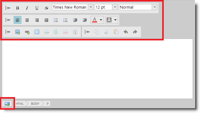
In the following screenshot you can see the igHtmlEditor with custom button icons applied and no icon borders.
Ignite UI for jQuery™ utilizes the jQuery UI CSS Framework for styling and theming purposes. Infragistics and metro are jQuery UI themes provided by Infragistics for use in your application.
Detailed information for applying these themes is available in the Styling and Theming Ignite UI for jQuery topic.
The igHtmlEditor specifically is not supported with jQuery UI themes and the Theme Roller tool because the styles of the jQuery UI themes override the igHtmlEditor button styles causing the buttons display incorrect icons from the jQuery UI themes.
You can however override the Infragistics themes to customize the styles applied to the igHtmlEditor using the reference below.
The following table summarizes the themes available for the igHtmlEditor.
| Theme | Description | |
|---|---|---|
| IG Theme | Path: {IG CSS root}/themes/Infragistics/ File: infragistics.theme.css | This theme defines general visual features for all Ignite UI for jQuery controls. |
| Metro Theme | Path: {IG CSS root}/themes/metro/ File: infragistics.theme.css | The Metro theme is an implementation of the clean, modern and fast Metro design language. |
The Metro theme is an implementation of the clean, modern and fast Metro design language.
The following table summarizes the purpose and functionality of the igHtmlEditor control’s featured button styles.
Note: The best way to apply multiple button background images is by using sprites.
| Style | Description |
|---|---|
| .ui-igbutton .ui-igbutton-collapse | Defines the background image for the collapse button. |
| .ui-igbutton .ui-igbutton-expand | Defines the background image for the expand button. |
| .ui-igbutton .ui-igbutton-redo | Defines the background image for the redo button. |
| .ui-igbutton .ui-igbutton-undo | Defines the background image for the undo button. |
| .ui-igbutton .ui-igbutton-increasefontsize | Defines the background image for the increase font size button. |
| .ui-igbutton .ui-igbutton-decreasefontsize | Defines the background image for the decrease font size button. |
| .ui-igbutton .ui-igbutton-viewsource-icon | Defines the background image for the view source button. |
| .ui-igbutton .ui-igbutton-addimage | Defines the background image for the add image button. |
| .ui-igbutton .ui-igbutton-addlink | Defines the background image for the add link button. |
| .ui-igbutton .ui-igbutton-copy | Defines the background image for the copy button. |
| .ui-igbutton .ui-igbutton-cut | Defines the background image for the cut button. |
| .ui-igbutton .ui-igbutton-paste | Defines the background image for the paste button. |
| .ui-igbutton .ui-igbutton-table | Defines the background image for the table button. |
| .ui-igbutton .ui-igbutton-addrow | Defines the background image for the add row button. |
| .ui-igbutton .ui-igbutton-addcolumn | Defines the background image for the add column button. |
| .ui-igbutton .ui-igbutton-removerow | Defines the background image for the remove row button. |
| .ui-igbutton .ui-igbutton-removecolumn | Defines the background image for the remove column button. |
| .ui-igbutton .ui-igbutton-justifyleft | Defines the background image for the justify left button. |
| .ui-igbutton .ui-igbutton-justifycenter | Defines the background image for the justify center button. |
| .ui-igbutton .ui-igbutton-justifyright | Defines the background image for the justify right button. |
| .ui-igbutton .ui-igbutton-justifyfull | Defines the background image for the justify full button. |
| .ui-igbutton .ui-igbutton-forecolor | Defines the background image for the fore color button. |
| .ui-igbutton .ui-igbutton-backcolor | Defines the background image for the back color button. |
| .ui-igbutton .ui-igbutton-bold | Defines the background image for the bold button. |
| .ui-igbutton .ui-igbutton-italic | Defines the background image for the italic button. |
| .ui-igbutton .ui-igbutton-underline | Defines the background image for the underline button. |
| .ui-igbutton .ui-igbutton-strikethrough | Defines the background image for the strikethrough button. |
| .ui-igbutton .ui-igbutton-indent | Defines the background image for the indent button. |
| .ui-igbutton .ui-igbutton-removeindent | Defines the background image for the remove indent button. |
| .ui-igbutton .ui-igbutton-unorderedlist | Defines the background image for the unordered list button. |
| .ui-igbutton .ui-igbutton-orderedlist | Defines the background image for the ordered list button. |
The following topics provide additional information related to this topic.
igHtmlEditor.The following samples provide additional information related to this topic.
igHtmlEditor control doesn't support the jQuery UI CSS Framework for styling, the standard Infragistics theme and the Windows UI themes are supported by default. This sample demonstrates how to customize igHtmlEditor look and feel by using CSS styles.View on GitHub