The Row Selectors feature for the igTreeGrid is extended from the igGrid RowSelectors. The feature is customized to ease selection in hierarchical data. What is more, in order to meet all kind of requirements Row Selectors provides the opportunity to decouple checkboxes from selection. Additional API options specific to the igTreeGrid are introduced – rowSelectorNumberingMode and chechkboxMode as well as additional API methods - checkedRows, uncheckedRows, partiallyCheckedRows, toggleCheckState and toggleCheckStateById.
The rowSelectors feature widget provides the user with the functionality to select cell(s), or entire row(s) by clicking the row selector column placed on the left of the first column of the grid. In addition to that, the widget provides row numbering functionalities and checkboxes for row selection. Another advantage of Row Selectors is that they could be easily configured to decouple checkboxes from selection if you would like achieve a "tree-like" look and feel of the applications.
In the igTreeGrid there are two possible modes for the row selectors numberingmode – sequential and hierarchical.
RowSelectors has a rowSelectorNumberingMode option for the numbering format of the rows which by default is set to “sequential”. In this scenario the row numbering format is going to be row`s visible index.
$("#treegrid ").igTreeGrid({
    dataSource: flatDS,
    primaryKey: “employeeID”,
    foreignKey: “PID”,
    features : [
    {
        name : "RowSelectors",
        rowSelectorNumberingMode: "sequential"
    },
    {
        name: "Selection"
    }
    ]
});
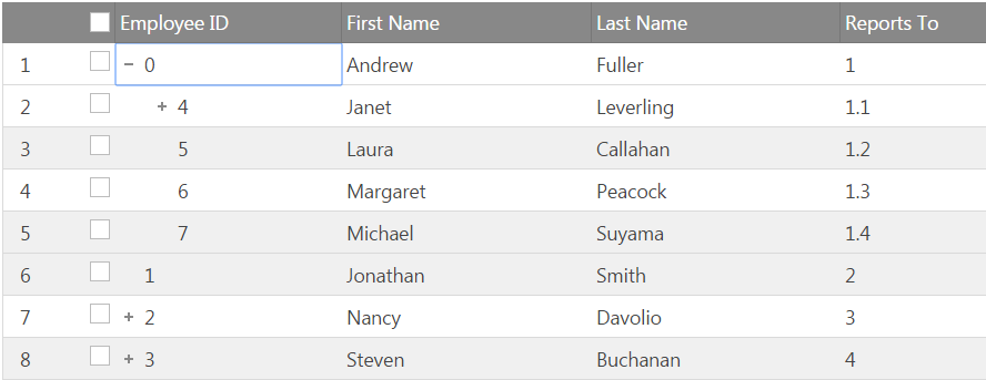
In order to apply formatting that is concatenation of parent and children indexes set rowSelectorNumberingMode to “hierarchical.”
$("#treegrid ").igTreeGrid({
    dataSource: flatDS,
    primaryKey: “employeeID”,
    foreignKey: “PID”,
    features : [
    {
        name : "RowSelectors",
        rowSelectorNumberingMode: "hierarachical"
    },
    {
        name: "Selection"
    }
    ]
});

Depending on the selection is going to be coupled with checkboxes or decoupeled there are two possible types of checkboxes that you could render: biState and triState. Bi-state checkboxes
Default state of this option is “biState” . When it is enabled clicking on a checkbox or selecting a row will apply selection to this row only.
$("#treegrid ").igTreeGrid({
    dataSource: flatDS,
    primaryKey: “employeeID”,
    foreignKey: “PID”,
    features : [
    {
        name : "RowSelectors",
        checkBoxMode: "biState"
    },
    {
        name: "Selection"
    }
    ]
});
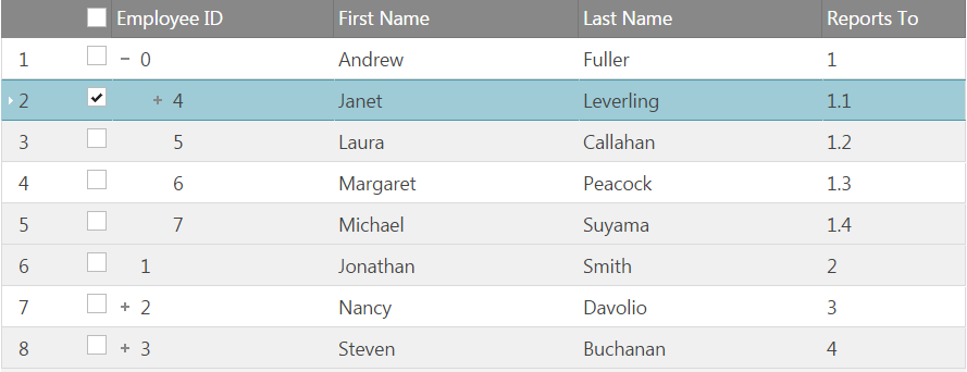
In this mode there is a clear distinction between selected row and the state of the corresponding checkbox. This configuration will decouple checkboxes from selection and selection in this case could only be single.
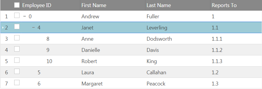
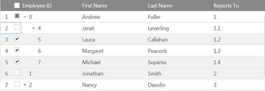
When in “triState” checkBoxMode selecting a row is not going to check the corresponding checkbox and vice versa, clicking a selector checkbox is not going to apply selection to the row.
$("#treegrid ").igTreeGrid({
    dataSource: flatDS,
    primaryKey: “employeeID”,
    foreignKey: “PID”,
    features : [
    {
        name : "RowSelectors",
        enableCheckBoxes: true,
        checkBoxMode: "triState"
    },
    {
        name: "Selection"
    }
    ]
});
Tri state checkboxes - selecting a row
Tri state checkboxes - clicking on the checkbox
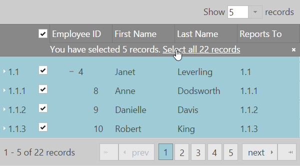
By default the user can select all rows in the current grid page using a checkbox in the header of the row selector column. Along with Paging feature, Row Selectors feature provides the ability of the user to select all records across all grid pages when 'enableSelectAllForPaging' option is enabled.
Note: This option is enabled by default.
An option 'selectAllForPagingTemplate' is available to control the notification template. The template supports parameters ${checked} (total checked records) and ${totalRecordsCount}.
The default template is:
<div class='ui-widget-header' tabindex='0'><div><div class='ui-widget-header' tabindex='0'><div>You have selected ${checked} records. <a href='#' tabindex='0' data-rs-select-all>Select all ${totalRecordsCount} records</a><span data-rs-close-all class='ui-icon-close ui-icon ui-iggrid-button' tabindex='0' style='float:right;'></span></div></div>
Similar to selecting all records, the grid provides the ability to deselect all records using the option 'deselectAllForPagingTemplate', which has the following default template: <div class='ui-widget-header' tabindex='0'><div>You have deselected ${unchecked} records. <a href='#' tabindex='0' data-rs-deselect-all>Deselect all ${totalRecordsCount} records</a><span data-rs-close-all class='ui-icon-close ui-icon ui-iggrid-button' tabindex='0' style='float:right;'></span></div></div>
Note: "Select/Deselect All" template represents an overlay which renders directly over the records, starting at the top of them.
The differences between the two checkbox modes related to "Select All" Paging functionality are described below:
With the default "biState" mode in order to select all grid pages, along with "enableSelectAllForPaging" option should be enabled also multiple selection.
$("#treegrid").igTreeGrid({
    dataSource: flatDS,
    primaryKey: “employeeID”,
    foreignKey: “PID”,
    features : [
    {
        name: "RowSelectors",
        rowSelectorNumberingMode: "sequential",
        enableCheckBoxes: true,
        checkBoxMode: "biState",
        enableSelectAllForPaging: true
    },
    {
        name: "Selection",
        multipleSelection: true
    },
    {
        name: "Paging",
        pageSize: 10,
        mode : "allLevels"
    }
    ]
});
Bi state mode - Select All functionality
Note: TriState mode is not supported with multiple selection.
View on GitHub