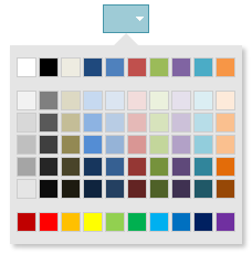
ui.igColorPickerSplitButton
Code Sample
<!DOCTYPE HTML>
<html>
<head>
    <title>Color Picker Split Button Demo</title>

	<!-- Infragistics Combined CSS -->
    <link href="css/themes/infragistics/infragistics.theme.css" rel="stylesheet" type="text/css" />
    <link href="css/structure/infragistics.css" rel="stylesheet" type="text/css" />
    <!-- jQuery Core -->
    <script src="js/jquery.js" type="text/javascript"></script>
    <!-- jQuery UI -->
    <script src="js/jquery-ui.js" type="text/javascript"></script>
    <!-- Infragistics Combined Scripts -->
    <script src="js/infragistics.core.js" type="text/javascript"></script>
    <script src="js/infragistics.lob.js" type="text/javascript"></script>
    <script type="text/javascript">
		$(function () {
			$("#color-picker-split-forecolor").igColorPickerSplitButton({
				items: [{
					name: "textColor",
					label: "Font Color",
					icon: "ui-igbutton-forecolor"
				}],
				defaultItemName: "textColor",
				selectedTextColor: "red"
			});

			$("#color-picker-split-backcolor").igColorPickerSplitButton({
				items: [{
					name: "backgroundColor",
					label: "Background Color",
					icon: "ui-igbutton-backcolor"
				}],
				defaultItemName: "backgroundColor",
				selectedTextColor: "red"
			});
        });
    </script>
    <style>
        body {
            margin-left: 150px;
        }
    </style>
</head>
<body>
    <div id="color-picker-split-forecolor"></div>
    <div id="color-picker-split-backcolor"></div>
</body>
</html>
Dependencies
Inherits
-
defaultColor
- Type:
- string
- Default:
- "#000"
Gets/sets the button default color value.
Code Sample
// Initialize $(".selector").igColorPickerSplitButton({ defaultColor: "rgb(255, 255, 255)"; }); // Get var defaultColor = $(".selector").igColorPickerSplitButton("option", "defaultColor"); // Set $(".selector").igColorPickerSplitButton("option", "defaultColor", "#000"); -
defaultItemName
Inherited- Type:
- string
- Default:
- "button1"
Default button item name.
Code Sample
// Initialize $(".selector").igColorPickerSplitButton({ defaultItemName: "SplitButton", }); // Get var defaultItemName = $(".selector").igSplitButton("option", "defaultItemName"); // Set $(".selector").igSplitButton("option", "defaultItemName", "SplitButton"); -
hasDefaultIcon
- Type:
- bool
- Default:
- true
If this option is set to true, the igColorPickerSplitButton will be rendered with an icon.
Code Sample
// Initialize $(".selector").igColorPickerSplitButton({ hasDefaultIcon: false; }); // Get var defaultIcon = $(".selector").igColorPickerSplitButton("option", "hasDefaultIcon"); -
items
- Type:
- array
- Default:
- []
- Elements Type:
- object
Button items.
Code Sample
// Initialize $(".selector").igColorPickerSplitButton({ items: [{ name: "textColor", label: "Font Color", iconClass: "ui-igbutton-forecolor" }] }); // Get var items = $(".selector").igColorPickerSplitButton("option", "items");-
iconClass
Inherited- Type:
- string
- Default:
- "ui-icon-gear"
Css class to represent the iconClass of the item.
-
label
Inherited- Type:
- string
- Default:
- "Button 1"
Item display label.
-
name
Inherited- Type:
- string
- Default:
- "button1"
Item name.
-
swapDefaultEnabled
Inherited- Type:
- bool
- Default:
- false
Specifies whether the default button will be switched when another button is selected.
Code Sample
            //Initialize
            $(".selector").igSplitButton({
                swapDefaultEnabled: true
            });
            // Get
            var swapDefaultEnabled = $(".selector").igSplitButton("option", "swapDefaultEnabled");
            // Set
            $(".selector").igSplitButton("option", "swapDefaultEnabled", true);
For more information on how to interact with the Ignite UI controls' events, refer to
Using Events in Ignite UI.
-
click
Inherited- Cancellable:
- false
Event fired when the button is clicked.
Function takes arguments evt and ui.
Use ui.item to get a reference the igSplitButton element.Code Sample
//Initialize $(".selector").igSplitButton({ click: function (evt, ui) {...} }); //Delegate $(document).delegate(".selector", "igsplitbuttonclick", function (evt, ui) { // return reference to the igSplitButton element ui.item // return type of the event evt.type }); -
collapsed
Inherited- Cancellable:
- false
Event fired after the button is collapsed.
Function takes arguments evt and ui.
Use ui.owner to get a reference the igSplitButton.Code Sample
//Initialize $(".selector").igSplitButton({ collapsed: function (evt, ui) {...} }); //Delegate $(document).delegate(".selector", "igsplitcollapsed", function (evt, ui) { // return reference to the igSplitButton ui.owner // return type of the event evt.type }); -
collapsing
Inherited- Cancellable:
- true
Event fired before a button item is collapsed.
Function takes arguments evt and ui.
Use ui.owner to get a reference the igSplitButton.Code Sample
//Initialize $(".selector").igSplitButton({ collapsing: function (evt, ui) {...} }); //Delegate $(document).delegate(".selector", "igsplitcollapsing", function (evt, ui) { // return reference to the igSplitButton ui.owner // return type of the event evt.type }); -
expanded
Inherited- Cancellable:
- false
Event fired after the button is expanded.
Function takes arguments evt and ui.
Use ui.owner to get a reference the igSplitButton.Code Sample
//Initialize $(".selector").igSplitButton({ expanded: function (evt, ui) {...} }); //Delegate $(document).delegate(".selector", "igsplitexpanded", function (evt, ui) { // return reference to the igSplitButton ui.owner // return type of the event evt.type }); -
expanding
Inherited- Cancellable:
- true
Event fired before a button item is expanded.
Function takes arguments evt and ui.
Use ui.owner to get a reference the igSplitButton.Code Sample
            //Initialize
            $(".selector").igSplitButton({
                expanding: function (evt, ui) {...}
            });
            //Delegate
            $(document).delegate(".selector", "igsplitexpanding", function (evt, ui) {
                // return reference to the igSplitButton
                ui.owner
                // return type of the event
                evt.type
            });
-
collapse
- .igColorPickerSplitButton( "collapse", e:object );
- Return Type:
- object
- Return Type Description:
- Returns reference to the igColorPickerSplitButton.
Collapse the widget.
- e
- Type:object
Code Sample
$(".selector").igColorPickerSplitButton("collapse"); -
destroy
- .igColorPickerSplitButton( "destroy" );
- Return Type:
- object
- Return Type Description:
- Returns reference to the element the widget was initialized on.
Destroys the widget.
Code Sample
$(".selector").igColorPickerSplitButton("destroy"); -
expand
- .igColorPickerSplitButton( "expand", e:object );
- Return Type:
- object
- Return Type Description:
- Returns reference to the igColorPickerSplitButton.
Expands the widget.
- e
- Type:object
Code Sample
$(".selector").igColorPickerSplitButton("expand"); -
setColor
- .igColorPickerSplitButton( "setColor", color:string );
- Return Type:
- object
- Return Type Description:
- Returns reference to the igColorPickerSplitButton.
Sets the color of the split button.
- color
- Type:string
- The color value to be set.
Code Sample
$(".selector").igColorPickerSplitButton("setColor", "#f12cf0); -
switchToButton
Inherited- .igColorPickerSplitButton( "switchToButton", button:object );
Switch to given igToolbar button.
- button
- Type:object
- . The button jQuery element.
Code Sample
$(".selector").igSplitButton("switchToButton", $element); -
toggle
Inherited- .igColorPickerSplitButton( "toggle", e:object );
- Return Type:
- object
- Return Type Description:
- Returns reference to the curent igSplitButton.
Toggle widget state between collapsed and expanded.
- e
- Type:object
- The igSplitButton to be expanded/collapsed.
Code Sample
$(".selector").igSplitButton( "toggle", e:object ); -
widget
Inherited- .igColorPickerSplitButton( "widget" );
Code Sample
$(".selector").igColorPickerSplitButton("widget");
-
ui-state-active
- The widget base element active css.
-
ui-splitbutton-arrow
- The widget arrow css.
-
ui-corner-left
- The widget left div element css.
-
ui-corner-right
- The widget right div element css.
-
ui-splitbutton ui-widget ui-state-default
- The widget base class css.
-
ui-state-focus
- The widget base element focus css.
-
ui-splitbutton-hover
- The widget base element hover css.