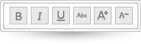
ui.igToolbar
Code Sample
<!DOCTYPE HTML>
<html>
<head>
    <title>Toolbar Demo</title>

	<!-- Infragistics Combined CSS -->
    <link href="css/themes/infragistics/infragistics.theme.css" rel="stylesheet" type="text/css" />
    <link href="css/structure/infragistics.css" rel="stylesheet" type="text/css" />
    <!-- jQuery Core -->
    <script src="js/jquery.js" type="text/javascript"></script>
    <!-- jQuery UI -->
    <script src="js/jquery-ui.js" type="text/javascript"></script>
    <!-- Infragistics Combined Scripts -->
    <script src="js/infragistics.core.js" type="text/javascript"></script>
    <script src="js/infragistics.lob.js" type="text/javascript"></script>
    <script type="text/javascript">
			$(function () {
                $('#toolbar').igToolbar({
                    "name": "textToolbar",
                    "displayName": "text manipulation toolbar",
                    "isExpanded": true,
                    "collapseButtonIcon": "ui-igbutton-collapse",
                    "expandButtonIcon": "ui-igbutton-expand",
                    "items": [{
                        "name": "Bold",
                        "type": "button",
                        "scope": null,
                        "props": {
                            "allowToggling": {
                                "value": true
                            },
                            "isBold": {
                                "value": false,
                                "action": "_isSelectedAction"
                            },
                            "boldButtonTooltip": {
                                "value": "Bold",
                                "action": "_tooltipAction"
                            },
                            "boldButtonIcon": {
                                "value": "ui-igbutton-bold",
                                "action": "_buttonIconAction"
                            }
                        }
                    }, {
                        "name": "Italic",
                        "type": "button",
                        "props": {
                            "isItalic": {
                                "value": false,
                                "action": "_isSelectedAction"
                            },
                            "italicButtonTooltip": {
                                "value": "Italic",
                                "action": "_tooltipAction"
                            },
                            "italicButtonIcon": {
                                "value": "ui-igbutton-italic",
                                "action": "_buttonIconAction"
                            }
                        }
                    }, {
                        "name": "Underline",
                        "type": "button",
                        "props": {
                            "isUnderline": {
                                "value": false,
                                "action": "_isSelectedAction"
                            },
                            "underlineButtonTooltip": {
                                "value": "Underline",
                                "action": "_tooltipAction"
                            },
                            "underlineButtonIcon": {
                                "value": "ui-igbutton-underline",
                                "action": "_buttonIconAction"
                            }
                        }
                    }, {
                        "name": "Strikethrough",
                        "type": "button",
                        "props": {
                            "isStrikethrough": {
                                "value": false,
                                "action": "_isSelectedAction"
                            },
                            "strikethroughButtonTooltip": {
                                "value": "Strikethrough",
                                "action": "_tooltipAction"
                            },
                            "strikethroughButtonIcon": {
                                "value": "ui-igbutton-strikethrough",
                                "action": "_buttonIconAction"
                            }
                        }
                    }, {
                        "name": "increasefontsize",
                        "type": "button",
                        "handler": "_increaseFontSize",
                        "props": {
                            "allowToggling": {
                                "value": false
                            },
                            "isIncreaseFont": {
                                "value": false,
                                "action": "_isSelectedAction"
                            },
                            "increaseFontButtonTooltip": {
                                "value": "Increase Font Size",
                                "action": "_tooltipAction"
                            },
                            "increaseFontButtonIcon": {
                                "value": "ui-igbutton-increasefontsize",
                                "action": "_buttonIconAction"
                            }
                        }
                    }, {
                        "name": "decreasefontsize",
                        "type": "button",
                        "handler": "_decreaseFontSize",
                        "props": {
                            "allowToggling": {
                                "value": false
                            },
                            "isDecreaseFont": {
                                "value": false,
                                "action": "_isSelectedAction"
                            },
                            "decreaseFontButtonTooltip": {
                                "value": "Decrease Font Size",
                                "action": "_tooltipAction"
                            },
                            "decreaseFontButtonIcon": {
                                "value": "ui-igbutton-decreasefontsize",
                                "action": "_buttonIconAction"
                            }
                        }
                    }]
                });
            });
    </script>
    <style>
        #toolbar_collapseButton {
            display: none;
        }
    </style>
</head>
<body>
    <div id="toolbar"></div>
</body>
</html>
Dependencies
Inherits
-
allowCollapsing
- Type:
- bool
- Default:
- true
Get/Set whether the toolbar can be collapsed.
Code Sample
//Initialize $(".selector").igToolbar({ allowCollapsing: true }); // Get var allowCollapsing = $(".selector").igToolbar("option", "allowCollapsing"); // Set $(".selector").igToolbar("option", "allowCollapsing", false); -
collapseButtonIcon
- Type:
- string
- Default:
- "ui-igbutton-collapsed"
The css class that will be applied to collapseButtonIcon.
Code Sample
//Initialize $(".selector").igToolbar({ collapseButtonIcon: "ui-igbutton-collapsed" }); // Get var collapseButtonIcon = $(".selector").igToolbar("option", "collapseButtonIcon"); // Set $(".selector").igToolbar("option", "collapseButtonIcon", "ui-igbutton-collapsed"); -
displayName
- Type:
- string
- Default:
- ""
Display Name of the widget.
Code Sample
//Initialize $(".selector").igToolbar({ displayName: "toolbar" }); // Get var displayName = $(".selector").igToolbar("option", "displayName"); // Set $(".selector").igToolbar("option", "displayName", "toolbar"); -
expandButtonIcon
- Type:
- string
- Default:
- "ui-igbutton-expanded"
The css class that will be applied to the expand/collapse button icon.
Code Sample
//Initialize $(".selector").igToolbar({ expandButtonIcon: "ui-igbutton-expanded" }); // Get var expandButtonIcon = $(".selector").igToolbar("option", "expandButtonIcon"); // Set $(".selector").igToolbar("option", "expandButtonIcon", "ui-igbutton-expanded"); -
height
- Type:
- object
- Default:
- null
Set/Get the widget height.
Code Sample
//Initialize $(".selector").igToolbar({ height: 200 }); // Get var height = $(".selector").igToolbar("option", "height"); // Set $(".selector").igToolbar("option", "height", 150); -
isExpanded
- Type:
- bool
- Default:
- true
Get/Set whether the widget is expanded initially.
Code Sample
//Initialize $(".selector").igToolbar({ isExpanded: true }); // Get var isExpanded = $(".selector").igToolbar("option", "isExpanded"); // Set $(".selector").igToolbar("option", "isExpanded", false); -
items
- Type:
- array
- Default:
- []
- Elements Type:
- object
Get/Set Toolbar's items.
Code Sample
//Initialize $(".selector").igToolbar({ items: [{ "name": "Italic", "type": "button", "props": { "isItalic": { "value": false, "action": "_isSelectedAction" }, "italicButtonTooltip": { "value": "Italic", "action": "_tooltipAction" }, "italicButtonIcon": { "value": "ui-igbutton-italic", "action": "_buttonIconAction" } }, "name": "Italic", "type": "button", "props": { "isItalic": { "value": false, "action": "_isSelectedAction" }, "italicButtonTooltip": { "value": "Italic", "action": "_tooltipAction" }, "italicButtonIcon": { "value": "ui-igbutton-italic", "action": "_buttonIconAction" } } }] }); // Get var items = $(".selector").igToolbar("option", "items"); // Set var items = [{ "name": "Italic", "type": "button", "props": { "isItalic": { "value": false, "action": "_isSelectedAction" }, "italicButtonTooltip": { "value": "Italic", "action": "_tooltipAction" }, "italicButtonIcon": { "value": "ui-igbutton-italic", "action": "_buttonIconAction" } } }]; $(".selector").igToolbar("option", "items", items); -
language
Inherited- Type:
- string
- Default:
- "en"
Set/Get the locale language setting for the widget.
Code Sample
//Initialize $(".selector").igToolbar({ language: "ja" }); // Get var language = $(".selector").igToolbar("option", "language"); // Set $(".selector").igToolbar("option", "language", "ja"); -
locale
- Type:
- object
- Default:
- {}
-
collapseButtonTitle
- Type:
- object
- Default:
- ""
Gets/Sets collapse button title.
Code Sample
//Initialize $(".selector").igToolbar({ locale: { collapseButtonTitle: "Collapse {0}" } }); // Get var text = $(".selector").igToolbar("option", "locale").collapseButtonTitle; // Set $(".selector").igToolbar("option", "locale", {collapseButtonTitle: "Collapse {0}"}); -
expandButtonTitle
- Type:
- object
- Default:
- ""
Gets/Sets expand button title.
Code Sample
				//Initialize
					$(".selector").igToolbar({
					locale: {
							expandButtonTitle: "Expand {0}"
						}
					});

					// Get
					var text = $(".selector").igToolbar("option", "locale").expandButtonTitle;

					// Set
					$(".selector").igToolbar("option", "locale", {expandButtonTitle: "Expand {0}"});
-
name
- Type:
- string
- Default:
- ""
Formal name of the widget.
Code Sample
//Initialize $(".selector").igToolbar({ name: "textToolbar" }); // Get var name = $(".selector").igToolbar("option", "name"); // Set $(".selector").igToolbar("option", "name", "textToolbar"); -
regional
Inherited- Type:
- enumeration
- Default:
- en-US
Set/Get the regional setting for the widget.
Code Sample
//Initialize $(".selector").igToolbar({ regional: "ja" }); // Get var regional = $(".selector").igToolbar("option", "regional"); // Set $(".selector").igToolbar("option", "regional", "ja"); -
width
- Type:
- object
- Default:
- null
Set/Get the widget width.
Code Sample
                //Initialize
                $(".selector").igToolbar({
                    width: 100
                });

                // Get
                var width = $(".selector").igToolbar("option", "width");

                // Set
                $(".selector").igToolbar("option", "width", 100);
For more information on how to interact with the Ignite UI controls' events, refer to
Using Events in Ignite UI.
-
collapsed
- Cancellable:
- false
Event fired after item is collapsed.
Code Sample
/Initialize $(".selector").igToolbar({ collapsed: function (evt, ui) {...} }); //Delegate $(document).delegate(".selector", "igtoolbarcollapsed", function (evt, ui) { //return reference to igToolbar object ui.owner //return type of the event evt.type }); -
collapsing
- Cancellable:
- true
Event is fired before item is collapsed.
Code Sample
//Initialize $(".selector").igToolbar({ collapsing: function (evt, ui) {...} }); //Delegate $(document).delegate(".selector", "igtoolbarcollapsing", function (evt, ui) { //return reference to igToolbar object ui.owner //return type of the event evt.type }); -
expanded
- Cancellable:
- false
Event fired after item is expanded.
Code Sample
//Initialize $(".selector").igToolbar({ expanded: function (evt, ui) {...} }); //Delegate $(document).delegate(".selector", "igtoolbarexpanded", function (evt, ui) { //return reference to igToolbar object ui.owner //return type of the event evt.type }); -
expanding
- Cancellable:
- true
Event fired before item is expanded.
Code Sample
//Initialize $(".selector").igToolbar({ expanding: function (evt, ui) {...} }); //Delegate $(document).delegate(".selector", "igtoolbarexpanding", function (evt, ui) { //return reference to igToolbar object ui.owner //return type of the event evt.type }); -
itemAdded
- Cancellable:
- false
Event fired after item is added.
Code Sample
//Initialize $(".selector").igToolbar({ itemAdded: function (evt, ui) {...} }); //Delegate $(document).delegate(".selector", "igtoolbaritemadded", function (evt, ui) { //return reference to igToolbar object ui.owner //return type of the event evt.type }); -
itemDisable
- Cancellable:
- false
Fired after item is dissabled.
Code Sample
//Initialize $(".selector").igToolbar({ itemDisable: function (evt, ui) {...} }); //Delegate $(document).delegate(".selector", "igtoolbaritemdisable", function (evt, ui) { //return reference to igToolbar object ui.owner //return type of the event evt.type }); -
itemEnabled
- Cancellable:
- false
Fired after item is enabled.
Code Sample
//Initialize $(".selector").igToolbar({ itemEnabled: function (evt, ui) {...} }); //Delegate $(document).delegate(".selector", "igtoolbaritemenabled", function (evt, ui) { //return reference to igToolbar object ui.owner //return type of the event evt.type }); -
itemRemoved
- Cancellable:
- false
Event fired after item is removed.
Code Sample
//Initialize $(".selector").igToolbar({ itemRemoved: function (evt, ui) {...} }); //Delegate $(document).delegate(".selector", "igtoolbaritemremoved", function (evt, ui) { //return reference to igToolbar object ui.owner //return type of the event evt.type }); -
toolbarButtonClick
- Cancellable:
- false
Event fired after a click on any toolbar button.
Code Sample
//Initialize $(".selector").igToolbar({ toolbarButtonClick: function (evt, ui) {...} }); //Delegate $(document).delegate(".selector", "igtoolbartoolbarbuttonclick", function (evt, ui) { //return reference to igToolbar object ui.owner //return type of the event evt.type }); -
toolbarComboOpening
- Cancellable:
- true
Event is fired before the toolbar is opened.
Code Sample
//Initialize $(".selector").igToolbar({ toolbarComboOpening: function (evt, ui) {...} }); //Delegate $(document).delegate(".selector", "igtoolbartoolbarcomboopening", function (evt, ui) { //return reference to igToolbar object ui.owner //return type of the event evt.type }); -
toolbarComboSelected
- Cancellable:
- false
Event fired after toolbar combo is selected.
Code Sample
//Initialize $(".selector").igToolbar({ toolbarComboSelected: function (evt, ui) {...} }); //Delegate $(document).delegate(".selector", "igtoolbartoolbarcomboselected", function (evt, ui) { //return reference to igToolbar object ui.owner //return type of the event evt.type }); -
toolbarCustomItemClick
- Cancellable:
- false
Event fired after a click on custom item.
Code Sample
//Initialize $(".selector").igToolbar({ toolbarCustomItemClick: function (evt, ui) {...} }); //Delegate $(document).delegate(".selector", "igtoolbartoolbarcustomitemclick", function (evt, ui) { //return reference to igToolbar object ui.owner //return type of the event evt.type }); -
windowResized
- Cancellable:
- false
Fired after the window is resized.
Code Sample
                //Initialize
                $(".selector").igToolbar({
                    windowResized: function (evt, ui) {...}
                });

                //Delegate
                $(document).delegate(".selector", "igtoolbarwindowresized", function (evt, ui) {
                    //return type of the event
                    evt.type
                });
-
activateItem
- .igToolbar( "activateItem", index:object, activated:object );
Activate item matching provided index.
- index
- Type:object
- The index of the item.
- activated
- Type:object
- The activate property value.
Code Sample
// Set item to be active $(".selector").igToolbar("activateItem", 0, true); // Set item to be inactive $(".selector").igToolbar("activateItem", 0, false); -
addItem
- .igToolbar( "addItem", item:object );
Add item to widget item array.
- item
- Type:object
- The item to be added.
Code Sample
$(".selector").igToolbar("addItem", { "name": "Italic", "type": "button", "props": { "isItalic": { "value": false, "action": "_isSelectedAction" }, "italicButtonTooltip": { "value": "Italic", "action": "_tooltipAction" }, "italicButtonIcon": { "value": "ui-igbutton-italic", "action": "_buttonIconAction" } } }); -
changeGlobalLanguage
Inherited- .igToolbar( "changeGlobalLanguage" );
Changes the widget language to global language. Global language is the value in $.ig.util.language.
Code Sample
$(".selector").igToolbar("changeGlobalLanguage"); -
changeGlobalRegional
Inherited- .igToolbar( "changeGlobalRegional" );
Changes the widget regional settins to global regional settings. Global regional settings are container in $.ig.util.regional.
Code Sample
$(".selector").igToolbar("changeGlobalRegional"); -
changeLocale
- .igToolbar( "changeLocale" );
-
deactivateAll
- .igToolbar( "deactivateAll" );
Deactivate all buttons.
Code Sample
$(".selector").igToolbar("deactivateAll"); -
destroy
- .igToolbar( "destroy" );
Destroy the widget.
Code Sample
$(".selector").igToolbar("destroy"); -
disableItem
- .igToolbar( "disableItem", index:object, disabled:object );
Disable item matching provided index.
- index
- Type:object
- The index of the item.
- disabled
- Type:object
- The disabled property value.
Code Sample
// Set item to be disabled $('.selector').igToolbar('disableItem', 0, true); // Set item to be not disabled $('.selector').igToolbar('disableItem', 0, false); -
getItem
- .igToolbar( "getItem", index:object );
- Return Type:
- object
- Return Type Description:
- Item with the provided index.
Gets the item by matching the provided index.
- index
- Type:object
- The index of the item.
Code Sample
$(".selector").igToolbar("getItem", 0); -
removeItem
- .igToolbar( "removeItem", index:object );
- Return Type:
- object
- Return Type Description:
- Item with the provided index.
Remove the item matching provided index.
- index
- Type:object
- The index of the item.
Code Sample
$(".selector").igToolbar("removeItem", 0); -
widget
- .igToolbar( "widget" );
Returns the element on which the widget was instantiated.
Code Sample
$(".selector").igToolbar("widget");
-
ig-toolbar-buttons-holder
- The widget toolbar button holder css class.
-
ig-toolbar-separator ui-widget-content
- The widget toolbar separator class css.
-
ui-state-default ui-igbutton-all-caps
- The widget collapse button class css.
-
ui-widget ui-widget-content ui-igtoolbar ui-corner-all
- The widget base class css.
-
ui-widget ui-widget-content ui-igtoolbar ui-corner-all
- The widget wrapper class css.