
This topic explains how to configure the different layouts supported by the igLayoutManger® control.
The following topics are prerequisites to understanding this topic:
igLayoutManager Overview: This topic explains the igLayoutManager control conceptually and provides information on the supported layouts and their uses.
Adding igLayoutManager: This topic demonstrates, with code examples, how to add the igLayoutManager control to an HTML page using either pure HTML, JavaScript, or ASP.MVC implementations.
This topic contains the following sections:
The igLayoutManager control supports several layouts. For a conceptual overview of each layout is and information about what it looks like, refer to igLayoutManager layouts summary chart. Layouts are specified by setting the layoutMode property of the igLayoutManager with an exception of the Column layout which is configured from the HTML markup (See Configuring the Column Layout.). For the valid settings of this property, see Property settings.
The following table lists the valid settings of the layoutMode property of the igLayoutManager control.
| In order to specify this layout: | Set the layoutMode property to: |
|---|---|
| Border | “border” |
| Column | – |
| Flow | “flow” |
| Grid | “grid” |
| Vertical | “vertical” |
Each layout is customizable to a different degree. Some layouts allow for defining items with different sizes and feature fluid and responsive design. The layouts also differ in the required minimum of configuration settings that are needed to make a layout work properly.
The following table explains briefly the configurable layouts of the igLayoutManager control and maps them to the properties that configure them. Further details are available after the table.
| Layout | Configurable aspects | Details | Properties |
|---|---|---|---|
| Border | Visibility of the Footer | You can choose to show or hide the Footer. | |
| Visibility of the Header | You can choose to show or hide the Header. | ||
| Visibility of the Left Sidebar | You can choose to show or hide the Left Sidebar. | ||
| Visibility of the Right Sidebar | You can choose to show or hide the Right Sidebar. | ||
| Relative widths of the Body and the Sidebars | You can adjust the width of the Body, Left Sidebar and Right Sidebar regions relative to each other (Sidebars car grow wider at the expense of the Body and vice versa.). This is achieved by specifying the width of each Sidebar individually. The widths can be set in either pixels or percentages. | ||
| Column | Width of the items’ containers | You can configure how many columns to merge to accommodate the width of an item container. This is achieved by using the CSS class naming convention <colN> where N is the number of the columns to merge. |
Defined through merging the necessary number of columns with that number indicated in the name of the <div> class
|
| Flow | Number of items |
You can specify the number of items to be rendered either through the HTML markup or using the itemCount property.
Note When defining the number of items using the itemCount property, you should not define any items in the markup. Defining items in the markup together with setting the itemCount is an undefined scenario and will result in adding the items defined with itemCount property to those defined in the markup. |
|
| Arrangement of items | The arrangement of items is also customizable. Rather than a grid of items, you can adjust the spacing to create a single line of items along the scrolling dimension. Items can also be of different sizes, which yields something more asymmetrical than a traditional grid but that still has a linear flow to it. | ||
| Grid | Number of rows | The rows count is customizable in this layout. | |
| Number of columns | The number of columns is customizable in this layout. | ||
| Arrangement of items |
Items position can be defined using colIndex and rowIndex options. colIndex defines in which column the item will be placed in.
rowIndexdefines in which row the item will be placed in.
|
||
| Column height | You can set the height of the columns in this layout. | ||
| Column width | You can set the width of the columns in this layout. | ||
| Left margin of the items | You can set the left margin of the items. | ||
| Top margin of the items | You can set the top margin of the items. | ||
| Automatic re-arrangement of items upon container resizing | You can disable the items rearrangement when the container is resized. | ||
| Spread of an items across the rows and columns of the grid | Rows and columns can be spanned across the rows and columns of the grid to accommodate items of different sizes. | ||
| Animated transitions duration | You can also change the animations duration (its default value is 500) and choose if the items should rearrange to fit in the container when it is resized. | ||
| Vertical | Number of items |
You can configure how many items to render. The items will arrange vertically from top to bottom.
You can specify the number of items to be rendered either through the HTML markup or using the itemCount property.
Note When defining the number of items using the itemCount property, you should not define any items in the markup. Defining items in the markup together with setting the itemCount is an undefined scenario and will result in adding the items defined with itemCount property to those defined in the markup. |
The Border layout is configurable through the layoutMode property of the control. The host HTML element of the control is <div> element. Child <div>s can be defined in the HTML markup of the host element, and upon initialization, the control will add the respective HTML elements and CSS classes.
Items are arranged through the respective class for each region. The Tile Manager uses the classes’ names to identify the regions and to position the items. The following table maps the regions to the mandatory class names that implement them.
| Region | Class name |
|---|---|
| Header | header |
| Body | center |
| Footer | footer |
| Left Sidebar | left |
| Right Sidebar | right |
Note: If there are any children that do not have any of the above classes, they will not be used.
The visibility of the Header, Footer, and Sidebars is configurable, as well as the relative width of the Body and the Left Sidebar and Right Sidebars.
The default settings of the Border layout configure it with all regions visible with the width of the Left Sidebar set at 20% of the total container's width and the width of the Right Sidebar – at 10%. To hide some of the regions, you need to set the respective property (showHeader, showFooter, showLeft, showRight) to false.
| In order to: | Use this property: | And set it to: | Required? | Default setting | |
|---|---|---|---|---|---|
| Set the layout as Border layout | layoutMode | border |

|
”column” | |
| Show or hide regions | Display or hide the Header area | showHeader | true or false |

|
true |
| Display or hide the Footer area | showFooter | true or false |
|
true | |
| Display or hide the Left Sidebar area | showLeft | true or false |
|
true | |
| Display or hide the Right Sidebar area | showRight | true or false |
|
true | |
| Set the relative widths of the Body and Sidebars (The widths of the Sidebars are configured directly; the width of the Body is a resultant value of the width of the container minus the widths of the sidebars.) | Set the width of the Left Sidebar | leftWidth | The desired width in pixels or percentages |
|
“20%” |
| Set the width of the Right Sidebar | rightWidth | The desired width in pixels or percentages |
|
“10%” | |
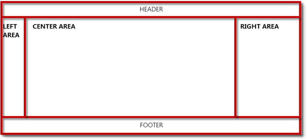
The picture below demonstrates a Border layout with HTML Markup a result of the following settings:
| Property | Value |
|---|---|
| layoutMode | “border” |
| leftWidth | “10%” |
| rightWidth | “20%’ |
Following is the code that implements this example. In the code, custom-created HTML markup is used.
In HTML:
<div id="layout" style="height: 300px;">
            <div class="left">
                  <h3>LEFT SIDEBAR</h3>
            </div>
            <div class="right">
                  <h3>RIGHT SIDEBAR</h3>
            </div>
            <div class="header">HEADER</div>
            <div class="footer">FOOTER</div>
            <div class="center">
                  <h3>BODY</h3>
            </div>
</div>
In JavaScript:
$("#layout").igLayoutManager({ layoutMode: “border”,
         borderLayout: {
            leftWidth: “10%”,
            rightWidth: “20%”
        }
});
The Column Layout is a based on a 12-column grid system in which columns can be merged to accommodate the width of the items. This layout is implemented entirely in CSS so it doesn’t require the igLayoutManager to be instantiated. Its main advantages compared to the other layouts are:
When defining CSS classes, make that all their names are prefixed with an ig class on the container, so that that no other rules get overwritten. The items’ placeholders’ widths are defined through merging the desired number of columns on a particular row. A container can merge up to 12 columns, but the total number of columns merged/occupied by containers on an individual row must be 12. The naming convention of the <div> classes that implement the columns is <colN> where N is the number of columns merged for the class, e.g. col4 means that the placeholder merges over 4 columns while col1 means that the column is not merged, i.e. the placeholder occupies only one column of the grid.
Any number of rows can be nested in other containers marked as <colN>. In this case, the parent container that is marked as <colN> will be divided in 12 columns and the nested rows will calculate their widths according to the width of the parent. This means that if the parent container has a class col6 applied, it will merge six columns of the main container's 12 columns. If you place three rows in this container and each of them has a class col4 applied, then each one of them will merge 2 columns of the main container on the page.
With the Column layout, there is no need to instantiate the igLayoutManager. You can only assign row class to a <div> element and a <colN> class to its children elements. This way, the layout will use the browser width to calculate the widths of the 12 columns. If you want to define the width of the main container yourself, then you should instantiate the igLayoutManager and set its width property.
The picture below demonstrates a Column layout HTML Markup in which 3 items spread over 4 columns each. The paragraphs are wrapped in a <div> element with class col4.

Following is the code that implements this example.
In HTML:
<div id="layout" class="ig-layout-col">
            <div class="row">
                  <div class="col4">
                        <p style="height: 100px; background-color: gray; color: white">
                              Content 1
                        </p>
                  </div>
                  <div class="col4">
                        <p style="height: 100px; background-color: gray; color: white">
                              Content 2
                        </p>
                  </div>
                  <div class="col4">
                        <p style="height: 100px; background-color: gray; color: white">
                              Content 3
                        </p>
                  </div>
            </div>
</div>
The host HTML element of the control is unordered list (UL). List items (LI) can be defined in the HTML markup of the host element, and upon initialization, the control will add the respective CSS classes, or they can be defined as an array of item objects in the control options, and the igLayoutManager will generate the corresponding markup. In order to have the markup as semantic as possible, when items are defined in the options, and not from markup, an unordered list (UL) and list items (LI) are used to render the items.
The following table maps the desired configuration to its respective property settings.
| In order to: | Use this property: | And set it to: | Required? | Default setting | |
|---|---|---|---|---|---|
| Configure Flow layout without HTML markup | Set the layout as Flow layout | layoutMode | flow |
|
“column” |
| Specify the number of items | itemCount | The desired number of items |
|
“null” | |
| or | |||||
| Set the layout as Border layout | layoutMode | flow |
|
“column” | |
| Arrange items and set their size | items | An array of objects |
|
[ ] | |
| Configure Flow layout with HTML markup | Set the layout as Border layout | layoutMode | flow |
|
“column” |
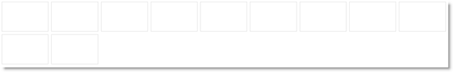
The screenshot below demonstrates layout as flow without HTML Markup a result of the following settings:
| Property | Value |
|---|---|
layoutMode |
“flow” |
itemCount |
11 |
Following is the code that implements this example.
In HTML:
<ul id="layout"></ul>
In JavaScript:
$("#layout").igLayoutManager({
     layoutMode: “flow”,
     itemCount: 11
});
The layout of the igLayoutManager is configured to Grid layout by setting the layoutMode property of the control to “grid”. The Grid layout is a complex of absolutely positioned boxes that allows for merging rows and columns. Initializing this layout from the HTML markup is not supported.
You can specify the number of rows and columns for the grid and the items’ height and width. The latter is configured through the columnHeight and columnWidth properties which serve to set the size of the regular (non-spanning) items (that is, the size of the items that do not span over multiple rows and columns and each of them occupies only one cell in the grid).
When setting columnWidth/columnHeight as *, the width/height will be equally distributed between all of the columns.
When specifying the columnWidth/columnHeight as an array (e.g. ["100px", "20%", "*", "*"]), if you have more than one column set as *, the remaining space will be equally distributed between these columns. If columnWidth is set as an array, its length will override the cols property. And if columnHeight is set as an array, its length will override the rows property.
Custom arrangement of the items is supported through the items property which is set to an array of objects. You can disable the automatic re-arrangement of items upon resizing the container; this gives you some extra control of the user experience.
The following table maps the desired configuration to its respective property settings.
| In order to: | Use this property: | And set it to: | Required? | Default setting |
|---|---|---|---|---|
| Set the layout as Grid layout | layoutMode | “grid” | |
“column” |
| Number and arrangement of items | items | An array of objects | |
[ ] |
| Set the number of columns in the grid | cols | The desired number of columns | |
“nul” |
| Set the height of the items | columnHeight | The desired height of the items in pixels, percentages or *, which will distribute the height equally between all the columns. Also, it accepts an array of heights, if you want to specify different height for each column. The value includes the width of the items' top margin. |
|
“null” |
| Set the width of the items | columnWidth | The desired width of the items in pixels, percentages or *, which will distribute the width equally between all the columns. Also, it accepts an array of widths, if you want to specify different width for each column. The value includes the width of the items' left margin. |
|
“null” |
| Set the number of rows | rows | The desired number of rows in the grid | |
“null” |
| Set the left margin of the items | marginLeft | The desired size in pixels | |
“0” |
| Set the top margin of the items | marginTop | The desired size in pixels | |
“0” |
| Enable/disable the automatic rearrangement of items upon container resizing | rearrangeItems | true or false | |
“true” |
| Set the duration of animations | animationDuration | The desired duration in milliseconds | |
“500” |
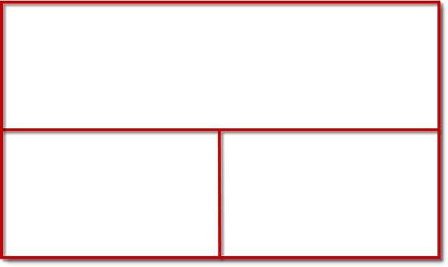
The picture below schematically demonstrates Grid layout configured as a 2x2 grid with an item that spans over two columns on the first row as result of the following settings:
| Property | Value |
|---|---|
| layoutMode | “grid” |
| width | “100%” |
| height | “500px” |
| gridLayout | A JavaScript object |
| items | An array of objects |
Following is the code that implements this example.
In HTML:
<ul id="layout"></ul>
In JavaScript:
$('#layout').igLayoutManager({
    layoutMode: "grid",
    width: "100%",
    height: "500px",
    gridLayout: {
        cols: 2,
        rows: 2
    },
    items: [
          {
              colIndex: 0,
              rowIndex: 0,
                      colSpan: 2
          }, {
              colIndex: 0,
              rowIndex: 1
          }, {
              colIndex: 1,
              rowIndex: 1
          }
    ]
});
The Vertical Layout is configurable through the layoutMode property of the control. The host HTML element of the control is DIV element. Child DIVs can be defined in the HTML markup of the host element, and upon initialization, the control will add the respective CSS classes, or they can be defined as an array of item objects in the control options, and the igLayoutManager will generate the corresponding markup. The number of items is specified through the itemCount property.
The following table maps the desired configuration to its respective property settings.
| In order to: | Use this property: | And set it to: | Required? | Default setting |
|---|---|---|---|---|
| Set the layout as vertical without HTML markup | layoutMode | vertical |
|
“column” |
| itemCount | Desired count of items |
|
“null” | |
| or | ||||
| layoutMode | vertical |
|
“column” | |
| items | Array of objects |
|
[ ] | |
| Set the layout as vertical with HTML markup | layoutMode | vertical |
|
“column” |
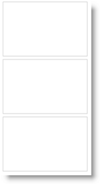
The screenshot below demonstrates layout as vertical without HTML Markup as result of the following settings:
| Property | Value |
|---|---|
| layoutMode | vertical |
| itemCount | 3 |
Following is the code that implements this example.
In HTML:
<ul id="layout"></ul>
In JavaScript:
$("#layout").igLayoutManager({
     layoutMode: “vertical”,
     itemCount: 3
});
The following topics provide additional information related to this topic.
Handling Events(igLayoutManager): This topic explains, with code examples, how to attach event handlers to the igLayoutManager control.
igLayoutManager Accessibility Compliance: This topic explains the accessibility features of the igLayoutManager control and provides information on how to achieve accessibility compliance for pages containing this control.
Known Issues and Limitations (igLayoutManager): This topic provides information about the known issues and limitations of the igLayoutManager control.
jQuery and MVC API Links (igLayoutManager): This topic provides links to the API documentation for the jQuery and its ASP.NET MVC helper class for the igLayoutManager control.
The following samples provide additional information related to this topic.
ASP.NET MVC Basic Usage: This sample demonstrates using the ASP.NET MVC helper for the Layout Manager control.
Border Layout from HTML Markup: This sample demonstrates initializing the igLayoutManager control’s Border layout from the HTML markup by assigning "center"/"left"/"right"/"header"/"footer" CSS classes.
Border Layout – Initializing with JavaScript: This sample demonstrates initializing the igLayoutManager control’s Border layout from JavaScript, by handling itemRendered events and assigning content to the created regions.
Responsive Column Layout: This sample demonstrates how the igLayoutManager control’s Column layout can be used by assigning classes to items thus specifying the area their content will span over. This sample does not use JavaScript initialization code: it is done with CSS and HTML only.
Responsive Flow Layout: This sample demonstrates the responsiveness of the igLayoutManager control’s Flow layout with various item sizes set either in pixels or percentages and setting the number of items in the igLayoutManager's options without the need for any initial markup.
Grid Layout with colspan and rowspan Support: This sample demonstrates the ability of the igLayoutManager control’s Grid layout to allow items to have arbitrary position in a grid with a predefined size including for items with different rowspan and colspan settings.
Grid Layout with Custom Size: This sample demonstrates the igLayoutManager control’s Grid layout having specific width and height for each column.
Responsive Vertical Layout: This sample s demonstrates the responsiveness of the igLayoutManager control’s Vertical layout with various item sizes set either in pixels or percentages and setting the number of items in the igLayoutManager's options without the need for any initial markup.
View on GitHub