
This topic explains, with code examples, how to add the igPopover™ control to an HTML page in either JavaScript or ASP.NET MVC.
The following topics are prerequisites to understanding this topic:
igPopover control and its main features and functionality.This topic contains the following sections:
The igPopover control can be initialized on any DOM element (called “target element”). The igPopover renders it content in nested DIV elements. By default, the content is the title of the target element, but it can also be a hard-coded string, HTML content, or a JavaScript function returning HTML string.
The following table summarizes the requirements for adding the igPopover control.
| Requirement / Required Resource | Description | What you need to do… | ||||
|---|---|---|---|---|---|---|
| jQuery and jQuery UI JavaScript resources | Ignite UI for jQuery™ is built on top of these frameworks: | Add script references to both libraries in the <head> section of your page. | ||||
| igPopover JavaScript resources |
The igPopover functionality of the Ignite UI for jQuery library is distributed across several files. You can load the required resources in one of the following ways:
|
Add one of the following:
|
||||
| IG theme (Optional) | This theme contains the visual styles for the Ignite UI for jQuery library. The theme file is: {IG CSS root}/themes/Infragistics/infragistics.theme.css | |||||
| igPopover structure | The styles from the following CSS file are used for rendering various elements of the control: {IG CSS root}/structure/modules/infragistics.ui.popover.css | Add style reference to the file in your page. |
Note: It is recommended to use the
igLoadercomponent to load JavaScript and CSS resources. For information on how to do this, refer to the Adding Required Resources Automatically with the Infragistics Loader topic. In addition to that, in the online Ignite UI for jQuery Samples Browser, you can find some specific examples on how to use theigLoaderwith theigPopovercomponent.
Following are the general conceptual steps for adding igPopover to an HTML page.
Adding the target HTML element
Adding the igPopover control
This procedure guides you through the steps of adding igPopover with basic functionality to an HTML page using a pure HTML/JavaScript implementation. It uses the Infragistics Loader component to load all Ignite UI for jQuery resources needed by the igPopover control.
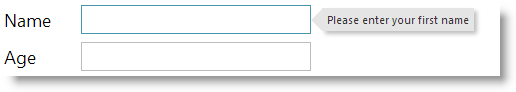
The procedure adds a basic igPopover control with default configuration to an input HTML element. The popover contains the title of the input and shows when the user hovers over the element with the mouse.
The following screenshot is a preview of the final result: the popover displaying as a result of a user action in the UI.
The required resources added and properly referenced. (For a conceptual overview of those resources, see Requirements.) These include:
The required files added to their appropriate locations:
The Ignite UI for jQuery CSS files added to a folder named Content/ig (For details, see the Styling and Theming Ignite UI for jQuery topic).
The Ignite UI for jQuery JavaScript files added to a folder of your web site or application named Scripts/ig (For details, see the Using JavaScript Resources in Ignite UI for jQuery topic).
In HTML:
<script  type="text/javascript" src="Scripts/jquery.js"></script>
<script  type="text/javascript" src="Scripts/jquery-ui.js"></script>
igLoader component referenced on the page.In HTML:
<script type="text/javascript" src="Scripts/ig/infragistics.loader.js"></script>
igLoader component instantiated:In HTML:
<script type="text/javascript">
Following is a conceptual overview of the process:
Adding the target HTML element
Adding the igPopover control
The following steps demonstrate how to add a basic igPopover control in HTML page.
Add the target HTML element.
Add an HTML element to be a target of igPopover.
For this example procedure, add an input HTML element.
In HTML:
<input id=”firstName” type=”text” title=”Please enter your first name” value=””>
Add the igPopover control.
Instantiate the igPopover control.
Add the initialization code to a script element in the HTML page. The initialization code creates igPopover instance targeting the target element created in step 1.
The following code creates an instance of the igPopover control without specifying its options. It targets the input element “firstName” created in step 1.
In JavaScript:
 $.ig.loader(function () {
     //  Create a basic igPopover control
     $("#firstName").igPopover();
 });
This procedure guides you through the steps of adding igPopover with basic functionality to an ASP.NET MVC View. The procedure uses the ASP.NET MVC syntax together with the required Loader configuration.
The procedure adds a basic igPopover control with default configuration
to an input HTML element. The popover contains the title of the input
and shows when the user hovers over the element with the mouse.
The following screenshot is a preview of the final result: the popover displaying as a result of a user action in the UI.
To complete the procedure, you need the following:
The required resources added and properly referenced. (For a conceptual overview of those resources, see Prerequisites.) These include:
The required files added to their appropriate locations:
The Ignite UI for jQuery CSS files added to a folder named Content/ig (For details, see the Styling and Theming Ignite UI for jQuery topic).
The Ignite UI for jQuery JavaScript files added to a folder of your web site or application named Scripts/ig (For details, see the Using JavaScript Resources in Ignite UI for jQuery topics).
In HTML:
<script  type="text/javascript" src="Scripts/jquery.js"></script>
<script  type="text/javascript" src="Scripts/jquery-ui.js"></script>
igLoader component referenced on the page.In HTML:
<script type="text/javascript" src="Scripts/ig/infragistics.loader.js"></script>
igLoader component instantiated in ASP.NET view:In HTML:
@(Html.Infragistics()
     .Loader()          .ScriptPath("http://localhost/ig_ui/js/")
     .CssPath("http://localhost/ig_ui/css/")
     .Render()
)
Following is a conceptual overview of the process:
Adding the target HTML element
Adding the igPopover control
The following steps demonstrate how to add a basic igPopover control to an ASP.NET MVC application.
Add the target HTML element.
Add an HTML element to be a target of the igPopover.
For this example procedure, add an HTML input element.
In HTML:
<input id=”firstName” type=”text” title=”Please enter your first name” value=””>
Add the igPopover control.
Add the configuration for Ignite UI for MVC Popover to your ASP.NET MVC View.
The following code creates an instance of the igPopover control without specifying its options. It targets the input element “firstName” created in step 1.
In ASPX:
 @(Html.Infragistics().Popover()
         .ID(“firstName”)
         .Render()
    )
The following topics provide additional information related to this topic.
Handling Events (igPopover): This topic explains the events of the igPopover control and provides code examples of attaching event handlers.
Configuring igPopover: This topic explains how to configure the content, activation, and positioning of the igPopover control.
Styling igPopover: This topic explains, with code examples, how to configure the look-and-feel of the igPopover control using CSS. This includes setting the background color of the content, the visibility and color of the pointer, the color of the header and the appearance of the Close button.
Accessibility Compliance (igPopover): This topic explains the accessibility features of the igPopover control and provides information on how to achieve accessibility compliance for pages containing this control.
Known Issues and Limitations (igPopover):This topic provides information about the known issues and limitations of the igPopover control and the available workarounds for them.
jQuery and MVC API Links (igPopover): This topic provides links to the API reference documentation for the jQuery and its ASP.NET MVC helper class for the igPopover control.
The following samples provide additional information related to this topic.
Basic Usage: This sample demonstrates the basic initialization scenarios (on a single target element and on multiple target elements) of igPopover in JavaScript.
ASP.NET MVC Basic Usage: This sample demonstrates the igPopover control in an ASP.NET MVC scenario. The control is initialized in the View using chaining syntax.
View on GitHub