
This topic provides an overview of the igPopover™ control and its main features and functionality.
This topic contains the following sections:
The igPopover control is a pop-up window functioning as a browser tooltip: it displays over a DOM element that provides context information about it.
The igPopover control is designed to be used as an enhanced replacement of browser tooltips and cannot work as a standalone window. Its content and display are dependent on the target element on which it is initialized.
The igPopover can has a wide range of uses, like providing context menus, tables, images, dynamic content, etc.(See the picture below).
igPopover is implemented similar to the browser tooltip: it adds small overlays of content to any element for housing secondary information. Unlike the tooltip however the popover gives you the flexibility to configure its content, activation, position.
The igPopover control’s positioning and activation (the event on which it displays) are configurable. igPopover can display on mouse-over, click, or when the target element gets the focus.
The look-and-feel of the popover is configurable through CSS styles.
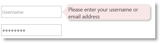
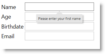
The igPopover control is implemented as an overlay container of any DOM element (called “target element”). This container displays the “title” attribute of the DOM element by default, but it can be configured display content in the form of a hard-coded string, HTML content, or JavaScript function returning HTML content.
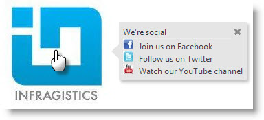
The following screenshot demonstrates a popover displayed over an image element (the Infragistics® logo) as the user points with it with the mouse. The popover here works as a context menu from which user can select an option. The used can also close the popover with the close button.
igPopover control is implemented close to the browser tooltip – it adds small overlays of content to any element for housing secondary information. Unlike the tooltip however the popover gives you the flexibility to configure its content, activation, position.
igPopover is supported on touch-enabled devices.
The following screenshot depicts the visual elements of the igPopover control. The configurable elements are listed after the image.
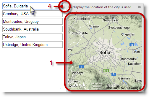
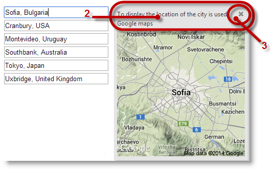
1 – Body
2 – Header
3 – Close button
4 – Pointer
The following table maps the visual elements of the igPopover control and the properties that configure them.
| Visual Element | Property |
|---|---|
| Body | contentTemplate |
| Header | headerTemplate.title |
| Close button | headerTemplate.closeButton |
The following table summarizes the main features of the igPopover control. Additional details are available after the summary table.
| Feature | Description |
|---|---|
| Configurable positioning | The direction and the position in which the popover shows relative to the target element is configurable. |
| Custom content | The popover can be set to display custom HTML content. Optionally, you can configure a header for the popover. |
| Configurable activation | You can control the event on which the popover to be shown. |
| Single/multiple targets | You can configure the popover display over multiple targets. Using the option selectors, can specify which elements should display popovers. |
| Touch support | The control is fully functional in touch environment. The only limitation is that you cannot configure the activation event: on touch devices the popover always shows on tap no matter what event has been set as activating. |
| Configurable look-and-feel | The styling of the igPopover control relies entirely on CSS classes. To change the look-and-feel of the popover, you need to override the classes on which the popover elements depend. |
The popover can be displayed on different side of the target element.
The side of the target on which the popover is displayed is called “direction” and is configured by setting the direction option.
If the popover is smaller than the target element, it always displays in the middle of the visible area of the target DOM element.
If the popover is larger than the target you can further configure its position along of the target DOM element. This is done with the position option.
In addition to that you can further restrict the positioning by providing a container (DIV element for example) whose boundaries serve to restrict the area within which the popover can be shown. The restricting area where the popover should be shown is configurable through the containment for the popover.
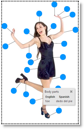
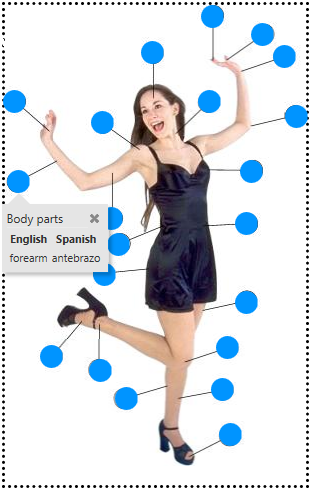
The following picture demonstrates a popover configured to display the name of the body parts in English and Spanish when you mouse-over the target circles. The popover is configured to display beneath the target element. However, because the popover has been restricted to display only inside the DIV container (indicated by dotted borders) and because for that particular element at the bottom there is not enough space for the popover to show beneath it, the containment rule kicks in and it displays above the target element.
By default, the igPopover control’s body displays the title of the target element, but you can set it to a hard-coded string, HTML content, or JavaScript function returning HTML content.
You can also configure the header of the widget igPopover. It can be only a text string is and is applicable mainly when you want a common header over multiple targets for the same popover (The body content will be different, but the header title stays the same).
In addition to that, you can have a close button in the header. The position of the button along the header is configurable.
You can control the event on which the popover to be shown. This is managed with the showOn option. The user actions on which igPopover can be activated are:
You can configure the popover display over multiple targets. Using the selectors option you can specify on which elements the popovers should appear.
In the illustration below, there are multiple anchor targets represented by image elements (the blue circles). The popover changes its content according the current target to display the name of the particular body part associated with the particular circle.
The styling of the igPopover control relies entirely on CSS classes. To change the look-and-feel of the popover, you need to override the classes on which the popover elements depend. The illustration below demonstrates a sample styling of the igPopover control (rounded corners of the main popover container and changed background color.)
The igPopover control is functional with its defaults settings, but if you want to customize its default behavior and appearance, there is a set of properties with which you can configure the header and the body of the control. You can also manage the activation of the popover (the triggering event), the dimensions, the positioning and the display of the pointer arrow.
The following table explains briefly the configurable aspects of the igPopover control and maps them to the properties that configure them. The aspects about which further details are available in this help as code examples, are highlighted in green in the table.
| Configurable aspect | Details | Properties | |
|---|---|---|---|
| Content | Header | The header is configurable. The title of the header may be HTML string or empty. In the latter case, the header is not displayed. The header can optionally render a Close button. | |
| Body |
The body of the igPopover content can be customized.
It can be :
|
||
| Target |
By default, igPopover is initialized over a single element. Multiple targets can be configured by setting them in theselectors
option.
|
||
| Activation | The event on which the popover is shown is configurable. | ||
| Positioning | Direction | The position of the popover relative to the target element. The direction is the side of the target where the popover container will be shown. | |
| Position | The position of the popover relative to the target element in case the popover is larger than the target. If the popover is smaller, it will always be shown in the middle of the visible area. | ||
| Containment | Containment works by specifying an object (like DIV container, for example) whose boundaries will serve to restrict the area within which the popover can be shown. | ||
| Size and dimensions | The container of the popover can have a defined width and height; if it hasn’t maximum width and height can be set. | ||
| Pointer |
The size and the color of the popover pointer arrow are configurable. The pointer has no options, it is managed through CSS classes:
|
||
By default, igPopover displays only the body content which is set to the title attribute of the target element. The header of the control is not shown.
By default, igPopover activates on mouse hover over the target element.
Note: On touch-enabled devices, activation cannot be configured.
The direction and position in which the popover shows relative to the target element are also configurable.
By default the popover is positioned at the bottom part of the target element in the middle of this part. If no place is available at the bottom, the order of the display directions is bottom > right > top > left.
For a listing of igPopover‘s default property settings, refer to the igPopover Property Reference topic.
The following topics provide additional information related to this topic.
Adding igPopover: This topic explains, with code examples, how to add the igPopover control to an HTML page in either JavaScript or ASP.NET MVC.
Configuring igPopover: This topic explains how to configure the features and behavior of the igPopover control.
Handling Events (igPopover): This topic explains the events of the igPopover control and provides some code examples of their use.
Styling igPopover: This topic explains, with code examples, how to configure the look-and-feel of the igPopover control using CSS. This includes setting the background color of the content, the visibility and color of the pointer, the color of the header, and the appearance of the Close button.
Accessibility Compliance (igPopover): This topic explains the accessibility features of the igPopover control and provides information on how to achieve accessibility compliance for pages containing this control.
Known Issues and Limitations (igPopover): This topic provides information about the known issues and limitations of the igPopover control and the available workarounds for them.
jQuery and MVC API Links (igPopover): This topic provides links to the API reference documentation for the jQuery and its ASP.NET MVC helper class for the igPopover control.
Property Reference (igPopover): This topic explains the properties of the igPopover control and lists their default values.
The following samples provide additional information related to this topic.
Basic Usage: This sample demonstrates the basic initialization scenarios (on a single target element and on multiple target elements) of igPopover in JavaScript.
ASP.NET MVC Usage: This sample demonstrates the igPopover control in an ASP.NET MVC scenario. The control is initialized in the View using chaining syntax.
View on GitHub