This topic provides a brief overview on how to style the series of the igDataChart™ control and demonstrates, as an example, how to apply drop-shadow effect to the series.
The following topics are prerequisites to understanding this topic:
This topic demonstrates how to add the igDataChart control to a page and bind it to data.
This topic contains the following sections:
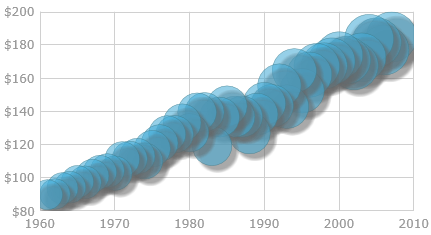
The igDataChart's series can be styled in many aspects, the main of which are applying different fill and outline brushes to the series. This is managed by the brush and outline properties of the series. Some other aspects of the series’ look-and-fill, such as the thickness of the outline and the opacity of the series, are configurable, too through the thickness and areaFillOpacity properties of the series.
In addition to managing the styling described above, drop-shadow effect can be applied to the chart series by setting the isDropShadowEnabled property.
The linear gradient effect is achieved, by setting the type of the brush or outline to "linearGradient" and providing an array of colorStops (at least two) with color and offset for each.
The following sample defines the chart configuration needed to achieve that effect:
With the drop-shadow effect, the series appear as if casting a shadow.
Applying the drop-shadow effect to the series is done by setting the isDropShadowEnabled property of the series to “true”. Customization of the effect in terms of configurable shadow type, blur radius, color, direction, and opacity is supported through the respective shadow-related properties of the series (See Drop-shadow effect configuration summary chart, Property settings, and the examples.).
Two types of shadows are available for the drop-shadow effect depending on whether the fill shape and the outline shape of a series cast separate shadows each or the series cast single monolith shadow:
The default schedule type is Monolith. The benefit of using the Compound shadow type is in the capability to visually fine-tune the drop-shadow effect.
Note: Currently, blur can be applied only to Compound shadows. For details on this limitation, see this note.
The shadow type is controlled by the useSingleShadow property. When this property is set to “true” (default), Monolith shadow is applied; when set to “false”, the shadow will be Compound.
The following table explains briefly the configurable aspects of the chart drop-shadow effect and maps them to properties that configure them. The default drop-shadow effect styling differs depending on the series type. Further details and examples about configuring the shadow type after the table.
The following table lists the configurable aspects of the drop-shadow effect to their respective property settings.
| In order to configure: | Use this property: | And set it to: | |
|---|---|---|---|
| Drop-shadow effect to be used | isDropShadowEnabled | “true” | |
| The type of the shadow | useSingleShadow | “true” or “false” | |
| The color/opacity of the shadow | shadowColor | The desired color HTML name, HEX color code or RGBA color definition | |
| The direction and offset | The horizontal offset of the shadow from the series visual | shadowOffsetX | A double value indicating the offset in pixels |
| The vertical offset of the shadow from the series visual | shadowOffsetY | A double value indicating the offset in pixels | |
| The blur level | shadowBlur |
The desired pixel double value representing the blur level. The higher the value, the blurrier the shadow.
Note: Monolith shadows do not allow for the blur effect to be applied to them: when the useSingleShadow property is set to “true”, the shadowBlur setting is disregarded and no blur is applied to the shadow. This is a deliberate limitation due to a Google® Chrome™ bug and extended to all major browsers thus ensuring consistent behavior across all of them. This behavior is subject to change once the aforementioned Chrome issue is resolved. In the meantime, if you need to apply blur to the shadow, use the Compound type of shadow (useSingleShadow:"true"). |
|
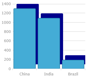
This example demonstrates applying and styling a Monolith drop-shadow. Since the useSingleShadow property is "true" by default, setting it explicitly in the code is not necessary.
The screenshot below demonstrates how a line series in an igDataChart control looks as a result of the following shadow-related settings:
| Property | Value |
|---|---|
| isDropShadowEnabled | true |
| shadowBlur | 20 |
| shadowColor | "darkBlue" |
| shadowOffsetX | 10 |
| shadowOffsetY | -15 |
Following is the code that implements this example.
In JavaScript:
series: [
    {
        type: "column",
        isDropShadowEnabled: true,
        shadowBlur: 20,
        shadowColor: "darkBlue",
        shadowOffsetX: 10,
        shadowOffsetY: -15
    }
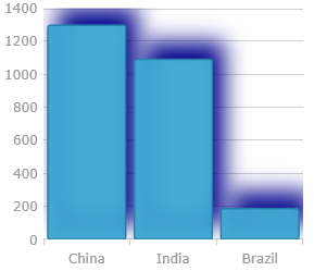
This example demonstrates applying a Compound drop-shadow with a blur.
The screenshot below demonstrates how a column series in a igDataChart control looks as a result of the following shadow-related settings:
| Property | Value |
|---|---|
| isDropShadowEnabled | true |
| useSingleShadow | false |
| shadowBlur | 20 |
| shadowColor | “darkBlue” |
| shadowOffsetX | 10 |
| shadowOffsetY | -15 |
Following is the code that implements this example.
In JavaScript:
series: [
    {
        type: "column",
        isDropShadowEnabled: true,
        useSingleShadow: false,
        shadowBlur: 20,
        shadowColor: "darkBlue",
        shadowOffsetX: 10,
        shadowOffsetY: -15,
      }
The following topics provide additional information related to this topic.
Styling igDataChart: This topic demonstrates how to apply styles and themes to the igDataChart control.
General information and a procedure for updating styles and themes in Ignite UI for jQuery™ library.
View on GitHub