
This topic demonstrates how to configure the igDialog™ so that it can be pinned and unpinned and how to perform these actions.
The following topics are prerequisites to understanding this topic:
igDialog Overview: The topic introduces the user to the igDialog control’s main features.
Adding igDialog: This topic demonstrates how to add the igDialog control to a web page.
This topic contains the following sections:
When the igDialog is pinned, then the whole control with its HTML content is moved to the original container and the dialog’s absolute position is removed. Pinned igDialog does not support modal and maximized states and it is not movable.
Note: If the parent element of the original
igDialogcontainer is invisible, then when dialog is pinned it also becomes invisible.
The following table lists the configurable aspects of the igDialog control. Additional details are available after the table.
| Configurable aspects | Details | Properties and Methods |
|---|---|---|
| Configuring pin/unpin | The properties that need to be configured to allow pin and unpin of the igDialog using control UI. | |
| Pin on minimized | The property that allows you to configure the igDialog so that when the state is changed to minimized, it becomes pinned to its parent. | pinOnMinimized |
| Pin igDialog | Method from igDialog API that allows pinning. | pin() |
| Unpin igDialog | Method from igDialog API that allows unpinning. | unpin() |
The table below demonstrates which properties need to be configured in order to pin the igDialog control. Setting showPinButton property will enable the pin icon in the header, while setting the pinned property will configure the initial state of the control.
The following table maps the desired functionality to property settings:
| In order to: | Use this property: | And set it to: |
|---|---|---|
| Show pin button | showPinButton | true |
| Pin the igDialog | pinned | true |
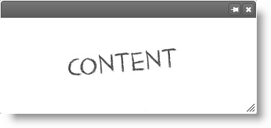
The screenshot below demonstrates how the igDialog looks as a result of the settings above. The window will be pinned at the top left corner of its parent:
The igDialog is configured so that it will pin every time it is minimized. For the needs of this example, the igDialog is minimized when configured.
The following table maps the desired functionality to the property settings:
| In order to: | Use this property: | And set it to: |
|---|---|---|
| Pin on minimize | pinOnMinimized | true |
| Minimize igDialog | state | “minimized” |
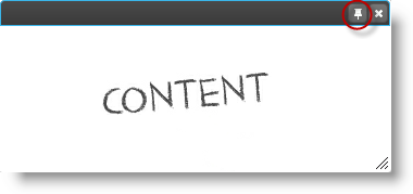
The screenshot below demonstrate how the igDialog looks as a result of the settings above. The window will be minimized and pinned at the top left corner of its parent:
As a result of the configuration from the previous paragraph, you will be able to pin the dialog window when the window is unpinned and by pressing the button at the top right corner of the header. If you have the showPinButton option disabled, then you can pin the control using its API.
The following code demonstrates how to pin the igDialog using its API:
In JavaScript:
$('#igDialog).igDialog("pin");
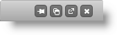
The screenshot below shows you the position of the pin button:
As a result of the configuration from the previous paragraph, you will be able to unpin the dialog window, when the window is pinned and by pressing the button at the top right corner of the header. If you have the showPinButton option disabled, then you can unpin the control using its API.
The following code demonstrates how to unpin the igDialog using its API:
In JavaScript:
$('#igDialog).igDialog("unpin");
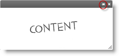
The screenshot below shows you the position of the unpin button:
The following topics provide additional information related to this topic:
igDialog Overview: The topic introduces the user to the igDialog control’s main features.
Adding igDialog: This topic demonstrates how to add the igDialog control to a web page.
The following samples provide additional information related to this topic:
igDialog icons.View on GitHub