
This topic demonstrates the different approaches of styling the igDialog™.
The following topics are prerequisites to understanding this topic:
igDialog Overview: The topic introduces the user to the igDialog control’s main features.
Adding igDialog: This topic demonstrates how to add the igDialog control to a web page.
This topic contains the following sections:
The following table lists the configurable aspects of the igDialog control that will allow style modification. Additional details are available after the table.
| Configurable aspects | Details | Related topics or sections |
|---|---|---|
Style the igDialog through control properties |
The properties that need to be configured so that the igDialog changes its appearance. |
igDialog Header and Footer |
Style and theme the igDialog through CSS Classes |
Override the basic igDialog classes and create your own theme for the dialog. |
CSS Class Reference (igDialog) |
Style the igDialog using the jQuery Theme Switcher |
Use the jQuery Theme Switcher to easily customize the igDialog control. |
Style using jQuery Theme Switcher |
Using the jQuery Theme Switcher is an easy way to style the igDialog control. This is possible because the igDialog CSS class naming follows the jQuery UI CSS Framework naming convention.
The following code shows you how to initialize the jQuery Theme Switcher. You do not need to make additional configurations on the igDialog; the Theme Switcher will replace CSS rules automatically.
$("#themeSwitcher").themeswitcher();

<div id="themeSwitcher"></div>
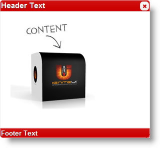
The screenshot below demonstrates the igDialog styled with Blitzer theme.
The following topics provide additional information related to this topic:
igDialog control’s main features.igDialog control to a web page.igDialog footer and header and how to customize them.igDialog™ control’s CSS classes.The following samples provide additional information related to this topic:
igDialog icons.View on GitHub