
This topic explains how to customize the look-and-feel of the igFunnelChart™ control.
The following table lists the concepts and topics required as a prerequisite to understanding this topic.
igFunnelChart control including its main features, minimum requirements, and user functionality. igFunnelChart control to an HTML page and bind it to data.This topic contains the following sections:
The igFunnelChart control allows developers to create easily funnel chart in applications or web sites. The igFunnelChart control uses the jQuery UI CSS Framework for the purposes of applying styles and themes. By default, the igFunnelChart uses the IG theme which is a jQuery UI theme provided by Infragistics® for use in your applications. In addition to that, the IG theme has some specific styles that support funnel charts. This is needed because, for the purpose of customizing the look and feel of funnel charts, a general jQuery UI theme would not be sufficient. You must provide additional styles classes for altering elements specific to funnel charts like tooltips, and slices.
Detailed information about using themes with Ignite UI for jQuery library is available in the Styling and Theming Ignite UI for jQuery topic.
Note: The base theme of Ignite UI for jQuery is unnecessary for charts and may be omitted on pages that contain only charts.
Ignite UI for jQuery offers the following themes for use with the igFunnelChart control:
Refer to the summary chart below for a detailed explanation.
The following table summarizes the themes available with the igFunnelChart.
| Theme | Description |
|---|---|
IG 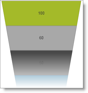 |
Path: <IG CSS root>/themes/infragistics/ File: infragistics.theme.css This theme defines general visual features for all Ignite UI for jQuery controls. Detailed information for using the IG theme is available in the Styling and Theming Ignite UI for jQuery topic. |
Metro 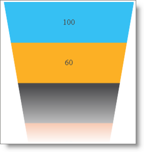 |
Path: <IG CSS root>/themes/metro/ File: infragistics.theme.css This theme defines visual features with regard to the new Windows® 8 user interface and touch enabled devices. It features sharp corners and some different colors for slices. |
The following CSS resources are necessary to correctly render funnel charts:
infragistics.theme.css – contains the IG Theme
infragistics.ui.chart.css – contains the Chart Structure classes
The following code snippets assume that the CSS resources reside in the Content/ig folder below the web site/application root.
Note: The following blocks provide information on manually including required CSS files; however, we recommend using the Infragistics Loader control to load these files into your page.
In HTML:
Required CSS resources code: HTML
<link href="Content/ig/themes/Infragistics/infragistics.theme.css" rel="Stylesheet" />
<link href="Content/ig/structure/modules/infragistics.ui.chart.css" rel="Stylesheet" />
In ASPX:
Required CSS resources code: MVC
<link href='@Url.Content("~/Content/ig/themes/Infragistics/infragistics.theme.css")'
      rel="stylesheet" type="text/css" />
<link href='@Url.Content("~/Content/ig/structure/modules/infragistics.ui.chart.css")'
      rel="stylesheet" type="text/css" />
The following table summarizes the purpose and functionality of the style classes used in the igFunnelChart control.
| Property | Description |
|---|---|
.ui-chart-palette-1 to .ui-chart-palette-N |
Sets border and background color for slices from 1 to N. You can have as many ui-chart-palette classes as needed by your application. |
.ui-funnel |
Sets basic settings for the entire funnel chart like font, font size and other. |
.ui-funnel-tooltip |
Sets all styling options for chart tooltips. |
.ui-funnel-slice |
Sets styling options for a slice. Used when there are either no selected slices or the useUnselectedStyle option is false. |
.ui-funnel-slice-selected |
Sets styling options for a selected slice. |
.ui-funnel-slice-unselected |
Set styling options for an unselected slice, used when there are other selected slices and the useUnselectedStyle option is true. |
The igFunnelChart control is all about visual content and has a lot of properties and styling options for changing a charts layout and colors. Use CSS to define:
With individual funnel chart control options you can define:
The following reference table catalogs all options for changing chart element colors and their purpose. When set, funnel chart options have precedence over style classes defined in CSS files. These options provide programmatic runtime changes to the rendering of charts.
The following table summarizes the purpose and functionality of the igFunnelChart control’s styling properties.
| Property | Description |
|---|---|
| brushes | Defines the palette for selecting automatically assigned slice colors. |
| outlines | Defines the palette for automatically assigned slice outline colors. |
| outlineThickness | Defines the thickness of slices’ outlines. |
The following table lists the code examples included in this topic.
| Example | Description |
|---|---|
| Configuring Inner and Outer Label Templates | This code example shows how to configure templates for inner and outer labels in a funnel chart. |
| Configuring Slice Colors by CSS | This code example shows how to customize slice colors by overriding CSS resources governing slice look and feel. |
| Configuring Slice Colors by Control Options | This code example shows how to customize slice colors by changing funnel chart options controlling slice look and feel. |
This code example shows how to configure funnel chart templates for inner and outer labels by defining and invoking callback functions for each slice on the chart. The callback functions pass with arguments enabling considerable flexibility in creating a suitable label. The functions must return a string which is drawn on the chart.
The following code snippet demonstrates how to configure callback functions for inner and outer labels in a funnel chart. The functions perform string manipulation on the input arguments and return a string that appears on the chart as a label for the corresponding slice.
In JavaScript:
$("#funnelChart").igFunnelChart({
    . . .
    formatInnerLabel: function (value, sliceNo, chart) {
        return "$" + value + " million";
    },
    formatOuterLabel: function (value, sliceNo, chart) {
        return "Division: " + value;
    }
});
| Argument | Description |
|---|---|
value |
Contains the value bound to the current slice from the data source passed to the chart. |
sliceNo |
Contains the index of the slice within the data source bound to the chart. |
chart |
Contains a reference to the chart widget. |
This code example shows how to customize slice colors by overriding CSS styles governing slice look and feel.
The following code snippet overrides multiple igFunnelChart styles. It redefines background and outline colors for the first six slices and sets both the selected and unselected slice styles.
In HTML:
<style type="text/css">
    /* Redefine the styles from infragistics.theme.css that define fill and border colors for slices */
    .ui-chart-palette-1 { border-color: #00AADE; background-color: #00AADE }
    .ui-chart-palette-2 { border-color: #4B4B4D; background-color: #4B4B4D }
    .ui-chart-palette-3 { border-color: #FCB025; background-color: #FCB025 }
    .ui-chart-palette-4 { border-color: #EC6C2B; background-color: #EC6C2B }
    .ui-chart-palette-5 { border-color: #36C0F3; background-color: #36C0F3 }
    .ui-chart-palette-6 { border-color: #5B17A8; background-color: #5B17A8 }
    /* Redefine slice selected and unselected styles */
    .ui-funnel-slice-selected { opacity: 1; }
    .ui-funnel-slice-unselected { opacity: 0.4; border: 1px solid black; }
</style>
This code example shows how to customize slice colors by changing the funnel chart options controlling look and feel of the slice. When configuring the brushes, outlines and outlineThickness options this configuration takes precedence over CSS for the corresponding visual elements.
The code example below shows how to configure custom colors for slice backgrounds and outlines. The example only provides the essential code for brushes, outlines and outlineThickness omitting all other igFunnelChart configurations.
In JavaScript:
$("#funnelChart").igFunnelChart({
    . . .
    brushes: ["#7DC3D9", "#3e5354", "#9EB5B4", "#5DD1C6", "#AFD1CE", "#2B768E"],
    outlines: [ "#3189A6", "#212D2E", "#5C7877", "#2FA498", "#487D78", "#163F4B" ],
    outlineThickness: 3
});
The following topics provide additional information related to this topic.
Binding igFunnelChart to Data: This topic explains how to bind the igFunnelChart control to various data sources.
Configuring igFunnelChart: This topic explains how to configure different visual features and behavior of the igFunnelChart control.
Styling igFunnelChart: This topic explains how to customize the look-and-feel of the igFunnelChart control.
Accessibility Compliance (igFunnelChart): This topic explains the igFunnelChart control’s accessibility features and provides advice on how to achieve accessibility compliance for pages containing charts.
Known Issues and Limitations (igFunnelChart): This topic lists the known issues related to the igFunnelChart control.
jQuery and MVC API Links (igFunnelChart): This topic lists the links to the API reference documentation for the igFunnelChart control.
The following sample provides additional information related to this topic.
sliceClicked event.The following material (available outside the Infragistics family of content) provides additional information related to this topic.
View on GitHub