
This topic explains how to configure in code the columns of the igGrid™ control.
This topic contains the following sections:
The table bellows lists the required background you need for fully understanding the information in this topic.
The table below lists the configurable behaviors of the igGrid control columns. These behaviors are managed through the properties of the columnSettings option of the control. For some of the behaviors/features, detailed explanations and examples are provided in the blocks following the chart.
Note: In the following table, the propertis and methods specific to the Hiding Column Chooser are not listed. They are available in the Hiding Column Chooser topic.
| Configurable behavior/feature | Configuration details | Configuration properties |
|---|---|---|
| Hiding a Column by Default | A column is hidden upon grid initialization. | hidden |
| Hiding a Column Completely | A column is hidden upon grid initialization with no user options to be displayed. | allowHiding |
| Enabling column hiding | Allows hiding the column by the user. | allowHiding |
| Width of the Hidden Column Indicator | The width in pixels of the hidden column indicator in the header | hiddenColumnIndicatorHeaderWidth |
| Configuring the Column Chooser | The default column chooser width in pixels | columnChooserWidth |
| Configuring the Column Chooser | The default column chooser height in pixels. | columnChooserHeight |
| Duration of the drop-down animation | The duration of the dropdown animation in milliseconds. | dropDownAnimationDuration |
| Showing/hiding Drop-down button. | The visibility of the footer button. | showDropDownButton |
| Configuring the Column Chooser | Text of the caption of the column Chooser window. | columnChooserCaptionText |
| Configuring the Column Chooser | The caption of the the drop-down tools menu (Feature Chooser). | columnChooserDisplayText |
| Tooltip text | The text displayed in the tooltip of the hidden column indicator. | hiddenColumnIndicatorTooltipText |
| Configuring the column key | The column key. This is the preferred column identifier. | columnKey |
| Configuring the column index | Column index. Can be used in if no column key has been set. | columnIndex |
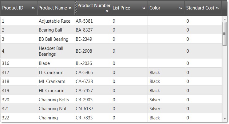
In the picture below, the Reorder Point column is hidden on initialization.
The table below maps the desired configurations to property settings. The properties are accessed through the igGridHiding options.
| Property | Setting |
|---|---|
| columnKey | ReorderPoint |
| allowHiding | true |
| hidden | true |
In JavaScript:
<script type="text/javascript">
$(function () {
    $("#grid1").igGrid({
        autoGenerateColumns: true,
        dataSource: adventureWorks,
        responseDataKey: 'Records',
        features: [
        {
            name: 'Hiding',
            columnSettings: [
                {columnKey: 'ReorderPoint', allowHiding: true, hidden: true}
            ]
        }
    });
});
</script>
In Razor:
@(Html.Infragistics().Grid(Model)
    .AutoGenerateColumns(true)
    .Features(feature =>{
        feature.Hiding().ColumnSettings(settings =>    settings.ColumnSetting()
        .ColumnKey("ReorderPoint")
        .AllowHiding(true)
        .Hidden(true));
    }).DataBind().Render()
)
The following picture displays a grid with two columns – Address and BirthDate – hidden completely. There are no indications about these columns, so the user cannot realize the columns are hidden.
The table below maps the desired configurations to property settings. The properties are accessed through the igGridHiding options.
| Property | Setting |
|---|---|
| columnKey | true |
| allowHiding | false |
In JavaScript:
<script type="text/javascript">
$(function () {
    $("#grid1").igGrid({
        autoGenerateColumns: true,
        dataSource: adventureWorks,
        responseDataKey: 'Records',
        features: [
        {
            name: 'Hiding',
            columnSettings: [
                {columnKey: 'Address', allowHiding: false, hidden: true}
                {columnKey: 'BirthDate', allowHiding: false, hidden: true}
            ]
        }
    });
});
</script>
In Razor:
@(Html.Infragistics().Grid(Model)
    .AutoGenerateColumns(true)
    .Features(feature =>{
        feature.Hiding().
        .ColumnSettings(settings =>
        {
            settings.ColumnSetting().ColumnKey("Address").Hidden(true).AllowHiding(false);
            settings.ColumnSetting().ColumnKey("BirthDate").Hidden(true).AllowHiding(false);
        })
    ).DataBind().Render()
)
Canceling column hiding is done by canceling the columnHiding event. The purpose of this is to prevent hiding the column if the columnHiding has been fired.
Following is a conceptual overview of the process:
columnHiding eventHandle the columnHiding event.
Define a handler function.
Define a function that will be called when the columnHiding event fires.
In JavaScript:
<script type="text/javascript">
    function gridColumnHiding (evt, ui) {

    };
</script>
Set the handler to the columnHiding event of the igGrid.
Once you have a handler defined, it has to be set as the handler for the columnHiding event. In jQuery, this can be done when the widget is instantiated. In ASP.NET MVC, the event must be attached using the jQuery on API. Using the on API is an option for attaching the event in a pure jQuery implementation as well. The type for this event is iggridhidingcolumnhiding.
In JavaScript:
 $(function () {
     $("#grid1").igGrid({
         autoGenerateColumns: true,
         dataSource: adventureWorks,
         responseDataKey: 'Records',
         features: [
         {
              name: 'Hiding',
              columnHiding: gridColumnHiding
         }
         ]
     });
 });
In JavaScript:
$("# grid1").on("iggridhidingcolumnhiding", comboSelectionChanging);
Cancel the event.
To cancel the event, return false.
In JavaScript:
<script type="text/javascript">
    function gridColumnHiding (evt, ui) {
       if (conditionNotMet)
          return false;
     };
</script>
For detailed information about these events, refer to their listing in the property reference section:
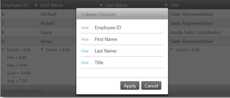
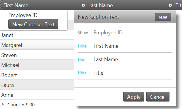
In this example, the Column Chooser is configured with the following settings:
Following is a preview of the final result.
The table below maps the desired configurations to property settings.
The properties are accessed through the igGridHiding options.
| Property | Setting |
|---|---|
| columnChooserWidth | 300 |
| columnChooserHeight | 300 |
| columnChooserCaptionText | New Caption Text |
| columnChooserDisplayText | New Chooser Text |
In JavaScript:
<script type="text/javascript">
$(function () {
    $("#grid").igGrid({
          autoGenerateColumns: true,
          dataSource: source,
              features: [
              {
                  name: 'Hiding',
                  columnChooserWidth: 300,
                  columnChooserHeight: 300,
                  columnChooserCaptionText: 'New Caption Text',
                  columnChooserDisplayText: 'New Chooser Text'
              }]
    });
});
</script>
In Razor:
@(Html.Infragistics().Grid(Model)
    .AutoGenerateColumns(true)
    .Features(feature =>{
            feature.Hiding()
            .ColumnChooserHeight(300)
            .ColumnChooserWidth(300)
            .ColumnChooserCaptionText("New Caption Text")
            .ColumnChooserDisplayText("New Chooser Text");
        }).DataBind().Render()
)
The following topics provide additional information related to this topic.
View on GitHub