
This topic provides conceptual information about the igPivotGrid™ control including its main features, minimum requirements, and user functionality.
The following table lists the topics and concepts required as a prerequisite to understanding this topic.
Topics
External Resources
This topic contains the following sections:
The igPivotGrid control is a data presentation control for displaying data in a pivot table. It enables users to perform complex analysis on the supplied data. The igPivotGrid uses the Online Analytical Processing (OLAP) approach to present the results of multi-dimensional queries in an easy to comprehend manner. The igPivotGrid control uses an instance of either igOlapFlatDataSource™ or igOlapXmlaDataSource™ component as data source.
The igPivotGrid control comprises the following elements:
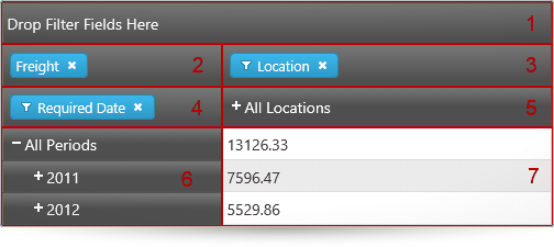
By dragging-and-dropping hierarchies from one drop-area to the other drop-areas, users can change the currently used hierarchies and measures, thus changing the tabular view of the result set displayed in the header areas and the cells. The row and column header areas display the members of the respective hierarchies and allow for expanding and collapsing of members (that have child member nodes). In each cell, the meaning of the value displayed is an intersection of the meanings of the respective column and row members (e.g. in the picture above, the meaning of the value 7596.47 is created by the intersection of “all locations” (= name of the column member) and “2011” (= name of the row member), i.e. the meaning is “what the freight for all products for the 2011 in all locations amounts to”).
Manipulating those elements allows users to go through the displayed results and instantly change the perspective to get a better angle on the data. That ultimately results in more effective data usage.
The igPivotGrid control can slice, dice, drill down or up, and pivot data taken from an OLAP cube or from a flat data collection. With its arsenal of features, igPivotGrid allows you to build sophisticated data-driven applications.
The igPivotGrid is designed to work closely with another control from the Ignite UI for jQuery suite – the igPivotDataSelector™. The igPivotDataSelector control all hierarchies and measures available in the data source available to users for displaying in the igPivotGrid. (If the igPivotGrid is used on its own, the users are limited in their interactions with the data only to the data slice that is currently displayed in the pivot grid.) If you prefer to use one widget instead of two you want to benefit from the built-in functionality to resize/collapse the igPivotDataSelector, use the igPivotView™ instead of the igPivotGrid-igPivotDataSelector combination.
The following summarizes the main features of the igPivotGrid control.
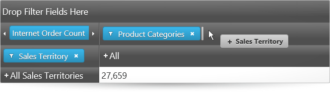
Any of the hierarchies of the data source can be used as columns, rows, or filters in the igPivotGrid. Data source measures are used to for displaying the corresponding numeric values. Users can move the present hierarchies between rows and columns by drag-and-drop. They can also specify the exact place of a hierarchy or measure in its area.
The following picture demonstrates the Sales Territory hierarchy being moved from the rows drop-area to the last position in the columns drop-area.
Note: The data arrangement capabilities of the
igPivotGridare limited to the hierarchies that are already available in the tabular view. If you need to enable users to use all hierarchies/members including those that are currently not displayed in the grid, you need to use theigPivotGridtogether with theigPivotDataSelectorcontrol.
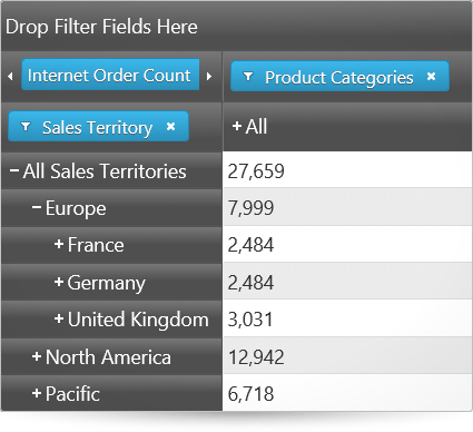
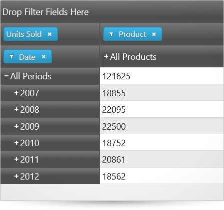
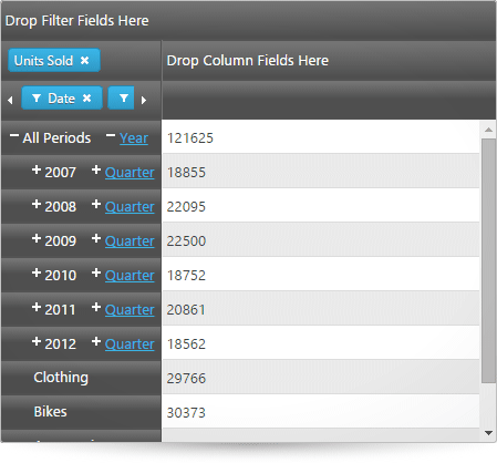
The igPivotGrid exposes a standard UI interface for presenting hierarchical data, It has +/- buttons for expanding collapsing the members all present hierarchies thus enabling users to display the desired tabular view arrangement.
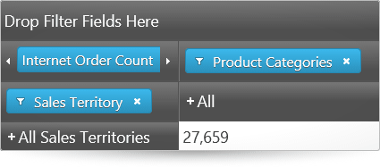
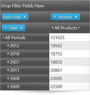
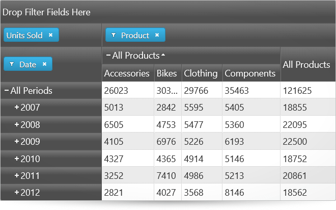
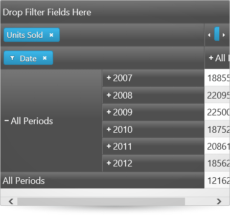
The following pictures compare the expanded and collapsed states of the members of the hierarchy used for the rows.
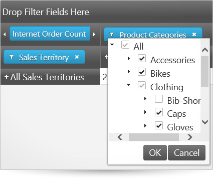
Users can choose which of the members to be displayed in the result, filtering out the ones that are not relevant to their analysis. Filtering criteria are selected by checking the members to display in a filter drop-down menu.
The igPivotGrid supports two types of sorting:
Value-based sorting can be used simultaneously with captions-based sorting when the latter is applied to a level of a column hierarchy. When, however, captions-based sorting is applied to the level members of a row hierarchy, applying value-based sorting will cancel the captions-based sorting. By the same token, when value-based sorting is applied to a column, applying caption-based sorting, cancels any previously applied value-based sorting.
Below, the picture on the left demonstrates value-based sorting, which is the All Products column with ascending sort order applied.
The picture on the right demonstrates captions-based sorting which, in this case, is the child members of the All Products member arranged alphabetically from left to right (ascending sort order).
The igPivotGrid has different layouts based on how the row and column headers are arranged for display with regards to the amount of space they occupy. The supported layouts are:
By default, the compact layout is enabled for the rows and disabled for the columns.
The following pictures compare the Standard, Compact and Tree layouts of the igPivotGrid.
The igPivotGrid control uses as a data source an instance of either the igOlapFlatDataSource or igOlapXmlaDataSource component. These two data source components are supported also by the igPivotDataSelector, a control with which the igPivotGrid is normally used together.
The igPivotGrid control integrates with the igPivotDataSelector control. This integration allows you to provide users with the ability to add/remove hierarchies and measures to/from the pivot grid.
The igPivotGrid control's content is rendered via a igGrid control, whose options can be set via the gridOptions.
The following features of the igGrid can be enabled via the gridOptions.features option:
The below sample demonstrates how to enable all the igGrid features supported by the igPivotGrid.
The following table summarizes the user interaction capabilities of the igPivotDataSelector control.
| The user can… | Using… | Details | Configurable? |
|---|---|---|---|
| Change the currently selected hierarchies for the rows, columns, and filters | Drag-and-drop from one of the drop-areas. | The user can move a hierarchy between the columns, filters, and rows areas.If an igPivotDataSelector bound to the same data source is available on the page, in addition to that all hierarchies and measures can be drag-and-dropped between the igPivotGrid and the igPivotDataSelector with the respective effect on the table view. |
 |
| Drill down/up the members of a hierarchy | The +/- buttons on the header cells. | The user can expand and collapse members of the hierarchy in order to go to the desired level of detail. |  |
| Filter the members in a hierarchy | The filter menu for each hierarchy that is added to the rows, columns, or filters. | For hierarchies, a filter menu is available (through a filter icon ( )) in which members of the hierarchy can be selected/unselected, thus adding/removing the member to/from the result. )) in which members of the hierarchy can be selected/unselected, thus adding/removing the member to/from the result. |
|
| Apply sorting | The sort buttons, users can sort the values for one or more columns and/or sort the member-headers for a particular level. | In addition to user sorting, initial sorting directions for specific levels can be set through the igPivotGrid properties. | |
Because the igPivotGrid control is a jQuery UI widget, it depends on jQuery and jQuery UI libraries. The Modernzr library is also used internally for detecting browser and device capabilities. The control uses several Ignite UI for jQuery shared resources for its functionality. References to these resources are needed nevertheless, in spite of pure jQuery or Ignite UI for MVC being used. The Infragistics.Web.Mvc assembly is required when the control is used in the context of ASP.NET MVC.
For a detailed list of the required resources for using the igPivotGrid control, refer to the Adding igPivotView to an HTML Page.
The following topics provide additional information related to this topic.
Adding igPivotGrid to an HTML Page: This topic demonstrates how to add the igPivotGrid to an HTML page.
Adding igPivotGrid to an ASP.NET MVC Application: This topic explains, in both conceptual and step-by-step form, how to add the igPivotGrid control to an ASP.NET MVC application using the ASP.NET MVC helper.
The following samples provide additional information related to this topic.
Binding to Flat Data Source: This sample demonstrates how to bind the igPivotGrid to an igOlapFlatDataSource and uses an igPivotDataSelector for data selection.
Using the ASP.NET MVC Helper with Xmla Data Source: This sample demonstrates how to use the ASP.NET MVC Helper for the igPivotGrid with igOlapXmlaDataSource.
Sorting: This sample demonstrates how to enable sorting in the igPivotGrid and how to apply sorting for specific levels upon initialization.
Layout Modes: This sample compares the layout of the igPivotGrid when compact column and row headers are enabled or disabled.
View on GitHub