
This topic provides conceptual information about the igPivotView™ control including its main features, minimum requirements, and user functionality.
The following table lists the topics and concepts required as a prerequisite to understanding this topic.
Topics
Multidimensional (OLAP) Data Source Components: This group of topics explains the multidimensional (OLAP) data source components of the Ignite UI for jQuery™ suite.
igPivotGrid Overview: This topic provides conceptual information about the igPivotGrid™ control including its main features, minimum requirements, and user functionality.
igPivotDataSelector Overview: This topic provides conceptual information about the igPivotDataSelector™ control including its main features, minimum requirements, and user functionality.
igSplitter Overview: This topic provides conceptual information about the igSplitter™ control including its features and user functionality.
External Resources
This topic contains the following sections:
igPivotView is a two-panel control that combines a pivot grid and a data selector separated with a splitter. It is a construction of three individual components – igPivotGrid, igPivotDataSelector, and igSplitter – assembled together to provide in one place all needed tools for manipulating multidimensional (OLAP data) in a pivot grid.
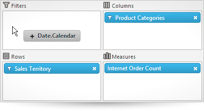
The igPivotView control comprises (the numbers refer to the illustration below):
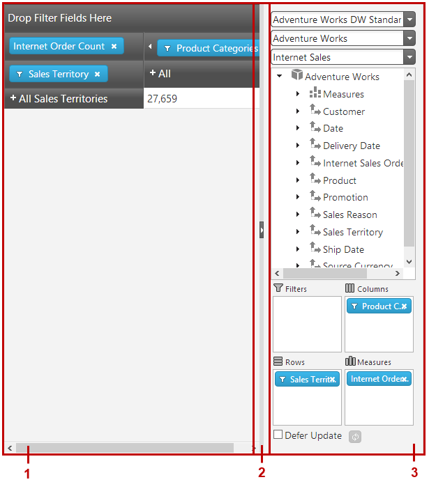
The igPivotView control uses as a data source an instance of either the igOlapFlatDataSource™ or igOlapXmlaDataSource™ component. The igPivotGrid and igPivotDataSelector operate over the same OLAP data source instance and user interaction in one of the components is automatically propagated to the other.
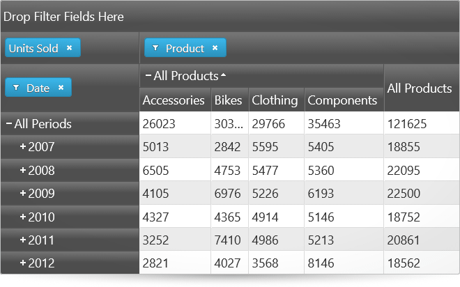
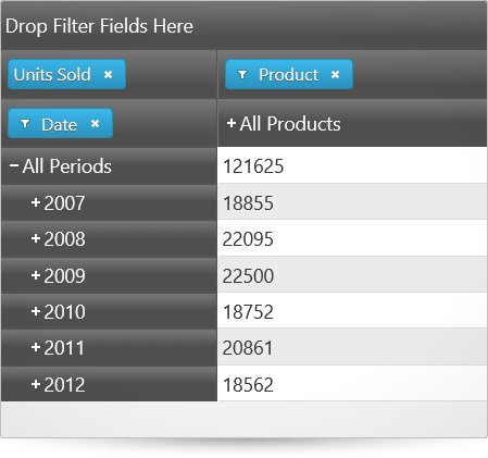
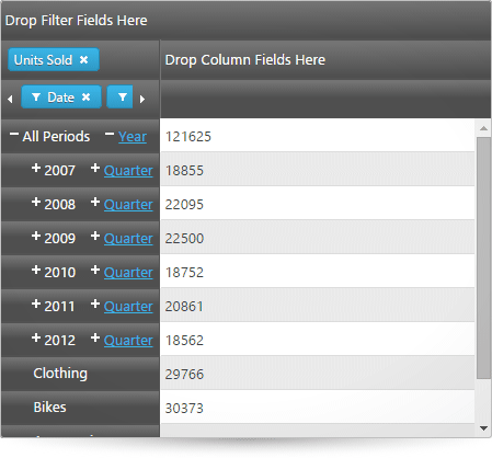
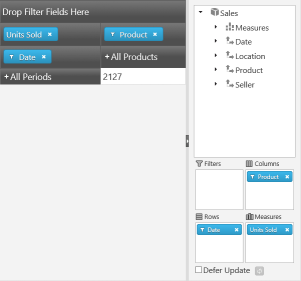
By dragging and dropping hierarchies and measures from the metadata tree to one of the drop areas (filters, columns, rows, measures) or between drop-areas, users can change the currently used hierarchies and measures, thus changing the tabular view of the result set displayed in the header areas and the cells. The row and column header areas display the members of the respective hierarchies and allow for expanding and collapsing of members (that have child member nodes). In each cell, the meaning of the value displayed is an intersection of the meanings of the respective column and row members (e.g. in the picture above, the meaning of the value 2127 is created by the intersection of “all products” (= name of the column member) and “2007” (= names of the row and the row members), i.e. the meaning is “what all products for 2007 amount to”).
Manipulating those elements allows users to go through the displayed results and instantly change the perspective to get a better angle on the data. That ultimately results in more effective data usage.
The igSplitter allows users to resize and collapse the igPivotDataSelector panel in order to allow for more space for displaying the igPivotGrid.
In order to configure an igPivotView you must, at a minimum, you need to supply it with a data source instance or set the required properties (dataSourceOptions, so that the data source is created internally). For details, refer to Adding igPivotView to an HTML Page.
All configuration properties (even those for the individual components comprising the igPivotView) are set through the igPivotView itself.
The features of the igPivotView control are a sum of the features of the controls that comprise it: igPivotGrid and igPivotDataSelector plus a few features that are specific to igPivotView only. So igPivotView’s main features can be grouped into the following categories (Follow the links for details.):
The following summarizes the main features of the igPivotGrid control.
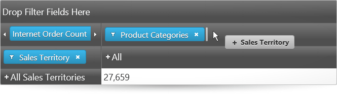
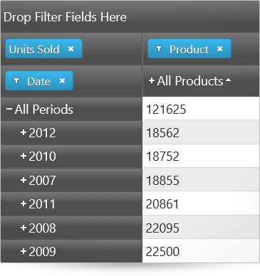
Any of the hierarchies of the data source can be used as columns, rows, or filters in the igPivotGrid. Data source measures are used to for displaying the corresponding numeric values. Users can move the present hierarchies between rows and columns by drag-and-drop. They can also specify the exact place of a hierarchy or measure in its area.
The following picture demonstrates the Sales Territory hierarchy being moved from the rows drop-area to the last position in the columns drop-area.
Note: The data arrangement capabilities of the
igPivotGridare limited to the hierarchies that are already available in the tabular view. If you need to enable users to use all hierarchies/members including those that are currently not displayed in the grid, you need to use theigPivotGridtogether with theigPivotDataSelectorcontrol.
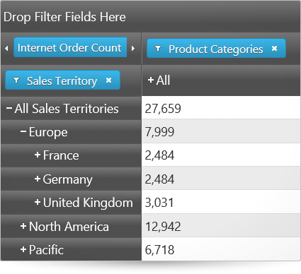
The igPivotGrid exposes a standard UI interface for presenting hierarchical data, It has +/- buttons for expanding collapsing the members all present hierarchies thus enabling users to display the desired tabular view arrangement.
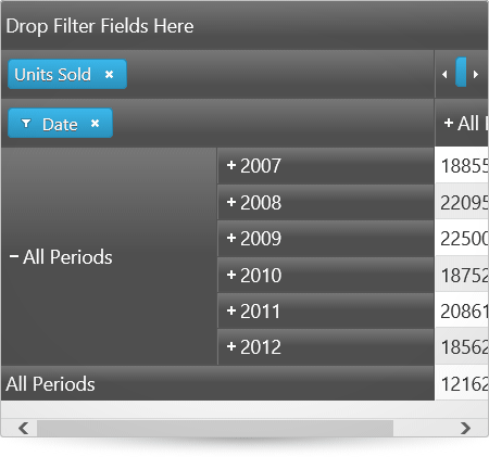
The following pictures compare the expanded and collapsed states of the members of the hierarchy used for the rows.
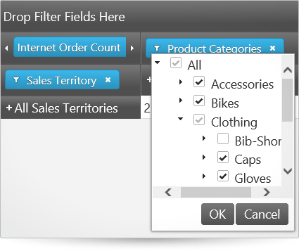
Users can choose which of the members to be displayed in the result, filtering out the ones that are not relevant to their analysis. Filtering criteria are selected by checking the members to display in a filter drop-down menu.
The igPivotGrid supports two types of sorting:
Value-based sorting can be used simultaneously with captions-based sorting when the latter is applied to a level of a column hierarchy. When, however, captions-based sorting is applied to the level members of a row hierarchy, applying value-based sorting will cancel the captions-based sorting. By the same token, when value-based sorting is applied to a column, applying caption-based sorting, cancels any previously applied value-based sorting.
Below, the picture on the left demonstrates value-based sorting, which is the All Products column with ascending sort order applied.
The picture on the right demonstrates captions-based sorting which, in this case, is the child members of the All Products member arranged alphabetically from left to right (ascending sort order).
The igPivotGrid has different layouts based on how the row and column headers are arranged for display with regards to the amount of space they occupy. The supported layouts are:
By default, the compact layout is enabled for the rows and disabled for the columns.
The following pictures compare the Standard, Compact and Tree layouts of the igPivotGrid.
The igPivotGrid control uses as a data source an instance of either the igOlapFlatDataSource or igOlapXmlaDataSource component. These two data source components are supported also by the igPivotDataSelector, a controls with which the igPivotGrid is normally used together.
The following table summarizes the main features of the igPivotDataSelector control.
Given a data source, the igPivotDataSelector provides drop-downs to select a database to connect to (if you are using database data), cube to extract data from, and a set of measure groups.
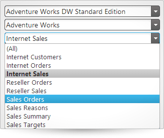
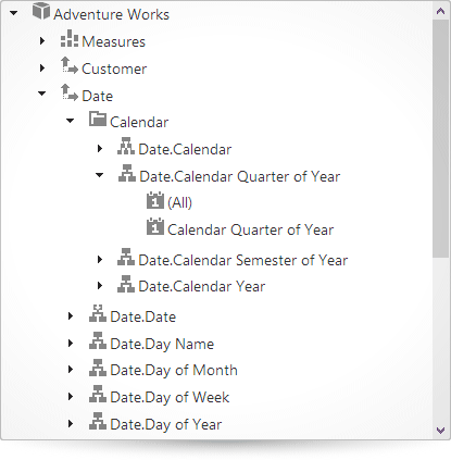
All the available dimensions with their respective hierarchies along with a list with all the available measures are loaded in a tree once the user chooses a database, cube, and measure group.
When the user selects a Measure group, the measures are filtered accordingly. If none is selected, all measures will be available in the metadata tree.
Unless custom restrictions are applied, all available hierarchies from the tree can be drag-and-dropped to one of the following areas: Rows, Columns, Filters. All available measures from the tree can be drag-and-dropped to the Measures area.
The igPivotDataSelector supports two data source update modes based on when the data source gets updated after the user makes a change in the control:
Deferred update improves the performance of the control by not taxing system resources, especially when very large amounts of data are involved.
In igPivotDataSelector, the user can control the refresh mode through the Defer Update checkbox and, if the box is checked, manually refresh the data source at their discretion by pressing the update button.

The following table summarizes the main features of the igPivotDataSelector control.
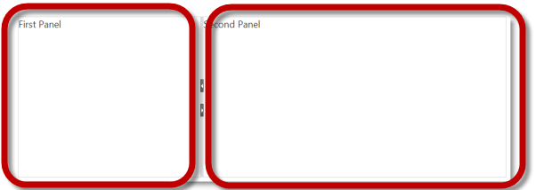
Panels have Expanded and Collapsed states which are inversely related: when one panel is expanded, the other panel is collapsed and the other way around. The expanded panel occupies the entire container and the collapsed panel is out of sight. Only one panel can be collapsed or expanded at a time.
The pictures below compare the expanded and collapsed states of the left panel.
Panels can be collapsed or expanded either by the user or programmatically through API methods. If expanding/collapsing is not enabled, the expand/collapse buttons are not displayed in the splitter bar. By default, the panels are not expandable/collapsible.
When a panel is expanded, the splitter bar is placed to its side in the direction of the other (now collapsed) panel. When the splitter bar is any other position then both panels are visible, but this condition of the panels is not associated with a panel state.
The igSplitter control divides the layout into two separate panels.
The panels are resizible relative to each other by moving the splitter bar within the splitter control. When the splitter bar is shifted in the direction of one of the panels, this sizes the panel down accordingly and the other panel sizes up accordingly. By default, the panels are resizable.
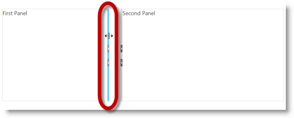
By default, the igSplitter control supports mouse dragging for resizing panels. Users can resize the areas by dragging the splitter bar. Releasing the mouse button after the drag movement resizes the panels according to the new position of the splitter bar.
The following table summarizes the features that are specific to the igPivotView control.
By default, the relative position of the panels to each other is the pivot grid on the left and the selector on the right. You can swap the pivot grid and the selector using the dataSelectorPanel properties of the igPivotView.
You can specify whether the panels should be resizable and/or collapsible using the dataSelectorPanel and pivotGridPanel options. These options control whether users will be allowed to resize and/or expand/collapse the panels of the igPivotGrid and the igPivotDataSelector using the igSplitter’s bar handle or the keyboard.
Automatic synchronization between igPivotDataSelector and igPivotGrid.
Since both igPivotGrid and igPivotDataSelector are bound to the same OLAP data source control instance (either igOlapFlatDataSource or igOlapXmlaDataSource) and their state is automatically synchronized upon any user interaction that makes a change to the data source.
The following table summarizes the user interaction capabilities of the igPivotView control.
| The user can… | Using… | Details | Configurable? |
|---|---|---|---|
Change database, cube, and measure group (igOlapXmlaDataSource only) |
The data selector combo boxes. | You can set up initial the database, cube and measure group programmatically using the catalog, cube, and measureGroup properties of the igOlapXmlaDataSource. |
 |
| Browse data source dimensions and measures | The metadata tree part of the igPivotDataSelectор. |
The user can see all available, dimensions, measures, hierarchies and levels. |  |
| Select hierarchies for the rows, columns, and filters | Perform drag-and-drop from the tree to the rows, columns and filters areas. | Users can drag-drop hierarchies between the drop areas of the igPivotDataSelector and the igPivotGrid. Additionally, all hierarchies and can be drag-and-dropped from the metadata tree to the columns, rows and filters drop areas. |
|
| Select measures | Perform drag-and-drop from the tree to the measures area. | Unless custom restrictions are set in place, the user can drag all the measures available in the metadata tree to the measures area. | |
| Enable/Disable Deferred Update | Checking/unchecking the Deferred Update checkbox | - | |
| Update the grid on demand if Deferred Update is enabled | By clicking the Update Layout button ( ). ). |
- | |
| Drill down/up the members of a hierarchy | The +/- buttons on the header cells. | The user can expand and collapse members of the hierarchy in order to go to the desired level of detail. | |
| Filter the members in a hierarchy | The filter menu for each hierarchy that is added to the rows, columns, or filters. | For hierarchies, a filter menu is available (through a filter icon ( )) in which members of the hierarchy can be selected/unselected, thus adding/removing the member to/from the result. )) in which members of the hierarchy can be selected/unselected, thus adding/removing the member to/from the result. |
|
| Apply sorting | The sort buttons, users can sort the values for one or more columns and/or sort the member-headers for a particular level. | In addition to user sorting, initial sorting directions for specific levels can be set through the igPivotGrid properties. | |
Resize/Collapse the igPivotDataSelector |
The igSplitter’s handle. |
By dragging the splitter’s handle or by clicking its expand/collapse button () users can resize the panel of the igPivotDataSelector. |
|
Because the igPivotView control is a jQuery UI widget, it depends on jQuery and jQuery UI libraries. The Modernizr library is also used internally for detecting browser and device capabilities. The control uses several Ignite UI for jQuery shared resources for its functionality. References to these resources are needed nevertheless, in spite of pure jQuery or Ignite UI for MVC being used. The Infragistics.Web.Mvc assembly is required when the control is used in the context of ASP.NET MVC.
For a detailed list of the required resources for using the igPivotView control, refer to the Adding igPivotView topics.
The following topics provide additional information related to this topic.
Adding igPivotView: This is a group of topics demonstrating how to add the igPivotView control to an HTML page and ASP.NET MVC Application.
Accessibility Compliance (igPivotView): This topic explains the accessibility features of the igPivotView control and provides advice on how to achieve accessibility compliance for pages containing this control.
Known Issues and Limitations (igPivotView): This topic provides information about the known issues and limitations of the igPivotView control.
jQuery and MVC API Links (igPivotView): This topic lists links to the API documentation about the igPivotView control.
The following samples provide additional information related to this topic.
Binding to Flat Data Source: This sample demonstrates how to bind the igPivotView to an igOlapFlatDataSource.
Binding to XMLA to Show KPIs: This sample demonstrates how to bind the igPivotView to an igOlapXmlaDataSource.
Using the Ignite UI for MVC with Flat Data Source: This sample demonstrates how to use the Ignite UI for MVC igPivotView with igOlapFlatDataSource.
Using the Ignite UI for MVC with Xmla Data Source: This sample demonstrates how to use the Ignite UI for MVC igPivotView with igOlapXmlaDataSource.
View on GitHub