
Ignite UI API Reference
ui.igSplitter
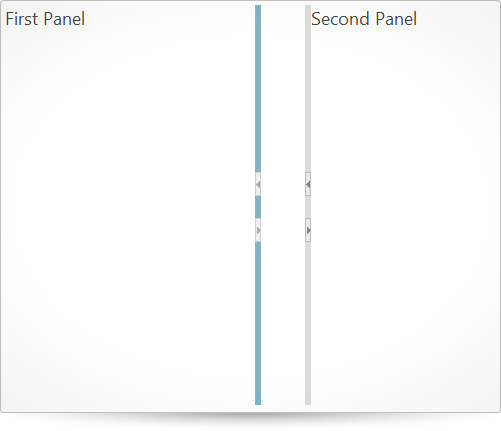
The splitter is a widget based on jQuery UI that manages layout into two panels with split bar and provides the end user with a rich interaction functionality including the ability to expand/collapse panel, and resize panels via split bar.
Code Sample
        <!doctype html>
        <html>
        <head>
            <!-- jQuery Core -->
            <script src="js/jquery.js" type="text/javascript"></script>
            <!-- jQuery UI -->
            <script src="js/jquery-ui.js" type="text/javascript"></script>
            <!-- Infragistics Loader Script -->
            <script src="js/infragistics.loader.js" type="text/javascript"></script>
            <!-- Infragistics Loader Initialization -->
            <script type="text/javascript">
                $.ig.loader({
                    scriptPath: "js/",
                    cssPath: "css/",
                    resources: "igSplitter"
                });

                $.ig.loader(function () {
                    $("#splitter").igSplitter({
                        height: "500px",
                        width: "700px",
                        panels: [
                            { size: "300px", min: "250px", max: "350px", collapsible: true },
                            { collapsible: true }
                        ]
                    });
                });
            </script>
        </head>
        <body>
            <div id="splitter">
                <div>First Panel</div>
                <div>Second Panel</div>
            </div>
        </body>
        </html>
Related Samples
- Basic Vertical Splitter
- Basic Horizontal Splitter
- Nested Splitters
- ASP.NET MVC Basic Usage
- Splitter API and Events
Related Topics
Dependencies
Inherits
-
dragDelta
- Type:
- number
- Default:
- 3
Specifies drag delta of the split bar. In order to start dragging move, the mouse has to be moved specific distance from original position.
Code Sample
$("#splitter").igSplitter({ dragDelta: 0 }); -
height
- Type:
- enumeration
- Default:
- null
Gets sets how the height of the control can be set.
Members
- null
- Type:object
- will fit the tree inside its parent container, if no other widths are defined.
- string
- The height width can be set in pixels (px) and percentage (%).
- number
- The height width can be set as a number in pixels.
Code Sample
$("#splitter").igSplitter({ height: "75%" }); //Get var height = $("#splitter").igSplitter('option', 'height'); //Set $("#splitter").igSplitter('option', 'height', 200); -
orientation
- Type:
- enumeration
- Default:
- vertical
Specifies the orientation of the splitter.
Members
- vertical
- Type:string
- .
- horizontal
- Type:string
Code Sample
$("#splitter").igSplitter({ orientation: "horizontal" }); -
panels
- Type:
- object
- Default:
- []
Specifies the panel settings. The panels are no more than two. Settings are specified via enumeration.
size="string|int"
min type="string|int"
max type="string|int"
resizable
collapsed
collapsible.Code Sample
$("#splitter").igSplitter({ panels: [ {size: "50%", min: "40%", max: "55%", collapsed: true, collapsible: true}, {collapsible: true} ] }); -
resizeOtherSplitters
- Type:
- bool
- Default:
- true
Specifies whether the other splitters on the page will be resized as this splitter resizes.
-
width
- Type:
- enumeration
- Default:
- null
Gets sets how the width of the control can be set.
Members
- null
- Type:object
- will stretch to fit data, if no other widths are defined.
- string
- The widget width can be set in pixels (px) and percentage (%).
- number
- The widget width can be set as a number in pixels.
Code Sample
            $("#splitter").igSplitter({
                width: "25%"
            });

            //Get
            var width = $("#splitter").igSplitter('option', 'width');

            //Set
            $("#splitter").igSplitter('option', 'width', 800);
For more information on how to interact with the Ignite UI controls' events, refer to
Using Events in Ignite UI.
-
collapsed
- Cancellable:
- false
Fired after collapsing is performed
Function takes arguments evt and ui.
Use ui.owner to get a reference to the splitter instance.
Use ui.index to get an index of collased panel.Code Sample
//Bind $(document).delegate(".selector", "igsplittercollapsed", function (evt, ui) { //return reference to igSplitter ui.owner; // return index of collapsed panel ui.index; }); //Initialize $(".selector").igSplitter({ collapsed: function(evt, ui) {...} }); -
expanded
- Cancellable:
- false
Fired after expanding is performed
Function takes arguments evt and ui.
Use ui.owner to get a reference to the splitter instance.
Use ui.index to get an index of expanded panel.Code Sample
//Bind $(document).delegate(".selector", "igsplitterexpanded", function (evt, ui) { //return reference to igSplitter ui.owner; // return index of expanded panel ui.index; }); //Initialize $(".selector").igSplitter({ expanded: function(evt, ui) {...} }); -
layoutRefreshed
- Cancellable:
- false
Fired after the panels are refreshed because of browser's resizing.
Function takes arguments evt and ui.
Use ui.owner to get a reference to the splitter instance.Code Sample
//Bind $(document).delegate(".selector", "igsplitterlayoutrefreshed", function (evt, ui) { //reference to igSplitter ui.owner; }); //Initialize $(".selector").igSplitter({ layoutRefreshed: function(evt, ui) {...} }); -
layoutRefreshing
- Cancellable:
- true
Fired before the panels are going to go refreshed because of browser's resizing.
Function takes arguments evt and ui.
Use ui.owner to get a reference to the splitter instance.Code Sample
//Bind $(document).delegate(".selector", "igsplitterlayoutrefreshing", function (evt, ui) { //reference to igSplitter ui.owner; }); //Initialize $(".selector").igSplitter({ layoutRefreshing: function(evt, ui) {...} }); -
resizeEnded
- Cancellable:
- false
Fired after split bar move is performed
Function takes arguments evt and ui.
Use ui.owner to get a reference to the splitter instance.Code Sample
//Bind $(document).delegate(".selector", "igsplitterresizeended", function (evt, ui) { //return reference to igSplitter ui.owner; }); //Initialize $(".selector").igSplitter({ resizeEnded: function(evt, ui) {...} }); -
resizeStarted
- Cancellable:
- false
Fired before split bar move is performed
Function takes arguments evt and ui.
Use ui.owner to get a reference to the splitter instance.Code Sample
//Bind $(document).delegate(".selector", "igsplitterresizestarted", function (evt, ui) { //return reference to igSplitter ui.owner; }); //Initialize $(".selector").igSplitter({ resizeStarted: function(evt, ui) {...} }); -
resizing
- Cancellable:
- true
Fired while split bar move is performed
Function takes arguments evt and ui.
Use ui.owner to get a reference to the splitter instance.Code Sample
        //Bind
        $(document).delegate(".selector", "igsplitterresizing", function (evt, ui) {
            //return reference to igSplitter
            ui.owner;
        });

        //Initialize
        $(".selector").igSplitter({
            resizing: function(evt, ui) {...}
        });
-
collapseAt
- .igSplitter( "collapseAt", index:object );
Collapse the specified panel.
- index
- Type:object
- Specifies the index of the panel to collapse.
Code Sample
$(".selector").igSplitter("collapseAt", 0); -
destroy
- .igSplitter( "destroy" );
Destructor.
Code Sample
$(".selector").igSplitter("destroy"); -
expandAt
- .igSplitter( "expandAt", index:object );
Expand the specified panel.
- index
- Type:object
- Specifies the index of the panel to expand.
Code Sample
$(".selector").igSplitter("expandAt", 1); -
firstPanel
- .igSplitter( "firstPanel" );
- Return Type:
- object
- Return Type Description:
- Returns the jQuery object of the first panel element.
Retrieves the jQuery element of the first panel.
Code Sample
var panel = $(".selector").igSplitter("firstPanel"); -
refreshLayout
- .igSplitter( "refreshLayout" );
You can refresh layout after the splitter is rendered in order to render it correctly.
Code Sample
$(".selector").igSplitter("refreshLayout"); -
secondPanel
- .igSplitter( "secondPanel" );
- Return Type:
- object
- Return Type Description:
- Returns the jQuery object of the second panel element.
Retrieves the jQuery element of the second panel.
Code Sample
var panel = $(".selector").igSplitter("secondPanel"); -
setFirstPanelSize
- .igSplitter( "setFirstPanelSize", size:object );
You can set new size of the first panel after the splitter is rendered.
- size
- Type:object
- Specifies the new size of the first panel.
Code Sample
$(".selector").igSplitter("setFirstPanelSize", 100); -
setSecondPanelSize
- .igSplitter( "setSecondPanelSize", size:object );
You can set new size of the second panel after the splitter is rendered.
- size
- Type:object
- Specifies the new size of the second panel.
Code Sample
$(".selector").igSplitter("setSecondPanelSize", 100); -
widget
- .igSplitter( "widget" );
- Return Type:
- object
- Return Type Description:
- Returns the element that represents this widget.
Returns the element that represents this widget.
Code Sample
var widget = $(".selector").igSplitter("widget");
-
ui-igsplitter-splitbar
- Class applied to the split bar in the splitter.
-
ui-igsplitter-splitbar-focus ui-state-focus
- Classes defining the focus state style of the split bar.
-
ui-igsplitter-splitbar-collapsed
- Class defining the collapsed state style of the split bar.
-
ui-igsplitter-splitbar-hover ui-state-hover
- Classes defining the hover state style of the split bar.
-
ui-igsplitter-splitbar-invalid
- Class defining the invalid state style of the split bar.
-
ui-igsplitter-splitbar-default ui-state-default
- Classes defining the default state style of the split bar.
-
ui-state-default
- Class defining the default state style of the button.
-
ui-igsplitter-collapse-button-hover ui-state-hover
- Classes defining the hover state style of the button.
-
ui-igsplitter-collapse-button-pressed
- Class defining the pressed state style of the button.
-
ui-igsplitter-collapse-single-button
- Class applied to a button in the split bar when it is single.
-
ui-igsplitter-collapse-button-horizontal-left
- Class applied to the left horizontal collapse button in the split bar when it is collapsed.
-
ui-icon ui-icon-triangle-1-s
- Class defining the right collapsed button icon in horizontal orientation.
-
ui-igsplitter-collapse-button-horizontal-left
- Class applied to the left horizontal collapse button in the split bar when it is expanded.
-
ui-icon ui-icon-triangle-1-n
- Class defining the left expanded button icon in horizontal orientation.
-
ui-igsplitter-collapse-button-horizontal-right
- Class applied to the right horizontal collapse button in the split bar when it is collapsed.
-
ui-icon ui-icon-triangle-1-n
- Class defining the right collapsed button icon in horizontal orientation.
-
ui-igsplitter-collapse-button-horizontal-right
- Class applied to the right horizontal collapse button in the split bar when it is expanded.
-
ui-icon ui-icon-triangle-1-s
- Class defining the right expanded button icon in horizontal orientation.
-
ui-igsplitter-panel-horizontal ui-widget-content
- Classes applied to the horizontal panel in the splitter.
-
ui-igsplitter-no-scroll
- Classes disabling the panel scrolling while width is zero.
-
ui-igsplitter-splitbar-resize-handler
- Class applied to the resize handler in the split bar.
-
ui-igsplitter-splitbar-resize-handler-inner
- Class applied to the inner resize handler in the split bar.
-
ui-igsplitter ui-widget ui-widget-content
- Classes applied to the top container element.
-
ui-igsplitter-collapse-button-vertical-left
- Class applied to the left vertical collapse button in the split bar when it is collapsed.
-
ui-icon ui-icon-triangle-1-e
- Class defining the left collapsed button icon in vertical orientation.
-
ui-igsplitter-collapse-button-vertical-left
- Class applied to the left vertical collapse button in the split bar when it is expanded.
-
ui-icon ui-icon-triangle-1-w
- Classes defining the left expanded collapse button icon in vertical orientation.
-
ui-igsplitter-collapse-button-vertical-right
- Class applied to the right vertical button in the split bar when it is collapsed.
-
ui-icon ui-icon-triangle-1-w
- Class defining the right collapsed button icon in vertical orientation.
-
ui-igsplitter-collapse-button-vertical-right
- Class applied to the right vertical collapse button in the split bar when it is expanded.
-
ui-icon ui-icon-triangle-1-e
- Class defining the right expanded button icon in vertical orientation.
-
ui-igsplitter-panel-vertical ui-widget-content
- Classes applied to the vertical panel in the splitter.