
This topic provides conceptual information for the igTree™ control including information regarding: features, binding to data sources, requirements, and templates.
This topic contains the following sections:
The table belows lists the required background you need to fully understand the information in this topic.
| Background type | Content |
|---|---|
| Topics | You need to first read the following topics: Ignite UI for jQuery Overview Using JavaScript Resources in Ignite UI for jQuery Styling and Theming Ignite UI for jQuery igGrid/igDataSource Architectural Overview, The Data Source Control section |
| External Resources | You need to first read the following article: Working with jQuery Widgets |
The table below briefly explains the main features of the igTree.
| Feature | Description |
|---|---|
| Load on demand | Load-on-demand is the primary way to optimize the igTree control’s performance by only creating HTML elements for data displayed to the user and requesting data only as needed. |
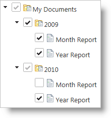
| Checkboxes | Checkboxes are available in either bi-state or tri-state modes to facilitate multiple selection. In tri-state mode, the selection cascades where checking a parent node will select all child nodes. |
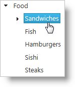
| Navigation & Selection | The igTree control has a rich keyboard interaction model for navigating, selecting, expanding, and collapsing nodes. |
| Node Images | Nodes can have their own custom images to provide more detail about an item or to customize the look and feel. |
| Adding and Removing Nodes | The Adding and Removing Nodes feature of the igTree control enables users to add and remove tree nodes. |
| Drag-and-Drop | The Drag-and-Drop feature of the igTree control enables users to drag-and-drop tree nodes. Dragging and dropping can be performed within the same tree or between two different trees. |
| Ignite UI for MVC | You can use managed .NET code to configure the igTree control. |
Load on demand is the primary way to optimize the igTree control’s performance by only creating HTML elements for data displayed to the user or requesting data only as needed. When enabled for local data, the igTree control only creates the necessary markup for nodes when they are expanded and brought into view. When binding to remote data, the igTree control makes an AJAX request for new data and creates HTML elements as needed from the server when a node is expanded.
Optimize the igTree’s Performance
Checkboxes are available in either bi-state or tri-state modes to facilitate multiple selection. In tri-state mode, the selection cascades where checking a parent node selects all child nodes. Similarly if a child checkbox is checked or unchecked, the checked state is represented in the parent checkbox with checked, partial, or unchecked states.
Configure Checkboxes and Selection
The igTree control has a rich keyboard interaction model for navigating, selecting, expanding, and collapsing nodes. See the user interaction and usability section below for more details.
Configure Checkboxes and Selection
Custom node image support is available for the igTree control. Images can be configured through binding, CSS, or templates and separate images can be used for parent nodes and leaf nodes.

The Adding and Removing Nodes feature of the igTree control enables users to add and remove tree nodes.
The Drag-and-Drop feature of the igTree control enables users to
drag-and-drop tree nodes.
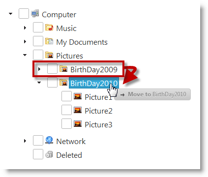
Dragging-and-drop can be performed within the same igTree control or between two igTree controls. The latter is configured in addition to the “normal” (within the same tree) drag-and-drop. You can specify the way in which you want the Drag-and-Drop feature to operate. This is managed by configuring one of the several supported Drag-and-Drop modes.
Configuring Drag-and-Drop Modes
You can use the Ignite UI for MVC Helper to use managed code languages to configure the igTree control. Using the MVC helpers allows you to take advantage of re-usable Views or ViewModels in your ASP.NET MVC applications. Further, you can bind to a collection of IQueryable collections in ASP.NET and the helper will generate the JSON data for the igTree control to use on the client.
The igTree control is a jQuery UI Widget and therefore is dependent on the jQuery and jQuery UI JavaScript libraries. In addition, there are several Ignite UI for jQuery™ JavaScript resources that the igTree control uses for shared functionality and data binding. The JavaScript references are required whether the igTree control is used in a pure JavaScript context or in ASP.NET MVC. When using the igTree control in ASP.NET MVC, the Infragistics.Web.Mvc assembly is required to configure the igTree control with .NET languages.
The table below lists the requirements for the igTree control.
| Requirement | Description |
|---|---|
| jQuery and jQuery UI JavaScript resources | Ignite UI for jQuery is built on top of these frameworks: jQuery jQuery UI Templating Engine Overview (for node templates) |
| Shared Ignite UI for jQuery JavaScript resources | There are several shared JavaScript resources in Ignite UI for jQuery that most widgets use: infragistics.util.js infragistics.util.jquery.js infragistics.ui.shared.js |
igDataSource JavaScript Resources |
The igTree control uses the igDataSource internally for data operations: infragistics.dataSource.js |
igTree JavaScript resources |
The JavaScript file for the igTree control: infragistics.ui.tree.js |
| IG Theme | This theme contains custom visual styles created especially for Ignite UI for jQuery |
| Base Theme | The base theme contains styles that primarily define the form and function for each control. |
The following table lists the requirements for binding the igTree control to data sources grouped by requirement category.
| Requirement category | Requirements listing |
|---|---|
| Data structure | Can be any of the following: Well-formed JSON or XML supplied locally or from a web server Nested UL HTML elements OData services JSONP IQueryable in ASP.NET MVC |
| Data types | String Number Boolean Image URL |
The following table lists the supported data sources and some basic specifics for their binding
| Data Source | Binding |
|---|---|
| igDataSource | The igDataSource component is used internally by the igTree control to manage data operations for the control. The data source accepts many different types of local and remote data. |
| Nested HTML UL elements | The igTree control can be instantiated with an existing unordered list (UL) or nested UL elements. |
IQueryable<T> |
In ASP.NET MVC, supply an IQueryable as the igTree control’s datasource and the collection is serialized to JSON and returned with the View for use in the browser. |
In most cases, you will use the dataSource or dataSourceUrl options of the igTree control to bind to data. This approach provides data to the igDataSource component which can handle the various supported data formats. The one main exception to using this approach is when the igTree control is instantiated using UL elements. The igTree control inherits the data and options of its base UL elements. In ASP.NET MVC, supplying a collection of IQueryable objects to the ASP.NET MVC Helper serializes the data from the server and passes it to the View. Once the page is received by the browser, the dataSource option of the igTree control is set for client-side operation.
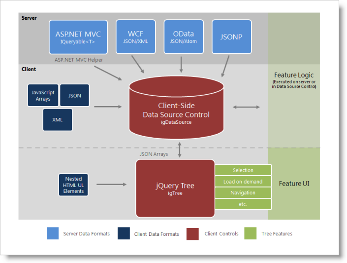
The following class diagram demonstrates how data binding works.
The table below lists the igTree control templates and their possible uses.
| Template | Use with igTree |
|---|---|
| Node | By setting the nodeContentTemplate option of the binding object, you can define custom HTML which will be shown for each node in the igTree control. |
The table below maps some of your possible needs to the appropriate templates.
| If you need to… | Then use this template: |
|---|---|
| Display custom HTML for each node on a certain level of hierarchy | nodeContentTemplate |
The table below briefly explains the user interaction capabilities of the igTree control.
| If you need to… | Then use this template: |
|---|---|
| Display custom HTML for each node on a certain level of hierarchy | nodeContentTemplate |
Following are some other topics you may find useful.
View on GitHub