
This topic presents the controls and the new and enhanced features for the Ignite UI™ 2014 Volume 1 release.
The following table summarizes what’s new in 2014 Volume 1. Additional details follow the summary table.
| Feature | Description |
|---|---|
| New Visual Studio templates | You can find a new set of Infragistics templates in the File - New Project dialog of Microsoft® Visual Studio®. |
| New theme (CTP) | A new theme named iOS 7 has been added. The theme is inspired by Apple’s iOS 7 design. |
| Feature | Description |
|---|---|
| New default style | This style features multiple visual changes making the charts look more impressive and streamlined. |
| Feature | Description |
|---|---|
| New control (CTP) | The igColorPicker™ control allows users to select pre-defined colors or to define their own color palettes. |
| Feature | Description |
|---|---|
| Column Fixing works with hidden columns | Now you can have both fixed and hidden columns in the grid. |
| Feature state persistence | Feature state persistence means persisting states of the grid features between re-bindings. |
| Improved delete row on touch devices | The delete row user experience on touch-enabled devices has improved. |
| Feature | Description |
|---|---|
| Feature state persistence | Feature state persistence means persisting states of the hierarchical grid features between re-bindings. |
| Improved delete row on touch devices | The delete row user experience on touch-enabled devices has improved. |
| Feature | Description |
|---|---|
| New Default Style | A new look-and-feel of the toolbar and the buttons. |
| Feature | Description |
|---|---|
| KPIs support | The igOlapXmlaDataSource™ has now built-in support for displaying KPIs defined in a cube. The KPIs supplied by the data source are visualized in the igPivotDataSelector™ and igPivotGrid™. |
| Remote ADOMD.NET data provider support | The igOlapXmlaDataSource now supports one more remote configuration where ADOMD.NET is used for communication with the SSAS server. |
| Feature | Description |
|---|---|
| New control (RTM) | The igPopover™ control, now RTM, adds tooltip-like functionality to DOM elements. |
| Feature | Description |
|---|---|
| New control (RTM) | The igRadialMenu™ control is a context menu presenting its items in a circular arrangement around a center button. |
| Feature | Description |
|---|---|
| New control (CTP) | igSplitButton is a drop-down button with which the user can select a default value bound to a primary button, or select from a list of values displayed in a drop-down list bound to a secondary button. It is useful when you want to provide a default action/command for a button but also need to supply other, secondary options. |
| Feature | Description |
|---|---|
| New control (CTP) | The igToolbar™ control allows you to create custom toolbars like those in the igHtmlEditor™. |
| Feature | Description |
|---|---|
| Support for Web Farms / Web Gardens | The igUpload™ control now supports Web Farm / Web Garden Internet Information Services (IIS) configurations. |
You can find a new set of Infragistics templates in the File - New Project dialog of Visual Studio 2012 and later. These templates are designed to help you get started with a functional, well-designed, and fully-styled application.
Each template includes documentation and more templates will appear in the Infragistics Template Gallery over time to address a wide range of application scenarios.
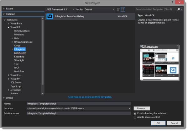
Note: In previous versions of Ignite UI for jQuery, the starter templates were installed with the product installer. They are now accessible through the Infragistics Template Gallery.
A new theme named iOS 7 has been added. The theme is inspired by Apple’s iOS 7 design.
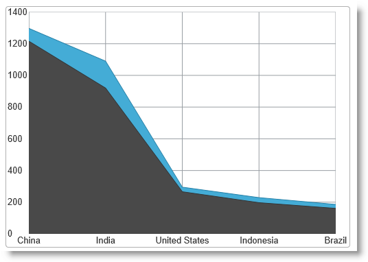
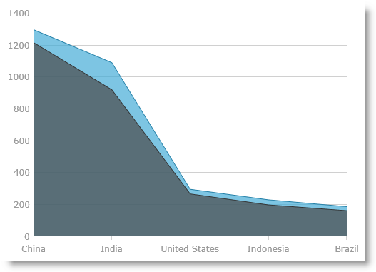
A new default style has been applied to the chart controls aiming to make the charts look more streamlined. (If necessary, you can revert the chart controls to the previous default style using the legacy.css style file.)
Old Default Style
New Default Style
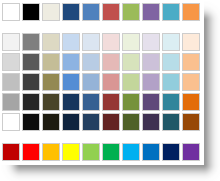
The igColorPicker control allows users to select pre-defined colors or to define their own color palettes.
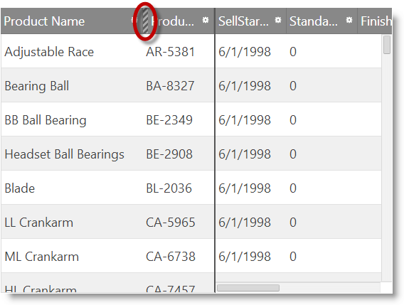
Now you can have both fixed and hidden columns in the grid. (The Column Fixing feature is now integrated with Column Hiding feature.
Feature state persistence means persisting states of the grid features between re-bindings.
A new property – persist – has been added to those features. Feature state persistence is enabled by default.
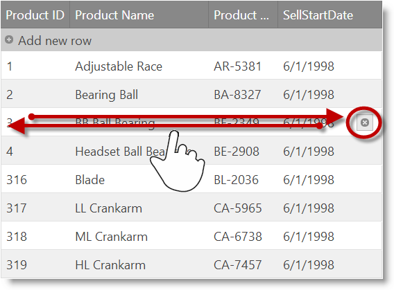
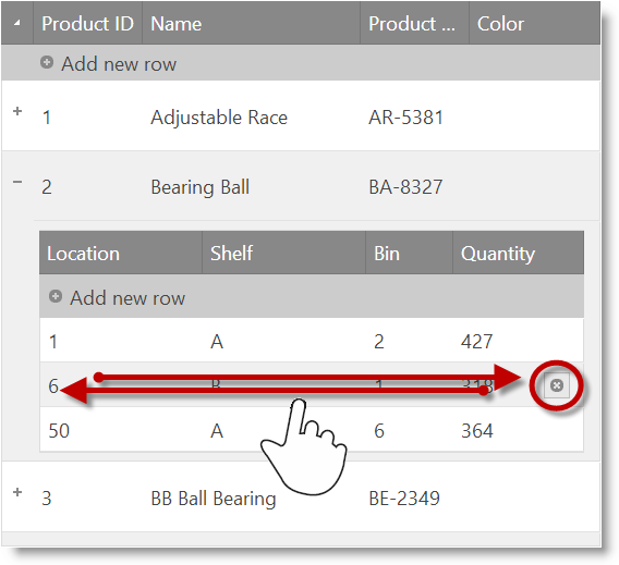
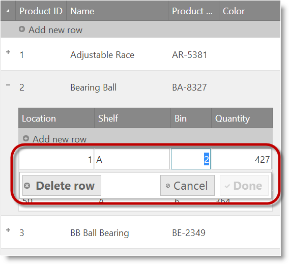
The delete row user experience on touch-enabled devices has improved.
In Cell Edit mode, swiping to the left or to the right displays the Delete Row button.
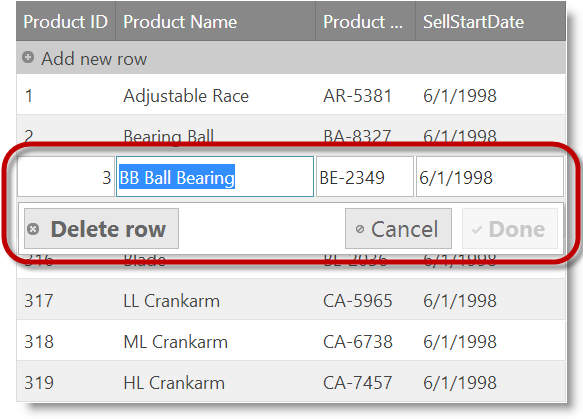
In Row Edit mode, the Delete Row button is available along with the Cancel and Done buttons.
Note: The Modernizr library is required for this feature to work.
Feature state persistence means persisting states of the grid features between re-bindings.
A new property – persist – has been added to those features. Feature state persistence is enabled by default.
The delete row user experience on touch-enabled devices has improved.
In Cell Edit mode, swiping to the left or to the right displays the Delete Row button.
In Row Edit mode, the Delete Row button is available along with the Cancel and Done buttons.
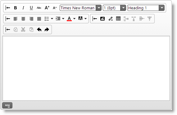
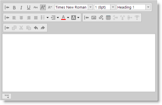
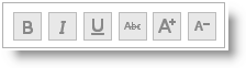
The new default style provides igHtmlEditor‘s toolbar and buttons with a new look-and-feel.
Old Default Style
New Default Style
The igOlapXmlaDataSource has now built-in support for displaying KPIs defined in a cube. The KPIs supplied by the data source are visualized in the igPivotDataSelector and igPivotGrid.
The igOlapXmlaDataSource now supports one more remote configuration
where ADOMD.NET is used for communication with the SSAS server.
The igPopover control, now RTM, adds tooltip-like functionality to DOM elements. igPopover is context-sensitive and displays dynamic content, detailed information, overlaid forms, or just about anything that should appear over a given element. The popover area is customizable and can be loaded on demand. You can configure its content, activation, and position.

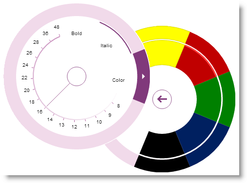
The igRadialMenu control is a context menu presenting its items in a circular arrangement around a center button. The circular arrangement of the items speeds up items selection, because each item is equally positioned in relation to the center. The igRadialMenu supports different item types for choosing numerical values, color values, or performs actions. Sub-Items are also supported.
The igSplitButton control is a drop-down button with which the user can select a default value bound to a primary button, or select from a list of values displayed in a drop-down list bound to a secondary button. It is useful when you want to provide a default action/command for a button but also need to supply other, secondary options.

The igToolbar control allows you to create custom toolbars like those in the igHtmlEditor.
The igUpload control now supports Web Farm / Web Garden Internet Information Services (IIS) configurations. It has an application-wide CustomDictionaryProvider option which enables third-party provider for igUpload’s data structures. The value for the option is a type name implementing ISafeDictionary<string, UploadInfo> interface. Implementing a type allows for storing and reading the common data for the uploaded files from a single source.
View on GitHub