
ui.igToolbarButton
Code Sample
<!DOCTYPE HTML>
<html>
<head>
<title>Toolbar Button Demos</title>
<!-- Infragistics Combined CSS -->
<link href="css/themes/infragistics/infragistics.theme.css" rel="stylesheet" type="text/css" />
<link href="css/structure/infragistics.css" rel="stylesheet" type="text/css" />
<!-- jQuery Core -->
<script src="js/jquery.js" type="text/javascript"></script>
<!-- jQuery UI -->
<script src="js/jquery-ui.js" type="text/javascript"></script>
<!-- Infragistics Combined Scripts -->
<script src="js/infragistics.core.js" type="text/javascript"></script>
<script src="js/infragistics.lob.js" type="text/javascript"></script>
<script type="text/javascript">
$(function () {
$("#toolbar-button-bold").igToolbarButton({
icons: {
primary: "ui-igbutton-bold",
secondary: null
}
});
$("#toolbar-button-justifyleft").igToolbarButton({
icons: {
primary: "ui-igbutton-justifyleft",
secondary: null
}
});
$("#toolbar-button-justifycenter").igToolbarButton({
icons: {
primary: "ui-igbutton-justifycenter",
secondary: null
}
});
$("#toolbar-button-justifyright").igToolbarButton({
icons: {
primary: "ui-igbutton-justifyright",
secondary: null
}
});
$("#toolbar-button-justifyfull").igToolbarButton({
icons: {
primary: "ui-igbutton-justifyfull",
secondary: null
}
});
});
</script>
</head>
<body>
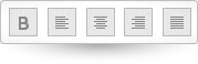
<div id="toolbar-button-bold"></div>
<div id="toolbar-button-justifyleft"></div>
<div id="toolbar-button-justifycenter"></div>
<div id="toolbar-button-justifyright"></div>
<div id="toolbar-button-justifyfull"></div>
</body>
</html>
Dependencies
Inherits
-
allowToggling
- Type:
- bool
- Default:
- true
Enable/Disable the "Toggling" of a button.
Code Sample
//Initialize $(".selector").igToolbarButton({ allowToggling: true }); // Get var allowedToggling = $(".selector").igToolbarButton("option", "allowToggling"); // Set $(".selector").igToolbarButton("option", "allowToggling", false); -
isSelected
- Type:
- bool
- Default:
- false
Enable/Disable the "Selecting" of a button.
Code Sample
            //Initialize
            $(".selector").igToolbarButton({
                isSelected: false
            });

            // Get
            var isSelected = $(".selector").igToolbarButton("option", "isSelected");

            // Set
            $(".selector").igToolbarButton("option", "isSelected", true);
For more information on how to interact with the Ignite UI controls' events, refer to
Using Events in Ignite UI.
-
activated
- Cancellable:
- false
Event fired after the toolbar button is activated.
Function takes arguments evt and ui.
Use ui.owner to get reference to the toolbar button performing the activation. -
activating
- Cancellable:
- true
Event fired before the toolbar button is activated.
Function takes arguments evt and ui.
Use ui.owner to get a reference to the toolbar button performing the activation. -
deactivated
- Cancellable:
- false
Event fired after the toolbar button is deactivated.
Function takes arguments evt and ui.
Use ui.owner to get reference to the toolbar button performing the deactivation. -
deactivating
- Cancellable:
- true
Event fired before the toolbar button is deactivated.
Function takes arguments evt and ui.
Use ui.owner to get a reference to the toolbar button performing the deactivation.
-
activate
- .igToolbarButton( "activate", event:object );
Activate toolbar button.
- event
- Type:object
Code Sample
$(".selector").igToolbarButton("activate"); -
deactivate
- .igToolbarButton( "deactivate", event:object );
Deactivate toolbar button.
- event
- Type:object
Code Sample
$(".selector").igToolbarButton("deactivate"); -
destroy
- .igToolbarButton( "destroy" );
Destroy the widget.
Code Sample
$(".selector").igToolbarButton("destroy"); -
toggle
- .igToolbarButton( "toggle" );
Toggle toolbar button.
Code Sample
$(".selector").igToolbarButton("toggle"); -
widget
- .igToolbarButton( "widget" );
- Return Type:
- object
- Return Type Description:
- Returns the element that represents this widget.
Returns the element that represents this widget.
-
ui-igtoolbarbutton