
Ignite UI API Reference
ui.igGridPaging
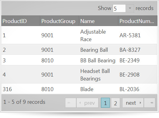
Both the igGrid and igHierarchicalGrid controls feature paging in the grid. Paging allows the grid to render a limited number of rows of the underlying set of data to the user at a time. Depending on how the grid is configured, you can choose to send all or just a sub-set of data to the client at a time. Further information regarding the classes, options, events, methods and themes of this API are available under the associated tabs above.
The following code snippet demonstrates how to initialize the igGrid control.
Click here for more information on how to get started using this API. For details on how to reference the required scripts and themes for the igGrid control read, Using JavaScript Resources in Ignite UI and Styling and Theming Ignite UI.Code Sample
<!doctype html>
<html>
<head>
    <title>Ignite UI igGridPaging</title>
    <!-- Infragistics Combined CSS -->
    <link href="css/themes/infragistics/infragistics.theme.css" rel="stylesheet" type="text/css" />
    <link href="css/structure/infragistics.css" rel="stylesheet" type="text/css" />
    <!-- jQuery Core -->
    <script src="js/jquery.js" type="text/javascript"></script>
    <!-- jQuery UI -->
    <script src="js/jquery-ui.js" type="text/javascript"></script>
    <!-- Infragistics Combined Scripts -->
    <script src="js/infragistics.core.js" type="text/javascript"></script>
	  <script src="js/infragistics.lob.js" type="text/javascript"></script>
    <script type="text/javascript">
        $(function () {
            var products = [
                { "ProductID": 1, "ProductGroup": "9001", "Name": "Adjustable Race", "ProductNumber": "AR-5381" },
                { "ProductID": 2, "ProductGroup": "9001", "Name": "Bearing Ball", "ProductNumber": "BA-8327" },
                { "ProductID": 3, "ProductGroup": "8010", "Name": "BB Ball Bearing", "ProductNumber": "BE-2349" },
                { "ProductID": 4, "ProductGroup": "9001", "Name": "Headset Ball Bearings", "ProductNumber": "BE-2908" },
                { "ProductID": 316, "ProductGroup": "8010", "Name": "Blade", "ProductNumber": "BL-2036" },
                { "ProductID": 317, "ProductGroup": "9001", "Name": "LL Crankarm", "ProductNumber": "CA-5965" },
                { "ProductID": 318, "ProductGroup": "8010", "Name": "ML Crankarm", "ProductNumber": "CA-6738" },
                { "ProductID": 319, "ProductGroup": "8010", "Name": "HL Crankarm", "ProductNumber": "CA-7457" },
                { "ProductID": 320, "ProductGroup": "9001", "Name": "Chainring Bolts", "ProductNumber": "CB-2903" }
            ];

            $("#grid").igGrid({
                autoGenerateColumns: true,
                dataSource: products,
                features: [{
                    name: "Paging",
                    type: "local",
                    pageSize: 5
                }]
            });
        });
    </script>
</head>
<body>
    <table id="grid">
    </table>
</body>
</html>
Related Samples
Related Topics
Dependencies
Inherits
-
currentPageDropDownLeadingLabel
- Type:
- string
- Default:
- ""
Leading label for the dropdown from where the page index can be switched.
Code Sample
//Initialize $(".selector").igGrid({ features : [ { name : "Paging", currentPageDropDownLeadingLabel : "Current Page" } ] }); //Get var label = $(".selector").igGridPaging("option", "currentPageDropDownLeadingLabel"); //Set $(".selector").igGridPaging("option", "currentPageDropDownLeadingLabel", "Current Page"); -
currentPageDropDownTooltip
- Type:
- string
- Default:
- ""
Custom localized tooltip for the page index dropdown.
Code Sample
//Initialize $(".selector").igGrid({ features : [ { name : "Paging", currentPageDropDownTooltip : "Choose Page" } ] }); //Get var tooltip = $(".selector").igGridPaging("option", "currentPageDropDownTooltip"); //Set $(".selector").igGridPaging("option", "currentPageDropDownTooltip", "Choose Page"); -
currentPageDropDownTrailingLabel
- Type:
- string
- Default:
- ""
Localized trailing label for the dropdown from where the page index can be switched.
Code Sample
//Initialize $(".selector").igGrid({ features : [ { name : "Paging", currentPageDropDownTrailingLabel : "Pages" } ] }); //Get var label = $(".selector").igGridPaging("option", "currentPageDropDownTrailingLabel"); //Set $(".selector").igGridPaging("option", "currentPageDropDownTrailingLabel", "Pages"); -
currentPageIndex
- Type:
- number
- Default:
- 0
Current page index that's bound and rendered in the UI.
Code Sample
//Initialize $(".selector").igGrid({ features : [ { name : "Paging", currentPageIndex : 5 } ] }); //Get var page = $(".selector").igGridPaging("option", "currentPageIndex"); //Set $(".selector").igGridPaging("option", "currentPageIndex", 5); -
defaultDropDownWidth
- Type:
- number
- Default:
- 70
Dropdown width for page size and page index dropdowns.
Code Sample
//Initialize $(".selector").igGrid({ features : [ { name : "Paging", defaultDropDownWidth : 100 } ] }); //Get var width = $(".selector").igGridPaging("option", "defaultDropDownWidth"); //Set $(".selector").igGridPaging("option", "defaultDropDownWidth", 100); -
delayOnPageChanged
- Type:
- number
- Default:
- 350
Time in milliseconds for which page dropdown will wait for keystrokes before changing the page.
Code Sample
//Initialize $(".selector").igGrid({ features : [ { name : "Paging", delayOnPageChanged : 500 } ] }); //Get var delayOnPageChanged = $(".selector").igGridPaging("option", "delayOnPageChanged"); -
firstPageLabelText
- Type:
- string
- Default:
- ""
Localized text for the first page label.
Code Sample
//Initialize $(".selector").igGrid({ features : [ { name : "Paging", firstPageLabelText : "First" } ] }); //Get var label = $(".selector").igGridPaging("option", "firstPageLabelText"); //Set $(".selector").igGridPaging("option", "firstPageLabelText", "First"); -
firstPageTooltip
- Type:
- string
- Default:
- ""
Custom localized tooltip for the first. page button.
Code Sample
//Initialize $(".selector").igGrid({ features : [ { name : "Paging", firstPageTooltip : "Go to first page" } ] }); //Get var tooltip = $(".selector").igGridPaging("option", "firstPageTooltip"); //Set $(".selector").igGridPaging("option", "firstPageTooltip", "Go to first page"); -
lastPageLabelText
- Type:
- string
- Default:
- ""
Localized text for the last page label.
Code Sample
//Initialize $(".selector").igGrid({ features : [ { name : "Paging", lastPageLabelText : "Last" } ] }); //Get var label = $(".selector").igGridPaging("option", "lastPageLabelText"); //Set $(".selector").igGridPaging("option", "lastPageLabelText", "Last"); -
lastPageTooltip
- Type:
- string
- Default:
- ""
Custom localized tooltip for the last. page button.
Code Sample
//Initialize $(".selector").igGrid({ features : [ { name : "Paging", lastPageTooltip : "Go to last page" } ] }); //Get var tooltip = $(".selector").igGridPaging("option", "lastPageTooltip"); //Set $(".selector").igGridPaging("option", "lastPageTooltip", "Go to last page"); -
nextPageLabelText
- Type:
- string
- Default:
- ""
Localized text for the next page label.
Code Sample
//Initialize $(".selector").igGrid({ features : [ { name : "Paging", nextPageLabelText : "Next" } ] }); //Get var label = $(".selector").igGridPaging("option", "nextPageLabelText"); //Set $(".selector").igGridPaging("option", "nextPageLabelText", "Next"); -
nextPageTooltip
- Type:
- string
- Default:
- ""
Custom localized tooltip for the next. page button.
Code Sample
//Initialize $(".selector").igGrid({ features : [ { name : "Paging", nextPageTooltip : "Go to next page" } ] }); //Get var tooltip = $(".selector").igGridPaging("option", "nextPageTooltip"); //Set $(".selector").igGridPaging("option", "nextPageTooltip", "Go to next page"); -
pageCountLimit
- Type:
- number
- Default:
- 10
Sets gets the number of pages which if exceeded a drop down list of page indices is displayed. If the number of pages is less than or equal to this option then page buttons are displayed.
Code Sample
//Initialize $(".selector").igGrid({ features : [ { name : "Paging", pageCountLimit : 5 } ] }); //Get var count = $(".selector").igGridPaging("option", "pageCountLimit"); //Set $(".selector").igGridPaging("option", "pageCountLimit", 5); -
pageIndexUrlKey
- Type:
- string
- Default:
- null
Denotes the name of the encoded URL parameter that will state what is the currently requested page index.
Code Sample
//Initialize $(".selector").igGrid({ features : [ { name : "Paging", pageIndexUrlKey : "page" } ] }); //Get var key = $(".selector").igGridPaging("option", "pageIndexUrlKey"); //Set $(".selector").igGridPaging("option", "pageIndexUrlKey", "page"); -
pagerRecordsLabelTemplate
- Type:
- string
- Default:
- ""
Custom pager records label template - in jQuery templating style and syntax.
Code Sample
//Initialize $(".selector").igGrid({ features : [ { name : "Paging", pagerRecordsLabelTemplate : "From ${startRecord} to ${endRecord} of ${recordCount}" } ] }); //Get var labelTemplate = $(".selector").igGridPaging("option", "pagerRecordsLabelTemplate"); //Set $(".selector").igGridPaging("option", "pagerRecordsLabelTemplate", "From ${startRecord} to ${endRecord} of ${recordCount}"); -
pagerRecordsLabelTooltip
- Type:
- string
- Default:
- ""
Custom localized tooltip for the pager records label.
Code Sample
//Initialize $(".selector").igGrid({ features : [ { name : "Paging", pagerRecordsLabelTooltip : "Current records" } ] }); //Get var labelTemplate = $(".selector").igGridPaging("option", "pagerRecordsLabelTooltip"); //Set $(".selector").igGridPaging("option", "pagerRecordsLabelTooltip", "Current records"); -
pageSize
- Type:
- number
- Default:
- 25
Default number of records per page.
Code Sample
//Initialize $(".selector").igGrid({ features : [ { name : "Paging", pageSize : 10 } ] }); //Get var pageSize = $(".selector").igGridPaging("option", "pageSize"); //Set $(".selector").igGridPaging("option", "pageSize", 10); -
pageSizeDropDownLabel
- Type:
- string
- Default:
- ""
Label rendered in front of the page size dropdown.
Code Sample
//Initialize $(".selector").igGrid({ features : [ { name : "Paging", pageSizeDropDownLabel : "Rows" } ] }); //Get var label = $(".selector").igGridPaging("option", "pageSizeDropDownLabel"); //Set $(".selector").igGridPaging("option", "pageSizeDropDownLabel", "Rows"); -
pageSizeDropDownLocation
- Type:
- enumeration
- Default:
- above
Members
- above
- Type:string
- it will be rendered above the grid header.
- inpager
- Type:string
- it will be rendered next to page links.
Code Sample
//Initialize $(".selector").igGrid({ features : [ { name : "Paging", pageSizeDropDownLocation : "inpager" } ] }); //Get var location = $(".selector").igGridPaging("option", "pageSizeDropDownLocation"); //Set $(".selector").igGridPaging("option", "pageSizeDropDownLocation", "inpager"); -
pageSizeDropDownTooltip
- Type:
- string
- Default:
- ""
Custom localized tooltip for the page size dropdown.
Code Sample
//Initialize $(".selector").igGrid({ features : [ { name : "Paging", pageSizeDropDownTooltip : "Choose page size" } ] }); //Get var tooltip = $(".selector").igGridPaging("option", "pageSizeDropDownTooltip"); //Set $(".selector").igGridPaging("option", "pageSizeDropDownTooltip", "Choose page size"); -
pageSizeDropDownTrailingLabel
- Type:
- string
- Default:
- ""
Trailing label for the page size dropdown.
Code Sample
//Initialize $(".selector").igGrid({ features : [ { name : "Paging", pageSizeDropDownTrailingLabel : "Rows" } ] }); //Get var label = $(".selector").igGridPaging("option", "pageSizeDropDownTrailingLabel"); //Set $(".selector").igGridPaging("option", "pageSizeDropDownTrailingLabel", "Rows"); -
pageSizeList
- Type:
- array
- Default:
- []
- Elements Type:
- object
Default: [5, 10, 20, 25, 50, 75, 100]. contents of the page size dropdown indicating what preconfigured page sizes are available to the end user.
Code Sample
//Initialize $(".selector").igGrid({ features : [ { name : "Paging", pageSizeList : [10, 20, 30] } ] }); //Get var pagesList = $(".selector").igGridPaging("option", "pageSizeList"); //Set $(".selector").igGridPaging("option", "pageSizeList", [10, 20, 30]); -
pageSizeUrlKey
- Type:
- string
- Default:
- null
Denotes the name of the encoded URL parameter that will state what is the currently requested page size.
Code Sample
//Initialize $(".selector").igGrid({ features : [ { name : "Paging", pageSizeUrlKey : "psize" } ] }); //Get var key = $(".selector").igGridPaging("option", "pageSizeUrlKey"); //Set $(".selector").igGridPaging("option", "pageSizeUrlKey", "psize"); -
pageTooltipFormat
- Type:
- string
- Default:
- ""
Custom localized format string for tooltips of buttons that directly jump to a particular page. The format string follows the jQuery templating style and syntax. See also the pageCountLimit option.
Code Sample
//Initialize $(".selector").igGrid({ features : [ { name : "Paging", pageTooltipFormat : "Open page" } ] }); //Get var key = $(".selector").igGridPaging("option", "pageTooltipFormat"); //Set $(".selector").igGridPaging("option", "pageTooltipFormat", "Open page"); -
prevPageLabelText
- Type:
- string
- Default:
- ""
Localized text for the prev page label.
Code Sample
//Initialize $(".selector").igGrid({ features : [ { name : "Paging", prevPageLabelText : "Previous" } ] }); //Get var label = $(".selector").igGridPaging("option", "prevPageLabelText"); //Set $(".selector").igGridPaging("option", "prevPageLabelText", "Previous"); -
prevPageTooltip
- Type:
- string
- Default:
- ""
Custom localized tooltip for the prev. page button.
Code Sample
//Initialize $(".selector").igGrid({ features : [ { name : "Paging", prevPageTooltip : "Go to previous page" } ] }); //Get var tooltip = $(".selector").igGridPaging("option", "prevPageTooltip"); //Set $(".selector").igGridPaging("option", "prevPageTooltip", "Go to previous page"); -
recordCountKey
- Type:
- string
- Default:
- null
The property in the response that will hold the total number of records in the data source.
Code Sample
//Initialize $(".selector").igGrid({ features : [ { name : "Paging", recordCountKey : "totalCount" } ] }); //Get var totalCount = $(".selector").igGridPaging("option", "recordCountKey"); //Set $(".selector").igGridPaging("option", "recordCountKey", "totalCount"); -
showFirstLastPages
- Type:
- bool
- Default:
- true
Option specifying whether to render the first and last page buttons.
Code Sample
//Initialize $(".selector").igGrid({ features : [ { name : "Paging", showFirstLastPages : false } ] }); //Get var showFirstLast = $(".selector").igGridPaging("option", "showFirstLastPages"); //Set $(".selector").igGridPaging("option", "showFirstLastPages", false); -
showPagerRecordsLabel
- Type:
- bool
- Default:
- true
Option specifying whether to show summary label for the currently rendered records or not.
Code Sample
//Initialize $(".selector").igGrid({ features : [ { name : "Paging", showPagerRecordsLabel : false } ] }); //Get var showRecordsLabel = $(".selector").igGridPaging("option", "showPagerRecordsLabel"); //Set $(".selector").igGridPaging("option", "showPagerRecordsLabel", false); -
showPageSizeDropDown
- Type:
- bool
- Default:
- true
If false, a dropdown allowing to change the page size will not be rendered in the UI.
Code Sample
//Initialize $(".selector").igGrid({ features : [ { name : "Paging", showPageSizeDropDown : false } ] }); //Get var showDropDown = $(".selector").igGridPaging("option", "showPageSizeDropDown"); //Set $(".selector").igGridPaging("option", "showPageSizeDropDown", false); -
showPrevNextPages
- Type:
- bool
- Default:
- true
Option specifying whether to render the previous and next page buttons.
Code Sample
//Initialize $(".selector").igGrid({ features : [ { name : "Paging", showPrevNextPages : false } ] }); //Get var showPages = $(".selector").igGridPaging("option", "showPrevNextPages"); //Set $(".selector").igGridPaging("option", "showPrevNextPages", false); -
type
- Type:
- enumeration
- Default:
- null
Members
- remote
- Type:string
- request.
- local
- Type:string
- paging on the client-side.
Code Sample
//Initialize $(".selector").igGrid({ features : [ { name : "Paging", type : "local" } ] }); //Get var type = $(".selector").igGridPaging("option", "type"); //Set $(".selector").igGridPaging("option", "type", "local"); -
visiblePageCount
- Type:
- number
- Default:
- 5
Number of pages that are constantly visible. For the invisible pages, prev and next buttons are used.
Code Sample
        //Initialize
        $(".selector").igGrid({
            features : [
                {
                    name : "Paging",
                    visiblePageCount : 10
                }
            ]
        });

        //Get
        var visCount = $(".selector").igGridPaging("option", "visiblePageCount");

        //Set
        $(".selector").igGridPaging("option", "visiblePageCount", 10);
For more information on how to interact with the Ignite UI controls' events, refer to
Using Events in Ignite UI.
-
pageIndexChanged
- Cancellable:
- false
Event fired after the page index is changed , but before grid data rebinds
Function takes arguments evt and ui.
Use ui.owner to get reference to igGridPaging.
Use ui.owner.grid to get reference to igGrid.
Use ui.pageIndex to get current page index.Code Sample
//Bind after initialization $(document).delegate(".selector", "iggridpagingpageindexchanged", function (evt, ui) { //return browser event evt.originalEvent; // Get a reference to the igGridPaging widget that fired the event ui.owner; // Get a reference to the igGrid widget to which the idGridPaging is bound ui.owner.grid; // Get the current page index ui.pageIndex; }); //Initialize $(".selector").igGrid({ features: [{ name: "Paging", pageIndexChanged: function (evt, ui) { ... } }] }); -
pageIndexChanging
- Cancellable:
- true
Event fired before the page index is changed.
Return false in order to cancel page index changing.
Function takes arguments evt and ui.
Use ui.owner to get reference to igGridPaging.
Use ui.owner.grid to get reference to igGrid.
Use ui.currentPageIndex to get current page index.
Use ui.newPageIndex to get new page index.Code Sample
//Bind after initialization $(document).delegate(".selector", "iggridpagingpageindexchanging", function (evt, ui) { //return browser event evt.originalEvent; // Get a reference to the igGridPaging widget that fired the event ui.owner; // Get a reference to the igGrid widget to which the idGridPaging is bound ui.owner.grid; // Get the current page index ui.currentPageIndex; // Get the index of the page that is about to be opened ui.newPageIndex; }); //Initialize $(".selector").igGrid({ features: [{ name: "Paging", pageIndexChanging: function (evt, ui) { ... } }] }); -
pagerRendered
- Cancellable:
- false
Event fired after the pager footer is rendered
Function takes arguments evt and ui.
Use ui.owner to get reference to igGridPaging.
Use ui.owner.grid to get reference to igGrid.
Use ui.dataSource to get reference to grid's data source.Code Sample
//Bind after initialization $(document).delegate(".selector", "iggridpagingpagerrendered", function (evt, ui) { //return browser event evt.originalEvent; // Get a reference to the igGridPaging widget that fired the event ui.owner; // Get a reference to the igGrid widget to which the idGridPaging is bound ui.owner.grid; // Get the data source of the grid ui.dataSource; }); //Initialize $(".selector").igGrid({ features: [{ name: "Paging", pagerRendered: function (evt, ui) { ... } }] }); -
pagerRendering
- Cancellable:
- true
Event fired before the pager footer is rendered (the whole area below the grid records).
Return false in order to cancel pager footer rendering.
Function takes arguments evt and ui.
Use ui.owner to get reference to igGridPaging.
Use ui.owner.grid to get reference to igGrid.
Use ui.dataSource to get reference to grid's data source.Code Sample
//Bind after initialization $(document).delegate(".selector", "iggridpagingpagerrendering", function (evt, ui) { //return browser event evt.originalEvent; // Get a reference to the igGridPaging widget that fired the event ui.owner; // Get a reference to the igGrid widget to which the idGridPaging is bound ui.owner.grid; // Get the data source of the grid ui.dataSource; }); //Initialize $(".selector").igGrid({ features: [{ name: "Paging", pagerRendering: function (evt, ui) { ... } }] }); -
pageSizeChanged
- Cancellable:
- false
Event fired after the page size is changed from the page size dropdown.
Function takes arguments evt and ui.
Use ui.owner to get reference to igGridPaging.
Use ui.owner.grid to get reference to igGrid.
Use ui.pageSize to get current page size.Code Sample
//Bind after initialization $(document).delegate(".selector", "iggridpagingpagesizechanged", function (evt, ui) { //return browser event evt.originalEvent; // Get a reference to the igGridPaging widget that fired the event ui.owner; // Get a reference to the igGrid widget to which the idGridPaging is bound ui.owner.grid; // Get the current page size in the grid ui.pageSize; }); //Initialize $(".selector").igGrid({ features: [{ name: "Paging", pageSizeChanged: function (evt, ui) { ... } }] }); -
pageSizeChanging
- Cancellable:
- true
Event fired when the page size is about to be changed from the page size dropdown.
Return false in order to cancel page size changing.
Function takes arguments evt and ui.
Use ui.owner to get reference to igGridPaging.
Use ui.owner.grid to get reference to igGrid.
Use ui.currentPageSize to get current page size.
Use ui.newPageSize to get new page size.Code Sample
        //Bind after initialization
        $(document).delegate(".selector", "iggridpagingpagesizechanging", function (evt, ui) {
            //return browser event
            evt.originalEvent;

            //	Get a reference to the igGridPaging widget that fired the event
            ui.owner;

            //	Get a reference to the igGrid widget to which the idGridPaging is bound
            ui.owner.grid;

            //	Get the current page size in the grid
            ui.currentPageSize;

            //	Get the new page size in the grid that is about to be set
            ui.newPageSize;
        });

        //Initialize
        $(".selector").igGrid({
            features: [{
                name: "Paging",
                pageSizeChanging: function (evt, ui) { ... }
            }]
        });
-
destroy
- .igGridPaging( "destroy" );
Destroys the igGridPaging feature by removing all elements in the pager area, unbinding events, and resetting data to discard data filtering on paging.
Code Sample
$(".selector").igGridPaging("destroy"); -
pageIndex
- .igGridPaging( "pageIndex", [index:number] );
- Return Type:
- number
- Return Type Description:
- if no param is specified, returns the current page index.
Gets /sets the current page index, delegates data binding and paging to $.ig.DataSource.
- index
- Type:number
- Optional
- the page index to go to.
Code Sample
//Get var index = $(".selector").igGridPaging("pageIndex"); //Set $(".selector").igGridPaging("pageIndex", 4); -
pageSize
- .igGridPaging( "pageSize", [size:number] );
- Return Type:
- number
- Return Type Description:
- if no param is specified, returns the current page size.
Gets / sets the page Size. if no parameter is specified, just returns the current page size.
- size
- Type:number
- Optional
- the page size .
Code Sample
        //Get
        var size = $(".selector").igGridPaging("pageSize");

        //Set
        $(".selector").igGridPaging("pageSize", 16);
-
ui-iggrid-firstpage ui-iggrid-paging-item ui-state-default ui-corner-left
- Classes applied to the area where the first page button and label are rendered.
-
ui-iggrid-pageimg ui-iggrid-firstpageimg ui-icon ui-icon-arrowstop-1-w
- Classes applied to the first page area that holds the span for the icon.
-
ui-iggrid-pageimg ui-iggrid-firstpageimgdisabled ui-icon ui-state-disabled ui-icon-arrowstop-1-w
- Classes applied to the first page area that holds the span for the icon when it is disabled.
-
ui-iggrid-firstpagelabel
- Classes applied to the first page's label (span).
-
ui-iggrid-firstpagelabeldisabled ui-state-disabled
- Classes applied to the first page's label (span) when it's disabled.
-
ui-iggrid-lastpage ui-iggrid-paging-item ui-state-default ui-corner-right
- Classes applied to the area where the last page button and label are rendered.
-
ui-iggrid-pageimg ui-iggrid-lastpageimg ui-icon ui-icon-arrowstop-1-e
- Classes applied to the last page area that holds the span for the icon.
-
ui-iggrid-pageimg ui-iggrid-lastpageimgdisabled ui-icon ui-state-disabled ui-icon-arrowstop-1-e
- Classes applied to the last page area that holds the span for the icon when it is disabled.
-
ui-iggrid-lastpagelabel
- Classes applied to the last page's label (span).
-
ui-iggrid-lastpagelabeldisabled ui-state-disabled
- Classes applied to the last page's label (span) when it's disabled.
-
ui-iggrid-nextpage ui-iggrid-paging-item ui-state-default
- Classes applied to the area where the next page button and label are rendered.
-
ui-iggrid-pageimg ui-iggrid-nextpageimg ui-icon ui-icon-triangle-1-e
- Classes applied to the next page area that holds the span for the icon.
-
ui-iggrid-pageimg ui-iggrid-nextpageimgdisabled ui-icon ui-state-disabled ui-icon-triangle-1-e
- Classes applied to the next page area that holds the span for the icon when it is disabled.
-
ui-iggrid-nextpagelabel
- Classes applied to the next page's label (span).
-
ui-iggrid-nextpagelabeldisabled ui-state-disabled
- Classes applied to the next page's label (span) when it's disabled.
-
ui-iggrid-page ui-state-default ui-corner-all
- Classes applied to a page container element (list item).
-
ui-iggrid-pagecurrent ui-state-active ui-corner-all
- Clases applied to the current page (corresponding to the current page index).
-
ui-iggrid-pagedropdown
- Classes applied to the editor dropdown from where the page index can be changed.
-
ui-iggrid-pagedropdowncontainer
- Classes applied to the element holding the editor dropdown from where the page index can be changed.
-
ui-iggrid-pagedropdownlabels
- Classes applied to the spans that are before and after the dropdown editor from where the page index can be changed.
-
ui-iggrid-pagefocused ui-state-focus
- Classes applied to the current page that has focus (when keyboard anvigation is used).
-
ui-iggrid-page-hover ui-state-hover
- Classes applied to a page list item when it's hovered.
-
ui-iggrid-pagelink ui-helper-reset
- Classes applied to a page link that can be clicked with the mouse.
-
ui-iggrid-pagelinkcurrent
- Classes applied to the anchor of the current page item.
-
ui-helper-reset ui-iggrid-pagelist ui-iggrid-paging-item
- Classes applied to the UL list that holds all pages.
-
ui-widget ui-iggrid-pager ui-helper-clearfix ui-corner-bottom ui-widget-header ui-iggrid-footer
- Classes applied to the pager area.
-
ui-iggrid-pagerrecordslabel ui-iggrid-results
- Classes applied to the label showing how many records are rendered of some total number.
-
ui-iggrid-paging
- Classes applied to the area on the right of the footer where first, last, prev, next buttons as well as page links and page index dropdown are rendered.
-
ui-iggrid-pagesizedropdown
- Classes applied to the editor dropdown from where page size can be changed.
-
ui-helper-clearfix ui-iggrid-pagesizedropdowncontainer
- Classes applied to the element that holds the page size dropdown.
-
ui-widget ui-helper-clearfix ui-iggrid-pagesizedropdowncontainerabove ui-iggrid-toolbar ui-widget-header and ui-corner-top
- Classes applied to the container of the page size dropdown editor, when it is rendered above the header.
-
ui-iggrid-pagesizelabel
- Classes applied to the editor dropdown label from where page size can be changed.
-
ui-iggrid-results
- Classes applied around the label showing the currently rendered record indices out of some total value.
-
ui-iggrid-prevpage ui-iggrid-paging-item ui-state-default
- Classes applied to the area where the prev page button and label are rendered.
-
ui-iggrid-pageimg ui-iggrid-prevpageimg ui-icon ui-icon-triangle-1-w
- Classes applied to the prev page area that holds the span for the icon.
-
ui-iggrid-pageimg ui-iggrid-prevpageimgdisabled ui-icon ui-state-disabled ui-icon-triangle-1-w
- Classes applied to the prev page area that holds the span for the icon when it is disabled.
-
ui-iggrid-prevpagelabel
- Classes applied to the prev page's label (span).
-
ui-iggrid-prevpagelabeldisabled ui-state-disabled
- Classes applied to the prev page's label (span) when it's disabled.