
Ignite UI API Reference
ui.igPopover
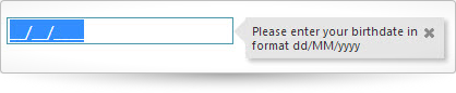
The igPopover adds tooltip like functionality to the browser.
Further information regarding the classes, options, events, methods and themes of this API are available under the associated tabs above.
The following code snippet demonstrates how to initialize the igPopover control on an igDateEditor control.
For details on how to reference the required scripts and themes for the igPopover control read Using JavaScript Resources in Ignite UI and Styling and Theming Ignite UI.
Code Sample
<!doctype html>
<html>
<head>
    <!-- Infragistics Combined CSS -->
    <link href="css/themes/infragistics/infragistics.theme.css" rel="stylesheet" type="text/css" />
    <link href="css/structure/infragistics.css" rel="stylesheet" type="text/css" />
    <!-- jQuery Core -->
    <script src="js/jquery.js" type="text/javascript"></script>
    <!-- jQuery UI -->
    <script src="js/jquery-ui.js" type="text/javascript"></script>
    <!-- Infragistics Combined Scripts -->
    <script src="js/infragistics.core.js" type="text/javascript"></script>
    <script src="js/infragistics.lob.js" type="text/javascript"></script>
    <script type="text/javascript">
        $(function () {
            $("#dateEditor").igDateEditor();
            $("#dateEditor").igPopover({
                direction: "right",
                position: "start",
                headerTemplate {
                  closeButton: true
                },
                closeOnBlur: true,
                animationDuration: 150,
                maxHeight: null,
                maxWidth: 170,
                showOn: "focus"
            });
        });
    </script>
</head>
<body>
    <input id="dateEditor" type="date" title="Please enter your birthdate in format dd/MM/yyyy" />
</body>
</html>
Related Samples
Dependencies
Inherits
-
animationDuration
- Type:
- number
- Default:
- 150
Sets the time popover fades in and out when showing/hiding.
Code Sample
//Initialize $(".selector").igPopover({ animationDuration: 200 }); // Get var animationDuration = $(".selector").igPopover("option", "animationDuration"); // Set $(".selector").igPopover("option", "animationDuration", 100); -
closeOnBlur
- Type:
- bool
- Default:
- true
Controls whether the popover will close on blur or not.
Code Sample
//Initialize $(".selector").igPopover({ closeOnBlur: false }); // Get var closeOnBlur = $(".selector").igPopover("option", "closeOnBlur"); -
containment
- Type:
- object
- Default:
- null
Sets the containment for the popover. Accepts a jQuery object.
Code Sample
//Initialize $(".selector").igPopover({ containment: $( '#popoverDivElement' ) }); // Get var containment = $(".selector").igPopover("option", "containment"); // Set $(".selector").igPopover("option", "containment", $( '#popoverTooltip' )); -
contentTemplate
- Type:
- enumeration
- Default:
- null
sets the content for the popover container. If left null the content will be get from the target. string String content of the popover container.
Members
- string
- String content of the popover container.
Code Sample
//Initialize // callback function $(".selector").igPopover({ contentTemplate:function () { var imgTemplate = "<img class='map' alt='${value}' src='http://maps.google.com/maps/api/staticmap?zoom=10&size=250x250&maptype=terrain&sensor=false¢er=${value}'>"; var data = [{ value: $( this )[0].value }]; return $.ig.tmpl( imgTemplate, data ); } }); // string content for the popover container $(".selector").igPopover({ contentTemplate:"<img src='http://www.infragistics.com/assets/images/logo.png' title='IG logo' />" }); // Set // Accepts setting the value only if string type is passed $(".selector").igPopover("option", "contentTemplate", "<img src='http://www.infragistics.com/assets/images/logo.png' title='IG logo' />"); // Get var contentFunction = $(".selector").igPopover("option", "contentTemplate"); -
direction
- Type:
- enumeration
- Default:
- auto
controls the direction in which the control shows relative to the target element.
Members
- auto
- Type:string
- lets the control show on the side where enough space is available with the following priority top > bottom > right > left.
- left
- Type:string
- shows popover on the left side of the target element.
- right
- Type:string
- shows popover on the right side of the target element.
- top
- Type:string
- shows popover on the top of the target element.
- bottom
- Type:string
- shows popover on the bottom of the target element.
Code Sample
//Initialize $(".selector").igPopover({ direction: "right" }); // Get var direction = $(".selector").igPopover("option", "direction"); // Set $(".selector").igPopover("option", "direction", "top"); -
headerTemplate
- Type:
- object
- Default:
- {}
Sets the content for the popover header.
Code Sample
//Initialize $(".selector").igPopover({ headerTemplate { closeButton: true, title : "The title of the popover" } }); // Get var headerTemplate = $(".selector").igPopover("option", "headerTemplate");-
closeButton
- Type:
- bool
- Default:
- false
Controls whether the popover renders a functional close button.
Code Sample
//Initialize $(".selector").igPopover({ headerTemplate { closeButton: true } }); // Get var closeButton = $(".selector").igPopover("option", "headerTemplate"); -
title
- Type:
- string
- Default:
- null
Sets the content for the popover header.
Code Sample
       //Initialize
        $(".selector").igPopover({
          headerTemplate {
            title : "The title of the popover"
          }
		    });

      // Get
		  var title = $(".selector").igPopover("option", "headerTemplate");
-
height
- Type:
- enumeration
- Default:
- null
defines height for the popover. leave null for auto.
Members
- number
- The height can be set as a number.
- string
- The height can be set in pixels (px).
Code Sample
//Initialize $(".selector").igPopover({ height: 200 }); // Get var height = $(".selector").igPopover("option", "height"); -
maxHeight
- Type:
- enumeration
- Default:
- 200
defines height the popover won't exceed even if no specific one is set. .
Members
- number
- The max height can be set as a number.
- string
- The max height can be set in pixels (px).
Code Sample
//Initialize $(".selector").igPopover({ maxHeight: "300px" }); // Get var maxHeight = $(".selector").igPopover("option", "maxHeight"); -
maxWidth
- Type:
- enumeration
- Default:
- 200
defines width the popover won't exceed even if no specific one is set. .
Members
- number
- The maxWidth can be set as a number.
- string
- The maxWidth can be set in pixels (px).
Code Sample
//Initialize $(".selector").igPopover({ maxWidth: "300px" }); // Get var maxWidth = $(".selector").igPopover("option", "maxWidth"); -
position
- Type:
- enumeration
- Default:
- auto
controls the position of the popover according to the target element in case the popover is larger than the target on the side we want to position, if the popover is smaller it should always be in the middle of the visible area.
Members
- auto
- Type:string
- lets the control choose a position depending on available space with the following priority balanced > end > start.
- balanced
- Type:string
- the popover is positioned at the middle of the target element.
- start
- Type:string
- the popover is positioned at the beginning of the target element.
- end
- Type:string
- the popover is positioned at the end of the target element.
Code Sample
//Initialize $(".selector").igPopover({ position: "balanced" }); // Get var position = $(".selector").igPopover("option", "position"); // Set $(".selector").igPopover("option", "position", "start"); -
selectors
- Type:
- string
- Default:
- null
Selectors indicating which items should show popovers. The predefined value is [title]. Customize if you're using something other then the title attribute for the popover content, or if you need a different selector for event delegation. When changing this option, you likely need to also change the contentTemplate option.
Code Sample
//Initialize $(".selector").igPopover({ selectors: "[value],a" // elements which have attribute 'value' and the hyperlinks (anchor elements) }); // Get var selectors = $(".selector").igPopover("option", "selectors"); -
showOn
- Type:
- enumeration
- Default:
- mouseenter
Members
- mouseenter
- Type:string
- the popover is shown on mouse enter in the target element.
- click
- Type:string
- the popover is shown on click on the target element.
Code Sample
//Initialize $(".selector").igPopover({ showOn: "focus" }); // Get var showOn = $(".selector").igPopover("option", "showOn"); -
width
- Type:
- enumeration
- Default:
- null
defines width for the popover. leave null for auto. .
Members
- number
- The width can be set as a number.
- string
- The width can be set in pixels (px).
Code Sample
		//Initialize
		$(".selector").igPopover({
			width: 300
		});

		// Get
		var width = $(".selector").igPopover("option", "width");
For more information on how to interact with the Ignite UI controls' events, refer to
Using Events in Ignite UI.
-
hidden
- Cancellable:
- false
Event fired after popover is hidden.
Function takes arguments evt and ui.
Use ui.element to get the element the popover is hidden for.
Use ui.content to get the content displayed in the popover as a string.
Use ui.popover to get the popover element hidden.
Use ui.owner to get reference to the igPopover widget.Code Sample
//Bind after initialization $(document).delegate(".selector", "igpopoverhidden", function (evt, ui) { //return the triggered event evt; // reference to the igPopover widget. ui.owner; // reference the element the popover hid for. ui.element; // reference the current content displayed in the popover as a string. ui.content; // reference the popover element hidden. ui.popover; }); //Initialize $(".selector").igPopover({ hidden: function (evt, ui) { ... } }); -
hiding
- Cancellable:
- true
Event fired before popover is hidden.
Function takes arguments evt and ui.
Use ui.element to get the element the popover will hide for.
Use ui.content to get the current content displayed in the popover as a string.
Use ui.popover to get the popover element hiding.
Use ui.owner to get reference to the igPopover widget.Code Sample
//Bind after initialization $(document).delegate(".selector", "igpopoverhiding", function (evt, ui) { //return the triggered event evt; // reference to the igPopover widget. ui.owner; // reference the element the popover will hide for. ui.element; // reference the current content in the popover as a string. ui.content; // reference the popover element hiding. ui.popover; }); //Initialize $(".selector").igPopover({ hiding: function (evt, ui) { ... } }); -
showing
- Cancellable:
- true
Event fired before popover is shown.
Function takes arguments evt and ui.
Use ui.element to get the element the popover will show for.
Use ui.content to get or set the content to be shown as a string.
Use ui.popover to get the popover element showing.
Use ui.owner to get reference to the igPopover widget.Code Sample
//Bind after initialization $(document).delegate(".selector", "igpopovershowing", function (evt, ui) { //return the triggered event evt; // reference to the igPopover widget. ui.owner; // reference the element the popover will show for. ui.element; // reference the current content to be shown as a string. ui.content; // reference the popover element showing. ui.popover; }); //Initialize $(".selector").igPopover({ showing: function (evt, ui) { ... } }); -
shown
- Cancellable:
- false
Event fired after popover is shown.
Function takes arguments evt and ui.
Use ui.element to get the element the popover showed for.
Use ui.content to get the content that was shown as a string.
Use ui.popover to get the popover element shown.
Use ui.owner to get reference to the igPopover widget.Code Sample
		//Bind after initialization
		$(document).delegate(".selector", "igpopovershown", function (evt, ui) {
			//return the triggered event
			evt;

			// reference to the igPopover widget.
			ui.owner;

			// reference the element the popover showed for.
			ui.element;

			// reference the content that was shown as a string.
			ui.content;

			// reference the popover element shown.
			ui.popover;
		});

		//Initialize
		$(".selector").igPopover({
			shown: function (evt, ui) {
				...
           }
		});
-
container
- .igPopover( "container" );
- Return Type:
- object
Returns the container for the popover contents.
Code Sample
var container = $( "#imgPopover" ).igPopover( "container" ); -
destroy
- .igPopover( "destroy" );
Destroys the popover widget.
Code Sample
$( "#imgPopover" ).igPopover( "destroy" );
-
getContent
- .igPopover( "getContent" );
- Return Type:
- string
- Return Type Description:
- The popover content.
Gets the currently set content for the popover container.
Code Sample
var currentContent = $( "#imgPopover" ).igPopover( "getContent" );
-
getCoordinates
- .igPopover( "getCoordinates" );
- Return Type:
- object
- Return Type Description:
- The popover coordinates in pixels.
Gets the current coordinates of the popover.
Code Sample
var coordinates = $( "#imgPopover" ).igPopover( "getCoordinates" ); -
hide
- .igPopover( "hide" );
Hides the popover for the specified target.
Code Sample
$( "#imgPopover" ).igPopover( "hide" );
-
id
- .igPopover( "id" );
- Return Type:
- string
Returns the ID of the element the popover is attached to.
Code Sample
var popoverID = $( "#imgPopover" ).igPopover( "id" );
-
setContent
- .igPopover( "setContent", newCnt:string );
Sets the content for the popover container.
- newCnt
- Type:string
- The popover content to set.
Code Sample
$( "#imgPopover" ).igPopover( "setContent" , "New Content To be Set");
-
setCoordinates
- .igPopover( "setCoordinates", pos:object );
Set the currently coordinates of the popover.
- pos
- Type:object
- The popover coordinates in pixels.
Code Sample
var position = {top: 300, left: 450}; $( "#imgPopover" ).igPopover( "setCoordinates" , position); -
show
- .igPopover( "show", [trg:domelement], [content:string] );
Shows the popover for the specified target.
- trg
- Type:domelement
- Optional
- The element to show popover for.
- content
- Type:string
- Optional
- The string to set for the popover to show.
Code Sample
		// show the popover for the target it has been initialized before
	     $( "#imgPopover" ).igPopover( "show" );

		 // show the popover for a new target and with s new content to be displayed
		 $( "#imgPopover" ).igPopover( "show", $( "#popover_target" ), "Content to be displayed in the popover");
-
target
- .igPopover( "target" );
- Return Type:
- object
- Return Type Description:
- The current target.
Gets the popover current target.
Code Sample
var target = $( "#imgPopover" ).igPopover( "target" );
-
ui-igpopover-arrow ui-igpopover-arrow-
- Classes applied to the popover arrow (like ui-igpopover-arrow-top, ui-igpopover-arrow-left, etc).
-
ui-widget ui-igpopover
- Classes applied to the main popover container.
-
ui-icon ui-icon-closethick ui-igpopover-close-button
- Classes applied to the close button.
-
ui-igpopover-title
- Classes applied to the title container(if title is defined in options).