
Ignite UI API Reference
ui.igGridRowSelectors
Both the igGrid and igHierarchicalGrid controls feature row selection in the grid. Using row selectors you can configure the control to select single or multiple rows in the grid. You may also optionally enable row numbering with row selection. Further information regarding the classes, options, events, methods and themes of this API are available under the associated tabs above.
The following code snippet demonstrates how to initialize the igGrid control.
Click here for more information on how to get started using this API. For details on how to reference the required scripts and themes for the igGrid control read, Using JavaScript Resources in Ignite UI and Styling and Theming Ignite UI.Code Sample
<!doctype html>
<html>
<head>
<!-- Infragistics Combined CSS -->
<link href="css/themes/infragistics/infragistics.theme.css" rel="stylesheet" type="text/css" />
<link href="css/structure/infragistics.css" rel="stylesheet" type="text/css" />
<!-- jQuery Core -->
<script src="js/jquery.js" type="text/javascript"></script>
<!-- jQuery UI -->
<script src="js/jquery-ui.js" type="text/javascript"></script>
<!-- Infragistics Combined Scripts -->
<script src="js/infragistics.core.js" type="text/javascript"></script>
<script src="js/infragistics.lob.js" type="text/javascript"></script>
<script type="text/javascript">
$(function () {
var ds = [
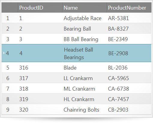
{ "ProductID": 1, "Name": "Adjustable Race", "ProductNumber": "AR-5381" },
{ "ProductID": 2, "Name": "Bearing Ball", "ProductNumber": "BA-8327" },
{ "ProductID": 3, "Name": "BB Ball Bearing", "ProductNumber": "BE-2349" },
{ "ProductID": 4, "Name": "Headset Ball Bearings", "ProductNumber": "BE-2908" },
{ "ProductID": 316, "Name": "Blade", "ProductNumber": "BL-2036" },
{ "ProductID": 317, "Name": "LL Crankarm", "ProductNumber": "CA-5965" },
{ "ProductID": 318, "Name": "ML Crankarm", "ProductNumber": "CA-6738" },
{ "ProductID": 319, "Name": "HL Crankarm", "ProductNumber": "CA-7457" },
{ "ProductID": 320, "Name": "Chainring Bolts", "ProductNumber": "CB-2903" }
];
$("#gridRowSelectors").igGrid({
width: "600px",
autoGenerateColumns: true,
dataSource: ds,
features: [
{
name: "RowSelectors"
},
{
name: "Selection"
}
]
});
});
</script>
</head>
<body>
<table id="gridRowSelectors"></table>
</body>
</html>
Related Samples
Related Topics
Dependencies
Inherits
-
enableCheckBoxes
- Type:
- bool
- Default:
- false
Determines whether the row selectors column should contain checkboxes.
Code Sample
//Initialize $(".selector").igGrid({ features : [ { name : "RowSelectors", enableCheckBoxes: true }, { name: "Selection" } ] }); //Get var checkboxes = $(".selector").igGridRowSelectors("option", "enableCheckBoxes"); -
enableRowNumbering
- Type:
- bool
- Default:
- true
Determines whether the row selectors column should contain row numbering.
Code Sample
//Initialize $(".selector").igGrid({ features : [ { name : "RowSelectors", enableRowNumbering: true }, { name: "Selection" } ] }); //Get var rowNumbering = $(".selector").igGridRowSelectors("option", "enableRowNumbering"); -
requireSelection
- Type:
- bool
- Default:
- true
Determines whether the selection feature is required for the row selectors. If set to "false"
the widget will not check for Selection availability. If set to "true" an exception will be thrown if Selection is
not available.Code Sample
//Initialize $(".selector").igGrid({ features : [ { name : "RowSelectors", requireSelection: true }, { name: "Selection" } ] }); //Get var requireSelection = $(".selector").igGridRowSelectors("option", "requireSelection"); -
rowNumberingSeed
- Type:
- number
- Default:
- 0
The seed to be added to the default numbering.
Code Sample
//Initialize $(".selector").igGrid({ features : [ { name : "RowSelectors", rowNumberingSeed: 5 }, { name: "Selection" } ] }); //Get var rowNumberingSeed = $(".selector").igGridRowSelectors("option", "rowNumberingSeed"); -
rowSelectorColumnWidth
- Type:
- enumeration
- Default:
- null
Members
- null
- Type:object
- will let the feature decide the best width depending on enabled contents.
- string
- The row selector column width can be set in pixels (px) and percentage (%).
- number
- The row selector width can be set as a number.
Code Sample
//Initialize $(".selector").igGrid({ features : [ { name : "RowSelectors", rowSelectorColumnWidth: 40 }, { name: "Selection" } ] }); //Get var width = $(".selector").igGridRowSelectors("option", "rowSelectorColumnWidth"); -
showCheckBoxesOnFocus
- Type:
- bool
- Default:
- false
Determines whether checkboxes will be shown only if row selectors are on focus/selected.
Code Sample
          //Initialize
        $(".selector").igGrid({
            features : [
                {
                    name : "RowSelectors",
                    showCheckBoxesOnFocus: true
                },
                {
                    name: "Selection"
                }
            ]
        });

        //Get
        var showCheckboxes = $(".selector").igGridRowSelectors("option", "showCheckBoxesOnFocus");
For more information on how to interact with the Ignite UI controls' events, refer to
Using Events in Ignite UI.
-
checkBoxStateChanged
- Cancellable:
- false
Event fired after a row selector checkbox had changed state.
Function takes arguments evt and ui.
Use ui.row to get reference to the row the clicked row selector resides in.
Use ui.rowIndex to get the index of the row the clicked row selector resides in.
Use ui.rowKey to get the key of the row the clicked row selector resides in.
Use ui.rowSelector to get reference to the row selector cell.
Use ui.owner to get reference to igRowSelectors.
Use ui.grid to get reference to the igGrid the igRowSelectors are initialized for.
Use ui.state to get the state of the checkbox ("on","off").
Use ui.isHeader to check if the header check box is the one being clicked. In this case no row related args are passed.Code Sample
//Bind after initialization $(document).delegate(".selector", "iggridrowselectorscheckboxstatechanged", function (evt, ui) { //return the triggered event evt; // reference to the row the clicked row selector resides in ui.row; // get the index of the row the clicked row selector resides in ui.rowIndex; // get the key of the row the clicked row selector resides in ui.rowKey; // get reference to the row selector cell ui.rowSelector; // get reference to the igGrid the igRowSelectors are initialized for ui.grid; // get the state of the checkbox ("on","off") ui.state; // check if the header row checkbox is clicked ui.isHeader; }); //Initialize $(".selector").igGrid({ features : [ { name : "RowSelectors", checkBoxStateChanged: function(evt, ui){ ... } } ] }); -
checkBoxStateChanging
- Cancellable:
- true
Event fired when a row selector checkbox is changing.
Function takes arguments evt and ui.
Use ui.row to get reference to the row the clicked row selector resides in.
Use ui.rowIndex to get the index of the row the clicked row selector resides in.
Use ui.rowKey to get the key of the row the clicked row selector resides in.
Use ui.rowSelector to get reference to the row selector cell.
Use ui.owner to get reference to igRowSelectors.
Use ui.grid to get reference to the igGrid the igRowSelectors are initialized for.
Use ui.currentState to get the current state of the checkbox ("on","off").
Use ui.newState to get the new state of the checkbox ("on","off").
Use ui.isHeader to check if the header check box is the one being clicked. In this case no row related args are passed.Code Sample
//Bind after initialization $(document).delegate(".selector", "iggridrowselectorscheckboxstatechanging", function (evt, ui) { //return the triggered event evt; // reference to the row the clicked row selector resides in ui.row; // get the index of the row the clicked row selector resides in ui.rowIndex; // get the key of the row the clicked row selector resides in ui.rowKey; // get reference to the row selector cell ui.rowSelector; // get reference to the igGrid the igRowSelectors are initialized for ui.grid; // get the current state of the checkbox ("on","off") ui.currentState; // get the new state of the checkbox ("on","off") ui.newState; // check if the header row checkbox is clicked ui.isHeader; }); //Initialize $(".selector").igGrid({ features : [ { name : "RowSelectors", checkBoxStateChanging: function(evt, ui){ ... } } ] }); -
rowSelectorClicked
- Cancellable:
- false
Event fired after a row selector is clicked.
Function takes arguments evt and ui.
Use ui.row to get reference to the row the clicked row selector resides in.
Use ui.fixedRow to get reference to the fixed row the clicked row selector resides in(if there are fixed columns).
Use ui.rowIndex to get the index of the row the clicked row selector resides in.
Use ui.rowKey to get the key of the row the clicked row selector resides in.
Use ui.rowSelector to get reference to the row selector cell.
Use ui.owner to get reference to igRowSelectors.
Use ui.grid to get reference to the igGrid the igRowSelectors are initialized for.Code Sample
        //Bind after initialization
        $(document).delegate(".selector", "iggridrowselectorsrowselectorclicked", function (evt, ui) {
            //return the triggered event
            evt;

            // reference to the row the clicked row selector resides in
            ui.row;

            // get the index of the row the clicked row selector resides in
            ui.rowIndex;

            // get the key of the row the clicked row selector resides in
            ui.rowKey;

            // get reference to the row selector cell
            ui.rowSelector;

            // get reference to the igGrid the igRowSelectors are initialized for
            ui.grid;
        });

        //Initialize
        $(".selector").igGrid({
            features : [
                {
                    name : "RowSelectors",
                    rowSelectorClicked: function(evt, ui){ ... }
                }
            ]
        });
-
destroy
- .igGridRowSelectors( "destroy" );
Code Sample
$(".selector").igGridRowSelectors("destroy");
-
ui-state-default ui-corner-all ui-igcheckbox-normal
- Classes applied to the checkbox container.
-
ui-icon ui-icon-check ui-igcheckbox-normal-off
- Classes defining the unchecked state of the checkbox.
-
ui-icon ui-icon-check ui-igcheckbox-normal-on
- Classes defining the checked state of the checkbox.
-
ui-iggrid-rowselector-footer
- Classes applied to the row selectors footer cells.
-
ui-iggrid-rowselector-header
- Classes applied to the row selectors header cells.
-
ui-state-hover
- Class defining the hover state style of the node.
-
ui-iggrid-rowselector-class
- Classes applied to the row selectors grid cells.
-
ui-iggrid-selectedcell ui-state-active
- Classes applied to the row selectors grid cells when they are selected.