
This topic explains, with code examples, how to configure the comparative measure marker of the igBulletGraph™ control. This includes the marker’s value, width, and formatting.
The following topics are prerequisites to understanding this topic:
igBulletGraph Overview: This topic provides conceptual information about the igBulletGraph control including its main features, minimum requirements, and user functionality.
Adding igBulletGraph: This is a group of topics explaining how to add the igBulletGraph control to an HTML page and an ASP.NET MVC application.
This topic contains the following sections:
The comparative marker indicates a mark on the scale against which the value denoted by the performance bar is compared. This comparative value can be some sort of a target to aim for (like target sales volume) or a limit that not to be exceeded (as the 98.6°F/37°C mark on a medical thermometer scale).
The value indicated by the comparative marker (and its position on the scale, respectively) is set by the targetValue property. The comparative marker is customizable in terms of position and size across the scale (targetValueInnerExtent and targetValueOuterExtent), breadth (targetValueBreadth) and look-and-feel (fill color – targetValueBrush, border thickness – targetValueStrokeThickness, border color – targetValueOutline) using the respective properties.
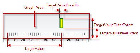
The following table explains briefly the configurable aspects of igBulletGraph control’s comparative marker and maps them to properties that configure them.
| Configurable aspects | Property | Default value | |
|---|---|---|---|
| Name | targetValueName | Not set | |
| Value indicated | targetValue | Not set | |
| Breadth | targetValueBreadth | 3.0 | |
| Position across the scale | Inner edge | targetValueInnerExtent | 0.3 |
| Outer edge | targetValueOuterExtent | 0.85 | |
| Look-and-feel | Fill color | targetValueBrush | Defined in the default theme |
| Border thickness | targetValueStrokeThickness | 1.0 | |
| Border color | targetValueOutline | Defined in the default theme | |
| Tooltip | targetValueToolTipTemplate | The value indicated by the comparative marker | |
The following table maps the desired behavior to its respective property settings.
| In order to configure: | Use this property: | And set it to: | ||
|---|---|---|---|---|
| Aspect | Details | |||
| Name | A name for the comparative marker (for displaying in the tooltip) | targetValueName | A string expressing the name of the comparative marker | |
| Value to indicate | The value to indicate | targetValue | The desired value in the measures of the scale | |
| Breadth | The breadth of the marker | targetValueBreadth | The desired value in pixels | |
| Position across the scale | Inner edge | The position of lower edge of the comparative marker at horizontal orientation or the left edge at vertical orientation. | targetValueInnerExtent | The desired value as a relative part of the height/width of the Graph area (depending on the orientation) presented as a fraction of 1 (e.g. 0.2) |
| Outer edge | The position of top edge of the comparative marker at horizontal orientation or the right edge at vertical orientation. | targetValueOuterExtent | The desired value as a relative part of the height/width of the Graph area (depending on the orientation) presented as a fraction of 1 (e.g. 0.2) | |
| Look-and-feel | Fill color | Fill color of the marker | targetValueBrush | The desired color |
| Border thickness | Thickness of the marker’s border | targetValueStrokeThickness | The desired value in pixels | |
| Border color | Configure the color of the marker’s border | targetValueOutline | The desired color | |
| Tooltip | Content of the comparative marker’s border | targetValueToolTipTemplate | The desired template(see Configuring the Tooltips (igBulletGraph) topic). | |
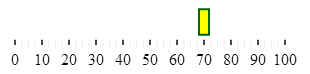
The screenshot below demonstrates how the igBulletGraph looks as a result of the following settings:
| Property | Value |
|---|---|
| targetValue | “70” |
| targetValueBreadth | “10” |
| targetValueBrush | '#FFFF00' |
| targetValueInnerExtent | “0.2” |
| targetValueOuterExtent | “0.7” |
| targetValueOutline | '#006400' |
| targetValueStrokeThickness | “3” |
Following is the code that implements this example.
In JavaScript:
$(function () {
$("#bulletGraph").igBulletGraph({
    height: "70",
    width: "300",
    targetValue:"70",
    targetValueBreadth:"10",
    targetValueBrush: '#FFFF00',
    targetValueOutline:'#006400',
    targetValueStrokeThickness: "2",
    targetValueInnerExtent:"0.3",
    targetValueOuterExtent:"0.8"
});
The following topics provide additional information related to this topic.
Configuring the Scale (igBulletGraph): This topic explains, with examples, how to configure the scale of the igBulletGraph control. This includes positioning the scale inside the control and configuring the scale tick marks and labels.
Configuring the Performance Bar (igBulletGraph): This topic explains, with examples, how to configure the performance bar of the igBulletGraph control. This includes the value indicated by the bar, its width, position, and formatting.
Configuring Comparative Ranges (igBulletGraph): This topic explains, with code examples, how to configure ranges in the igBulletGraph control. This includes the number of ranges and their positions, lengths, widths, and formatting.
Configuring the Background (igBulletGraph): This topic explains, with code examples, how to configure a background for the bullet graph. This includes setting the background’s size, position, color, and border.
Configuring the Tooltips (igBulletGraph): This topic explains, with code examples, how to enable the tooltips in the igBulletGraph control and configure the delay with which they are displayed.
The following samples provide additional information related to this topic.
Performance Bar Settings: This sample demonstrates configuring the performance (actual value) bar, the comparative measure (target value) marker, and the dimension of the scale of the igBulletGraph control.
Basic Configuration: This sample demonstrates a simple configuration of the igBulletGraph control.
View on GitHub