
This topic explains, with code examples, how to enable the tooltips in the igBulletGraph™ control and configure the delay with which they are displayed as well as creating custom tooltips templates and a code sample ilustrating it.
The following topics are prerequisites to understanding this topic:
igBulletGraph Overview: This topic provides conceptual information about the igBulletGraph control including its main features, minimum requirements, and user functionality.
Adding igBulletGraph: This is a group of topics demonstrating how to add the igBulletGraph™ control to an HTML page and to an ASP.NET MVC application.
This topic contains the following sections:
The igBulletGraph control supports tooltips. They are pre-configured to show the values indicated by the performance bar, comparative marker, and comparative ranges. The tooltip for each of these visual elements is configured individually by a property setting.
Tooltips are configurable in terms of visibility (can be enabled/disabled), delay (the timeout with which the tooltip appears is configurable), and value. Because the value of the tooltips can be set to a custom template, you have a wide array of possibilities to present the information relevant for the specific use case in the most appropriate manner.
By default, tooltips are disabled.
The following table maps the configurable aspects of the igBulletGraph control related to tooltips to the properties that manage them.
| Configurable aspect | Details | Properties / Events | Default value | |
|---|---|---|---|---|
| Visibility | You can enable/disable tooltips for the igBulletGraph control. | showToolTip | False | |
| Delay | The timeout before the tooltip appears upon the visual element at mouse hovering is configurable in milliseconds. | showToolTipTimeout | 500 | |
| Value | You can provide a custom value for the respective tooltip template property. | Performance bar | valueToolTipTemplate | Depends on whether valueName has been initialized (see Configuring a Custom Tooltip for the Performance Bar) |
| Comparative marker | targetValueToolTipTemplate | The value indicated by the comparative marker | ||
| Comparative Range(s) | rangeToolTipTemplate | The start and end values of the range separated by a hyphen | ||
Note: In order to bind to different values of the respective visual element when you change the default tooltip template, you must use the ${Item.Property} syntax from within the template.
You can show or hide (default setting) the tooltips on a igBulletGraph.
The following table maps the desired behavior to property settings.
| In order to: | Use this property: | And set it to: |
|---|---|---|
| Enable tooltips | showToolTip | true |
| Disable tooltips | showToolTip | false |
The following code example enables the tooltips:
In JavaScript:
$("#bulletgraph").igBulletGraph({
                …
                showToolTip: true
});
It is possible to specify a delay by which a tooltip is displayed after the respective visual element has been hovered. The default value is 500 milliseconds.
The following table maps the desired behavior to property settings.
| In order to: | Use this property: | And set it to: |
|---|---|---|
| Configure the initial delay before the tooltip is displayed | showToolTipTimeout | The desired value in milliseconds |
The following code example sets the tooltip delay to 2000 milliseconds:
In JavaScript:
$("#bulletgraph").igBulletGraph({
                …
                showToolTip: true,
                showToolTipTimeout: 2000
});
The default value of the tooltip is pre-configured depending on whether the valueName property has been initialized.
If the valueName property has been initialized, the default format of the tooltip property would be:
<valueName> : <value>
If the valueName property has not been initialized, the default format of the tooltip would be:
<value>
To change the data (and/or its look-and-feel) presented by the tooltip, you can set it to a custom template.
The following table maps the desired behavior to its respective property settings.
| In order to: | Use this property: | And set it to: |
|---|---|---|
| Set a custom tooltip for the performance bar | valueToolTipTemplate | The id of the desired template. |
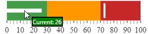
The screenshot below demonstrates how the tooltip of the igBulletGraph’s performance bar looks as a result of the following settings:
| Property | Value |
|---|---|
| valueToolTipTemplate | "valueToolTipTemplate" |
Where "valueToolTipTemplate" is the id of the template:
In HTML:
<script id="valueToolTipTemplate" type="text/x-jquery-tmpl"></script>
Following is the code that implements this example.
In HTML:
<script id="valueToolTipTemplate" type="text/x-jquery-tmpl"></script>
<script type="text/javascript">
$(function () {
$("#bulletgraph").igBulletGraph({
showToolTip: true,
valueToolTipTemplate: "valueToolTipTemplate"
…
});
});
</script>
The tooltip for the comparative marker displays the value set for the marker using the default system font and styled by default in accordance with the look of the control. To specify custom settings, set the tooltip value to a custom template.
The following table maps the desired behavior to its respective property settings.
| In order to: | Use this property: | And set it to: |
|---|---|---|
| Set a custom tooltip for the comparative marker | targetValueToolTipTemplate | The id of the desired template |
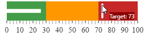
The code below illustrates displaying the value presented in the tooltip of the comparative marker as a result of the following settings:
| Property | Value |
|---|---|
| targetValueToolTipTemplate | "targetValueToolTipTemplate" |
Where "targetValueToolTipTemplate" is the id of the template:
In HTML:
<script id="targetValueToolTipTemplate" type="text/x-jquery-tmpl"></script>
Following is the code that implements this example.
In HTML:
<script id="targetValueToolTipTemplate" type="text/x-jquery-tmpl"></script>
<script type="text/javascript">
$(function () {
$("#bulletgraph").igBulletGraph({
showToolTip: true,
targetValueToolTipTemplate: "targetValueToolTipTemplate",
…
});
});
</script>
By default, the tooltips for the comparative ranges display the starting and ending values of the range, separated by a hyphen (i.e. 0 - 34), no matter where exactly over the range the mouse is being hovered. To change these pre-configured settings, you can set a custom template.
The following table maps the desired behavior to its respective property settings.
| In order to: | Use this property: | And set it to: |
|---|---|---|
| Set a custom tooltip for the comparative range(s) | rangeToolTipTemplate | The id of the desired template |
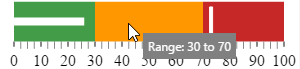
The screenshot below demonstrates displaying the value presented in the tooltip of the comparative range as a result of the following settings:
| Property | Value |
|---|---|
| rangeToolTipTemplate | "rangeToolTipTemplate" |
Where "rangeToolTipTemplate" is the id of the template:
In HTML:
<script id="rangeToolTipTemplate" type="text/x-jquery-tmpl"></script>
Following is the code that implements this example.
In HTML:
<script id="rangeToolTipTemplate" type="text/x-jquery-tmpl"></script>
<script type="text/javascript">
$(function () {
$("#bulletgraph").igBulletGraph({
showToolTip: true,
targetValueToolTipTemplate: "targetValueToolTipTemplate",
valueToolTipTemplate: "valueToolTipTemplate",
rangeToolTipTemplate: 'rangeToolTipTemplate',
value: 26,
targetValue: 73,
height: "70px",
width: "300px",
ranges: [
{
name: 'bad',
startValue: 0,
endValue: 30
},
{
name: 'acceptable',
startValue: 30,
endValue: 70
},
{
name: 'good',
startValue: 70,
endValue: 100
}]
});
});
</script>
This sample demonstrates what can be achieved when combining all of the custom tooltips mentioned above. It includes templates for all of the configurable areas where you can have a tooltip - the performance bar, comparative marker and ranges.
While the first igBulletGraph used for visualizing the Development Task and has default tooltips enabled and configured only via the options API, the second one illustrating the Quality Assurance Task is taking advantage of the custom tooltip templates used and has more unique look when key areas are hovered.
In the sample's context, even though these tasks are executed simultaneously at the course of three weeks, initially more time has been spent on development. This is demonstrated by the progress bars’ placement amongst the three different ranges (“Low, “Medium” and “High”), that represent the level of confidence for delivering the needed results.
The following topics provide additional information related to this topic.
Configuring the Scale (igBulletGraph): This topic explains, with examples, how to configure the scale of the igBulletGraph control. This includes positioning the scale inside the control and configuring the scale tick marks and labels.
Configuring the Performance Bar (igBulletGraph): This topic explains, with examples, how to configure the performance bar of the igBulletGraph control. This includes the value indicated by the bar, its width, position, and formatting.
Configuring the Comparative Marker (igBulletGraph): This topic explains, with code examples, how to configure the comparative measure marker of the igBulletGraph control. This includes the marker’s value, width, and formatting.
Configuring Comparative Ranges (igBulletGraph): This topic explains, with code examples, how to configure ranges in the igBulletGraph control. This includes the number of ranges and their positions, lengths, widths, and formatting.
Configuring the Background (igBulletGraph): This topic explains, with code examples, how to configure a background for the bullet graph. This includes setting the background’s size, position, color, and border.
View on GitHub