
This topic provides conceptual information about the igBulletGraph™ control including its main features, minimum requirements, and user functionality.
The following concept is required for understanding this topic.
This topic contains the following sections:
The igBulletGraph control is an Ignite UI for jQuery™ control which allows for visualizing data in the form of a bullet graph. Linear by design, it provides a simple and concise view of a primary measure or measures compared against a scale and, optionally, some other measure.
The igBulletGraph control provides you with the ability to create attractive data presentations, replacing meters and gauges that are used on dashboards with simple yet straightforward and clear bar charts. A bullet graph is one of the most effective and efficient ways to present progress towards goals, good/better/best ranges, or compare multiple measurements in as little horizontal or vertical space as possible.
The features of igBulletGraph include configurable orientation and direction, configurable visual elements and tooltips, and more. The control has also a built-in support for animated transitions.
The igBulletGraph control exposes an API for setting the state of its scale’s orientation and direction, so that the look of the graph can be largely customized. (For details, see the Configuring the Orientation and Direction (igBulletGraph) topic.)
Each of the visual elements of the bullet graph can be configured in several aspects. (For details, see Configurable Visual Elements of igBulletGraph and Related Properties.)
The igBulletGraph control provides built-in support for animation by its transitionDuration property. The animation effect occurs on loading the control as well as when the value of any of its properties is changed. By default, animated transitions are disabled. Providing a value in milliseconds for the transitionDuration property of the control determines the timeframe for swiping the control into view by smoothly visualizing all its visual elements through a slide effect (from bottom-left to top-right). Setting the value to 0 disables the animated transition. For a sample, demonstrating the animation transition effect, see the Animated Transitions sample.
The built-in tooltips of the igBulletGraph control show the values used to create the performance bars, the target value or the values, corresponding to the different ranges respectively. They are initially styled in accordance with the default look of the control, but their look can be customized by templates. By default, tooltips are disabled. (For details, see Configuring the Tooltips (igBulletGraph))
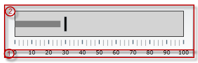
The user-visible area of the igBulletGraph control is logically divided into a Graph area and a Reserved area.
| Horizontal orientation | Vertical orientation |
|---|---|
 |
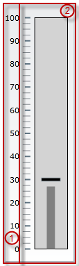 |
The main purpose of the Reserved area is to provide enough space for the numbering labels of the scale at any orientation – horizontal or vertical (The Reserved area automatically re-sizes when the orientation changes in order to accommodate the specific space requirements for displaying the numbering labels in each of the orientations: in horizontal orientation, the area has to fit the labels’ height and in vertical orientation – their maximum width.) This doesn’t mean that you must necessarily place the numbering labels in the Reserved area: actually, you can position the label row anywhere across-the-scale within the Graph area. However, even if you place the label row outside Reserved area, this will have no bearing on the spread and location of the Reserved area itself – it remains where it is, automatically defined through the height/width (depending on the orientation) of the numbering labels.
Another aspect in which the Reserved area is significant is the fact that its inner edge specifies the beginning edge of the Graph area in the across-the-scale dimension. This is important, because this edge serves as a reference mark for the extent-related properties that position some visual elements across the scale. (Positive values for these properties – the most common case – position the visual elements inside the Graph area and negative values – inside the Reserved area.)
Spread of the Graph area:
The igBulletGraph control features the following visual elements (See the picture below.):
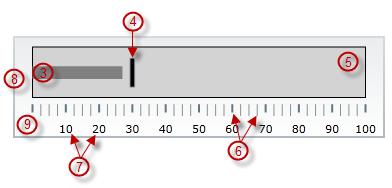
There are several specific aspects in which each element can be configured.
The following table provides an overview of the configurable aspects of the visual elements of the igBulletGraph control. Further details about the configurable aspects with illustrations and the properties that configure them are available, for each visual element, in the blocks that follow the table:
| Visual element | Main configurable aspects |
|---|---|
| Scale |
|
| Performance bar |
|
| Comparative marker |
|
| Comparative ranges |
|
| Background |
|
| Tooltips |
|
The following pictures illustrate the scale-related extents, listed in the table below.
| Extent positioning the scale within the Graph area | Extents configuring the position of the labels |
|---|---|
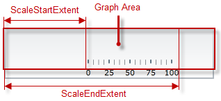 |
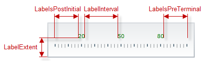 |
| Extents configuring the major tick marks along the scale | Extents configuring the major tick marks across the scale |
|---|---|
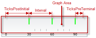 |
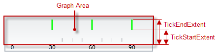 |
| Extents configuring the minor tick marks across the scale |
|---|
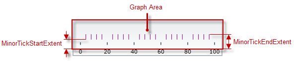 |
The following table maps the configurable aspects related to the scale of the bullet graph to the igBulletGraph properties that manage them.
| Configurable aspects | Property | Default value | |||
|---|---|---|---|---|---|
| Position | scaleStartExtent | 0.05 | |||
| scaleEndExtent | 0.95 | ||||
| Range and Values | Max value | minimumValue | 0 | ||
| Min value | maximumValue | 100 | |||
| Tick marks | Major tick marks | Position (within the scale), spacing, and length | interval | Not set | |
| ticksPostInitial | 0 | ||||
| ticksPreTerminal | 0 | ||||
| tickStartExtent | 0.02 | ||||
| tickEndExtent | 0.2 | ||||
| Look-and-feel | Color | tickBrush | Defined in the default theme | ||
| Width | tickStrokeThickness | 2.0 | |||
| Minor tick marks | Number (between two adjacent major tick marks) | minorTickCount | 3.0 | ||
| Position | minorTickStartExtent | 0.06 | |||
| minorTickEndExtent | 0.2 | ||||
| Look-and-feel | Color | minorTickBrush | Defined in the default theme | ||
| Width | minorTickStrokeThickness | 1.0 | |||
| Labels | Position and spacing | labelExtent | 0 | ||
| labelInterval | Not set | ||||
| labelsPostInitial | 0 | ||||
| labelsPreTerminal | 0 | ||||
| Number format | labelFormat | Not set | |||
| Look-and-feel | Color | fontBrush | Defined in the default theme | ||
| Font | font | Defined in the default theme | |||
The following picture illustrates the performance-bar-related extents, listed in the table below.
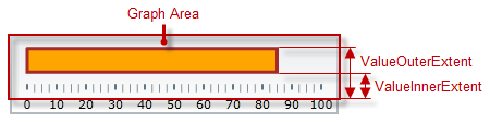
The following table maps the configurable aspects related to the performance bar of the bullet graph to the igBulletGraph properties that manage them.
| Configurable aspects | Property | Default value | |
|---|---|---|---|
| Name | valueName | Not set | |
| Value to indicate | value | Not set | |
| Breadth and position | valueInnerExtent | 0.5 | |
| valueOuterExtent | 0.65 | ||
| Look-and-feel | Fill color | valueBrush | Defined in the default theme |
| Border color | valueOutline | Defined in the default theme | |
| Border thickness | valueStrokeThickness | 1.0 | |
| Tooltip | valueToolTip | Depends on whether valueName has been initialized | |
The following picture illustrates the comparative-market-related extents, listed in the table below.
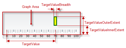
The following table maps the configurable aspects related to the comparative marker of the bullet graph to the igBulletGraph properties that manage them.
| Configurable aspects | Property | Default value | |
|---|---|---|---|
| Value indicated | targetValue | Not set | |
| Breadth | targetValueBreadth | 3.0 | |
| Look-and-feel | Fill color | targetValueBrush | Defined in the default theme |
| Border color | targetValueOutline | Defined in the default theme | |
| Border thickness | targetValueStrokeThickness | 1.0 | |
The following picture illustrates the comparative-ranges-related extents, listed in the table below.
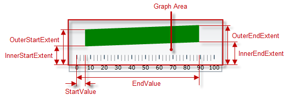
The following table maps the configurable aspects related to the comparative ranges of the bullet graph to the igBulletGraph properties that manage them.
| Configurable aspects | Property | Default value | |
|---|---|---|---|
| Number (of ranges in the graph) | ranges | Not set | |
| Length, width, and position | startValue | Not set | |
| endValue | Not set | ||
| innerStartExtent | Not set | ||
| innerEndExtent | Not set | ||
| outerStartExtent | Not set | ||
| outerEndExtent | Not set | ||
| Look-and-feel | Fill color | brush | Defined in the default theme |
| Border color | outline | Defined in the default theme | |
| Border thickness | strokeThickness | 1.0 | |
| Tooltip | rangeToolTip | The start and end values of the range separated by a hyphen (-). | |
The following picture illustrates the background-related extents, listed in the table below.
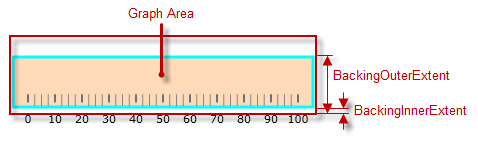
The following table maps the configurable aspects related to the background of the bullet graph to the igBulletGraph properties that manage them.
| Configurable aspects | Property | Default value | |
|---|---|---|---|
| Spread and position (across the scale) | backingInnerExtent | 0 | |
| backingOuterExtent | 1.0 | ||
| Look-and-feel | Color | backingBrush | Defined in the default theme |
| Border color | backingOutline | Defined in the default theme | |
| Border thickness | backingStrokeThickness | 2.0 | |
The following table maps the configurable aspects of the igBulletGraph control related to tooltips to the properties that manage them.
| Configurable aspect | Details | Properties / Events | Default value | |
|---|---|---|---|---|
| Visibility | You can enable/disable tooltips for the igBulletGraph control. | showToolTip | False | |
| Delay | The timeout before the tooltip appears upon the visual element at mouse hovering is configurable in milliseconds. | showToolTipTimeout | 500 | |
| Value | You can provide a custom value for the respective tooltip property. | Performance bar | valueToolTip | Depends on whether valueName has been initialized (see Configuring the Tooltips (igBulletGraph)) |
| Comparative marker | targetValueToolTip | The value indicated by the comparative marker | ||
| Comparative Range(s) | rangeToolTip | The start and end values of the range separated by a hyphen. | ||
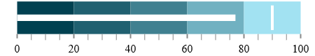
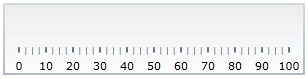
By default, the igBulletGraph control is oriented horizontally. It displays with a scale starting at 0 and ending at 100. The major tick marks of the control are located at an interval of 10 and the count of minor tick marks between each pair of major tick marks is 3. There is no title/subtitle displayed, the background color is a variety of light grey. The border is 2 pixels thick colored in dark grey. No comparative marker or ranges are displayed. Animated transitions are disabled.
The following picture demonstrates a igBulletGraph displayed with default settings.
The igBulletGraph control is a jQuery UI widget and, therefore, depends on the jQuery and jQuery UI libraries. References to these resources are needed nevertheless, in spite of the use of pure jQuery or Ignite UI for MVC. The Infragistics.Web.Mvc assembly is required when the control is used in the context of ASP.NET MVC.
In order for the bullet graph to display the performance value(s), the targetValue property has to be set.
For the full requirements listing, refer to the Adding igBulletGraph topic.
The following topics provide additional information related to this topic.
Adding igBulletGraph: This is a group of topics demonstrating how to add the igBulletGraph control to an HTML page and to an ASP.NET MVC application.
Configuring igBulletGraph: This is a group of topics explaining how to configure the various aspects of the igBulletGraph control including its orientation and direction and visual elements.
jQuery and MVC API Links (igBulletGraph): This topic provides links to the API reference documentation about the igBulletGraph control and its ASP.NET MVC Helper.
Known Issues and Limitations (igBulletGraph): This topic provides information about the known issues and limitations of the igBulletGraph control.
The following samples provide additional information related to this topic.
Basic Configuration: This sample demonstrates a simple configuration of the igBulletGraph control.
Animated Transitions: This sample demonstrates animated transitions between different sets of settings in the igBulletGraph control.
The following material (available outside the Infragistics family of content) provides additional information related to this topic.
View on GitHub