
The following table summarizes the new features for the Ignite UI for jQuery™ 2012 Volume 2 release. Additional details are available after the summary table.
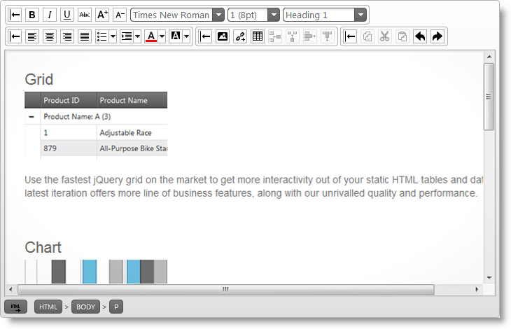
igHtmlEditor control: The new igHtmlEditor™ is a jQuery WYSIWYG control and provides HTML editing capabilities in the web browser.
igDialog control: The Infragistics® igDialog™ is a widget based on jQuery UI that provides a robust dialog layout for your application.
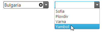
Cascading igCombo: The cascading functionality of the igCombo™ control requires configuring at least two instances of the control bound together in parent-child relationships. When a value from the parent igCombo is selected, then the values in the child are filtered.
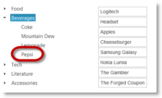
Adding and Removing Nodes from igTree: The Adding and Removing features of the igTree™ control enables users to add and remove tree nodes.
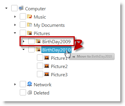
Drag-and-Drop for igTree: The Drag-and-Drop feature of the igTree control enables users to drag-and-drop tree nodes. Dragging and dropping can be performed within the same tree or between two different trees.
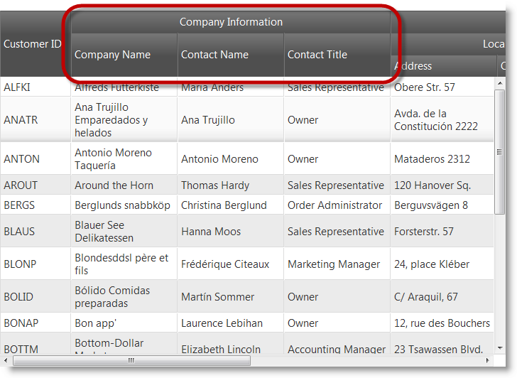
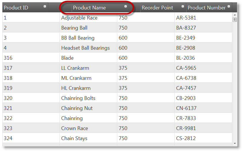
Multi-Column Headers: Multi-Column Headers feature is available for the igGrid and igHierarchicalGrid™.
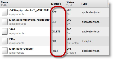
REST Support: Binding to REST Services is available for the igGrid and igHierarchicalGrid
Column moving (CTP): Column moving allows you to reorder columns.
DataTable and DataSet binding for igGrid and igHierarchicalGrid: Binding to a DataTable or DataSet is available for the igGrid and igHierarchicalGrid
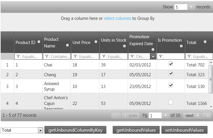
Unbound columns: The unbound column provides a way to define a column in the igGrid and igHierarchicalGrid which is not bound to a data source and can be used for rendering calculated or otherwise custom values
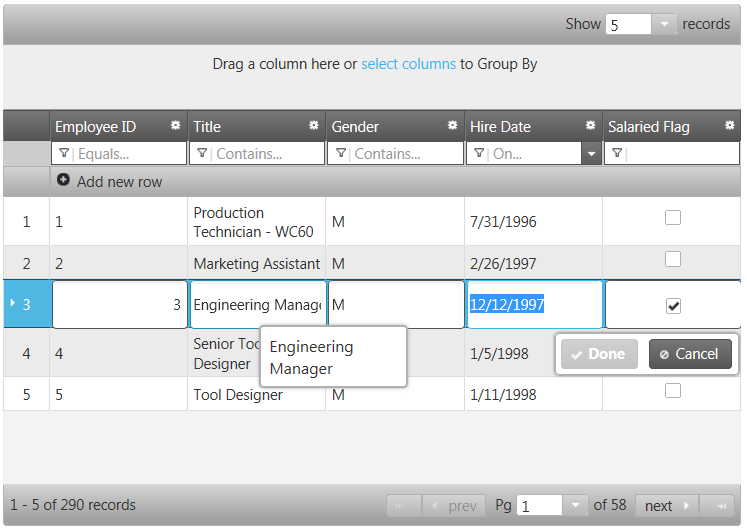
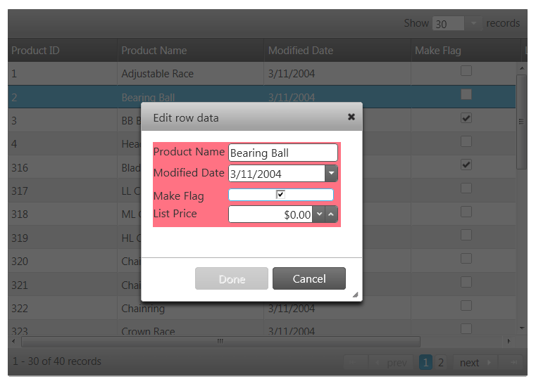
Row Edit Template: Starting with version 12.2, the updating feature of the igGrid provides Row Edit Template and allows the user to edit records in a pop up dialog, as compared to inline editing.
Grouping Dates: The grid’s grouping feature now supports richer functionality when grouping date values.
ExcelNavigationMode & HorizontalMoveOnEnter: In the igGrid and igHierarchicalGrid updating feature provides two new properties. ExcelNavigationMode allows you to position the cursor inside the edited cell using the arrows keys. HorizontalMoveOnEnter enables moving to the next cell when pressing the Enter key while editing a cell.
igMap Control is RTM: The igMap™ control is released for displaying geographic maps.
Financial indicators added to the igDataChart control: The igDataChart™ control now supports 35 new financial series for displaying different financial indicators about stock prices.
Hover and Null Support for igRating (Mobile): It’s possible to set the value of the igRating™ Mobile control to null, if the control has been rated previously. When you use the igRating™ Mobile control in a Desktop Browser, the rating displays a mouse hover style.
Generating Direct Links to Child Layouts in igListView: The igListView™ control contains new functionality allowing you to generate static links for its child layouts
Mobile Button: The Button ASP.NET MVC helper is a server-side helper that renders the widget.
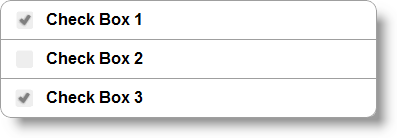
Mobile CheckBox: The CheckBox ASP.NET MVC helper is a server-side helper that renders the widget.
Mobile CheckBoxGroup: The CheckBoxGroup ASP.NET MVC helper allows you to combine several individual check boxes under one context.
Mobile Collapsible: The Collapsible ASP.NET MVC helper produces a collapsible block of content.
Mobile CollapsibleSet: The Collapsible Set ASP.NET MVC helper produces a collapsible block of content which consist of collapsible controls inside.
Mobile Link: The Link ASP.NET MVC helper is used to render a HTML reference. It has several additional methods for customizing the Link.
Mobile NavBar: The NavBar ASP.NET MVC helper defines a menu of items that reference external pages or internal page blocks.
Mobile Page, PageContent, PageFooter, PageHeader: The Ignite UI for MVC allow you to create jQuery Mobile pages using Razor or ASPX syntax.
Mobile Popup: Popup is a widget that allows you to display HTML content in a popup window.
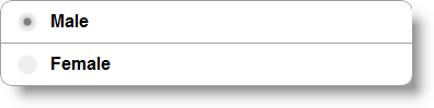
Mobile RadioButtonGroup: The RadioButtonGroup ASP.NET MVC helper renders a set of options but only allows you to select one of them.
Mobile SelectMenu: The SelectMenu ASP.NET MVC helper produces a jQuery Mobile selectmenu widget based on a native select element.
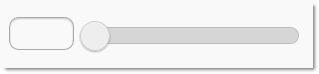
Mobile Slider: The Slider ASP.NET MVC helper is used to render a jQuery Mobile slider widget in an ASP.NET view.
Mobile TextBox: The TextBox ASP.NET MVC helper renders standard HTML inputs.
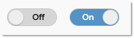
Mobile ToggleSwitch: The Toggle Switch ASP.NET MVC helper produces a binary “flip switch” that is used for on/off or true/false data input.
The igHtmlEditor control is a jQuery HTML editor control that features standard HTML editing capabilities. Formatting options include font face, font size, text and image alignment and link and table support. Further information regarding the classes, options, events, methods and themes of this API are available under the associated tabs above.
Infragistics igDialog is a widget based on jQuery UI that provides the ability to show target elements as the content of a dialog. The content of the igDialog can be any valid HTML code as well as other dialog windows. The igDialog widget is applied on a HTML DIV or IFRAME element and the content that is inside that DIV/IFRAME will be the content of the dialog window.
In HTML:
<div id="dialog">
    igDialog Content
</div>
The cascading functionality of the igCombo control requires configuring at least two instances of the control bound together in parent-child relationships. When a value from the parent igCombo is selected, then the values in the child are filtered. This is functionality that the igCombo delivers “out of the box”: all you need is to configure parent and child igCombos and their data sources.
The Adding and Removing feature of igTree control enables users to add and remove tree nodes.
Dragg-and-drop can be performed within the same igTree control or between two igTree controls. The latter is configured in addition to the “normal” (within the same tree) drag-and-drop. You can specify the way in which you want the Drag-and-Drop feature to operate. This is managed by configuring one of the several supported Drag-and-Drop modes.
The igGrid and igHierarchicalGrid now feature multi-column headers. The multi-column headers feature provides header grouping and it’s well integrated with Hiding, Resizing and Column Moving features.
Multi-Column Headers (igHierarchicalGrid)
The new type $.ig.RESTDataSource which inherits from $.ig.DataSource provides REST support. The igGrid and igHierarchicalGrid support REST binding using the $.ig.RESTDataSource internally. They inherit all $.ig.RESTDataSource options, meaning these options can be set directly on the grid.
Binding igHierarchicalGrid to REST Services
Column moving allows you to reorder columns. It has two modes.
Immediate mode moves the column header while you are dragging it and animatedly swaps the other column. Actual moving of the column contents is performed when you drop the column header.
Deferred mode shows arrows which show the position where the column will be placed if you drop it.
In the screenshot below you can see the column moving feature woring in immediate mode.
Binding to ADO.NET DataTable and DataSet is available for igGrid and igHierarchicalGrid. There is a new property introduced the igGrid ASP.NET MVC helper: DataMember. When set, the grid looks for the name of the DataTable matching the DataMember value from the DataSet to which the grid is bound. The property is useful when AutoGenerateLayouts is False and the layouts are defined manually.
Another change made in v12.2 is that AutogenerateLayouts is false by default.
Binding igGrid to DataTable (igGrid)
Binding igHierarchialGrid to DataSet (igHierarchialGrid)
The unbound column provides a way to define a column in the igGrid and igHierarchicalGrid which is not bound to a data source and can be used for rendering calculated or otherwise custom values. There is a new property introduced the igGrid : MergeUnboundColumns. It defines how the unbound columns are sent to the client when the type of the data source is remote.
When MergeUnboundColumns is true then the unbound values are merged into the data rows inside JSON response. Otherwise the unbound values are saved in the metadata property of the JSON response.
When MergeUnboundColumns =true and you haven’t set unbound values through SetUnboundValues then the whole data source is traversed and all values are set with the default value (null value) for the unbound columns.
Unbound Columns(igHierarchicalGrid)
Starting with version 12.2, the updating feature of the igGrid provides Row Edit Templates and allows the end user to edit records in a pop up dialog, as compared to inline editing.
The feature is implemented as part of grid updating. The editMode option has a new value added: “rowEditTemplate”, apart from the “row” and “cell” which exist currently.
When the row edit template is automatically generated, it is based on the data types of the columns. It uses the columnSettings for updating feature in order to determine what kind of editor will be rendered.
You can define a row edit template also by specifying as a template string using rowEditDialogRowTemplate option or referencing a template element using rowEditDialogRowTemplateID option. These options can be used to format and style the row edit dialog.
There is validation integration in the row edit template.
Configure Row Edit Template(igGrid)
The groupBy feature now allows the user to group by dates, taking into account the format. The improvement applies to both remote and local grouping.
With this new functionality, the date appears using the format “yyyy/dd/mm” and it is grouped by comparing the year, day, and month. If the date is formatted as “yyyy/dd/mm hh:mm”, it will be compared using those values and grouped accordingly.
In the igGrid and igHierarchicalGrid updating feature provides two new options. ExcelNavigationMode allows you to position the cursor inside the edited cell using the arrows keys. Its default value is “false”.
HorizontalMoveOnEnter enables moving to the next editable cell when pressing the Enter key while editing a cell. Its default value is “false”.
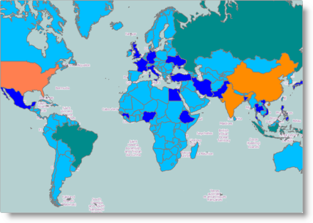
The igMap control for displaying geographic maps is released. It facilitates drawing maps with custom overlays in HTML5 web applications and sites. It uses the Canvas tag in HTML5 to plot the actual maps and visualize data on the maps. The control allows various geographic visualizations by providing five geographic series types:
The following is an example of a geographic map showing the World with all countries colored depending on their population size using a Geographic Shape series.
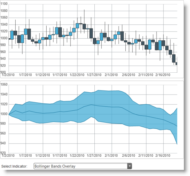
The igDataChart control now supports 35 new financial series for displaying different financial indicators.. The financial indicator series accepts data in the same format as the existing financial series, i.e. records have properties like Open, Close, High and Low [price] for depicting a stock price during a certain period of time. Financial indicators show different characteristics of price changes and provide additional information and insight to financial analysts.
The followingis a picture of a regular financial chart along with a chart displaying on of the new supported financial indicators.
It’s possible to set the value of the igRating Mobile control to null if the control has been rated before. This can be achieved by using the swipe events. If you swipe by starting from the current value and ending at the beginning of the control, the rating value will be set to null. This is not achievable under the desktop environment, when the mouse is used.
When you use the igRating™ Mobile control in a Desktop Browser, the
rating displays a mouse hover style.
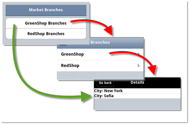
The igListView control enables you to generate static links for its child layouts. Having static links for child layouts makes it possible to navigate directly to them from some external web page.
The Button ASP.NET MVC helper is a server-side helper that renders the control. It allows you to add a button into your ASP.NET MVC application and configure its state either on the client or on the server.

The CheckBox ASP.NET MVC helper is a server-side helper that renders the control. It allows you to add a check box in your ASP.NET MVC application and configure its state either on the client or on the server. This means that you can use the jQuery Mobile plugin to dynamically modify the checkbox.

The CheckBoxGroup ASP.NET MVC helper allows you to combine several individual check boxes under one context. This means that you can use the jQuery Mobile plugin to dynamically modify the checkboxes. For more information about configuring and using the individual check box, review the CheckBox topic.
The Collapsible ASP.NET MVC helper produces a collapsible block of content.
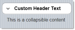
There is an option to set the header of the collapsible block to look like a clickable button. The content of the collapsible block can contain any HTML content.
The CollapsibleSet ASP.NET MVC helper produces a collapsible layout container. It groups the collapsible controls and allows only one collapsible of the group to be expanded at one time. If a collapsed item isexpanded, the previous one gets collapsed automatically.
The Link ASP.NET MVC helper is used to render an HTML hyperlink. It has several additional methods that allow configuring the Link and customizing it.


The NavBar ASP.NET MVC helper defines a menu of items that are a reference to external pages or internal page blocks. The control has an API for configuring and styling individual items as well as the NavBar as a whole. The NavBar helper renders a jQuery Mobile widget.

The Page ASP.NET MVC helper is used to define the container for a single Page in the context of . Between the opening and closing fragments of the Page wrapper, you can define the Page HTML content, as well as define Page Content, Page Footer, Page Header or other jQuery mobile controls. You can define several pages in a MVC View, but only the first one will be active. If you want to change the page you will need to do this manually. The Page MVC helper renders a jQuery Mobile Page widget. For more information about page anatomy and page transition, please review this list of tutorials, provided by jQuery Mobile.
The Popup is a widget that allows you to display HTML content in a popup window. The content can be any HTML content. You can use HTML anchors to easily open the popup and it has a set of features that can be used right out of the box.

The RadioButtonGroup ASP.NET MVC helper renders a set of options but only allows you to select one of them. Similar to some other controls, the RadioButtonGroup ASP.NET MVC helper uses a standard HTML input element and then adds additional markup and functionality to support a touch environment. For example, rather than the normal vertical positioning of all the radio buttons, RadioButtonGroup ASP.NET MVC helper allows you to have a horizontal list of buttons as well. You can also access any of the radio buttons using the jQuery Mobile widget.
The SelectMenu ASP.NET MVC helper produces a jQuery Mobile selectmenu widget based on a native select element.
The Slider ASP.NET MVC helper is used to render a jQuery Mobile slider widget in an ASP.NET view. A slider is a common UI element on mobile devices used for numeric data input. The following screenshot shows a slider with default options and values:
The TextBox ASP.NET MVC helper renders standard HTML inputs. Once rendered, jQuery Mobile optimizes them for mobile and touch devices. This means that you can use the jQuery Mobile plugin to dynamically modify the inputs.

The Toggle Switch ASP.NET MVC helper produces a binary “flip switch” that is used for on/off or true/false data input. Such virtual switches are common User Interface (UI) elements in mobile devices. The Toggle Switch is a track slider with two alternative positions (left and right) representing the two states of the “switch” (Enabled and Disabled). There is also a label indicating the current state and different color schemes for each of the states.
View on GitHub