
This topic provides an overview of the new features of Ignite UI for jQuery™ 2013 Volume 2 release.
The following table summarizes the new features for the Ignite UI for jQuery 2013 Volume 2 release. Additional details are available after the summary table.
| Control | Feature | Description |
|---|---|---|
| Ignite UI for jQuery | Custom downloads | A new tool for creating custom downloads is available. Select the controls you want to use and the tool creates a download package containing a customized, combined, and minified JavaScript file and theme files. Find out more on the download page. |
| igBulletGraph | New control |
The igBulletGraph control is a data visualization control for visualizing data in the form of a bullet graph.
|
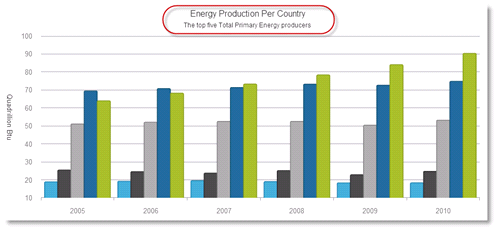
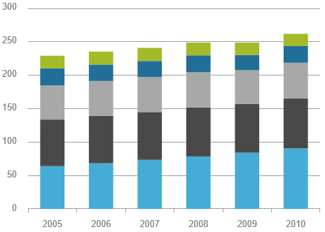
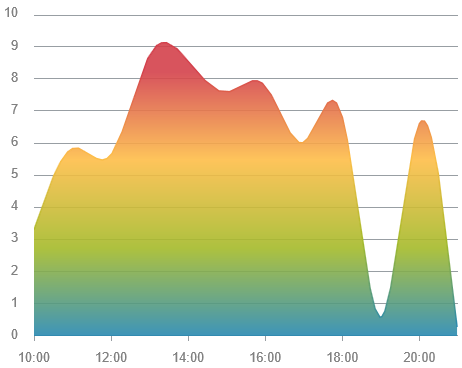
| igDataChart | Title and subtitle | You can now add a title and/or subtitle to the top section of the chart. |
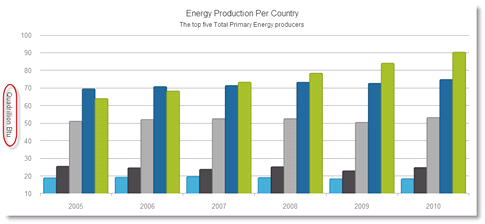
| Axis title and subtitle | You can now add title and/or subtitle to the x- and y-axes of the control. | |
| Series highlighting | You can now highlight an entire series or some individual items within the series. | |
| Animated transitions | The series can now appear with animation effect when the chart is initially loaded. | |
| Hover interactions | Hover interactions enable you to display annotations over the series of the chart. These annotations are implemented through configurable hover interaction layers that are dependent on the cursor position. | |
| Axis ticks | You can now display tick marks for the labels of vertical and horizontal axes. | |
| Color gradients | You can now use gradient colors in the chart. | |
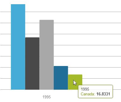
| Default tooltips | Default tooltips are now available meaning that a tooltip is displayed for the series without any additional configuration being necessary. | |
| Drop shadow | Drop-shadow effect can be now applied to the series’ visual. | |
| New CSS style |
There is a new CSS style for the igDataChart control. The style features multiple visual changes making the chart look better.
|
|
| Knockout support |
You have now support for the Knockout library in the igDataChart control.
|
|
| igDataSource | oData filtering by date |
When bound to an oData service, the igDataSource is able to filter date columns.
|
| igDoughnutChart | New control |
The igDoughnutChart is a data visualization control for displaying data in the form of a doughnut chart.
|
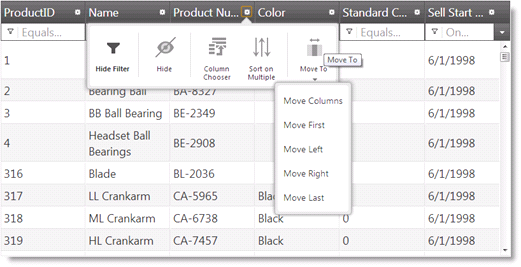
| igGrid | Column fixing | Previously CTP, the Column Fixing feature has now been released to the market and is fully documented. This feature enables fixing a column on the left or on the right of the grid, so that it cannot get out of user view when scrolling horizontally. |
| jsRender integration |
The igGrid control now supports the jsRender templating engine.
|
|
| RWD Mode Vertical Column Rendering | Vertical Column Rendering is a new feature that renders the grid in two columns as a Responsive Web Design (RWD) to changing the width of the browsers viewport. The first column displays the column captions, and the second column – the data. | |
| New design of the Feature Chooser | The Feature Chooser has now a new design that provides better support for touch-enabled devices. | |
| Load-on-Demand (CTP) |
With the igGrid Load-on-Demand feature, currently in CTP, the data is not loaded to the grid until the requested data is needed in view. This greatly improves the grid performance with large data sets.
|
|
| igLayoutManager | New control | igLayoutManager is now RTM. |
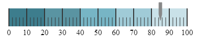
| igLinearGauge | New control |
The igLinearGauge control visualizes data in the form of a linear gauge. It provides a simple and concise view of a performance value compared against a scale and one or more comparative ranges.
|
| igMap | High density scatter series | The new geographic High-Density Scatter series allows you to bind and show scatter data ranging from hundreds to millions of data points requiring exceedingly little loading time. |
| igPieChart | Curved label callout lines |
You can now add two types of curves to the lines in the label callouts in the igPieChart.
|
| igPopover | New control (CTP) |
The igPopover control, currently in CTP, adds tooltip-like functionality to the DOM elements.
|
| igQRCodeBarcode | New control |
The igQRCodeBarcode control generates QR (Quick Response) barcode images for use in your web application.
|
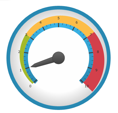
| igRadialGauge | New control |
igRadialGauge is a data visualization control for displaying a gauge containing a number of visual elements, such as a scale with tick marks and labels, a needle, and a number of ranges.
|
| igTileManager | New control |
Previously CTP, the igTileManager control has now been released to the market and is fully documented. The igTileManager is a layout control for rendering and managing data into tiles.
|
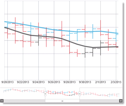
| igZoombar | New control |
igZoombar control adds zooming functionality to range enabled controls like igDataChart.
|
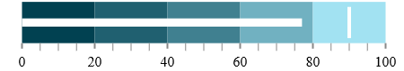
The igBulletGraph control is a data visualization control for visualizing data in the form of a bullet graph. Linear by design, it provides a simple and concise view of a performance bar compared against a scale and, optionally, some other measures.
You can now add a title and/or subtitle to the top section of the chart. When a title/subtitle is added, the content of the chart is re-sized automatically to allow for the title/subtitle content.
You can now add a title and/or subtitle to the x- and y-axes of the control.
You can now highlight an entire series or some individual items within the series.
The highlighting capabilities are series-specific. With single-shape series, such as Line, series the entire line is highlighted, while with series consisting of multiple shapes, such as Column series, each individual shape (column) can be highlighted. In all supported series, individual markers can be highlighted.
Highlighting is supported with the mouse only.
Series highlighting is supported for the following series types:
This feature allows the series to animate during the initialization of the igDataChart control.
Hover interactions enable you to display annotations over the series of the chart. These annotations are implemented through configurable hover interaction layers that are dependent on the cursor position.
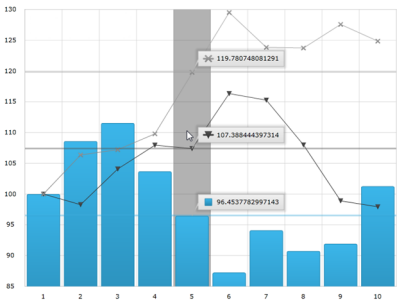
Hover interaction layers are actually series that are added to the series collection and are dependent on the cursor position. Adding hover interaction layers to the igDataChart control disables the default behavior of the crosshairs, tooltips, or both (depending on which type of layer is added).
You can now display axis tick marks outside the chart plot area. This allows displaying ticks for each of the labels and may serve for simplifying the chart look by replacing the axes gridlines with ticks.
You can now use gradient colors in the chart.
Default tooltips are now available meaning that a tooltip is displayed for the series without any additional configuration being necessary. The default tooltip templates are different for the different series types in order to present information optimally.
Drop-shadow effect can be applied to the series’ visual.
There is a new CSS style for the igDataChart control. The style features multiple visual changes and settings to improve the overall chart look and feel.
igDataChart)You have now support for the Knockout library in the igDataChart control. This makes it easier to use the Knockout library and its declarative syntax to instantiate and configure igDataChart.
The igDoughnutChart is a data visualization control for displaying data in the form of a doughnut chart. It allows for proportionally illustrating the occurrences of a variable. The inner radius of the control is configurable, and the Doughnut Chart’s series provides a built-in support for selecting and exploding its slices.
Visualizing the occurrence of multiple variables (adding multiple series) is possible, using concentric rings. The chart can be styled by configuring its properties or applying themes.
Previously CTP, the Column Fixing feature has now been released to the market and is fully documented. This feature enables fixing a column on the left or on the right of the grid, so that it cannot get out of user view when scrolling horizontally. This can be performed either by the user from the grid interface or programmatically through the API of the Column Fixing feature. When Column Fixing is activated, the fixed/fixable columns are indicated with a pin button in their headers.
The igGrid control now supports the jsRender templating engine.
Vertical Column Rendering is a new feature that renders the grid in two columns as a Responsive Web Design (RWD) to changing the width of the browsers viewport. The first column is the header column where the column captions reside. The second column contains row data.
The Feature Chooser has now a new design that provides better support for touch-enabled devices.
With the igGrid Load-on-Demand feature, currently in CTP, the data is not loaded to the grid until the requested data is needed in view. This greatly improves the grid performance with large data sets. Load-on-Demand can operate in two alternative modes: Automatic and Manual.
The igLayoutManager is a layout control for managing the overall HTML page layout in Web applications by arranging the page elements in pre-defined (but customizable) layout patterns (called “layouts”).
The igLinearGauge control visualizes data in the form of a linear gauge.
It provides a simple and concise view of a performance value compared
against a scale and one or more comparative ranges.
The new geographic High-Density Scatter series allows you to bind and show scatter data ranging from hundreds to millions of data points requiring exceedingly little loading time.
Because of the sheer number of data points, the series displays the scatter data as tiny dots (as opposed to full-size markers) and the areas the most data-intensive areas – higher color density representing clusters of data points.
You can now add two types of curves to the lines in the label callouts in the igPieChart. You can choose whether to use a straight line or one of the curves and specify the line style and the spacing between the label and the end of the line.
The igPopover control, currently in CTP, adds tooltip-like functionality to the DOM elements. It makes possible various customizations to tooltips, such as:
igPopover will be shown
The igQRCodeBarcode control generates QR (Quick Response) barcode images for use in your web application. The following screenshot shows a sample igQRCodeBarcode control with the “http://www.infragistics.com” data encoded.

igRadialGauge is a data visualization control for displaying a gauge containing a number of visual elements, such as a scale with tick marks and labels, a needle, and a number of ranges. The control also supports ranges, which provides visual cues for the scale.
Previously CTP, the igTileManager control has now been released to the
market and is fully documented.
The igTileManager is a layout control for rendering and managing data into tiles. The tiles are displayed in a responsive grid layout (for example, dashboard with a set of different components such as grid, chart, map, and etc.).
The igZoombar control provides zooming functionality to range-enabled controls. The igZoombar features a horizontal scroll bar, a thumbnail of the whole range, and a resizable zoom-range window. The igZoombar integrates out-of-the-box with the igDataChart control.
View on GitHub