
ui.igCombo
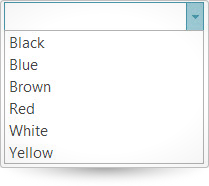
The igCombo control is a jQuery combo box which supports virtualization, auto-complete, auto-suggest, multiple selection, and item templates. With the igCombo control you can create drop downs that accept text entries as well as options selected from the items list. Further information regarding the classes, options, events, methods and themes of this API are available under the associated tabs above.
The following code snippet demonstrates how to initialize the igCombo control.
Click here for more information on how to get started using this API. For details on how to reference the required scripts and themes for the igCombo control read, Using JavaScript Resources in Ignite UI and Styling and Theming Ignite UI.Code Sample
      <!doctype html>
        <html>
        <head>
            <!-- Infragistics Combined CSS -->
            <link href="css/themes/infragistics/infragistics.theme.css" rel="stylesheet" type="text/css" />
            <link href="css/structure/infragistics.css" rel="stylesheet" type="text/css" />
            <!-- jQuery Core -->
            <script src="js/jquery.js" type="text/javascript"></script>
            <!-- jQuery UI -->
            <script src="js/jquery-ui.js" type="text/javascript"></script>
            <!-- Infragistics Combined Scripts -->
            <script src="js/infragistics.core.js" type="text/javascript"></script>
			      <script src="js/infragistics.lob.js" type="text/javascript"></script>
            <script type="text/javascript">
     	            $(function () {
                          var colors = [{
                          "Name": "Black"
                        }, {
                          "Name": "Blue"
                        }, {
                          "Name": "Brown"
                        }, {
                          "Name": "Red"
                        }, {
                          "Name": "White"
                        }, {
                          "Name": "Yellow"
                        }];

                  $("#combo").igCombo({
                          dataSource: colors,
                          textKey: "Name",
                          valueKey: "Name",
                          width: "200px"
                    });
                });
            </script>

      </head>
      <body>
         <input id="combo" />
      </body>
      </html>
Related Samples
Related Topics
Dependencies
Inherits
-
allowCustomValue
- Type:
- bool
- Default:
- false
If set to true:
1. Allows custom value input only with single selection.
2. Custom values will be auto completed to the closest value if autoComplete is enabled.Code Sample
//Initialize $(".selector").igCombo({ allowCustomValue: true }); //Get var allowCustomValue = $(".selector").igCombo("option", "allowCustomValue"); //Set $(".selector").igCombo("option", "allowCustomValue", false); -
animationHideDuration
- Type:
- number
- Default:
- 100
Gets/Sets hide drop-down list animation duration in milliseconds.
Code Sample
//Initialize $(".selector").igCombo({ animationHideDuration: 25 }); //Get var animationDuration = $(".selector").igCombo("option", "animationHideDuration"); //Set $(".selector").igCombo("option", "animationHideDuration", 25); -
animationShowDuration
- Type:
- number
- Default:
- 100
Gets/Sets show drop-down list animation duration in milliseconds.
Code Sample
//Initialize $(".selector").igCombo({ animationShowDuration: 25 }); //Get var animationDuration = $(".selector").igCombo("option", "animationShowDuration"); //Set $(".selector").igCombo("option", "animationShowDuration", 25); -
autoComplete
- Type:
- bool
- Default:
- false
Gets/Sets ability to autocomplete field from first matching item in list.
Note: When autoComplete option is enabled, then "startsWith" is used for filteringCondition.Code Sample
//Initialize $(".selector").igCombo({ autoComplete: true }); //Get var autoComplete = $(".selector").igCombo("option", "autoComplete"); //Set $(".selector").igCombo("option", "autoComplete", false); -
autoSelectFirstMatch
- Type:
- bool
- Default:
- true
Gets/Sets whether the first matching item should be auto selected when typing in input. When multiSelection is enabled this option will instead put the active item on the matching element.
Code Sample
//Initializes $(".selector").igCombo({ autoSelectFirstMatch: false }); //Get var autoSelectFirstMatch = $(".selector").igCombo("option", "autoSelectFirstMatch"); //Set $(".selector").igCombo("option", "autoSelectFirstMatch", true); -
caseSensitive
- Type:
- bool
- Default:
- false
If set to true, filtering and auto selection will be case-sensitive.
Code Sample
//Initialize $(".selector").igCombo({ caseSensitive: true }); //Get var caseSensitive = $(".selector").igCombo("option", "caseSensitive"); //Set $(".selector").igCombo("option", "caseSensitive", true); -
clearButtonTitle
Removed- Type:
- string
- Default:
- ""
This option has been removed as of 2017.2 Volume release.
Gets/Sets title for html element which represent clear button.
Use option locale.clearButtonTitle.Code Sample
//Initialize $(".selector").igCombo({ clearButtonTitle : "Clear value" }); //Get var title = $(".selector").igCombo("option", "clearButtonTitle"); //Set $(".selector").igCombo("option", "clearButtonTitle", "Clear value"); -
closeDropDownOnBlur
- Type:
- bool
- Default:
- true
Gets/Sets ability to close drop-down list when control loses focus.
Code Sample
//Initialize $(".selector").igCombo({ closeDropDownOnBlur: false }); //Get var closeDropDownOnBlur = $(".selector").igCombo("option", "closeDropDownOnBlur"); //Set $(".selector").igCombo("option", "closeDropDownOnBlur", false); -
closeDropDownOnSelect
- Type:
- bool
- Default:
- true
Gets sets ability to close drop-down list when single item in the list is selected with mouse click or enter press. The default value when multiSelection is enabled will be false. This option will not close the drop down when multiSelection is enabled and additive selection is performed.
Code Sample
//Initialize $(".selector").igCombo({ closeDropDownOnSelect: false }); //Get var closeDropDownOnSelect = $(".selector").igCombo("option", "closeDropDownOnSelect"); //Set $(".selector").igCombo("option", "closeDropDownOnSelect", false); -
dataSource
- Type:
- object
- Default:
- null
Gets/Sets a valid data source accepted by $.ig.DataSource, or an instance of an $.ig.DataSource itself.
Note: if it is set to string and dataSourceType option is not set, then $.ig.JSONDataSource is used.Code Sample
//Initialize $(".selector").igCombo({ dataSource: data }); //Get var data = $(".selector").igCombo("option", "dataSource"); //Set $(".selector").igCombo("option", "dataSource", ds); -
dataSourceType
- Type:
- string
- Default:
- null
Sets data source type (such as "json", "xml", etc). Please refer to the documentation of $.ig.DataSource and its type property.
Code Sample
//Initialize $(".selector").igCombo({ dataSourceType: "xml" }); //Get var dataType = $(".selector").igCombo("option", "dataSourceType"); -
dataSourceUrl
- Type:
- string
- Default:
- null
Sets URL which is used for sending JSON on request for remote filtering (MVC for example). That option is required when load on demand is
enabled and its type is remote.Code Sample
//Initialize $(".selector").igCombo({ dataSourceUrl: "data.svc" }); //Get var dataUrl = $(".selector").igCombo("option", "dataSourceUrl"); -
delayInputChangeProcessing
- Type:
- number
- Default:
- 250
Specifies the delay duration before processing the changes in the input. Useful to boost performance by lowering the count of selection, filtering, auto complete and highlighting operations executed on each input change.
Code Sample
//Initialize $(".selector").igCombo({ delayInputChangeProcessing: 500 }); //Get var delayInputChangeProcessing = $(".selector").igCombo("option", "delayInputChangeProcessing"); //Set $(".selector").igCombo("option", "delayInputChangeProcessing", 1000); -
dropDownAttachedToBody
- Type:
- bool
- Default:
- true
If set to true, the container of the drop-down list is appended to the body.
If set to false, it is appended to the parent element of the combo.Code Sample
//Initialize $(".selector").igCombo({ dropDownAttachedToBody: false }); //Get var dropDownAttachedToBody = $(".selector").igCombo("option", "dropDownAttachedToBody"); -
dropDownButtonTitle
Removed- Type:
- string
- Default:
- ""
This option has been removed as of 2017.2 Volume release.
Gets/Sets title for html element which represent the drop-down button.
Use option locale.dropDownButtonTitle.Code Sample
//Initialize $(".selector").igCombo({ dropDownButtonTitle : "Open Dropdown" }); //Get var title = $(".selector").igCombo("option", "dropDownButtonTitle"); //Set $(".selector").igCombo("option", "dropDownButtonTitle", "Open Dropdown"); -
dropDownOnFocus
- Type:
- bool
- Default:
- false
Gets/Sets ability to show the drop-down list when the combo is in focus. This option has effect only if the combo is in editable mode.
Code Sample
//Initialize $(".selector").igCombo({ dropDownOnFocus: true }); //Get var dropDownOnFocus = $(".selector").igCombo("option", "dropDownOnFocus"); //Set $(".selector").igCombo("option", "dropDownOnFocus", true); -
dropDownOrientation
- Type:
- enumeration
- Default:
- auto
Gets/Sets drop-down list orientation when open button is clicked.
Members
- auto
- Type:string
- if there is enough space, it positions the drop-down list below the combo input, otherwise - above the combo input.
- bottom
- Type:string
- below the combo input.
- top
- Type:string
- above the combo input.
Code Sample
//Initialize $(".selector").igCombo({ dropDownOrientation: "top" }); //Get var dropDownOrientation = $(".selector").igCombo("option", "dropDownOrientation"); //Set $(".selector").igCombo("option", "dropDownOrientation", "top"); -
dropDownWidth
- Type:
- enumeration
- Default:
- null
Gets/Sets the width of drop-down list in pixels.
Members
- string
- Type:string
- The default drop-down list width can be set in pixels (px).
- number
- Type:number
- The default drop-down list width can be set as a number.
Code Sample
//Initialize $(".selector").igCombo({ dropDownWidth: 200 }); //Get var width = $(".selector").igCombo("option", "dropDownWidth"); //Set $(".selector").igCombo("option", "dropDownWidth", 200); -
enableClearButton
- Type:
- bool
- Default:
- true
Specifies whether the clear button should be rendered.
When the mode is single selection, readonly or readonlylist this option will default to false. It can still be enabled when it is specifically set to true.Code Sample
//Initialize $(".selector").igCombo({ enableClearButton: false }); //Get var enableClearButton = $(".selector").igCombo("option", "enableClearButton"); //Set $(".selector").igCombo("option", "enableClearButton", false); -
filterExprUrlKey
- Type:
- string
- Default:
- null
Gets/Sets URL key name that specifies how the remote filtering expressions will be encoded for remote requests, e.g. &filter('col') = startsWith. Default is OData.
Code Sample
//Initialize $(".selector").igCombo({ filterExprUrlKey: "filter" }); //Get var filterKey = $(".selector").igCombo("option", "filterExprUrlKey"); //Set $(".selector").igCombo("option", "filterExprUrlKey", "filter"); -
filteringCondition
- Type:
- enumeration
- Default:
- contains
Gets/Sets condition used for filtering. Note: When autoComplete is enabled, the filtering condition is always "startsWith".
Members
- contains
- Type:string
- doesNotContain
- Type:string
- startsWith
- Type:string
- endsWith
- Type:string
- greaterThan
- Type:string
- lessThan
- Type:string
- greaterThanOrEqualTo
- Type:string
- lessThanOrEqualTo
- Type:string
- equals
- Type:string
- doesNotEqual
- Type:string
Code Sample
//Initialize $(".selector").igCombo({ filteringCondition: "startsWith" }); //Get var condition = $(".selector").igCombo("option", "filteringCondition"); //Set $(".selector").igCombo("option", "filteringCondition", "startsWith"); -
filteringLogic
- Type:
- enumeration
- Default:
- OR
Gets/Sets filtering logic.
Members
- OR
- Type:string
- AND
- Type:string
Code Sample
//Initialize $(".selector").igCombo({ filteringLogic: "and" }); //Get var filteringLogic = $(".selector").igCombo("option", "filteringLogic"); //Set $(".selector").igCombo("option", "filteringLogic", "or"); -
filteringType
- Type:
- enumeration
- Default:
- local
Gets/Sets type of filtering. Note: option is set to "remote", then the "css.waitFiltering" is applied to combo and its drop-down list.
Members
- remote
- Type:string
- filtering is performed by server.
- local
- Type:string
- filtering is performed by $.ig.DataSource.
- none
- Type:string
- filtering is disabled.
Code Sample
//Initialize $(".selector").igCombo({ filteringType: "remote" }); //Get var filterType = $(".selector").igCombo("option", "filteringType"); //Set $(".selector").igCombo("option", "filteringType", "remote"); -
footerTemplate
- Type:
- string
- Default:
- null
Gets/Sets template used to render a footer in the drop-down list.
Notes:
1. The template is rendered inside of DIV html element.
2. The following variables can be used:
- {0}: Number of records in igCombo (view of dataSource)
- {1}: Number of records in dataSource
- {2}: Number of (filtered) records on server
- {3}: Number of all records on server.Code Sample
//Initialize $(".selector").igCombo({ footerTemplate: "<div class='dropDownHeaderFooter'>Available Products</div>" }); //Get var footerTemplate = $(".selector").igCombo("option", "footerTemplate"); //Set $(".selector").igCombo("option", "footerTemplate", "<div class='dropDownFooterClass'>Product Count: {0} / {3} {1}/ {2}</div>"); -
format
- Type:
- string
- Default:
- "auto"
Gets/Sets the format string that is used to format the text display values in the combo.
Valid options are:
"auto" (default) - uses automatic formatting for Date and number objects.
"none", "", or null - will disable formatting
Custom values can be something like "currency", "percent", "dateLong", "time", "MMM-dd-yyyy H:mm tt", etc.
Custom format strings should match the data type in "textKey" column.Code Sample
//Initialize $(".selector").igCombo({ format: "auto" }); //Get var format = $(".selector").igCombo("option", "format"); -
grouping
- Type:
- object
- Default:
- {}
Gets/Sets object specifying grouping feature options. The option has key and dir properties.
Code Sample
//Initialize $(".selector").igCombo({ grouping: { key: "Country", dir: "desc" } }); //Get var grouping = $(".selector").igCombo("option", "grouping"); //Set $(".selector").igCombo("option", "grouping", { key: "Age", dir: "asc" });-
dir
- Type:
- enumeration
- Default:
- asc
Specifies the sort order - ascending or descending.
Members
- asc
- Type:string
- desc
- Type:string
Code Sample
//Initialize $(".selector").igCombo({ grouping: { key: "Country", dir: "desc" } }); //Get var grouping = $(".selector").igCombo("option", "grouping"); var dir = grouping.dir; //Set $(".selector").igCombo("option", "grouping", { dir: "asc" }); -
key
- Type:
- string
- Default:
- null
Gets/Sets name of column by which the records will be grouped. Setting this option enables the grouping.
Code Sample
					//Initialize
					$(".selector").igCombo({
						grouping: {
							key: "Country"
						}
					});

					//Get
					var grouping = $(".selector").igCombo("option", "grouping");
					var key = grouping.key;

					//Set
					$(".selector").igCombo("option", "grouping", { key: "Age" });
-
headerTemplate
- Type:
- string
- Default:
- null
Gets/Sets template used to render a header in the drop-down list. The template is rendered inside of a DIV html element.
Code Sample
//Initialize $(".selector").igCombo({ headerTemplate: "<div class='dropDownHeaderFooter'>Available Products</div>" }); //Get var headerTemplate = $(".selector").igCombo("option", "headerTemplate"); //Set $(".selector").igCombo("option", "headerTemplate", "<div class='dropDownHeaderClass'>Available Products</div>"); -
height
- Type:
- enumeration
- Default:
- null
Gets/Sets height of combo. The numeric and string values (valid html units for size) are supported. It includes %, px, em and other units.
Members
- string
- The default height can be set in pixels (px), %, em and other units.
- number
- The default height can be set as a number.
Code Sample
//Initialize $(".selector").igCombo({ height: "25px" }); //Get var height = $(".selector").igCombo("option", "height"); //Set $(".selector").igCombo("option", "height", "25px"); -
highlightMatchesMode
- Type:
- enumeration
- Default:
- multi
Gets/Sets condition used for highlighting of matching parts in items of drop-down list.
Members
- multi
- Type:string
- multiple matches in a single item are rendered.
- contains
- Type:string
- match at any position in item is rendered.
- startsWith
- Type:string
- only match which starts from the beginning of text is rendered.
- full
- Type:string
- only fully matched items are rendered.
- null
- Type:object
- matches are not rendered.
Code Sample
//Initialize $(".selector").igCombo({ highlightMatchesMode: "startsWith" }); //Get var highlightMatchesMode = $(".selector").igCombo("option", "highlightMatchesMode"); //Set $(".selector").igCombo("option", "highlightMatchesMode", "full"); -
initialSelectedItems
- Type:
- array
- Default:
- []
- Elements Type:
- object
Gets/Sets list of items to be selected when the combo is initialized. It should contain array of objects with index or value property, then on initialization the matching items will be selected. If initialSelectedItems are not set, the combo is with single selection and it is in a dropdown, readonly or readonlylist mode, the first item will be automatically selected.
Note: Only items loaded on initialization can be selected. When using load on demand, selecting an item which is not loaded yet will fail.Code Sample
//Initialize with index $(".selector").igCombo({ multiSelection: { enabled: true }, initialSelectedItems: [ { index: 0 }, { index: 1 }, { index: 2 } ] }); //Initialize with value $(".selector").igCombo({ initialSelectedItems: [ { value: 5 } ] }); //Get var initialSelectedItems = $(".selector").igCombo("option", "initialSelectedItems");-
index
- Type:
- number
- Default:
- -1
Optional="true" Index of item in the list. The index should be greater than -1 and less than the count of the items in the list (rows in dataSource).
Code Sample
//Initialize $(".selector").igCombo({ multiSelection: { enabled: true }, initialSelectedItems: [ { index: 1 }, { index: 3 }, { index: 5 } ] }); //Get var initialSelectedItems = $(".selector").igCombo("option", "initialSelectedItems"); -
value
- Type:
- object
- Default:
- null
Optional="true" Value matching the valueKey property of the item.
Code Sample
					//Initialize
					$(".selector").igCombo({
						multiSelection: {
							enabled: true
						},
						initialSelectedItems: [
							{ value: 2 },
							{ value: 5 }
						]
					});

					//Get
					var initialSelectedItems = $(".selector").igCombo("option", "initialSelectedItems");
-
inputName
- Type:
- string
- Default:
- null
Gets/Sets the name of a hidden INPUT element, which is used when submitting data. Its value will be set to the values of the selected items valueKeys separated by ',' character on any change in igCombo. If the combo element has 'name' attribute and this option is not set, the 'name' attribute will be used for the input name.
Code Sample
//Initialize $(".selector").igCombo({ inputName: "textField" }); //Get var inputName = $(".selector").igCombo("option", "inputName"); //Set $(".selector").igCombo("option", "inputName", "textField"); -
itemTemplate
- Type:
- string
- Default:
- null
Gets/Sets a template used to render an item in list. The igCombo utilizes igTemplating for generating node content templates.
More info on the templating engine can be found here: http://www.igniteui.com/help/infragistics-templating-engine.Code Sample
//Initialize $(".selector").igCombo({ itemTemplate: "<span class="movieTitle">${Name}</span><img src="${Url}" />" }); //Get var template = $(".selector").igCombo("option", "itemTemplate"); -
language
Inherited- Type:
- string
- Default:
- "en"
Set/Get the locale language setting for the widget.
Code Sample
//Initialize $(".selector").igCombo({ language: "ja" }); // Get var language = $(".selector").igCombo("option", "language"); // Set $(".selector").igCombo("option", "language", "ja"); -
loadOnDemandSettings
- Type:
- object
- Default:
- {}
Gets/Sets container of variables which define load on demand functionality.
Notes:
That option has effect only when data is loaded remotely using dataSourceUrl.
Selection is supported only for already loaded items.Code Sample
//Initialize $(".selector").igCombo({ loadOnDemandSettings: { enabled: true, pageSize: 55 } }); //Get var loadOnDemandSettings = $(".selector").igCombo("option", "loadOnDemandSettings"); //Get the enabled state loadOnDemandSettings.enabled; //Get the drop down list page size loadOnDemandSettings.pageSize; //Set $(".selector").igCombo("option", "loadOnDemandSettings", { enabled: true, pageSize: 55 });-
enabled
- Type:
- bool
- Default:
- false
Gets/Sets option to enable load on demand.
Code Sample
//Initialize $(".selector").igCombo({ loadOnDemandSettings: { enabled: true } }); //Get var loadOnDemandSettings = $(".selector").igCombo("option", "loadOnDemandSettings"); //Get the enabled state loadOnDemandSettings.enabled; //Set $(".selector").igCombo("option", "loadOnDemandSettings", { enabled: true }); -
pageSize
- Type:
- number
- Default:
- 16
Gets/Sets number of records loaded on each request.
Code Sample
					//Initialize
					$(".selector").igCombo({
						loadOnDemandSettings: {
							enabled: true,
							pageSize: 55
						}
					});

					//Get
					var loadOnDemandSettings = $(".selector").igCombo("option", "loadOnDemandSettings");
					//Get the drop down list page size
					loadOnDemandSettings.pageSize;

					//Set
					$(".selector").igCombo("option", "loadOnDemandSettings", { enabled: true, pageSize: 55 });
-
locale
- Type:
- object
- Default:
- {}
-
clearButtonTitle
- Type:
- object
- Default:
- ""
Gets/Sets title for html element which represent the clear button.
Code Sample
//Initialize $(".selector").igCombo({ locale: { clearButtonTitle: "Clear value" } }); //Get var text = $(".selector").igCombo("option", "locale").clearButtonTitle; //Set $(".selector").igCombo("option", "locale", { clearButtonTitle: "Clear value" }); -
dropDownButtonTitle
- Type:
- object
- Default:
- ""
Gets/Sets title for html element which represent the drop-down button.
Code Sample
//Initialize $(".selector").igCombo({ locale: { dropDownButtonTitle: "Open Dropdown" } }); //Get var text = $(".selector").igCombo("option", "locale").dropDownButtonTitle; //Set $(".selector").igCombo("option", "locale", { dropDownButtonTitle: "Open Dropdown" }); -
noMatchFoundText
- Type:
- object
- Default:
- ""
Gets/Sets text of list item for condition when filteringType option is enabled and no match was found.
Code Sample
//Initialize $(".selector").igCombo({ locale: { noMatchFoundText: "No match found" } }); //Get var text = $(".selector").igCombo("option", "locale").noMatchFoundText; //Set $(".selector").igCombo("option", "locale", { noMatchFoundText: "No match found" }); -
placeHolder
- Type:
- object
- Default:
- ""
Gets/Sets value that is displayed when input field is empty.
Code Sample
					//Initialize
					$(".selector").igCombo({
						locale: {
							placeHolder: "Empty input field"
						}
					});

					//Get
					var text = $(".selector").igCombo("option", "locale").placeHolder;

					//Set
					$(".selector").igCombo("option", "locale", { placeHolder: "Empty input field" });
-
mode
- Type:
- enumeration
- Default:
- editable
Sets gets functionality mode.
Members
- editable
- Type:string
- Allows to modify value by edit field and drop-down list.
- dropdown
- Type:string
- Allows to modify value by drop-down list only.
- readonlylist
- Type:string
- Allows to open list, but does not allow any changes in field or selection in drop-down list. If selection is not set, then first item in dataSource is automatically selected.
- readonly
- Type:string
- Does not allow to open list or change value in field. If selection is not set, then first item in dataSource is automatically selected.
Code Sample
//Initialize $(".selector").igCombo({ mode: "readonlylist" }); //Get var mode = $(".selector").igCombo("option", "mode"); -
multiSelection
- Type:
- object
- Default:
- {}
Gets/Sets object specifying multi selection feature options. Note showCheckboxes and itemSeparator has effect only if multi selection is enabled.
Code Sample
//Initialize $(".selector").igCombo({ multiSelection: { enabled: true, addWithKeyModifier: false, showCheckboxes: false, itemSeparator: ', ' } }); //Get var multiSelection = $(".selector").igCombo("option", "multiSelection");-
addWithKeyModifier
- Type:
- bool
- Default:
- false
Set addWithKeyModifier to true to disable the additive selection, then additive selection can be done by ctrl + mouse click / enter.
Code Sample
//Initialize $(".selector").igCombo({ multiSelection: { addWithKeyModifier: true } }); //Get var multiSelection = $(".selector").igCombo("option", "multiSelection"); var addWithKeyModifier = multiSelection.addWithKeyModifier; //Set $(".selector").igCombo("option", "multiSelection", { addWithKeyModifier: true }); -
enabled
- Type:
- bool
- Default:
- false
Set enabled to true to turn multi selection on. Set to true by default when target element for the combo is a select with the multiple attribute set.
Code Sample
//Initialize $(".selector").igCombo({ multiSelection: { enabled: true } }); //Get var multiSelection = $(".selector").igCombo("option", "multiSelection"); var enabled = multiSelection.enabled; //Set $(".selector").igCombo("option", "multiSelection", { enabled: true }); -
itemSeparator
- Type:
- string
- Default:
- ", "
Use itemSeparator to set what string to be rendered between items in field.
Code Sample
//Initialize $(".selector").igCombo({ multiSelection: { itemSeparator: ", " } }); //Get var multiSelection = $(".selector").igCombo("option", "multiSelection"); var itemSeparator = multiSelection.itemSeparator; //Set $(".selector").igCombo("option", "multiSelection", { itemSeparator: ". " }); -
showCheckboxes
- Type:
- bool
- Default:
- false
Set showCheckboxes to true to render check boxes in front of each drop down item.
Code Sample
					//Initialize
					$(".selector").igCombo({
						multiSelection: {
							showCheckboxes: true
						}
					});

					//Get
					var multiSelection = $(".selector").igCombo("option", "multiSelection");
					var showCheckboxes = multiSelection.showCheckboxes;

					//Set
					$(".selector").igCombo("option", "multiSelection", { showCheckboxes: false });
-
noMatchFoundText
Removed- Type:
- string
- Default:
- ""
This option has been removed as of 2017.2 Volume release.
Gets/Sets text of list item for condition when filteringType option is enabled and no match was found.
Use option locale.noMatchFoundText.Code Sample
//Initialize $(".selector").igCombo({ noMatchFoundText : "Please try again" }); //Get var text = $(".selector").igCombo("option", "noMatchFoundText"); //Set $(".selector").igCombo("option", "noMatchFoundText", "Please try again"); -
placeHolder
Removed- Type:
- string
- Default:
- ""
This option has been removed as of 2017.2 Volume release.
Gets/Sets value that is displayed when input field is empty.
Use option locale.placeHolder.Code Sample
//Initialize $(".selector").igCombo({ placeHolder : "Empty input field" }); //Get var pHolder = $(".selector").igCombo("option", "placeHolder"); //Set $(".selector").igCombo("option", "placeHolder", "Please type in some text"); -
preventSubmitOnEnter
- Type:
- bool
- Default:
- true
Gets/Sets ability to prevent submitting form on enter key press.
Code Sample
//Initialize $(".selector").igCombo({ preventSubmitOnEnter: true }); //Get var preventSubmitOnEnter = $(".selector").igCombo("option", "preventSubmitOnEnter"); //Set $(".selector").igCombo("option", "preventSubmitOnEnter", false); -
regional
Inherited- Type:
- enumeration
- Default:
- en-US
Set/Get the regional setting for the widget.
Code Sample
//Initialize $(".selector").igCombo({ regional: "ja" }); // Get var regional = $(".selector").igCombo("option", "regional"); // Set $(".selector").igCombo("option", "regional", "ja"); -
requestType
- Type:
- string
- Default:
- "GET"
Specifies the HTTP verb to be used to issue the request.
Code Sample
//Initialize $(".selector").igCombo({ requestType: "get" }); //Get var requestType = $(".selector").igCombo("option", "requestType"); -
responseContentType
- Type:
- string
- Default:
- null
Content type of the response. See http://api.jquery.com/jQuery.ajax/ => contentType.
Code Sample
//Initialize $(".selector").igCombo({ responseContentType: "application/json; charset=utf-8" }); //Get var responseContentType = $(".selector").igCombo("option", "responseContentType"); -
responseDataKey
- Type:
- string
- Default:
- null
See $.ig.DataSource This is basically the property in the response where data records are held, if the response is wrapped.
Code Sample
//Initialize $(".selector").igCombo({ responseDataKey: "d.results" }); //Get var dataKey = $(".selector").igCombo("option", "responseDataKey"); -
responseDataType
- Type:
- enumeration
- Default:
- null
Response type when a URL is set as the data source. See http://api.jquery.com/jQuery.ajax/ => dataType.
Members
- json
- Type:string
- xml
- Type:string
- html
- Type:string
- script
- Type:string
- jsonp
- Type:string
- text
- Type:string
Code Sample
//Initialize $(".selector").igCombo({ responseDataType: "text" }); //Get var responseDataType = $(".selector").igCombo("option", "responseDataType"); -
responseTotalRecCountKey
- Type:
- string
- Default:
- null
See $.ig.DataSource property in the response specifying the total number of records on the server.
Code Sample
//Initialize $(".selector").igCombo({ responseTotalRecCountKey: "count" }); //Get var countKey = $(".selector").igCombo("option", "responseTotalRecCountKey"); -
selectItemBySpaceKey
- Type:
- bool
- Default:
- false
Gets/Sets ability to select items by space button press.
Code Sample
//Initialize $(".selector").igCombo({ selectItemBySpaceKey: true }); //Get var selectSpace = $(".selector").igCombo("option", "selectItemBySpaceKey"); //Set $(".selector").igCombo("option", "selectItemBySpaceKey", true); -
suppressKeyboard
- Type:
- bool
- Default:
- false
Gets/Sets whether the onscreen keyboard should be shown when the dropdown button is clicked (touch devices only).
Note: The keyboard will still show when the combo input is focused in editable mode.Code Sample
//Initialize $(".selector").igCombo({ suppressKeyboard: true }); //Get var suppressKeyboard = $(".selector").igCombo("option", "suppressKeyboard"); //Set $(".selector").igCombo("option", "suppressKeyboard", true); -
tabIndex
- Type:
- number
- Default:
- null
Gets/Sets tabIndex for the field of the combo.
Code Sample
//Initialize $(".selector").igCombo({ tabIndex: 3 }); //Get var tabIndex = $(".selector").igCombo("option", "tabIndex"); //Set $(".selector").igCombo("option", "tabIndex", 3); -
textKey
- Type:
- string
- Default:
- null
Gets/Sets name of column which contains the displayed text. If it is missing, then valueKey option will be used.
Code Sample
//Initialize $(".selector").igCombo({ textKey: "ProductName" }); //Get var key = $(".selector").igCombo("option", "textKey"); -
validatorOptions
- Type:
- object
- Default:
- null
Gets/Sets object which contains options supported by igValidator.
Notes: in order for validator to work, application should ensure that igValidator is loaded (ig.ui.validator.js/css files).Code Sample
//Initialize $(".selector").igCombo({ validatorOptions: { required: true } }); //Get var validatorOptions = $(".selector").igCombo("option", "validatorOptions"); //Set $(".selector").igCombo("option", "validatorOptions", { required: true }); -
valueKey
- Type:
- string
- Default:
- null
Gets/Sets name of column which contains the "value". If it is missing, then the name of first column will be used.
Code Sample
//Initialize $(".selector").igCombo({ valueKey: "ProductID" }); //Get var key = $(".selector").igCombo("option", "valueKey"); -
virtualization
- Type:
- bool
- Default:
- false
Gets/Sets ability to use virtual rendering for drop-down list. Enable to boost performance when combo has lots of records.
If that option is enabled, then only visible items are created and the top edge of the first visible item in list is aligned to the top edge of list.Code Sample
//Initialize $(".selector").igCombo({ virtualization: true }); //Get var isVirtualizationEnabled = $(".selector").igCombo("option", "virtualization"); -
visibleItemsCount
- Type:
- number
- Default:
- 15
Gets/Sets how many items should be shown at once.
Notes:
This option is used for virtualization in order to render initial list items.Code Sample
//Initialize $(".selector").igCombo({ visibleItemsCount: 22 }); //Get var count = $(".selector").igCombo("option", "visibleItemsCount"); //Set $(".selector").igCombo("option", "visibleItemsCount", 33 }); -
width
- Type:
- enumeration
- Default:
- null
Gets/Sets the width of combo. The numeric and string values (valid html units for size) are supported. It includes %, px, em and other units.
Members
- string
- The default width can be set in pixels (px), %, em and other units.
- number
- The default width can be set as a number.
Code Sample
				//Initialize
				$(".selector").igCombo({
					width: "300px"
				});
				//Get
				var width = $(".selector").igCombo("option", "width");
				//Set
				$(".selector").igCombo("option", "width", "300px");
For more information on how to interact with the Ignite UI controls' events, refer to
Using Events in Ignite UI.
-
dataBinding
- Cancellable:
- true
Event which is raised before data binding is performed.
Function takes arguments evt and ui.
Use ui.owner to get a reference to igCombo performing the databinding.
Use ui.dataSource to get a reference to the $.ig.DataSource combo is to be databound to.Code Sample
$(document).delegate(".selector", "igcombodatabinding", function (evt, ui) { //use to obtain reference to igCombo ui.owner; //use to obtain reference to instance of $.ig.DataSource used by combo ui.dataSource; }); //Initialize $(".selector").igCombo({ dataBinding: function (evt, ui) { ... } }); -
dataBound
- Cancellable:
- false
Event which is raised after data binding is complete.
Function takes arguments evt and ui.
Use ui.owner to obtain reference to igCombo performing the data binding.
Use ui.dataSource to get a reference to the $.ig.DataSource combo is databound to.
Use ui.success to see if the databinding was performed correctly.
Use ui.errorMessage to get the error message if the databinding failed.Code Sample
$(document).delegate(".selector", "igcombodatabound", function (evt, ui) { //use to obtain reference to igCombo ui.owner; //use to obtain reference to instance of $.ig.DataSource used by combo ui.dataSource; }); //Initialize $(".selector").igCombo({ dataBound: function (evt, ui) { ... } }); -
dropDownClosed
- Cancellable:
- false
Event which is raised after drop-down list was closed.
Function takes arguments evt and ui.
Use evt.originalEvent to obtain reference to event of browser.
Use ui.owner to obtain reference to igCombo.
Use ui.list to obtain reference to jquery DOM element which represents drop down list container.Code Sample
$(document).delegate(".selector", "igcombodropdownclosed", function (evt, ui) { //use to obtain reference to the event browser evt.originalEvent; //use to obtain reference to igCombo ui.owner; //use to obtain reference to jQuery DOM element which represents a container of list ui.element; }); //Initialize $(".selector").igCombo({ dropDownClosed: function (evt, ui) { ... } }); -
dropDownClosing
- Cancellable:
- true
Event which is raised before drop-down list is closed.
Return false in order to cancel hide action.
Function takes arguments evt and ui.
Use ui.owner to obtain reference to igCombo.
Use ui.list to obtain reference to jquery DOM element which represents drop down list container.Code Sample
$(document).delegate(".selector", "igcombodropdownclosing", function (evt, ui) { //use to obtain reference to the event browser evt.originalEvent; //use to obtain reference to igCombo ui.owner; //use to obtain reference to jQuery DOM element which represents a container of list ui.element; }); //Initialize $(".selector").igCombo({ dropDownClosing: function (evt, ui) { ... } }); -
dropDownOpened
- Cancellable:
- false
Event which is raised after drop-down list was opened.
Function takes arguments evt and ui.
Use ui.owner to obtain reference to igCombo.
Use ui.list to obtain reference to jquery DOM element which represents drop down list container.Code Sample
$(document).delegate(".selector", "igcombodropdownopened", function (evt, ui) { //use to obtain reference to the event browser evt.originalEvent; //use to obtain reference to igCombo ui.owner; //use to obtain reference to jQuery DOM element which represents a container of list ui.element; }); //Initialize $(".selector").igCombo({ dropDownOpened: function (evt, ui) { ... } }); -
dropDownOpening
- Cancellable:
- true
Event which is raised before drop-down list is opened.
Return false in order to cancel drop-down action.
Function takes arguments evt and ui.
Use ui.owner to obtain reference to igCombo.
Use ui.list to obtain reference to jquery DOM element which represents drop down list container.Code Sample
$(document).delegate(".selector", "igcombodropdownopening", function (evt, ui) { //use to obtain reference to the event browser evt.originalEvent; //use to obtain reference to igCombo ui.owner; //use to obtain reference to jQuery DOM element which represents a container of list ui.element; }); //Initialize $(".selector").igCombo({ dropDownOpening: function (evt, ui) { ... } }); -
filtered
- Cancellable:
- false
Event which is raised after filtering.
Function takes arguments evt and ui.
Use evt.originalEvent to obtain reference to event of browser. That can be null.
Use ui.owner to obtain reference to igCombo.
Use ui.elements to obtain a jquery reference to the rendered filtered elements.Code Sample
$(document).delegate(".selector", "igcombofiltered", function (evt, ui) { //use to obtain reference to the event browser evt.originalEvent; //use to obtain reference to igCombo ui.owner; //use to obtain reference to array which contains expressions supported by $.ig.DataSource ui.expression; }); //Initialize $(".selector").igCombo({ filtered: function (evt, ui) { ... } }); -
filtering
- Cancellable:
- true
Event which is raised before data filtering.
Function takes arguments evt and ui.
Use ui.owner to obtain reference to igCombo.
Use ui.expression to obtain reference to array which contains expressions supported by $.ig.DataSource.
Each expression-item contains following members: fieldName (textKey), cond (filteringCondition), expr (value/string to filter).Code Sample
$(document).delegate(".selector", "igcombofiltering", function (evt, ui) { //use to obtain reference to the event browser evt.originalEvent; //use to obtain reference to igCombo ui.owner; //use to obtain reference to array which contains expressions supported by $.ig.DataSource ui.expression; }); //Initialize $(".selector").igCombo({ filtering: function (evt, ui) { ... } }); -
itemsRendered
- Cancellable:
- false
Event which is raised after rendering of the combo items completes.
Function takes arguments evt and ui.
Use ui.owner to get a reference to the combo performing rendering.
Use ui.dataSource to get a reference to the $.ig.DataSource combo is databound to.Code Sample
$(document).delegate(".selector", "igcomboitemsrendered", function (evt, ui) { //use to obtain reference to igCombo ui.owner; //use to get a reference to the $.ig.DataSource combo is databound to. ui.dataSource; }); //Initialize $(".selector").igCombo({ itemsRendered: function(evt, ui) {...} }); -
itemsRendering
- Cancellable:
- true
Event which is raised before rendering of the combo items is performed.
Function takes arguments evt and ui.
Use ui.owner to get a reference to the combo performing rendering.
Use ui.dataSource to get a reference to the $.ig.DataSource combo is databound to.Code Sample
$(document).delegate(".selector", "igcomboitemsrendering", function (evt, ui) { //use to get a reference to the combo performing rendering. ui.owner; //use to get a reference to the $.ig.DataSource combo is databound to. ui.dataSource; }); //Initialize $(".selector").igCombo({ itemsRendering: function(evt, ui) {...} }); -
rendered
- Cancellable:
- false
Event which is raised after rendering of the combo completes.
Function takes arguments evt and ui.
Use ui.owner to get a reference to the combo performing rendering.
Use ui.element to get a reference to the main/top combo element.Code Sample
$(document).delegate(".selector", "igcomborendered", function (evt, ui) { //use to get a reference to the combo performing rendering. ui.owner; //use to get a reference to the main/top combo element. ui.element; }); //Initialize $(".selector").igCombo({ rendered: function(evt, ui) {...} }); -
selectionChanged
- Cancellable:
- false
Event which is raised after selection change.
Function takes arguments evt and ui.
Use ui.owner to obtain reference to igCombo.
Use ui.items to obtain reference to array of new selected items. That can be null.
Use ui.oldItems to obtain reference to array of old selected items. That can be null.Code Sample
$(document).delegate(".selector", "igcomboselectionchanged", function (evt, ui) { //use to obtain reference to the event browser evt.originalEvent; //use to obtain reference to igCombo ui.owner; //use to obtain reference to array of new selected items. That can be null. ui.items; //use to obtain reference to array of old selected items. That can be null. ui.oldItems; }); //Initialize $(".selector").igCombo({ selectionChanged: function (evt, ui) { ... } }); -
selectionChanging
- Cancellable:
- true
Event which is raised before selection change.
Return false in order to cancel change.
Function takes arguments evt and ui.
Use ui.owner to obtain reference to igCombo.
Use ui.currentItems to obtain reference to array of the selected items before the new selection has happened. That can be null.
Use ui.items to obtain reference to array of all items that will be selected after the selection finish. That can be null.Code Sample
				$(document).delegate(".selector", "igcomboselectionchanging", function (evt, ui) {
					//use to obtain reference to the event browser
					evt.originalEvent;
					//use to obtain reference to igCombo
					ui.owner;
					//use to obtain reference to array of new selected items. That can be null.
					ui.items;
					//use to obrain reference to array of currently selected items.
					ui.currentItems
				});

				//Initialize
				$(".selector").igCombo({
					selectionChanging: function (evt, ui) {
						...
					}
				});
-
activeIndex
- .igCombo( "activeIndex", [index:number] );
- Return Type:
- enumeration
- Return Type Description:
- Can return 'number|object'. Returns index of active item in list or -1, if parameter is undefined. Otherwise, it returns reference to this igCombo.
Gets/Sets index of active item in list.
- index
- Type:number
- Optional
- New active index for list. In order to clear active item, use -1.
Code Sample
//Return index of active item var index = $(".selector").igCombo("activeIndex"); $(".selector").igCombo("activeIndex", 5); -
changeGlobalLanguage
Inherited- .igCombo( "changeGlobalLanguage" );
Changes the widget language to global language. Global language is the value in $.ig.util.language.
Code Sample
$(".selector").igCombo("changeGlobalLanguage"); -
changeGlobalRegional
Inherited- .igCombo( "changeGlobalRegional" );
Changes the widget regional settins to global regional settings. Global regional settings are container in $.ig.util.regional.
Code Sample
$(".selector").igCombo("changeGlobalRegional"); -
changeLocale
- .igCombo( "changeLocale" );
Changes the all locales into the widget element to the language specified in options.language
Note that this method is for rare scenarios, see language or locale option setter.Code Sample
$(".selector").igCombo("changeLocale"); -
changeRegional
- .igCombo( "changeRegional" );
Changes the the regional settings of widget element to the language specified in options.regional
Note that this method is for rare scenarios, use regional option setter.Code Sample
$(".selector").igCombo("changeRegional"); -
clearFiltering
- .igCombo( "clearFiltering", [event:object] );
- Return Type:
- object
- Return Type Description:
- Returns reference to this igCombo.
Clears filtering.
Code Sample
$(".selector").igCombo("clearFiltering"); // triggering filtering and filtering $(".selector").igCombo("clearFiltering", true); -
clearInput
- .igCombo( "clearInput", [options:object], [event:object] );
- Return Type:
- object
- Return Type Description:
- Returns reference to this igCombo.
Clears the input text, resets highlighting, filtering and selection.
- options
- Type:object
- Optional
- Object with set of options controlling the behavior of this api method.
focusCombo (boolean): Set to true to focus combo after clearing the input. - event
- Type:object
- Optional
- Indicates the browser event which triggered this action (not API). Calling the method with this param set to "true" will trigger selectionChanging and selectionChanged events.
Code Sample
$(".selector").igCombo("clearInput"); // clearing input, focusing the input and triggering events $(".selector").igCombo("clearInput", { focusCombo : true }, true); -
closeDropDown
- .igCombo( "closeDropDown", [callback:function], [event:object] );
- Return Type:
- object
- Return Type Description:
- Returns reference to this igCombo.
Closes the drop down.
- callback
- Type:function
- Optional
- Specifies callback function to be executed when close animation is completed.
- event
- Type:object
- Optional
- Indicates the browser event which triggered this action (not API). Calling the method with this param set to "true" will trigger dropDownClosing and dropDownClosed events.
Code Sample
$(".selector").igCombo("closeDropDown"); // using callback and triggering events var callback = function () { ... } $(".selector").igCombo("closeDropDown", callback, true); -
comboWrapper
- .igCombo( "comboWrapper" );
- Return Type:
- object
- Return Type Description:
- Returns reference to the jQuery outer element object.
Gets jQuery object of the outer element of the combo.
Code Sample
var comboWrapper = $(".selector").igCombo("comboWrapper"); -
dataBind
- .igCombo( "dataBind" );
- Return Type:
- object
- Return Type Description:
- Returns reference to this igCombo.
Performs databinding on the combo box. The databinding and dataBound events are always raised.
Code Sample
$(".selector").igCombo("dataBind"); -
dataForElement
- .igCombo( "dataForElement", $element:object );
- Return Type:
- object
- Return Type Description:
- The null or object - the associated data of the element.
Gets the associated data of li element in the combo.
- $element
- Type:object
- jQuery element of item in the drop down list.
Code Sample
var data = $(".selector").igCombo("dataForElement", $element); -
dataForValue
- .igCombo( "dataForValue", value:object );
- Return Type:
- object
- Return Type Description:
- The null or object - the associated data of the element.
Gets the associated data of an item by value matching it's valueKey property.
- value
- Type:object
- Value matching the valueKey property of item to be tested if it is selected.
Code Sample
var data = $(".selector").igCombo("dataForValue", value); -
deselect
- .igCombo( "deselect", $items:object, [options:object], [event:object] );
- Return Type:
- object
- Return Type Description:
- Returns reference to this igCombo.
Deselects a list item from the drop down list.
- $items
- Type:object
- jQuery object with item or items to be deselected.
- options
- Type:object
- Optional
- Object with set of options controlling the behavior of this api method.
focusCombo (boolean): Set to true to focus combo after the deselection.
keepInputText (boolean): Set to true to keep input text unchanged after the deselection. By default input text is updated. - event
- Type:object
- Optional
- Indicates the browser event which triggered this action (not API). Calling the method with this param set to "true" will trigger selectionChanging and selectionChanged events.
Code Sample
//deselect item $(".selector").igCombo("deselect", $itemLi); //deselect items $(".selector").igCombo("deselect", $itemsLi); //deselect item, focus combo, keep input text and trigger events $(".selector").igCombo("deselect", $itemLi, { focusCombo: true, keepInputText: true }, true); -
deselectAll
- .igCombo( "deselectAll", [options:object], [event:object] );
- Return Type:
- object
- Return Type Description:
- Returns reference to this igCombo.
Deselects all selected items from the drop down list.
- options
- Type:object
- Optional
- Object with set of options controlling the behavior of this api method.
focusCombo (boolean): Set to true to focus combo after the deselection.
keepInputText (boolean): Set to true to keep input text unchanged after the deselection. By default input text is updated. - event
- Type:object
- Optional
- Indicates the browser event which triggered this action (not API). Calling the method with this param set to "true" will trigger selectionChanging and selectionChanged events.
Code Sample
$(".selector").igCombo("deselectAll"); //deselect all, focus combo, keep input text and trigger events $(".selector").igCombo("deselectAll", { focusCombo: true, keepInputText: true }, true); -
deselectByIndex
- .igCombo( "deselectByIndex", index:object, [options:object], [event:object] );
- Return Type:
- object
- Return Type Description:
- Returns reference to this igCombo.
Deselects a list item from the drop down list by index.
- index
- Type:object
- Index or array of indexes of items to be selected.
- options
- Type:object
- Optional
- Object with set of options controlling the behavior of this api method.
focusCombo (boolean): Set to true to focus combo after the deselection.
keepInputText (boolean): Set to true to keep input text unchanged after the deselection. By default input text is updated. - event
- Type:object
- Optional
- Indicates the browser event which triggered this action (not API). Calling the method with this param set to "true" will trigger selectionChanging and selectionChanged events.
Code Sample
//deselect by index $(".selector").igCombo("deselectByIndex", 3); //deselect by array of indexes $(".selector").igCombo("deselectByIndex", [0,2]); //deselect by index, focus combo, keep input text and trigger events $(".selector").igCombo("deselectByIndex", 1, { focusCombo: true, keepInputText: true }, true); -
deselectByValue
- .igCombo( "deselectByValue", value:object, [options:object], [event:object] );
- Return Type:
- object
- Return Type Description:
- Returns reference to this igCombo.
Deselects a list item from the drop down list by value.
- value
- Type:object
- Value or array of values matching the valueKey property of item/items to be deselected.
- options
- Type:object
- Optional
- Object with set of options controlling the behavior of this api method.
focusCombo (boolean): Set to true to focus combo after the deselection.
keepInputText (boolean): Set to true to keep input text unchanged after the deselection. By default input text is updated. - event
- Type:object
- Optional
- Indicates the browser event which triggered this action (not API). Calling the method with this param set to "true" will trigger selectionChanging and selectionChanged events.
Code Sample
//deselect by value $(".selector").igCombo("deselectByValue", 3); //deselect by value as string $(".selector").igCombo("deselectByValue", "3"); //deselect by array of values $(".selector").igCombo("deselectByValue", [1,2,3]); //deselect by value, focus combo, keep input text and trigger events $(".selector").igCombo("deselectByValue", 1, { focusCombo: true, keepInputText: true }, true); -
destroy
- .igCombo( "destroy" );
- Return Type:
- object
- Return Type Description:
- .
Destroys the igCombo widget.
Code Sample
$(".selector").igCombo("destroy"); -
dropDown
- .igCombo( "dropDown" );
- Return Type:
- object
- Return Type Description:
- Returns reference to the jQuery drop down object.
Gets jQuery object of the drop down associated with this combo widget.
Code Sample
var $dropDownContainer = $(".selector").igCombo("dropDown"); -
dropDownOpened
- .igCombo( "dropDownOpened" );
- Return Type:
- bool
- Return Type Description:
- Returns boolean representing whether the combo drop down list is opened.
Returns boolean representing whether the combo drop down list is opened.
Code Sample
var isDropDownOpened = $(".selector").igCombo("dropDownOpened"); -
filter
- .igCombo( "filter", [texts:object], [event:object] );
- Return Type:
- object
- Return Type Description:
- Returns reference to this igCombo.
Triggers filtering.
Code Sample
//filter by string $(".selector").igCombo("filter", "Bob"); //filter by array of strings $(".selector").igCombo("filter", ["Smith", "Mary"], true); //filter by string and trigger events $(".selector").igCombo("filter", "Bob", true); -
filterByExpressions
- .igCombo( "filterByExpressions", expressions:array, [event:object] );
- Return Type:
- object
- Return Type Description:
- Returns reference to this igCombo.
Creates expressions for filtering.
Code Sample
//filter by expression $(".selector").igCombo("filterByExpressions", [{cond: "startsWith", expr: "Smith", logic: "or"}]); //filter by array of expressions $(".selector").igCombo("filterByExpressions", [{cond: "startsWith", expr: "Smith", logic: "or"}, {cond: "startsWith", expr: "Mary", logic: "and"}]); //filter by array of expressions and trigger events $(".selector").igCombo("filterByExpressions", [{cond: "startsWith", expr: "Smith", logic: "and"}, {cond: "endsWith", expr: "Sauerkraut", logic: "and"}], true); -
filteredItems
- .igCombo( "filteredItems" );
- Return Type:
- array
- Return Type Description:
- The null or array with objects containing following members: data - the associated data, element - the jquery element of the li.
Gets array with objects representing the filtered li elements in combo box.
Code Sample
var filteredItems = $(".selector").igCombo("filteredItems"); var filteredItemData = filteredItems[0].data; var $filteredItemLi = filteredItems[0].element; -
index
- .igCombo( "index", [index:object], [options:object], [event:object] );
- Return Type:
- object
- Return Type Description:
- Returns reference to this igCombo, or array of indices if the index parameter is provided.
Gets/Sets selected item/s from the drop-down list by specified index.
- index
- Type:object
- Optional
- Index or array of indexes of items to be selected.
- options
- Type:object
- Optional
- Object with set of options controlling the behavior of this api method.
closeDropDown (boolean): Set to true to close the drop down list after the selection.
focusCombo (boolean): Set to true to focus combo after the selection.
additive (boolean): Set to true to select the item without losing other selection. Works only when multi selection is enabled.
keepFiltering (boolean): Set to true to keep filtering after the selection. By default the filtering is cleared.
keepInputText (boolean): Set to true to keep input text unchanged after the selection. By default input text is updated.
keepHighlighting (boolean): Set to true to keep highlighting unchanged after the selection. By default highlighting is removed.
keepNavItem (boolean): Set to true to keep current navigation item unchanged after the selection. By default the navigation item is changed to the new selected item.
keepScrollPosition (boolean): Set to true to keep current scroll position. By default the scroll position will change so that the last selected item is visible. - event
- Type:object
- Optional
- Indicates the browser event which triggered this action (not API). Calling the method with this param set to "true" will trigger selectionChanging and selectionChanged events.
Code Sample
//get selected item index var selectedItemIndex = $(".selector").igCombo("index"); //get selected items indexes var selectedItemsIndexesArray = $(".selector").igCombo("index"); //select item by index $(".selector").igCombo("index", 3); //select items by indexes $(".selector").igCombo("index", [0, 1, 2]); //selects item by index, set options after selecting the item and trigger events $(".selector").igCombo("index", 3, { // Closes the drop down list after the selection. closeDropDown: true, // Focus combo after the selection. focusCombo: true, // Selects the item without losing other selection. Works only when multi selection is enabled. additive: true, // Keeps input text unchanged after the selection. By default input text is updated. keepInputText: true, // Keeps highlighting unchanged after the selection. By default highlighting is removed. keepHighlighting: true, // Keeps current navigation item unchanged after the selection. By default the navigation item is changed to the new selected item. keepNavItem: true, // Keeps current scroll position. By default the scroll position will change so that the last selected item is visible. keepScrollPosition: true, // Calling the method with this param set to "true" will trigger selection changed event. }, true); -
isIndexSelected
- .igCombo( "isIndexSelected", index:object );
- Return Type:
- bool
- Return Type Description:
- Returns boolean representing whether the item is selected.
Verifies whether the li representing the data source's record at the specified index is selected.
- index
- Type:object
- Index of data source record.
Code Sample
var isIndexSelected = $(".selector").igCombo("isIndexSelected", 2); -
isSelected
- .igCombo( "isSelected", $item:object );
- Return Type:
- bool
- Return Type Description:
- Returns boolean representing whether the item is selected.
Verifies whether the specified li is selected.
- $item
- Type:object
- jQuery object with item to verify whether it is selected.
Code Sample
var isSelected = $(".selector").igCombo("isSelected", $item); -
isValueSelected
- .igCombo( "isValueSelected", value:object );
- Return Type:
- bool
- Return Type Description:
- Returns boolean representing whether the item is selected.
Verifies whether a specified value is selected.
- value
- Type:object
- Value matching the valueKey property of item to be tested if it is selected.
Code Sample
//value as number var isValueSelected = $(".selector").igCombo("isValueSelected", 2); //value as string var isValueSelected = $(".selector").igCombo("isValueSelected", "2"); -
items
- .igCombo( "items" );
- Return Type:
- array
- Return Type Description:
- The null or array with objects containing following members: data - the associated data, element - the jquery element of the li.
Gets array with data and objects representing li elements in combo box.
Code Sample
var items = $(".selector").igCombo("items"); var firstItemData = items[0].data; var $firstItemLi = items[0].element; -
itemsFromElement
- .igCombo( "itemsFromElement", $element:object );
- Return Type:
- object
- Return Type Description:
- The null when no such item is found. Object when single element is provided or array with objects when multiple elements are provided containing following members: data - the associated data, element - the jquery element of the li.
Gets object/s containing data and list item in the combo by element/s.
- $element
- Type:object
- jQuery object with drop down list item element or elements.
Code Sample
//from a list item var item = $(".selector").igCombo("itemsFromElement", $liElement); //from array of list items var items = $(".selector").igCombo("itemsFromElement", $liElements); var firstItemData = items[0].data; var $firstItemLi = items[0].element; -
itemsFromIndex
- .igCombo( "itemsFromIndex", index:number );
- Return Type:
- object
- Return Type Description:
- The null when no such item is found. Object when single element is provided or array with objects when multiple elements are provided containing following members: data - the associated data, element - the jquery element of the li.
Gets object/s containing data and list item in the combo by index/es.
- index
- Type:number
- Index or array of indexes of items in the drop down list.
Code Sample
//get item by index var item = $(".selector").igCombo("itemsFromIndex", 0); //get items by indexes var items = $(".selector").igCombo("itemsFromIndex", [0, 1, 2]); var firstItemData = items[0].data; var $firstItemLi = items[0].element; -
itemsFromValue
- .igCombo( "itemsFromValue", value:object );
- Return Type:
- object
- Return Type Description:
- The null when no such item is found. Object when single element is provided or array with objects when multiple elements are provided containing following members: data - the associated data, element - the jquery element of the li.
Gets object/s containing data and list item in the combo by value/s.
- value
- Type:object
- Value of item in the drop down list or array with values.
Code Sample
//get item by value var item = $(".selector").igCombo("itemsFromValue", 2); //get items by values var items = $(".selector").igCombo("itemsFromValue", 2); var firstItemData = items[0].data; var $firstItemLi = items[0].element; -
list
- .igCombo( "list" );
- Return Type:
- object
- Return Type Description:
- Returns reference to the jQuery list container object.
Gets jQuery object of the container that holds the list with items.
Code Sample
var list = $(".selector").igCombo("list"); -
listItems
- .igCombo( "listItems" );
- Return Type:
- object
- Return Type Description:
- Returns reference to jQuery objects representing all rendered list items in the combo drop down list.
Gets jQuery objects representing all rendered list items in the combo drop down list.
Code Sample
var listItems = $(".selector").igCombo("listItems"); -
listScrollTop
- .igCombo( "listScrollTop", [value:number] );
- Return Type:
- enumeration
- Return Type Description:
- Can return 'number|object'. If parameter is undefined, then scrollTop is returned. Otherwise, it returns reference to this igCombo.
Gets/Sets scrollTop attribute of html element, which scrolls drop-down list of items.
- value
- Type:number
- Optional
- New value for scroll top in list. Note: if list is closed and new value is provided, then openDropDown() is called automatically.
Code Sample
//Get var scrollTop = $(".selector").igCombo("listScrollTop"); //Set $(".selector").igCombo("listScrollTop", 50); -
openDropDown
- .igCombo( "openDropDown", [callback:function], [focusCombo:bool], [event:object] );
- Return Type:
- object
- Return Type Description:
- Returns reference to this igCombo.
Opens the drop-down.
- callback
- Type:function
- Optional
- Specifies callback function to be executed when open animation is completed.
- focusCombo
- Type:bool
- Optional
- Set to false to not focus combo"s text input after the drop down is opened. By default the combo's input is focused.
- event
- Type:object
- Optional
- Indicates the browser event which triggered this action (not API). Calling the method with this param set to "true" will trigger dropDownOpening and dropDownOpened events.
Code Sample
$(".selector").igCombo("openDropDown"); //opens combo, executes the callback, focuses combo and triggers events var callback = function() { ... } $(".selector").igCombo("openDropDown", callback, true, true); -
positionDropDown
- .igCombo( "positionDropDown" );
- Return Type:
- object
- Return Type Description:
- Returns reference to this combo.
Repositions drop down under combo input. Has effect only when the drop down is attached to body.
Code Sample
$(".selector").igCombo("positionDropDown"); -
refreshValue
- .igCombo( "refreshValue" );
- Return Type:
- object
- Return Type Description:
- Returns reference to this combo.
Forces an update of the igCombo value according to the current text in the igCombo input.
The refresh is primarily intended to be used with allowCustomValue set to true.
The refresh will take the current text and, if no selection is applied, will set it as igCombo value provided that allowCustomValue true.Code Sample
$(".selector").igCombo("refreshValue"); -
select
- .igCombo( "select", $items:object, [options:object], [event:object] );
- Return Type:
- object
- Return Type Description:
- Returns reference to this igCombo.
Selects a list item from the drop-down list.
- $items
- Type:object
- jQuery object with item or items to be selected.
- options
- Type:object
- Optional
- Object with set of options controlling the behavior of this api method.
closeDropDown (boolean): Set to true to close the drop down list after the selection.
focusCombo (boolean): Set to true to focus combo after the selection.
additive (boolean): Set to true to select the item without losing other selection. Works only when multi selection is enabled.
keepFiltering (boolean): Set to true to keep filtering after the selection. By default the filtering is cleared.
keepInputText (boolean): Set to true to keep input text unchanged after the selection. By default input text is updated.
keepHighlighting (boolean): Set to true to keep highlighting unchanged after the selection. By default highlighting is removed.
keepNavItem (boolean): Set to true to keep current navigation item unchanged after the selection. By default the navigation item is changed to the new selected item.
keepScrollPosition (boolean): Set to true to keep current scroll position. By default the scroll position will change so that the last selected item is visible. - event
- Type:object
- Optional
- Indicates the browser event which triggered this action (not API). Calling the method with this param set to "true" will trigger selectionChanging and selectionChanged events.
Code Sample
//select item $(".selector").igCombo("select", $item); //select items $(".selector").igCombo("select", $items); //select items, set options controlling the behavior and trigger events $(".selector").igCombo("select", $item, { closeDropDown: true, focusCombo: true, keepFiltering: true, keepInputText: true, keepHighlighting: true, keepNavItem: true }, true); -
selectAll
- .igCombo( "selectAll", [options:object], [event:object] );
- Return Type:
- object
- Return Type Description:
- Returns reference to this igCombo.
Selects all items from the drop-down list.
- options
- Type:object
- Optional
- Object with set of options controlling the behavior of this api method.
closeDropDown (boolean): Set to true to close the drop down list after the selection.
focusCombo (boolean): Set to true to focus combo after the selection.
keepFiltering (boolean): Set to true to keep filtering after the selection. By default the filtering is cleared.
keepInputText (boolean): Set to true to keep input text unchanged after the selection. By default input text is updated.
keepHighlighting (boolean): Set to true to keep highlighting unchanged after the selection. By default highlighting is removed.
keepNavItem (boolean): Set to true to keep current navigation item unchanged after the selection. By default the navigation item is changed to the new selected item.
keepScrollPosition (boolean): Set to true to keep current scroll position. By default the scroll position will change so that the last selected item is visible. - event
- Type:object
- Optional
- Indicates the browser event which triggered this action (not API). Calling the method with this param set to "true" will trigger selectionChanging and selectionChanged events.
Code Sample
$(".selector").igCombo("selectAll"); //select all, set options controlling behavior $(".selector").igCombo("selectAll", { closeDropDown: true, focusCombo: true, keepFiltering: true, keepInputText: true, keepHighlighting: true, keepNavItem: true, keepScrollPosition: true }, true); -
selectedItems
- .igCombo( "selectedItems" );
- Return Type:
- array
- Return Type Description:
- The null or array with objects containing following members: data - the associated data, element - the jQuery element of the li.
Gets array with objects representing selected li elements in combo box.
Code Sample
var items = $(".selector").igCombo("selectedItems"); var firstItemData = items[0].data; var $firstItemLi = items[0].element; -
text
- .igCombo( "text", [text:string] );
- Return Type:
- enumeration
- Return Type Description:
- Can return 'string|object'. If parameter is undefined, then current text in field is returned. Otherwise, it returns reference to this igCombo.
Gets/Sets text in text input field.
- text
- Type:string
- Optional
- New text value for combo's input field.
Code Sample
//Get var text = $(".selector").igCombo("text"); //Set $(".selector").igCombo("text", "Orange"); -
textInput
- .igCombo( "textInput" );
- Return Type:
- object
- Return Type Description:
- Returns reference to the jQuery input object.
Gets jQuery object of the text input associated with this combo widget.
Code Sample
var $textInput = $(".selector").igCombo("textInput"); -
validate
- .igCombo( "validate" );
- Return Type:
- bool
- Return Type Description:
- True if all checks have passed. Can be null in case validation is not enabled.
Trigger validation.
Code Sample
var isValid = $(".selector").igCombo("validate"); -
validator
- .igCombo( "validator", [destroy:bool] );
- Return Type:
- object
- Return Type Description:
- Returns reference to igValidator or null.
Gets reference to igValidator used by igCombo.
- destroy
- Type:bool
- Optional
- Request to destroy validator.
Code Sample
var validator = $(".selector").igCombo("validator"); //destroy the validator $(".selector").igCombo("validator", true); -
value
- .igCombo( "value", [value:object], [options:object], [event:object] );
- Return Type:
- object
- Return Type Description:
- Returns reference to this igCombo, or array of values if the value parameter is provided.
Selects list item/items from the drop-down list by specified value or array of values. When called witout params will return the value of the selected item or if multiSelection is enabled array of selected values.
- value
- Type:object
- Optional
- Value or array of values matching the valueKey property of item/items to be selected.
- options
- Type:object
- Optional
- Object with set of options controlling the behavior of this api method.
closeDropDown (boolean): Set to true to close the drop down list after the selection.
focusCombo (boolean): Set to true to focus combo after the selection.
additive (boolean): Set to true to select the item without losing other selection. Works only when multi selection is enabled.
keepFiltering (boolean): Set to true to keep filtering after the selection. By default the filtering is cleared.
keepInputText (boolean): Set to true to keep input text unchanged after the selection. By default input text is updated.
keepHighlighting (boolean): Set to true to keep highlighting unchanged after the selection. By default highlighting is removed.
keepNavItem (boolean): Set to true to keep current navigation item unchanged after the selection. By default the navigation item is changed to the new selected item.
keepScrollPosition (boolean): Set to true to keep current scroll position. By default the scroll position will change so that the last selected item is visible. - event
- Type:object
- Optional
- Indicates the browser event which triggered this action (not API). Calling the method with this param set to "true" will trigger selectionChanging and selectionChanged events.
Code Sample
//Get value/s var value = $(".selector").igCombo("value"); //Set value $(".selector").igCombo("value", 2); //Set values $(".selector").igCombo("value", [1, 2]); //Set value, set options controlling behavior and trigger events $(".selector").igCombo("value", 3, { closeDropDown: true, focusCombo: true, additive: true, keepFiltering: true, keepInputText: true, keepHighlighting: true, keepNavItem: true, keepScrollPosition: true }, true); -
valueInput
- .igCombo( "valueInput" );
- Return Type:
- object
- Return Type Description:
- Returns reference to the jQuery input object.
Gets jQuery object of the value input associated with this combo widget.
Code Sample
var $input = $(".selector").igCombo("valueInput");
-
ui-state-active
- Class applied to elements in active state.
-
ui-igcombo-button ui-state-default ui-unselectable
- Class applied to the DIV element which represents the drop down button.
-
ui-igcombo-buttonicon ui-icon-triangle-1-s ui-icon
- Classes applied to the DIV element which represents image on drop down button.
-
ui-igcombo-button-ltr ui-corner-right
- Class applied to the DIV element which represents drop down button when direction is left to right.
-
ui-igcombo-button-rtl ui-corner-left
- Class applied to the DIV element which represents drop down button when direction is right to left.
-
ui-igcombo-checkbox ui-state-default ui-corner-all ui-igcheckbox-small
- Class applied to the SPAN element which represents checkbox in list item.
-
ui-icon ui-igcombo-checkbox-off ui-igcheckbox-small-off
- Class applied to the SPAN element which represents icon in unchecked checkbox.
-
ui-icon ui-icon-check ui-igcombo-checkbox-on ui-igcheckbox-small-on
- Class applied to the SPAN element which represents icon in unchecked checkbox.
-
ui-igcombo-clear ui-unselectable
- Class applied to the DIV element which represents clear button.
-
ui-igcombo-clear-hover ui-state-hover
- Classes applied to the SPAN element of clear button in mouse-over state.
-
ui-igcombo-clearicon ui-icon-circle-close ui-icon
- Class applied to the DIV element which represents image on clear button.
-
ui-igcombo-clear-rtl ui-unselectable
- Class applied to the DIV element which represents clear button with right to left direction.
-
ui-igcombo ui-widget ui-state-default ui-corner-all ui-unselectable
- Class applied to the combo element.
-
ui-igcombo-wrapper
- Class applied to the wrapper element.
-
ui-state-disabled
- Class applied to combo top element when in readonly mode.
-
ui-igcombo-dropdown ui-widget ui-widget-content ui-corner-all
- Class applied to the DIV element which represents the combo drop down. It contains the list, the header and the footer containers.
-
ig-rtl
- Class applied to the drop down list when direction is right to left.
-
ui-igcombo-mode-dropdown
- Class applied to the combo in drop down mode.
-
ui-igcombo-field ui-corner-all
- Class applied to the editing element.
-
ui-igcombo-fieldholder
- Class applied to the holder of editing element.
-
ui-igcombo-fieldholder-ltr ui-corner-left
- Class applied to the holder of editing element when direction is left to right.
-
ui-igcombo-fieldholder-rtl ui-corner-right
- Class applied to the holder of editing element when direction is right to left.
-
ui-igcombo-footer
- Classes applied to the DIV element which represents footer in combo drop down.
-
ui-igcombo-group
- Classes applied to the element which holds group of list items in drop down list.
-
ui-igcombo-group-header ui-state-default ui-unselectable
- Classes applied to the header element of each group.
-
ui-igcombo-header
- Classes applied to the DIV element which represents header in combo drop down.
-
ui-helper-hidden
- Class applied to filtered list items to hide them.
-
ui-igcombo-hidden-field
- Class applied to the hidden input field.
-
ui-state-hover
- Class applied to elements when hovered.
-
ui-igcombo-item-in-focus
- Class applied to the list item elements hover with mouse or navigated to by keyboard.
-
ui-igcombo-list
- Class applied to the DIV element which is used as container for drop down list.
-
ui-igcombo-listitem ui-state-default ui-unselectable
- Classes applied to the LI element which represents item in drop down list.
-
ui-igcombo-highlight
- Class applied to the text in LI element which represents highlighted text in dropdown list.
-
ui-igcombo-listitemholder
- Class applied to the UL element which is used as container for list items.
-
ui-igcombo-listitemtextwithcheckbox
- Class applied to the SPAN element which represents text of item in dropdown list when checkboxes are enabled.
-
ui-igcombo-list-overflow
- Class applied to the drop down container element when virtualization is enabled.
-
ui-igcombo-loading
- Class applied to the DIV which represents overlay over drop down list while data is retrieving.
-
ui-igcombo-no-border
- Class applied to drop down element when it is closed.
-
ui-igcombo-nomatchfound
- Class applied to LI element that is shown when no matches are found while filtering.
-
ui-igcombo-orientation-bottom
- Class applied to combo drop down element when bottom orientation is used.
-
ui-igcombo-orientation-top
- Class applied to combo drop down element when top orientation is used.
-
ui-igcombo-mode-readonlylist
- Class applied to the combo in read only list mode.
-
ui-igcombo-mode-readonly
- Class applied to the combo in read only mode.
-
ui-igcombo-records-data
- Class applied to the span element in the footer that represents the number of records in the data source.
-
ui-igcombo-records-server
- Class applied to the span element in the footer that represents the number of filtered records on the server.
-
ui-igcombo-records-server-total
- Class applied to the span element in the footer that represents the number of total records on the server.
-
ui-igcombo-records-view
- Class applied to the span element in the footer that represents the number of records in data source view.
-
ui-igcombo-scroll ui-unselectable
- Class applied to the scroll element when virtualization is enabled.
-
ui-igcombo-scrollholder ui-unselectable
- Class applied to the scroll holder element when virtualization is enabled.
-
ui-igcombo-textbox ui-state-default ui-corner-all
- Class applied to the text box container.
-
ui-unselectable
- Class applied to unselectable elements.